Today is the second day of Conceptober. Todays prompt is create a City Edition jersey concept. City Edition jerseys are jerseys meant to connect the team to their city through design. That is accomplished by having a jersey that is inspired by the city and often times having design elements inspired or taken straight from the city. City Edition jerseys were started by Nike and the National Basketball Association in 2017. Since then Major League Baseball has also adopted City Edition jerseys. Those familiar with my Reno Ice Adult League Concept series or my American Hockey League Concept series will know that I do city jerseys for all of those teams.
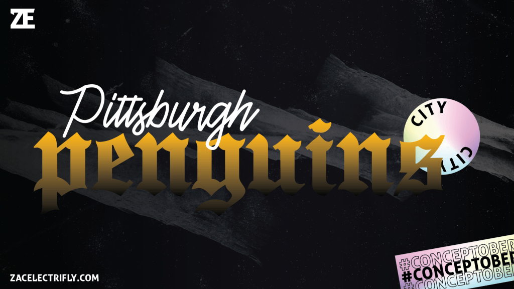
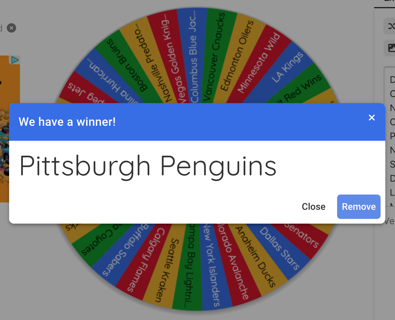
Again I used the Wheel of Names to pick a team to do this concept for. I stuck with the National Hockey League for todays Conceptober design. I removed the Florida Panthers as I did the Florida Panthers Earned Edition jersey for them for yesterdays Conceptober team. The Pittsburgh Penguins won todays wheel spin.
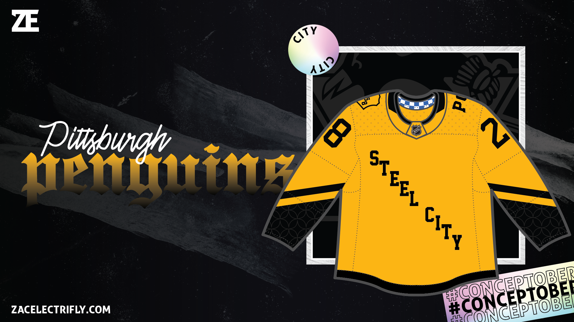
My Pittsburgh Penguins City Edition concept jersey was designed around “Steel City”. Steel City is one of the nicknames for Pittsburgh. Pittsburgh is called “the Steel City” because of the Pittsburgh steel industry. It is a yellow and black jersey inspired by their current third jersey design. The pattern on the sleeves represents the Pittsburgh flag being black, yellow, and black. On part of the sleeves it has a pattern inspired by the Pittsburgh Steelers. The Pittsburgh Steelers are the six team super bowl champions of the National Football League. The Steelers are named after the steel industry and their logo is the same as the U.S. Steel logo. The pattern on the jersey is also a reference to the steel industry of Pittsburgh. On the front is a diagonal “Steel City” wordmark. Besides being the main point of the jersey the diagonal wordmark is a reference to the Pittsburgh Penguins original jerseys that had a diagonal wordmark. On the right shoulder is a shield with the founding year of Pittsburgh in it. The shape of the shield is inspired by the Pittsburgh Riverhounds of the United Soccer League Championship. It has “1758” in the shield diagonally. On the left shoulder is an arced “PHG” wordmark. This is a reference to the Pittsburgh Pirates of Major League Baseball. It is inspired by the Pirates 2023 City Connect jerseys. “PGH” standing for Pittsburgh. Lastly the collar has a blue and white checkered pattern on it inspired by the Pittsburgh Flag.
This design was largely inspired by the Pittsburgh Pirates City Connect jersey. The Penguins do not currently have a yellow jersey. So I knew it was going to be yellow. It had to be black and yellow because of the flag. Then after that I wanted to just put as many references in the jersey to the Pittsburgh steel industry, Pittsburgh sports teams, and the Pittsburgh flag.
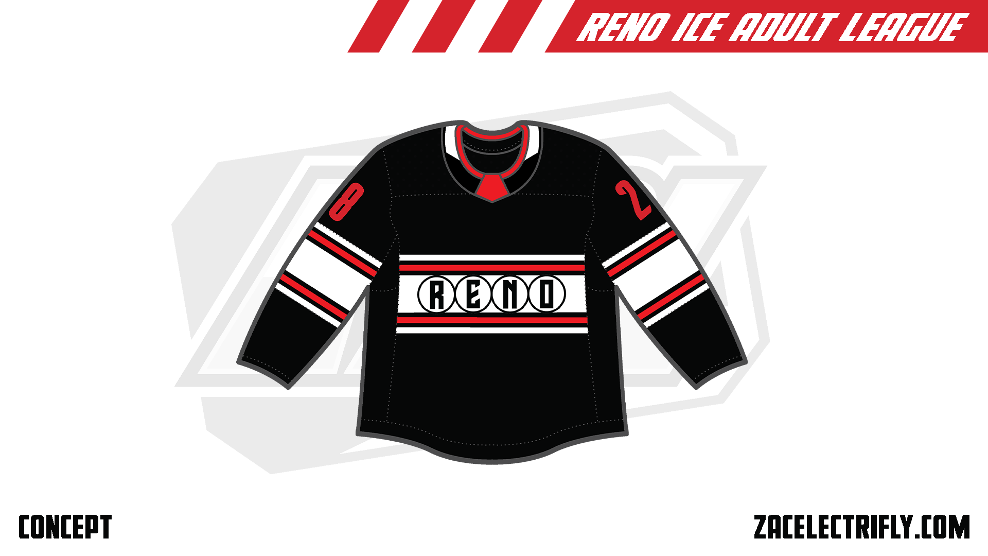
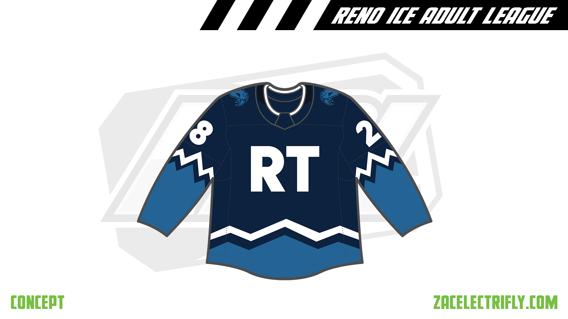
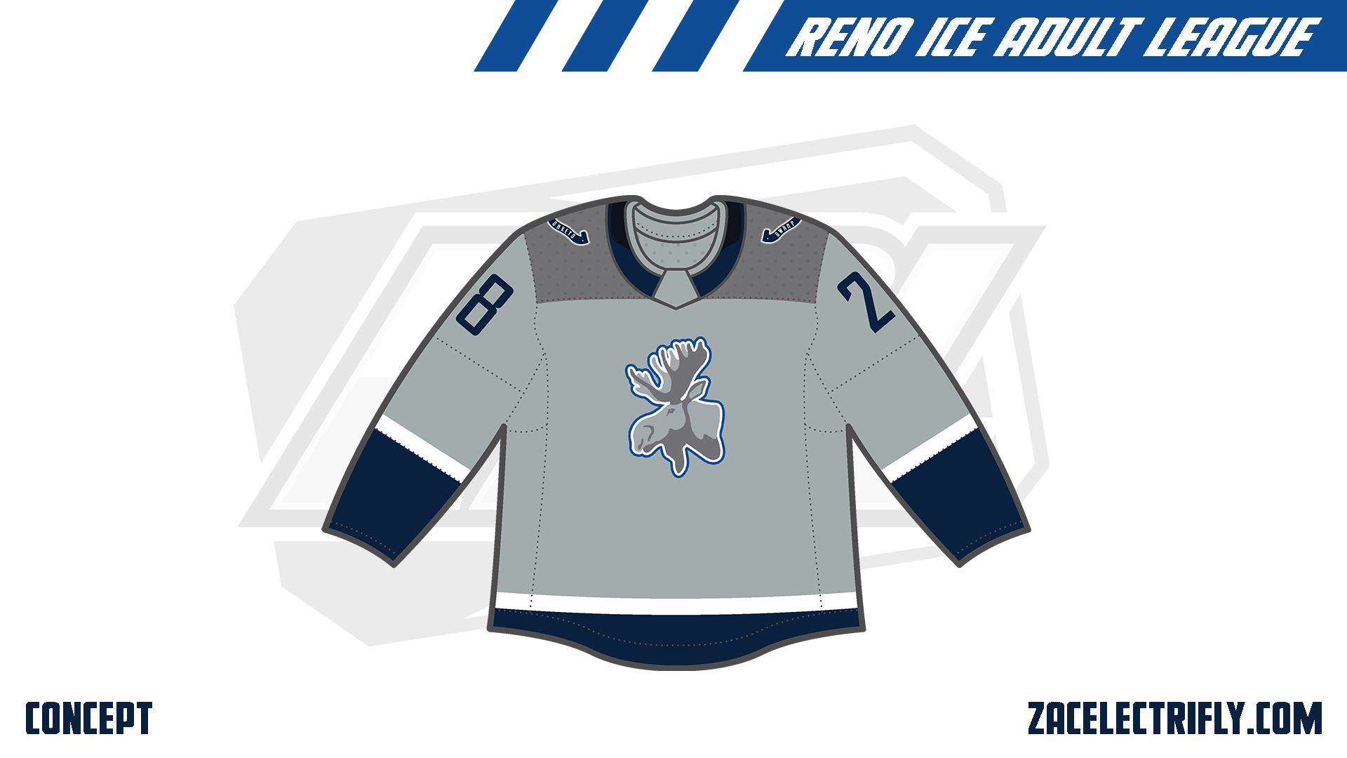
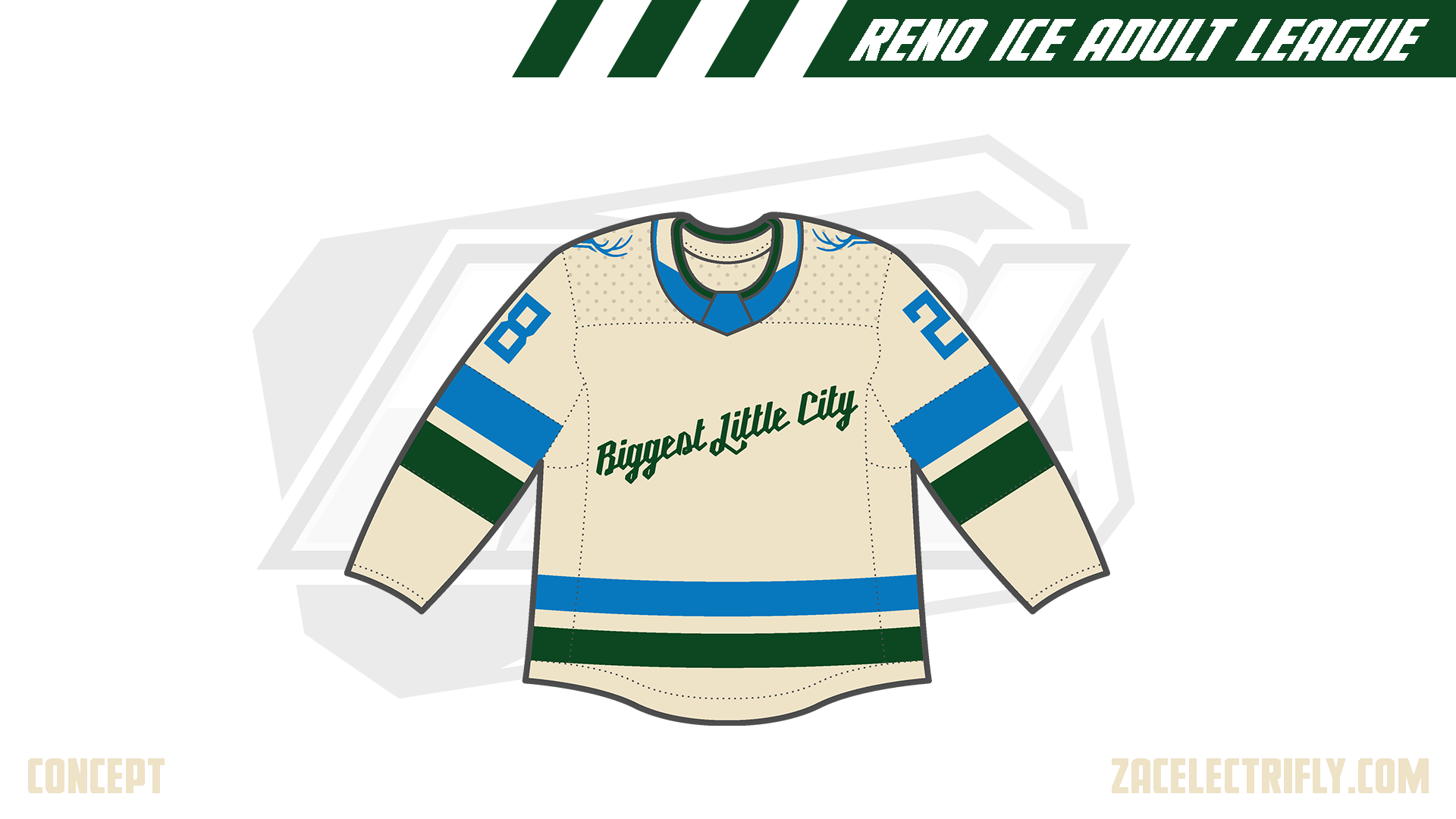
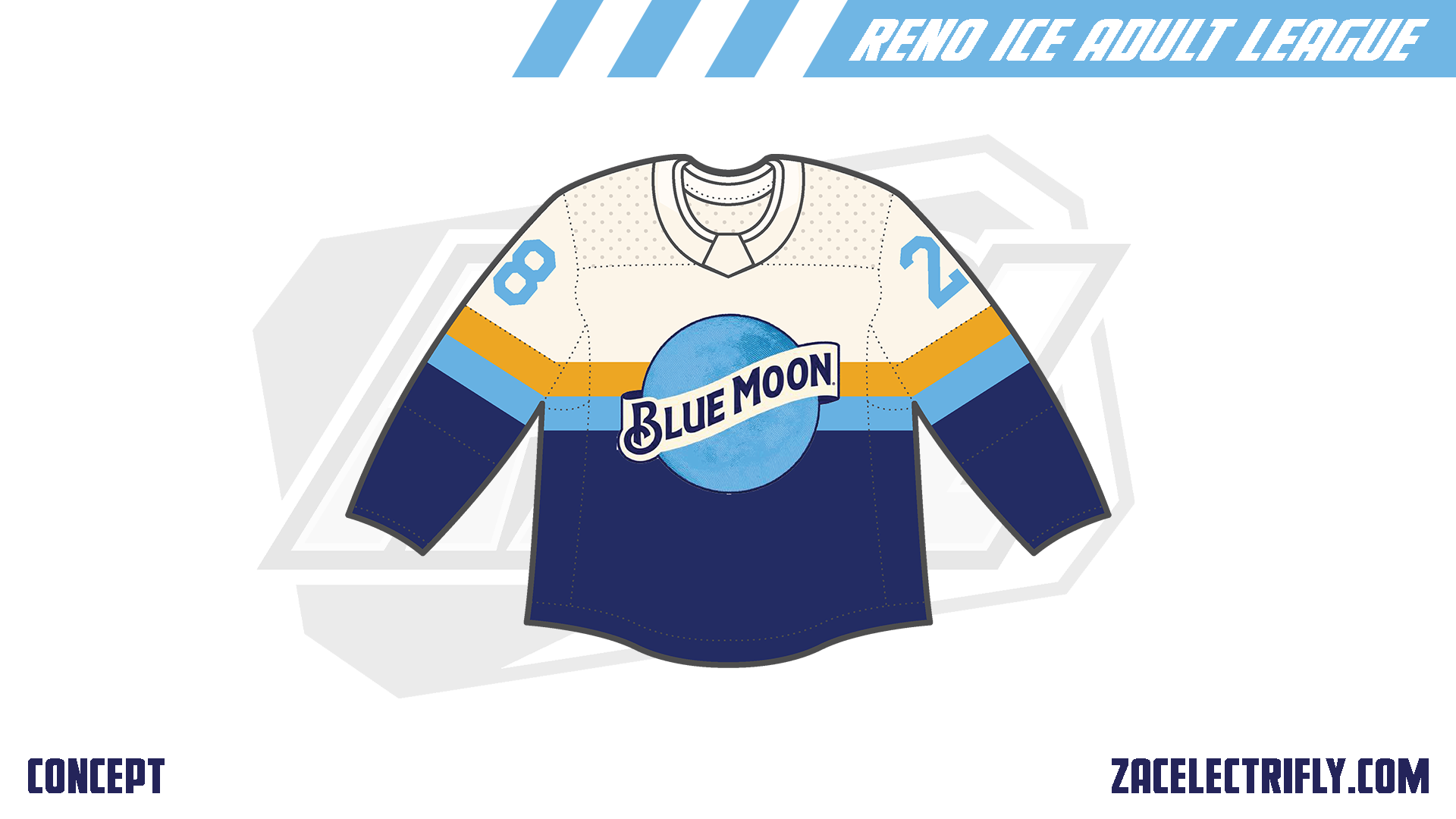
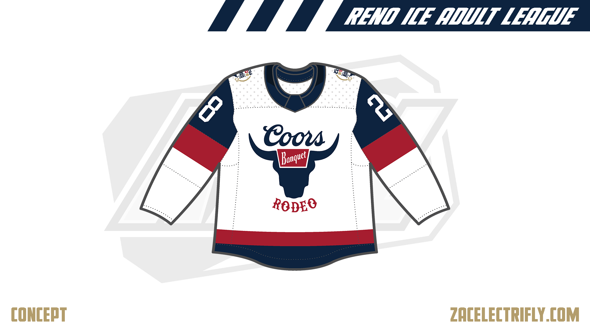
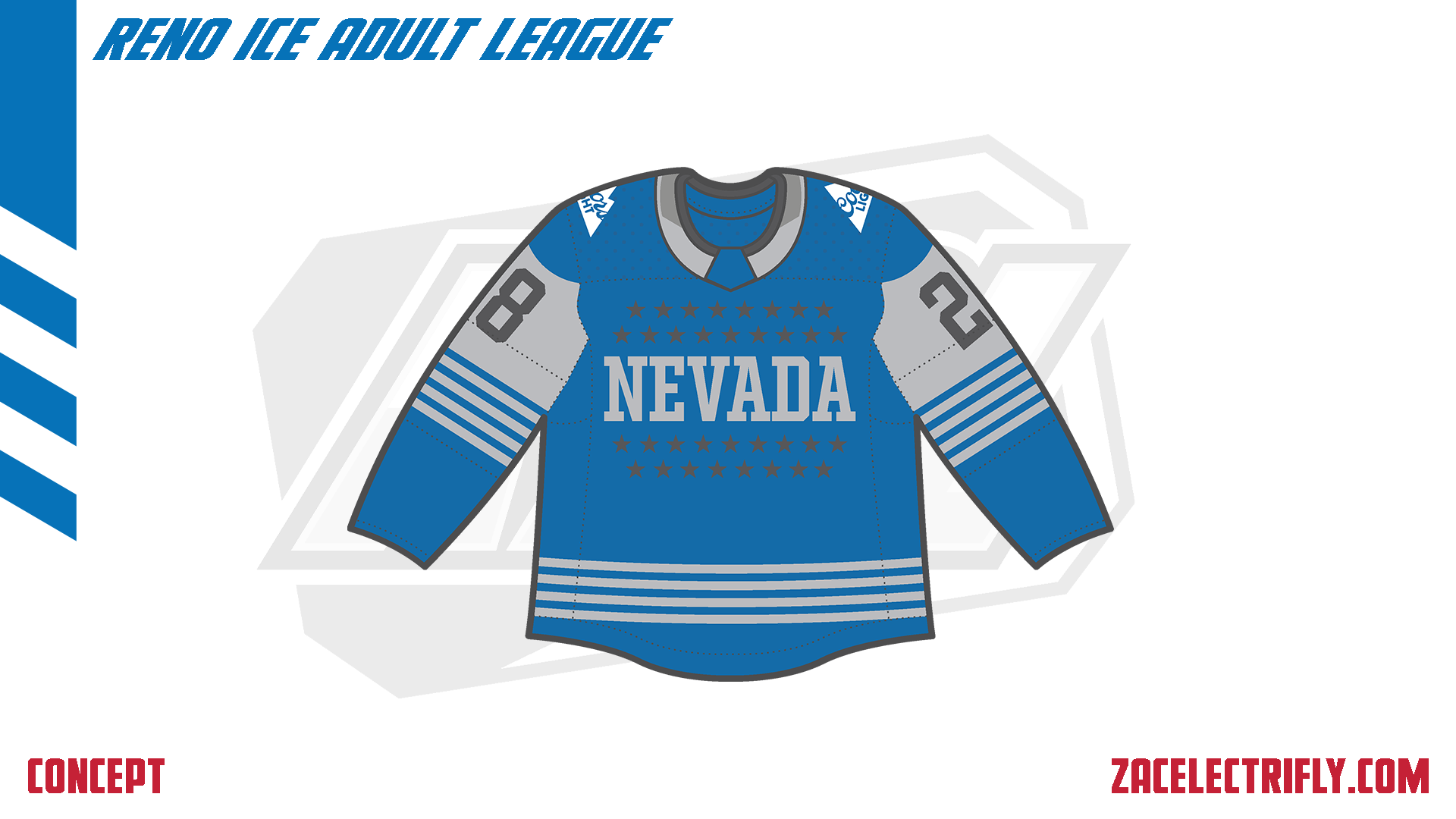
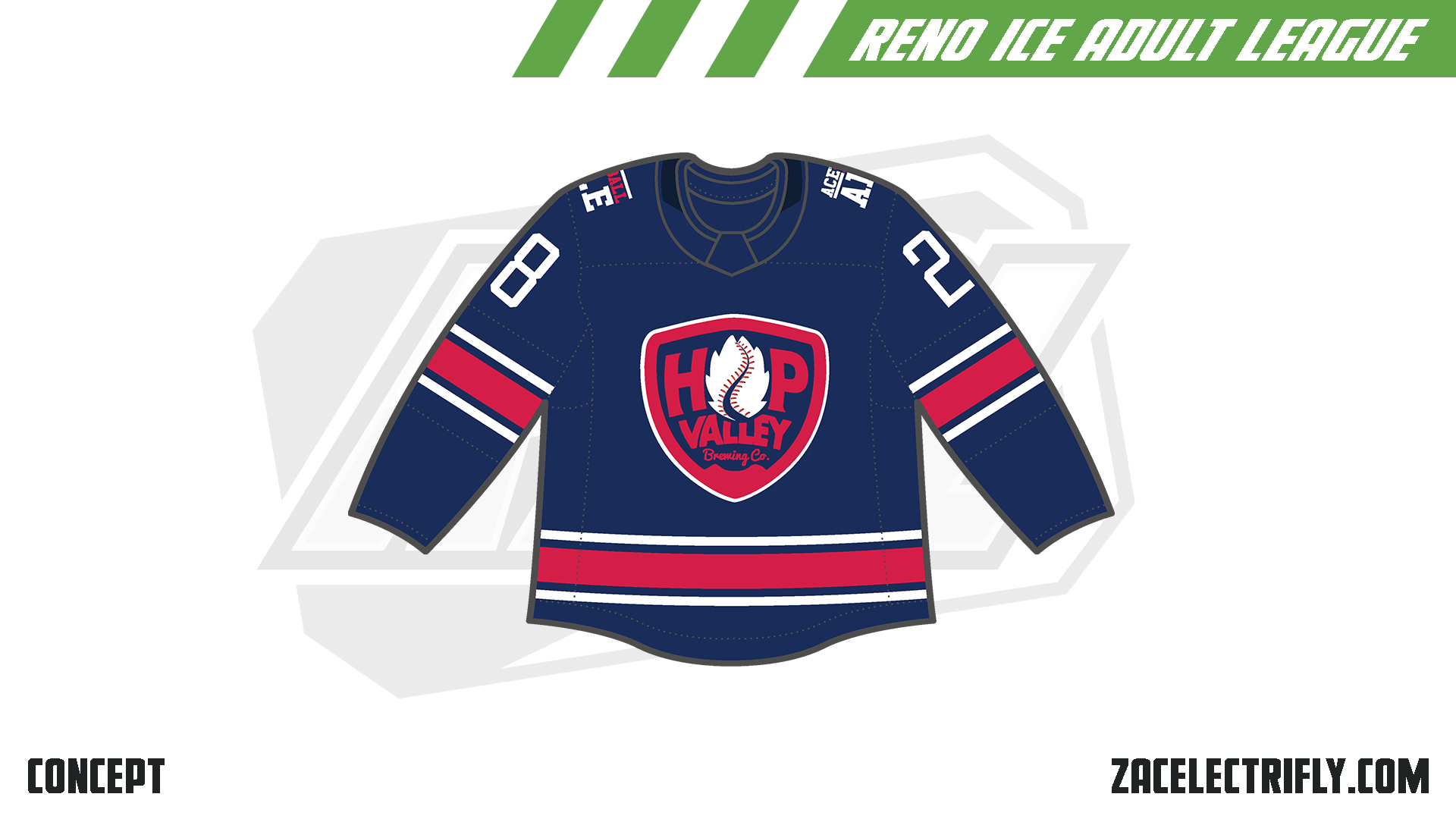
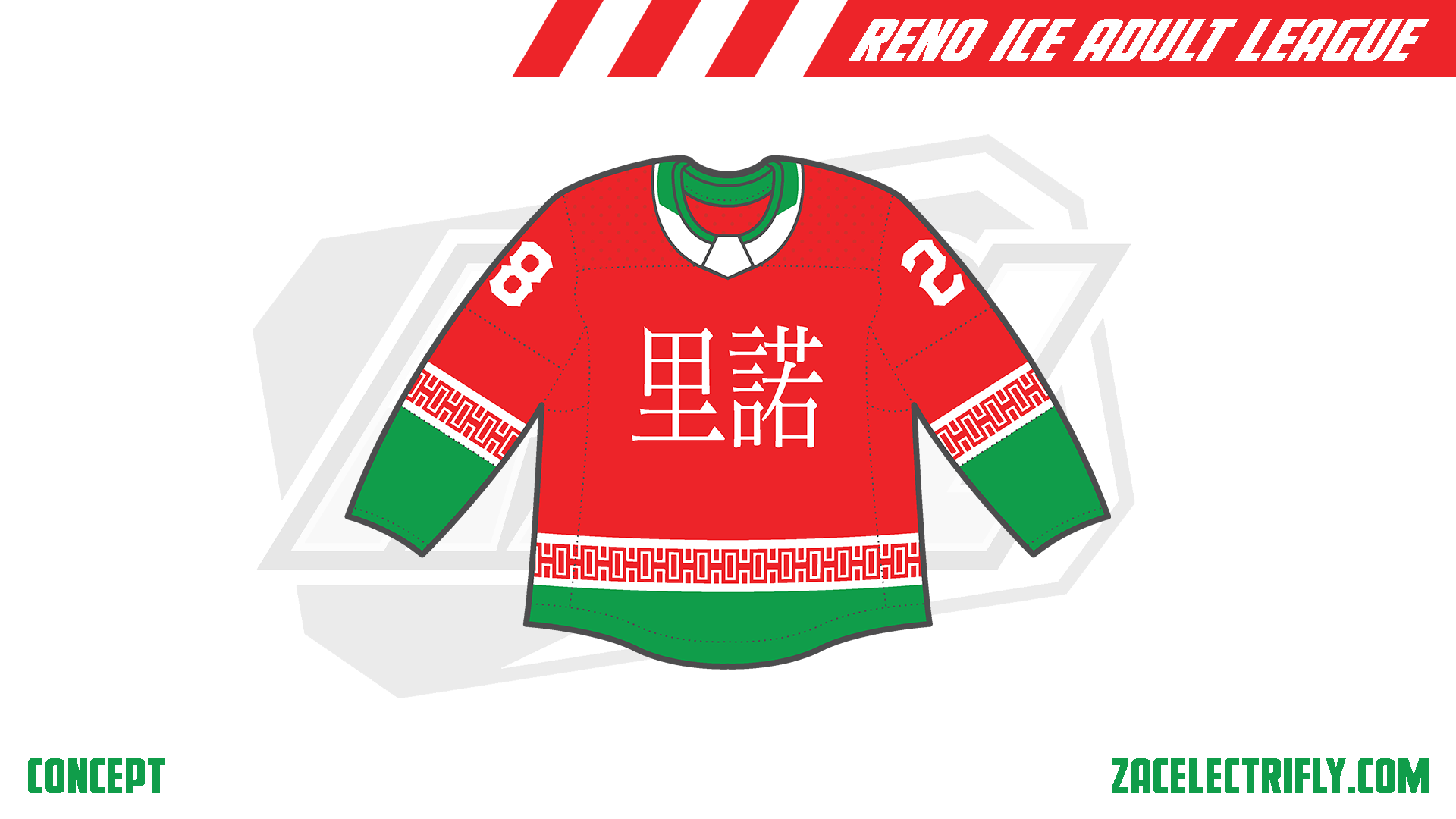
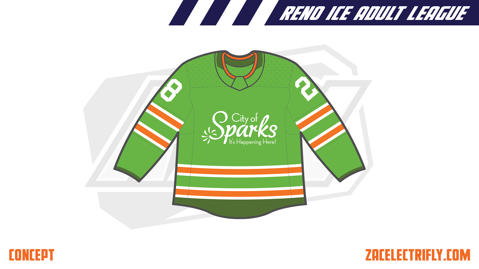
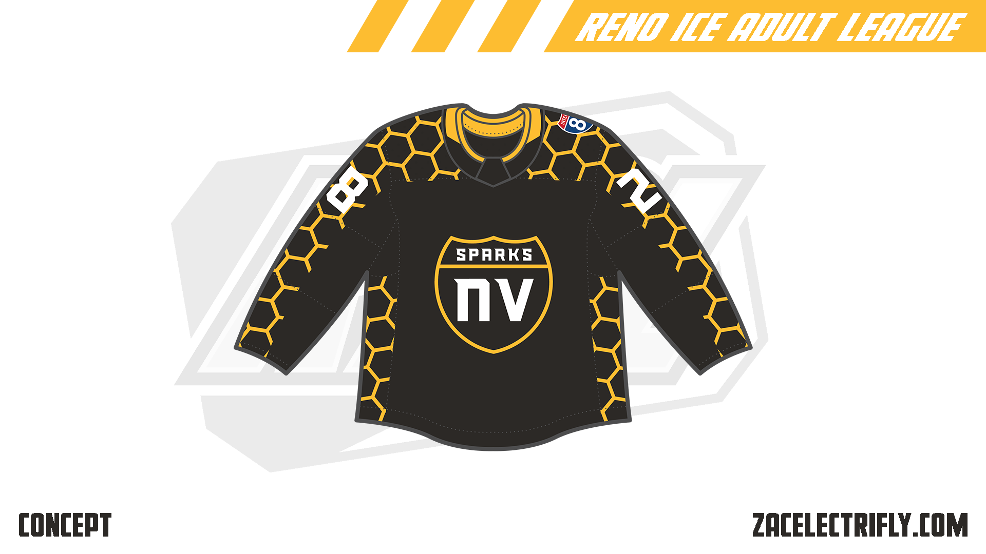
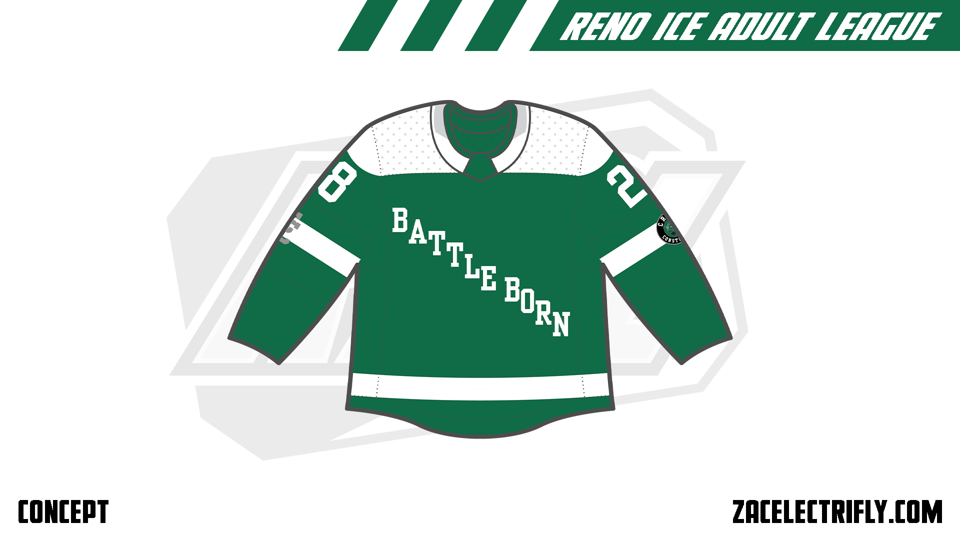
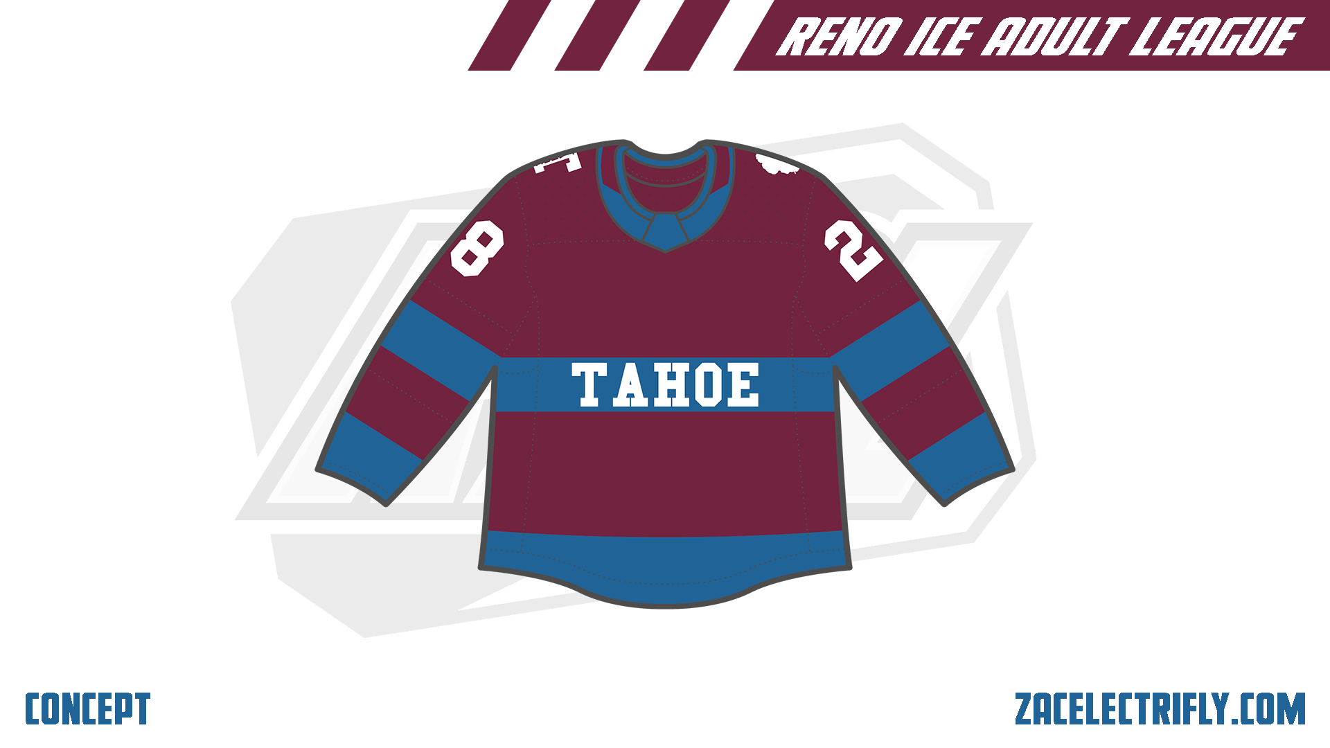
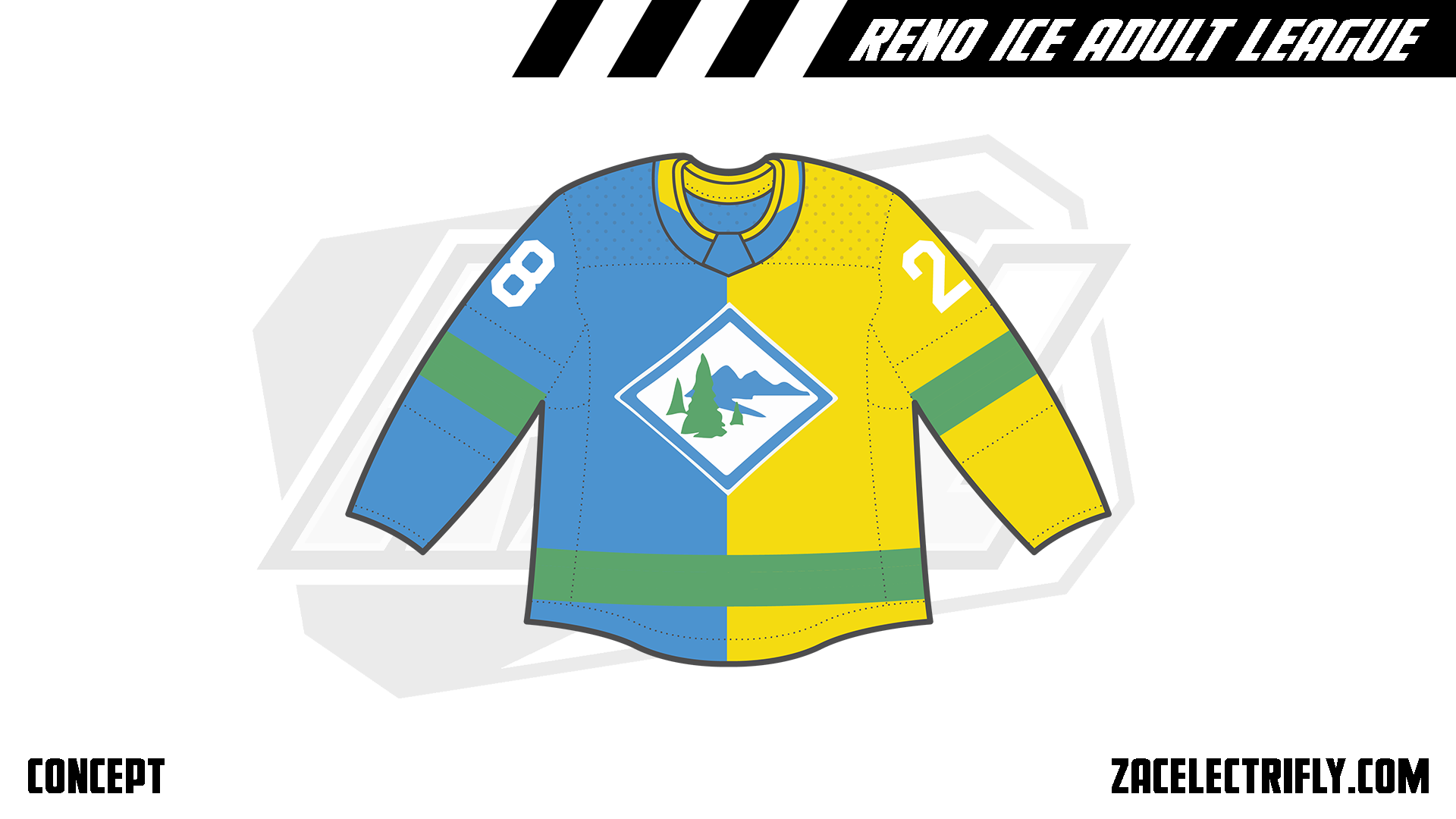
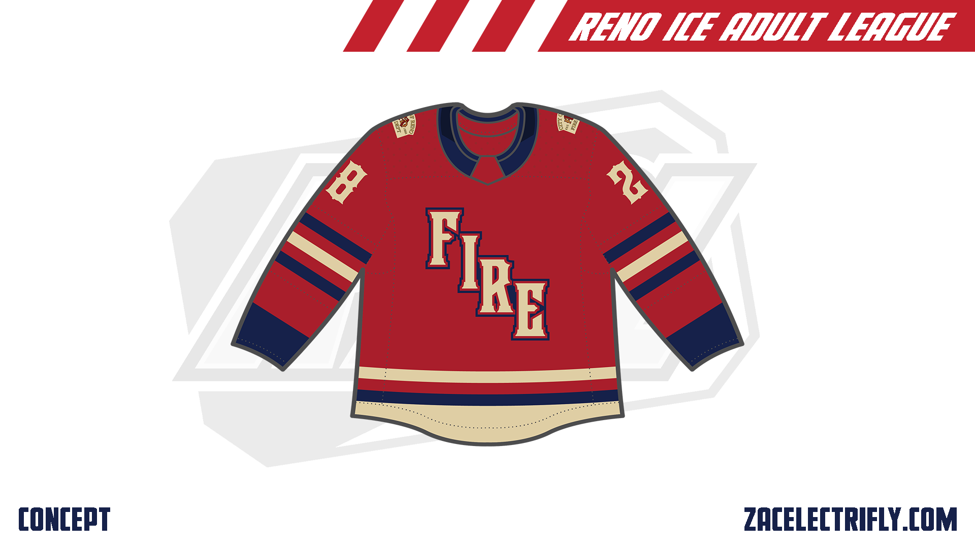
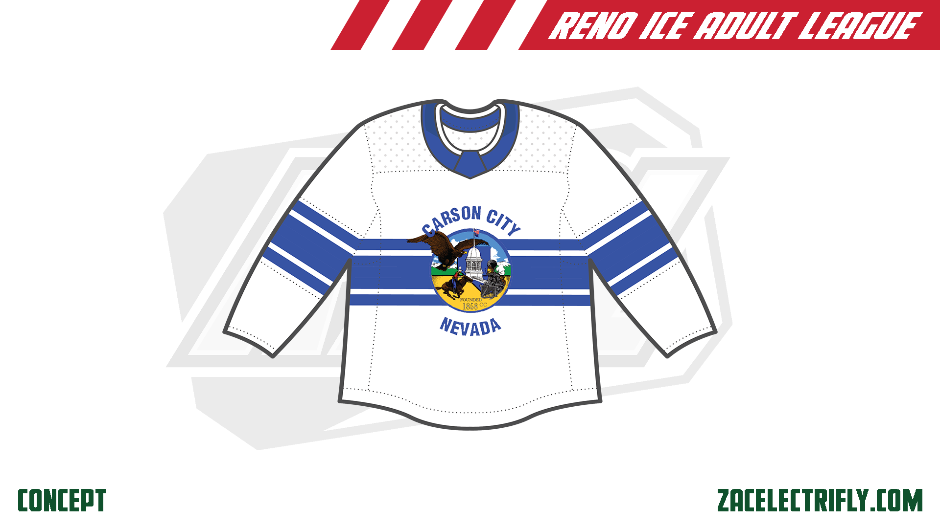
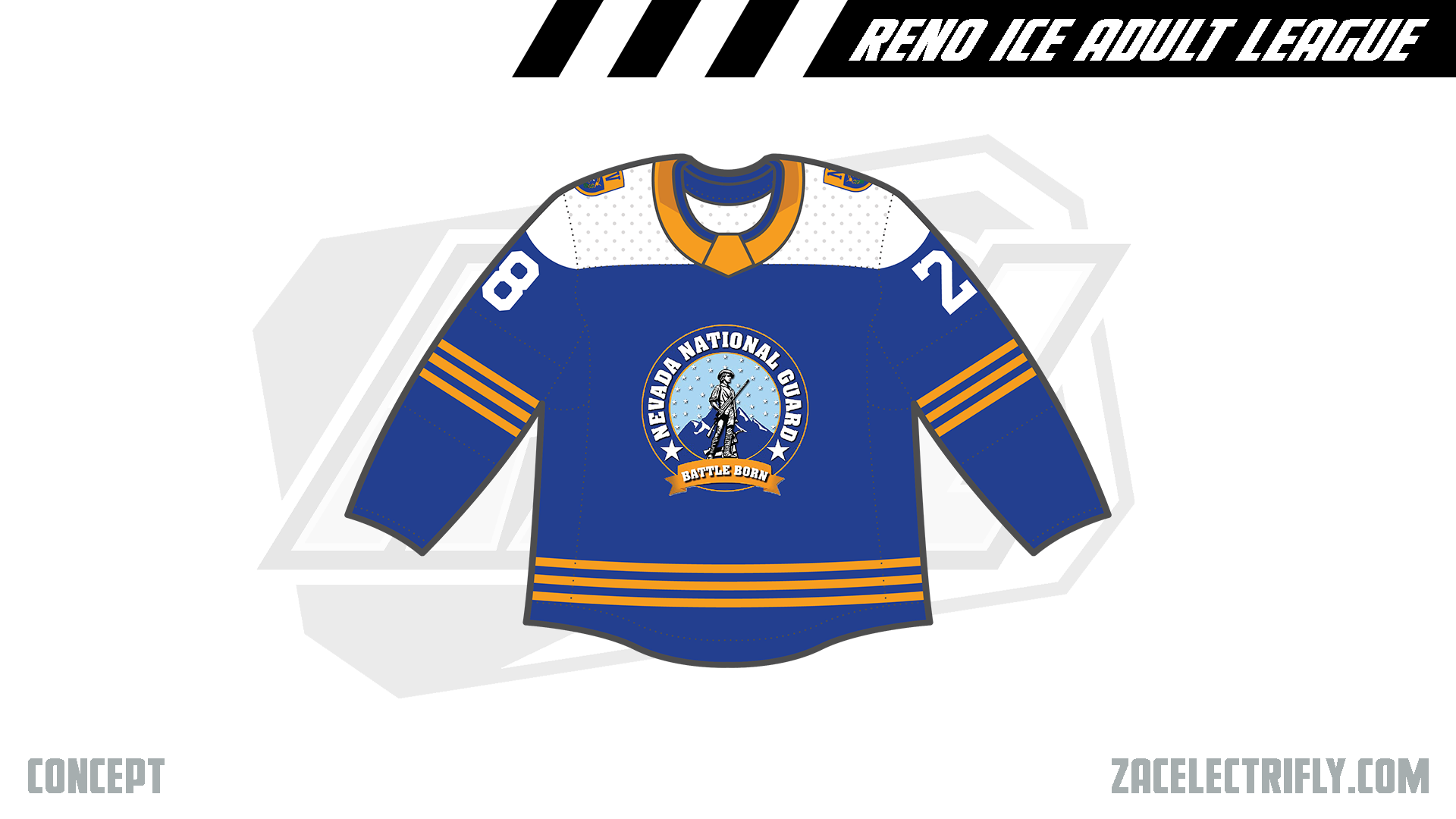
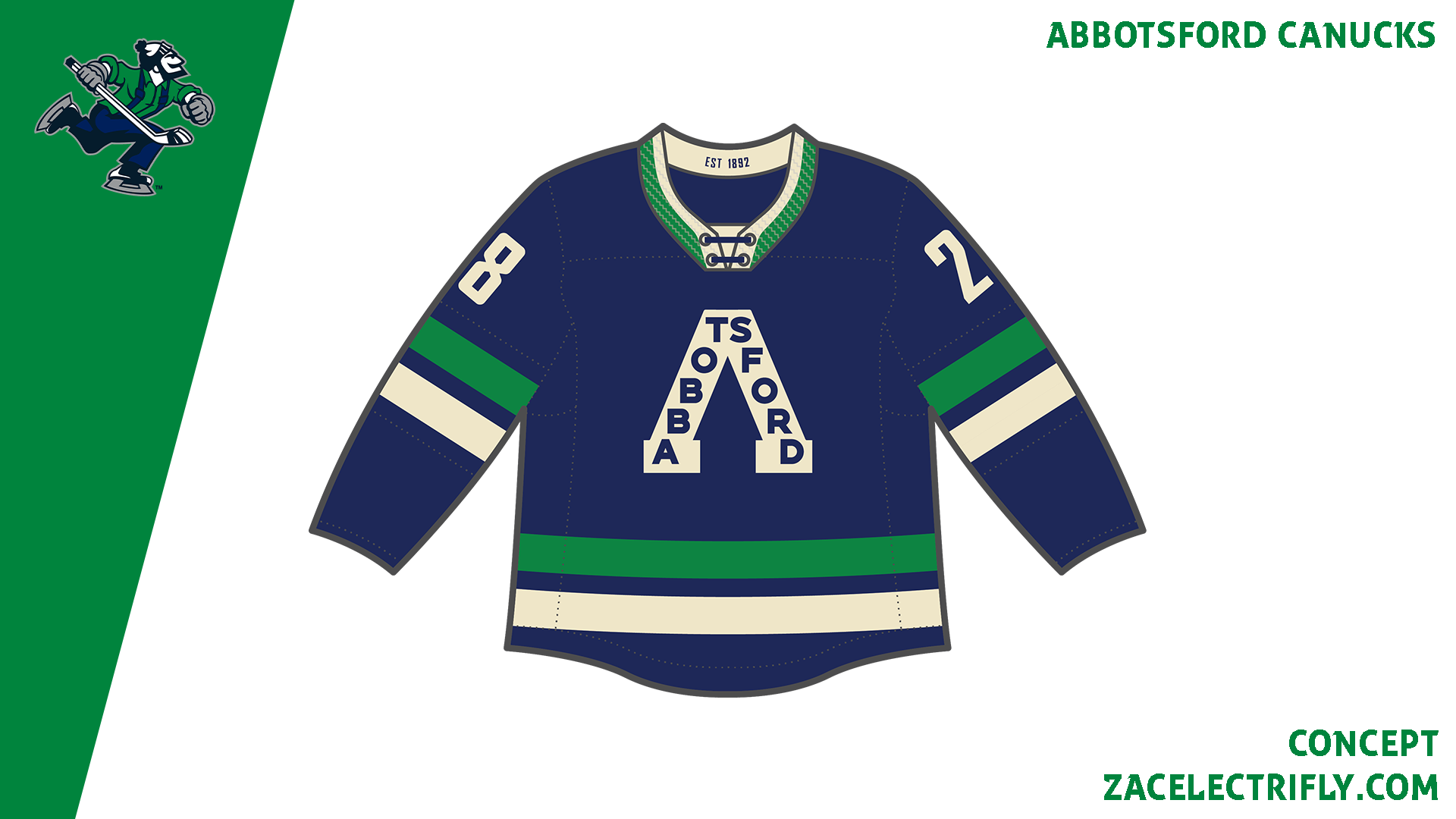
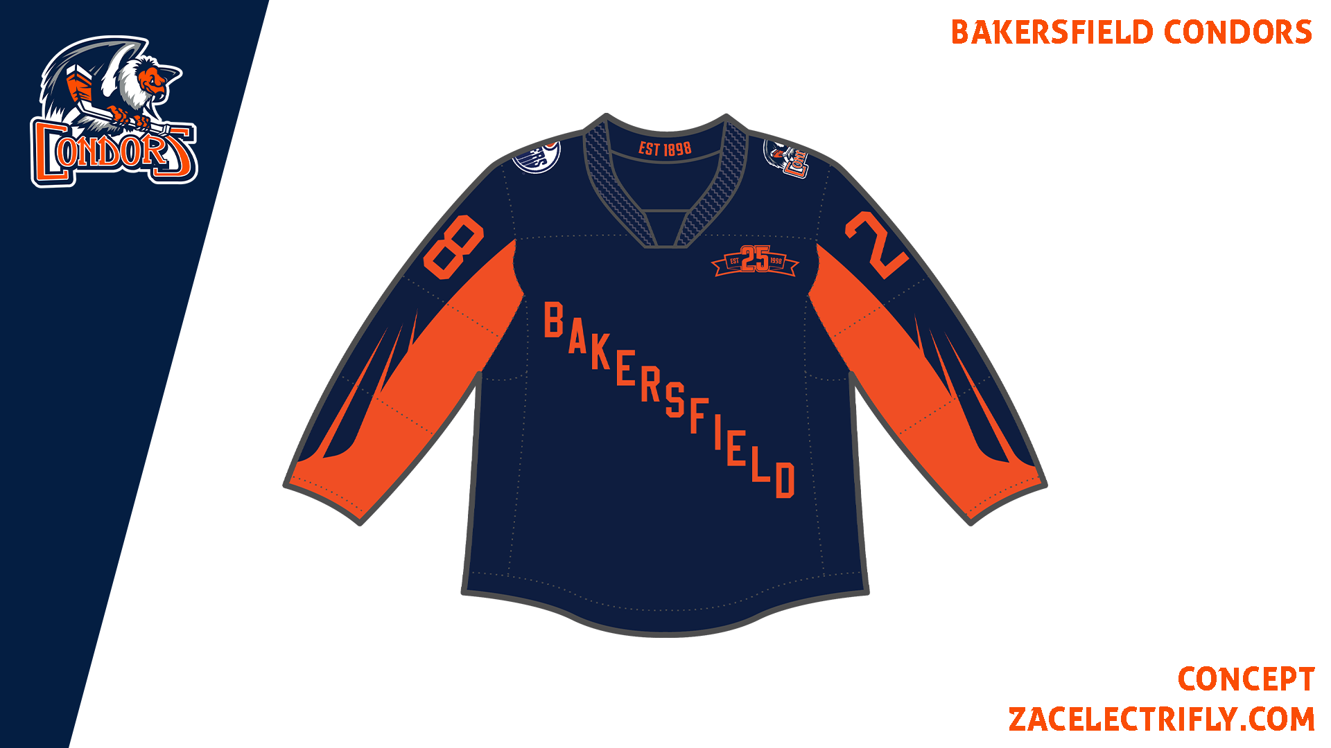
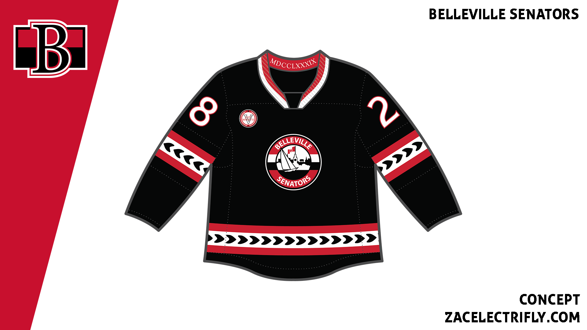
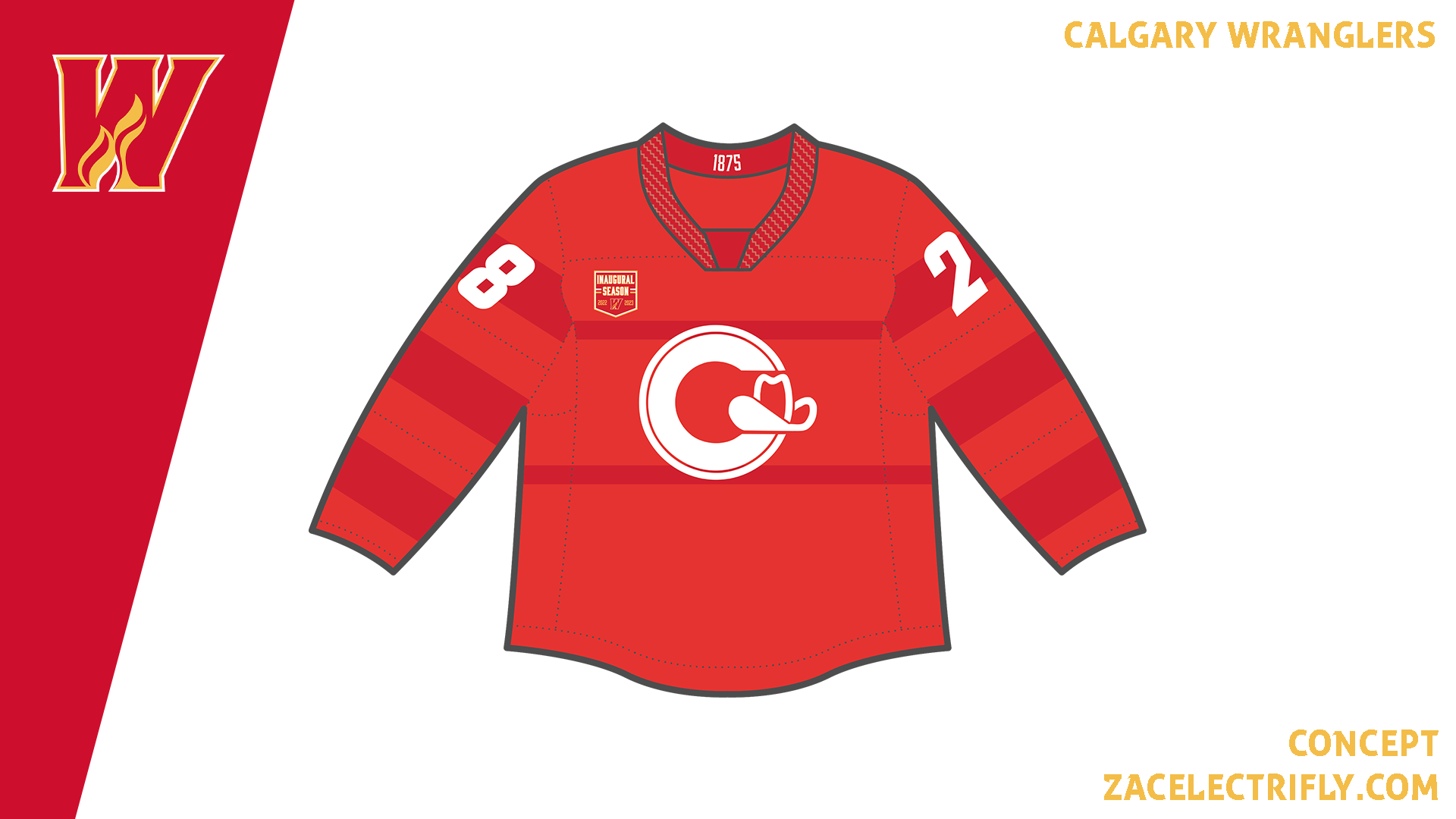
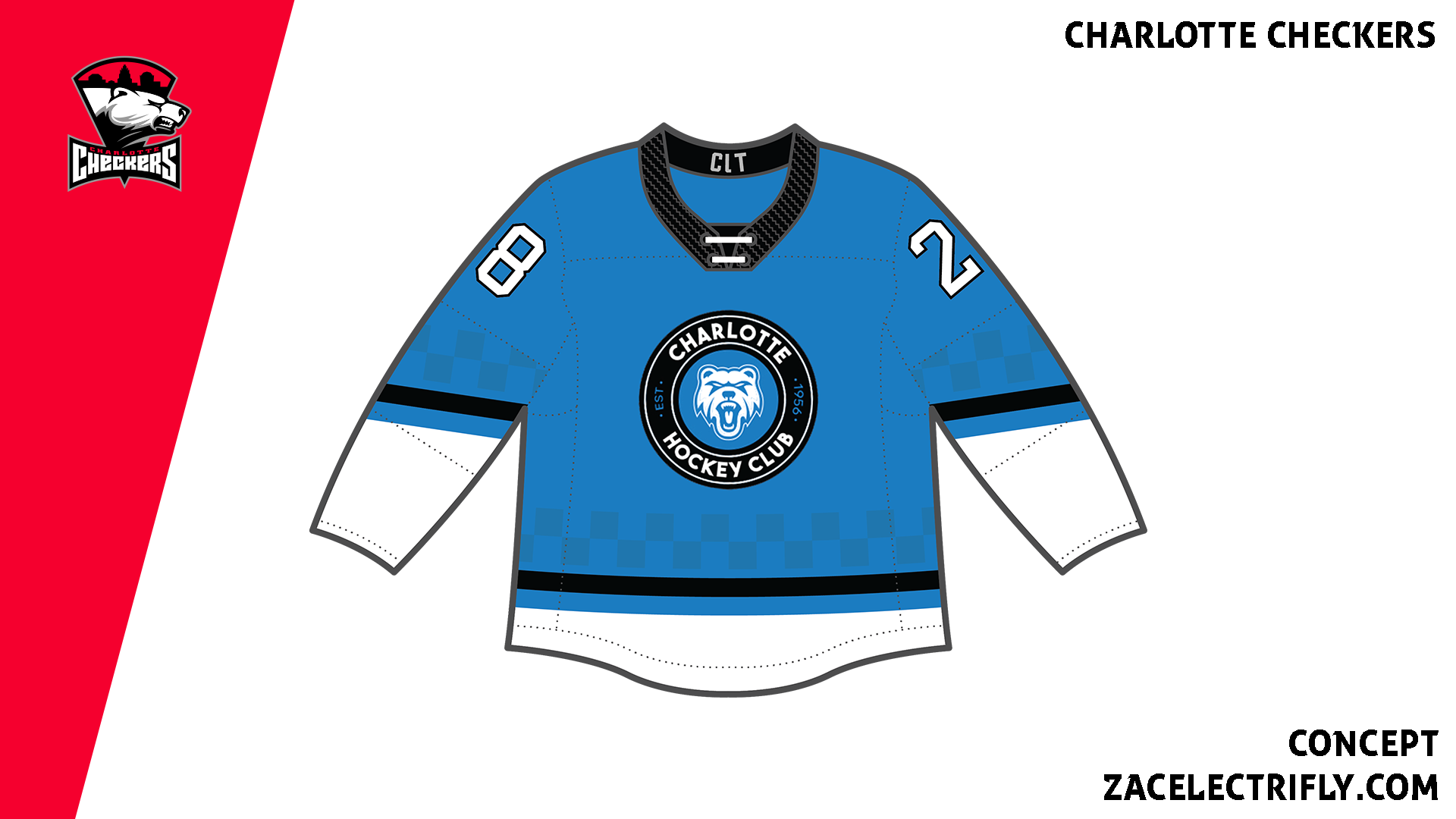
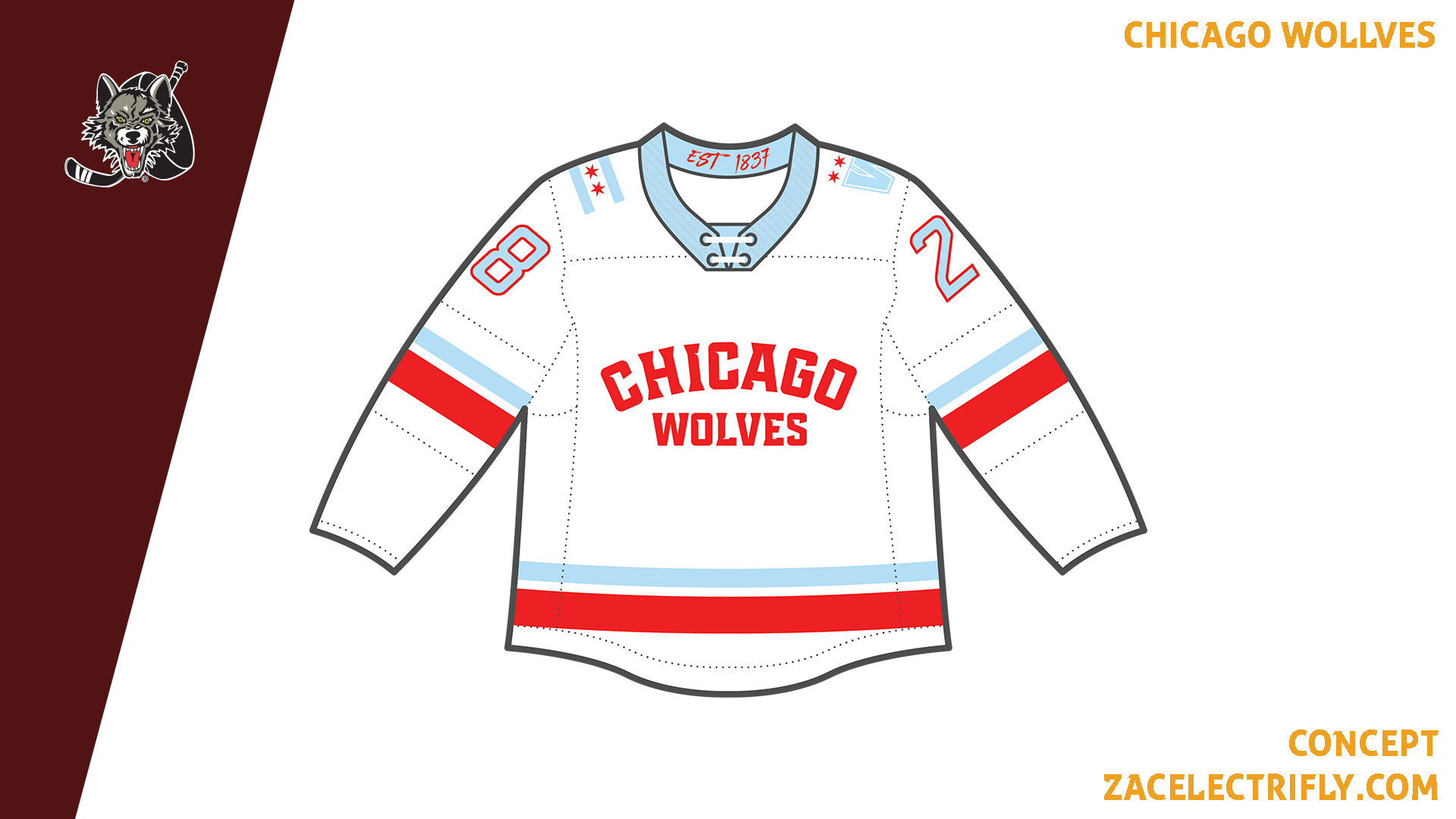
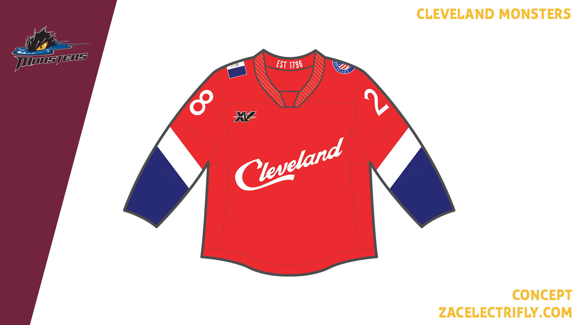
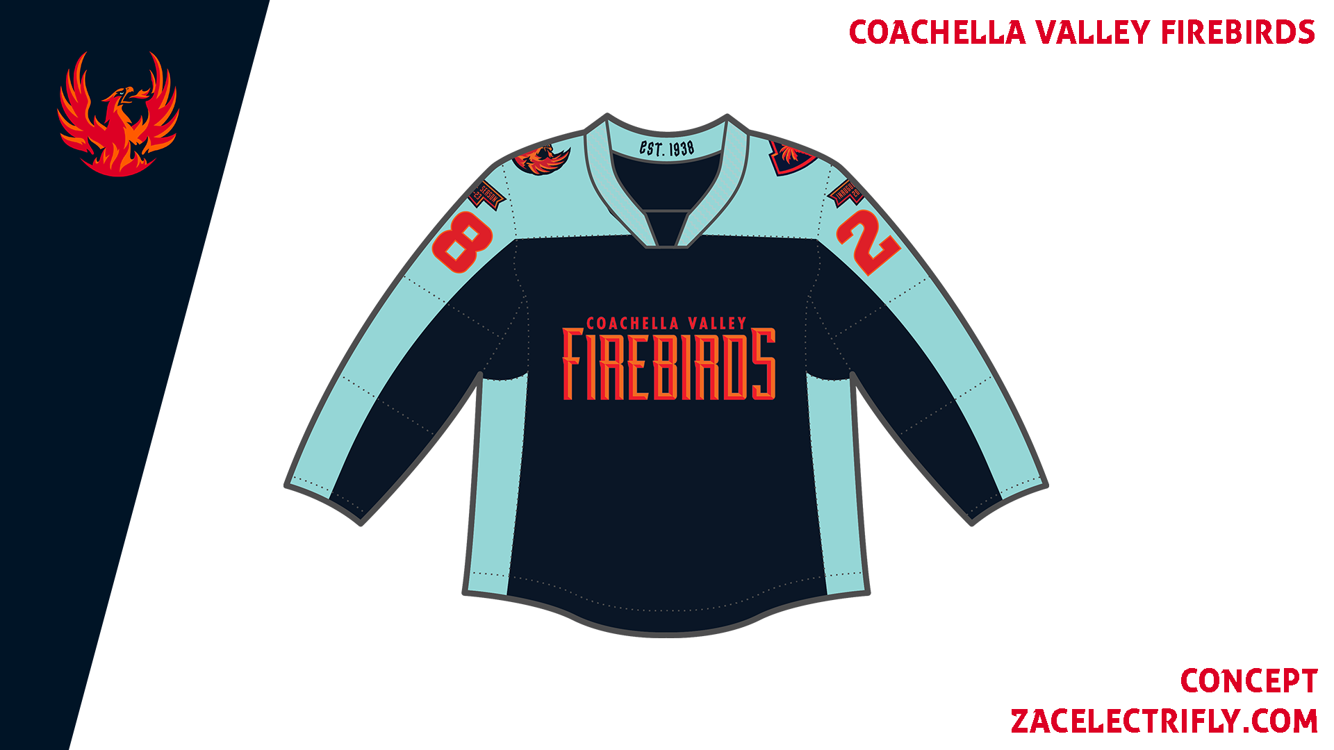
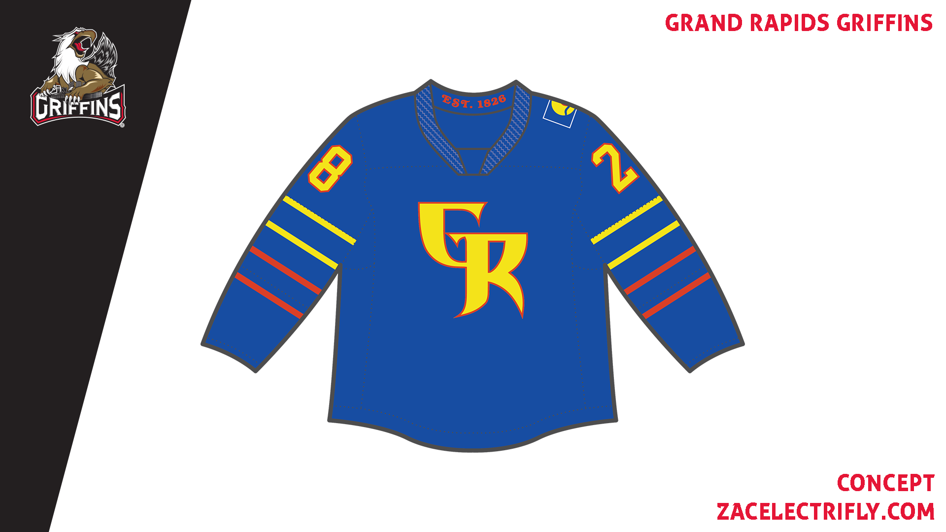
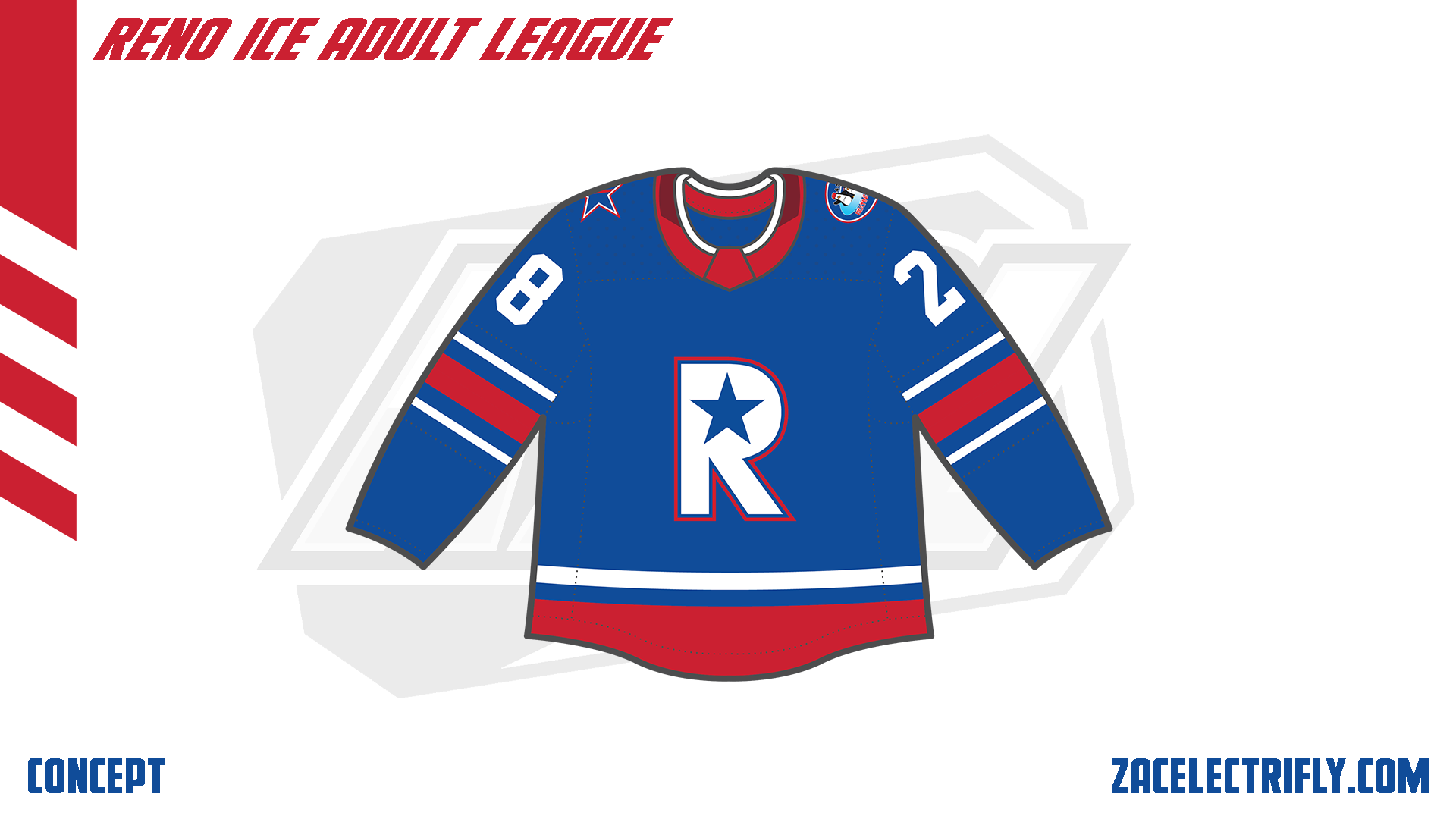
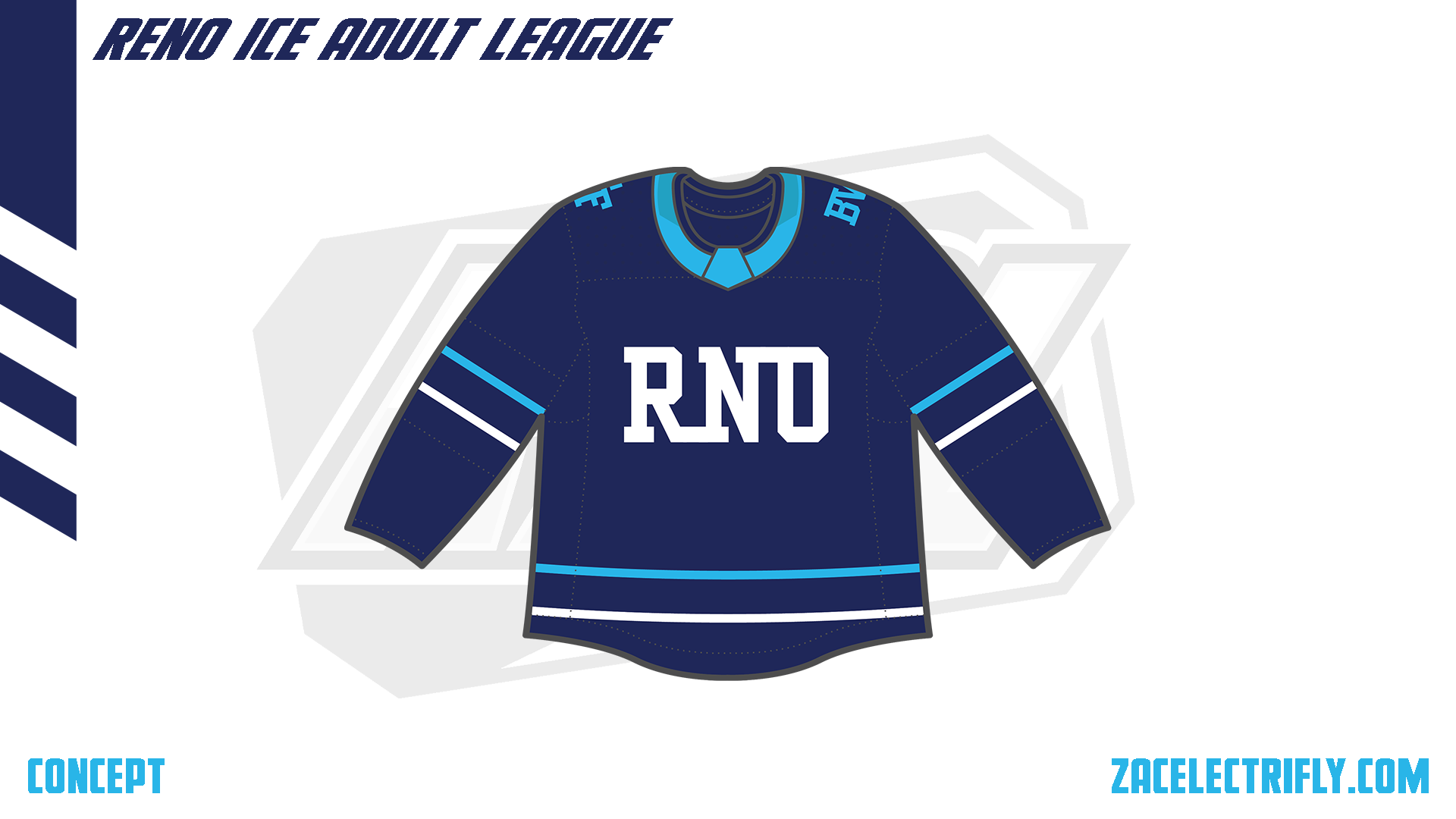
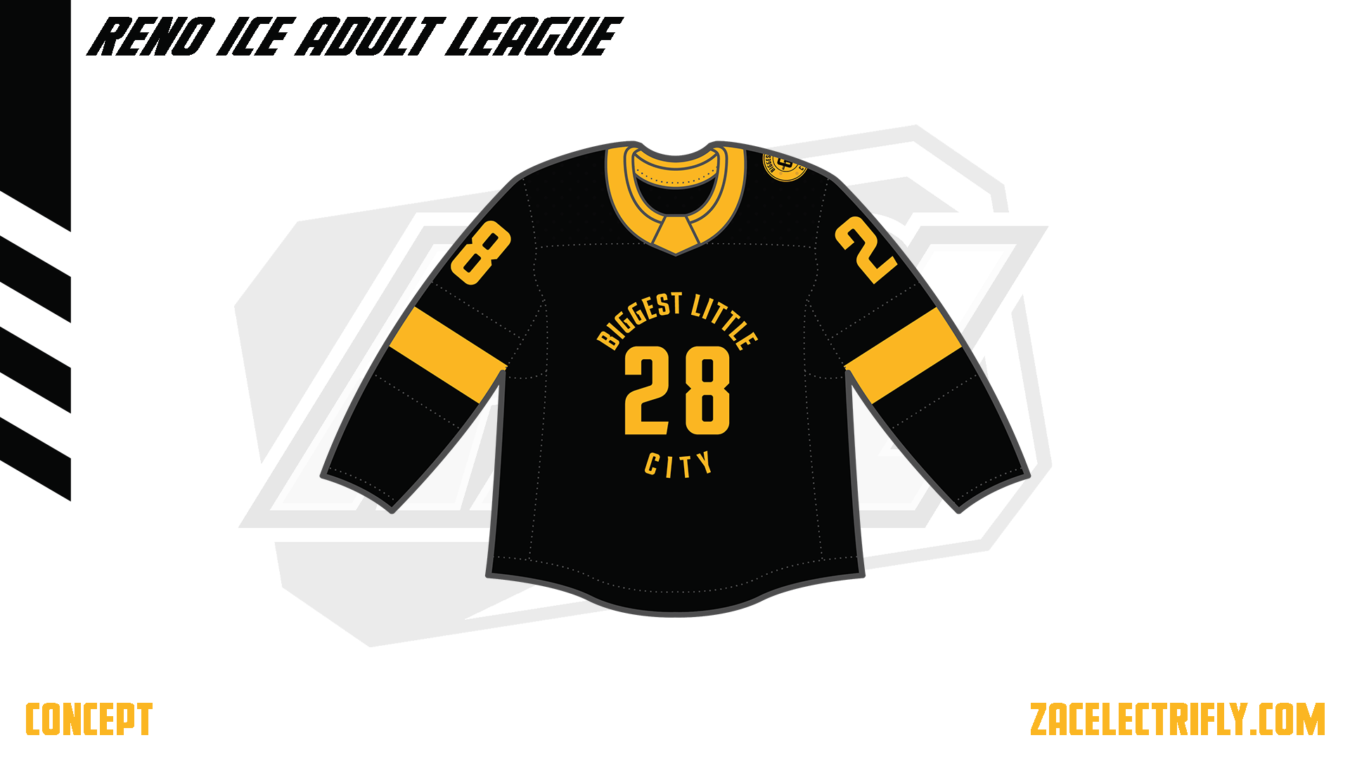
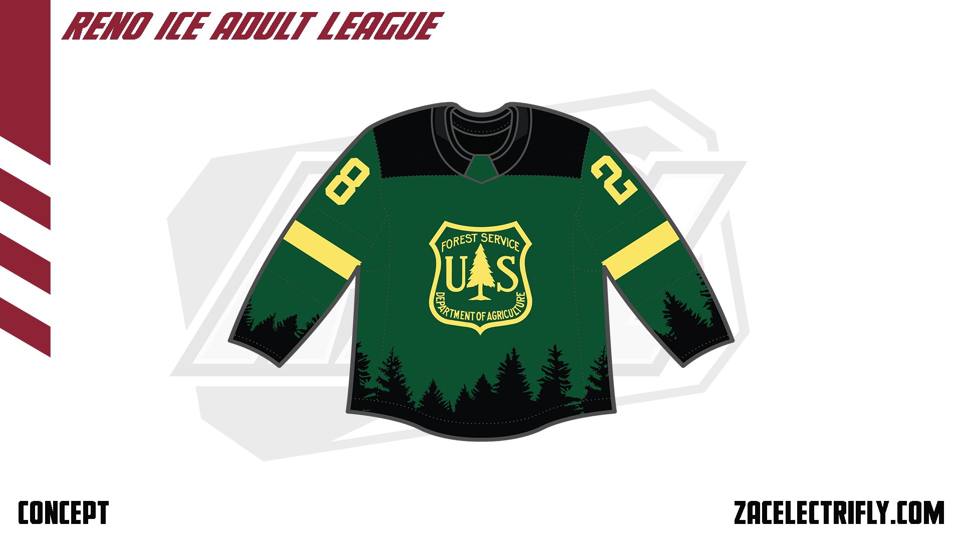
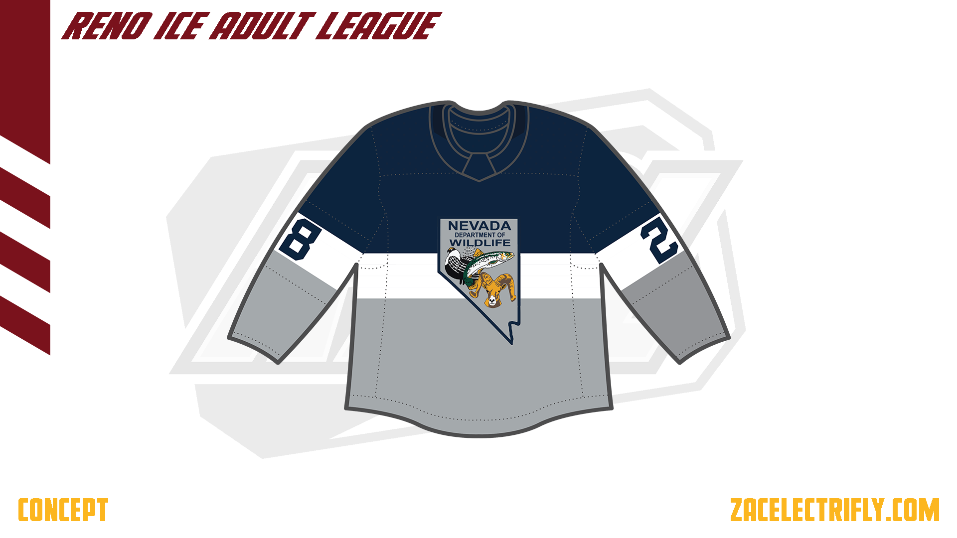
Here are some of the other City jerseys I have done for my RIAL concept series and my AHL concept series.


Here is the full list of Conceptober prompts:


Leave a comment