Lake Tahoe is getting an ECHL team. They announced the name would be the Tahoe Knight Monsters on Thursday, November 30th, 2023. The ECHL is the third level of hockey in the National Hockey League system. The Second level is the American Hockey League. The Tahoe Knight Monsters will be the first pro hockey team in the Reno Tahoe area since the late 90s. They will be the 29th team in the ECHL. They will play their home games at the Tahoe Blue Center. They will begin play in the 2024-25 season. I am excited for pro hockeys return to the region. So I did a quick concept.


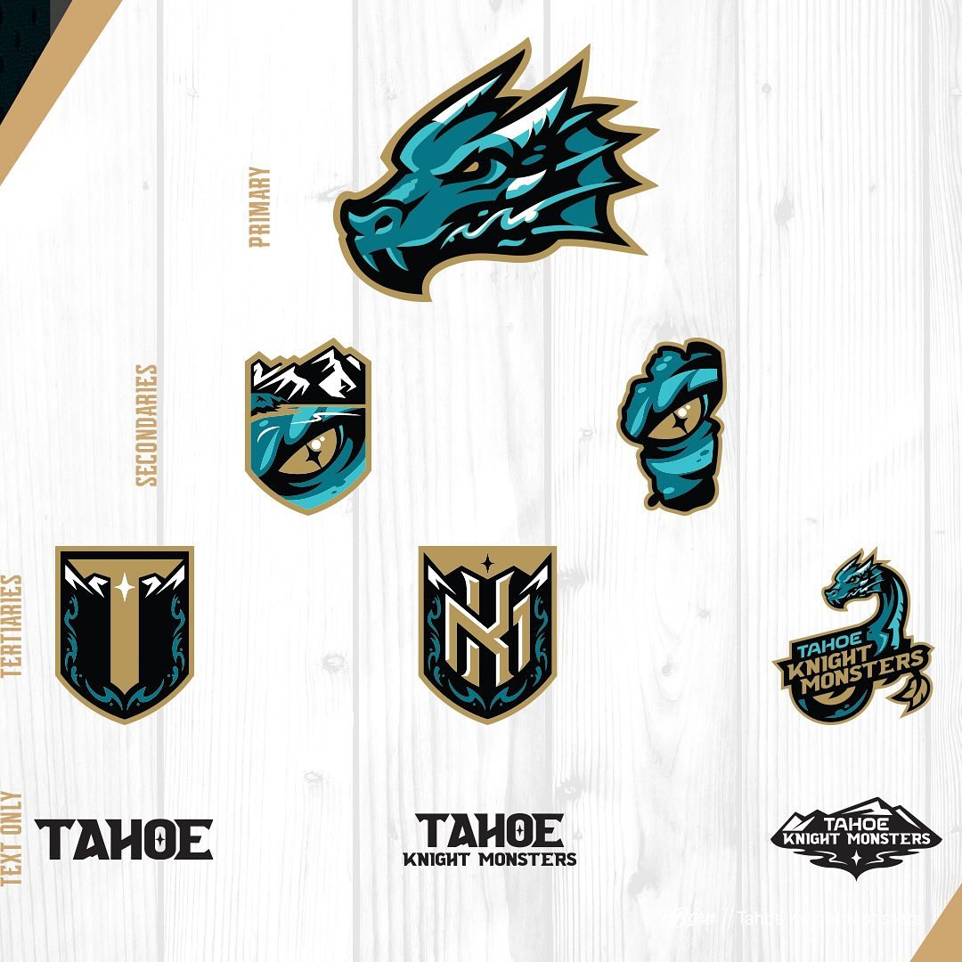
Above are the Tahoe Knight Monsters name is inspired by Tessie. The mythical creature that lives in Lake Tahoe. After fan input Knight Monsters is the name they came up with. They have some obvious thematic connections to the Vegas Golden Knights. However the Knight Monsters have not announced an affiliate yet. The Tahoe Knight Monsters colors are Tessie Teal, Tahoe Turquoise, 1644′ Deep Black, and Vegas Gold.
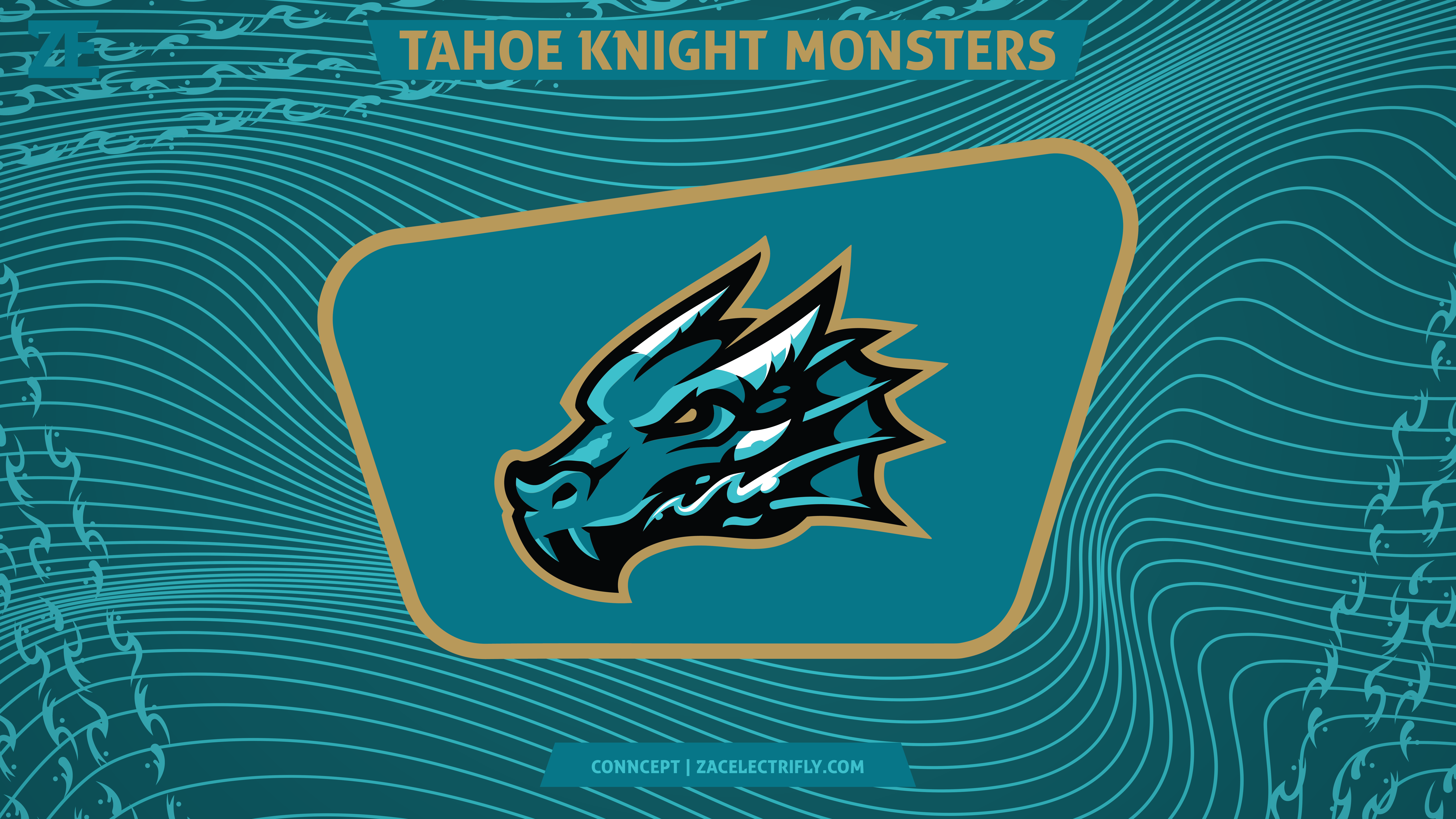
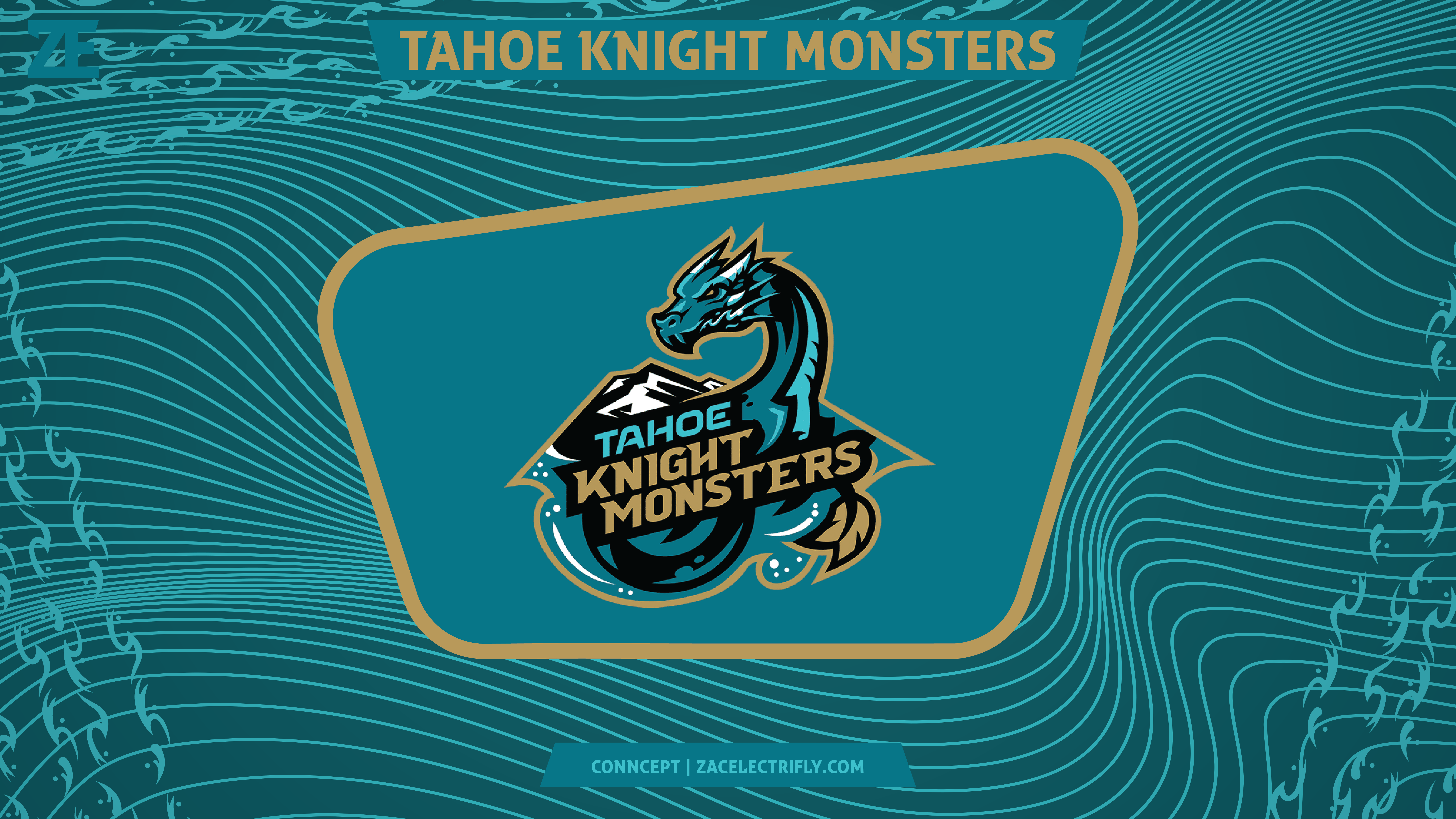
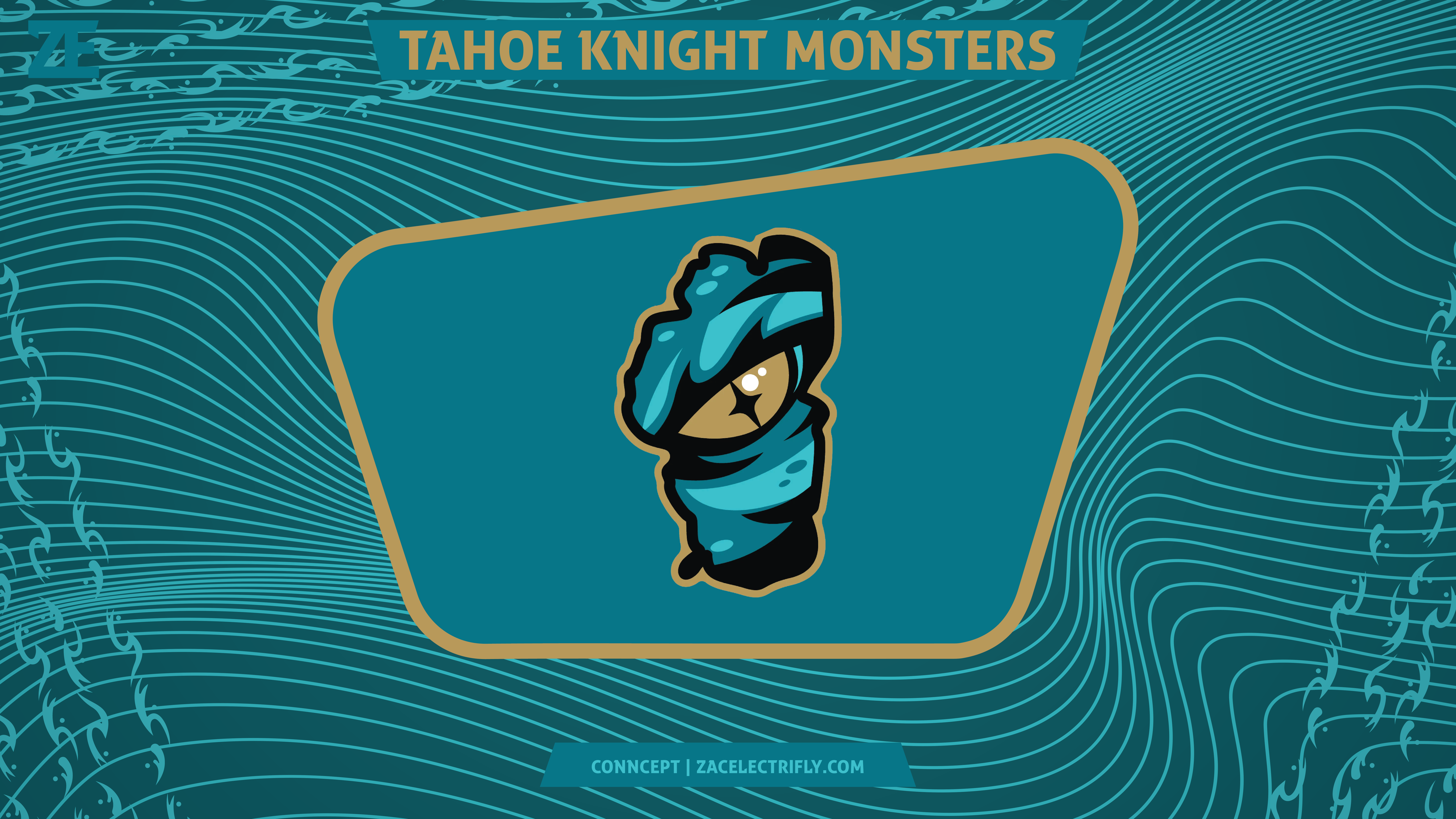
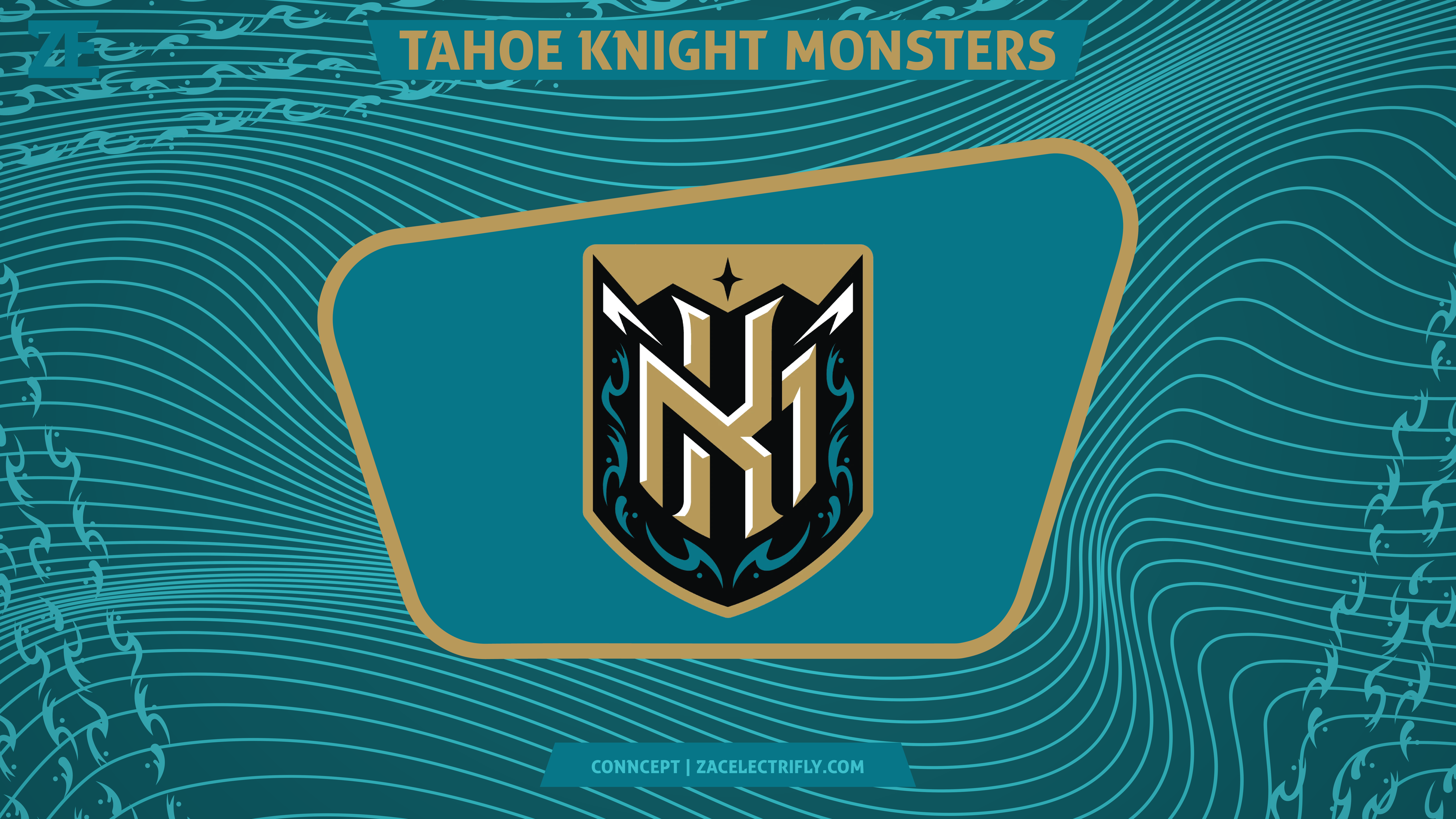
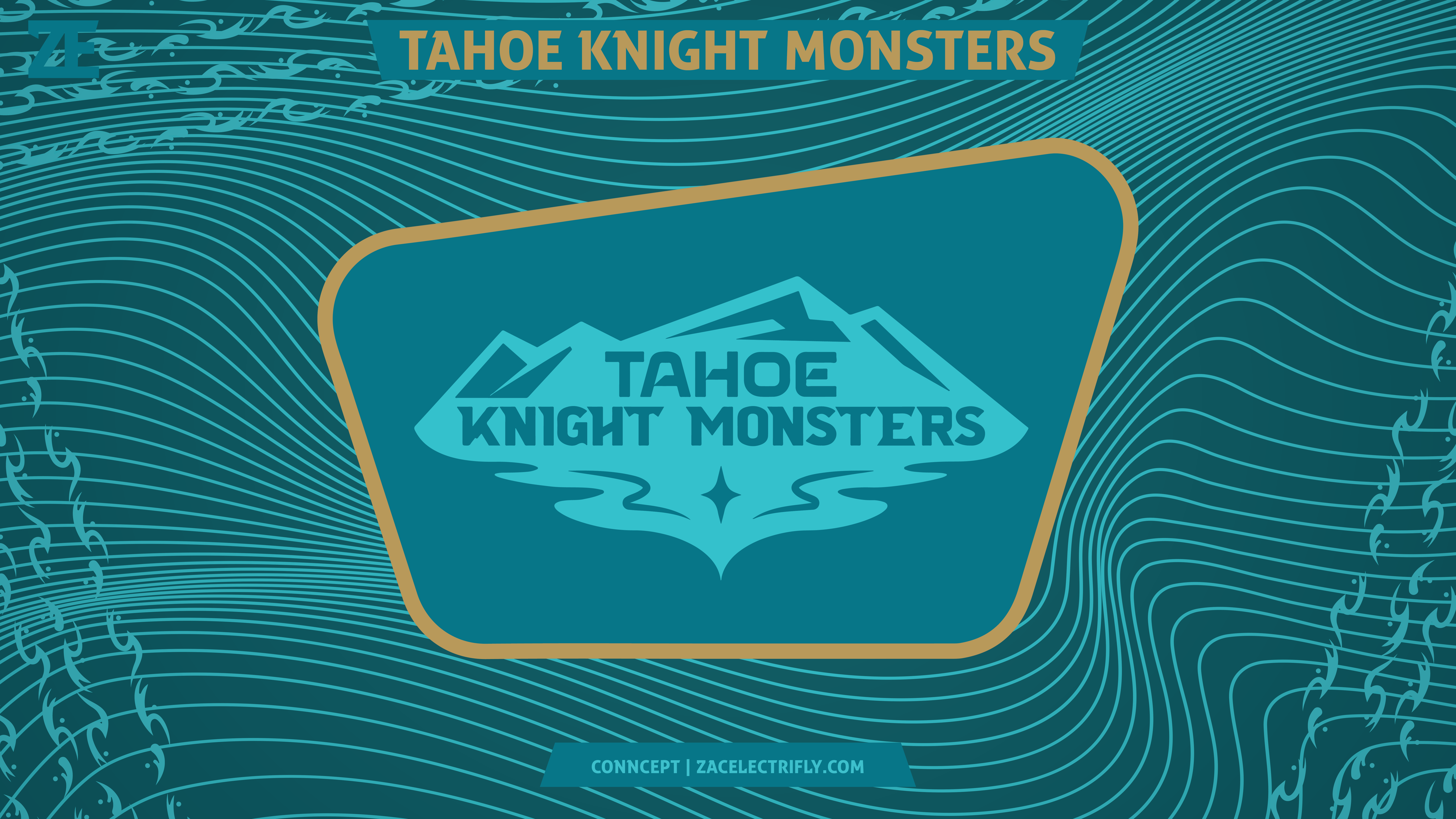
I did talk about the name, logos, and branding in my last post about the Tahoe Knight Monsters. According to Barn Creative (who made the log), Tessies head will be the primary logo. However another logo was shown off at the unveiling that was not apart of what Barn Creative showed off on facebook. I did not use all of the logos in my concept. I did not create any new logos for this concept. The first logo is Tahoe Tessies head. The second logo is mountains, Tahoe Tessie, and the team name. The third logo is Lake Tahoe with Tessie looking through. The four and fifth logos are shield logos inspired by the Vegas Golden Knights and Henderson Silver Knights logo. One of the logos has an KM interlocking monogram and the other one has a T. The other logo I used for this concept is a wordmark logo.
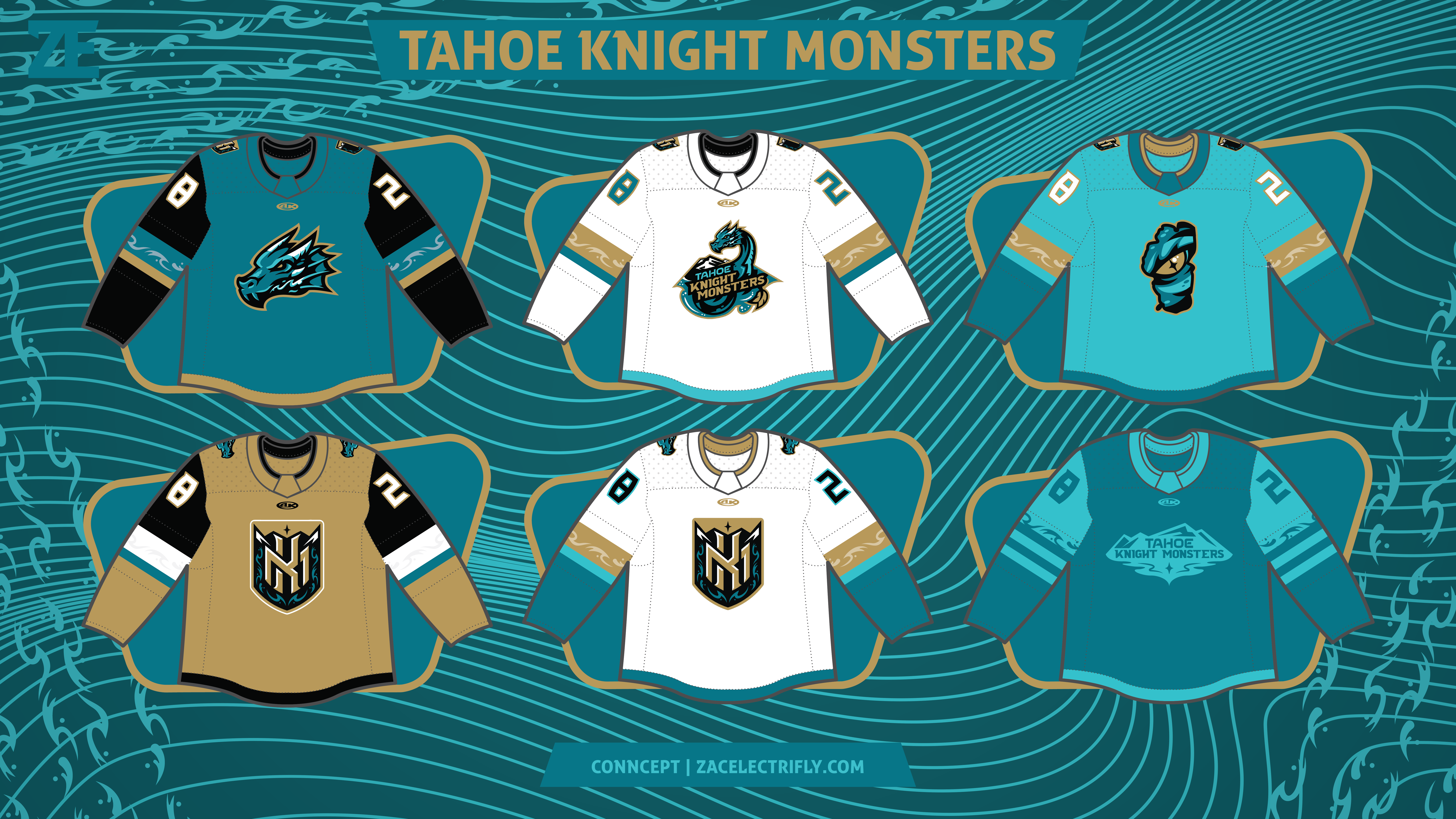

I created six jerseys for this concept. Basically it’s two sets. I initially set out to create three jerseys and ended up with six. So for this concept the idea could be that they use one set of jerseys for half the season and the other set for the other half of the season. The Anaheim Ducks used four jerseys from 1997 to 2000. The Savannah Ghost Pirates (the current ECHL affiliate of the Vegas Golden Knights) announced two additional jerseys on top of their current home, away, and alternate jerseys. ECHL and minor league teams have like ten jerseys a season with all of their specialty jerseys. So while it is unlikely they would have six jerseys it is not impossible.
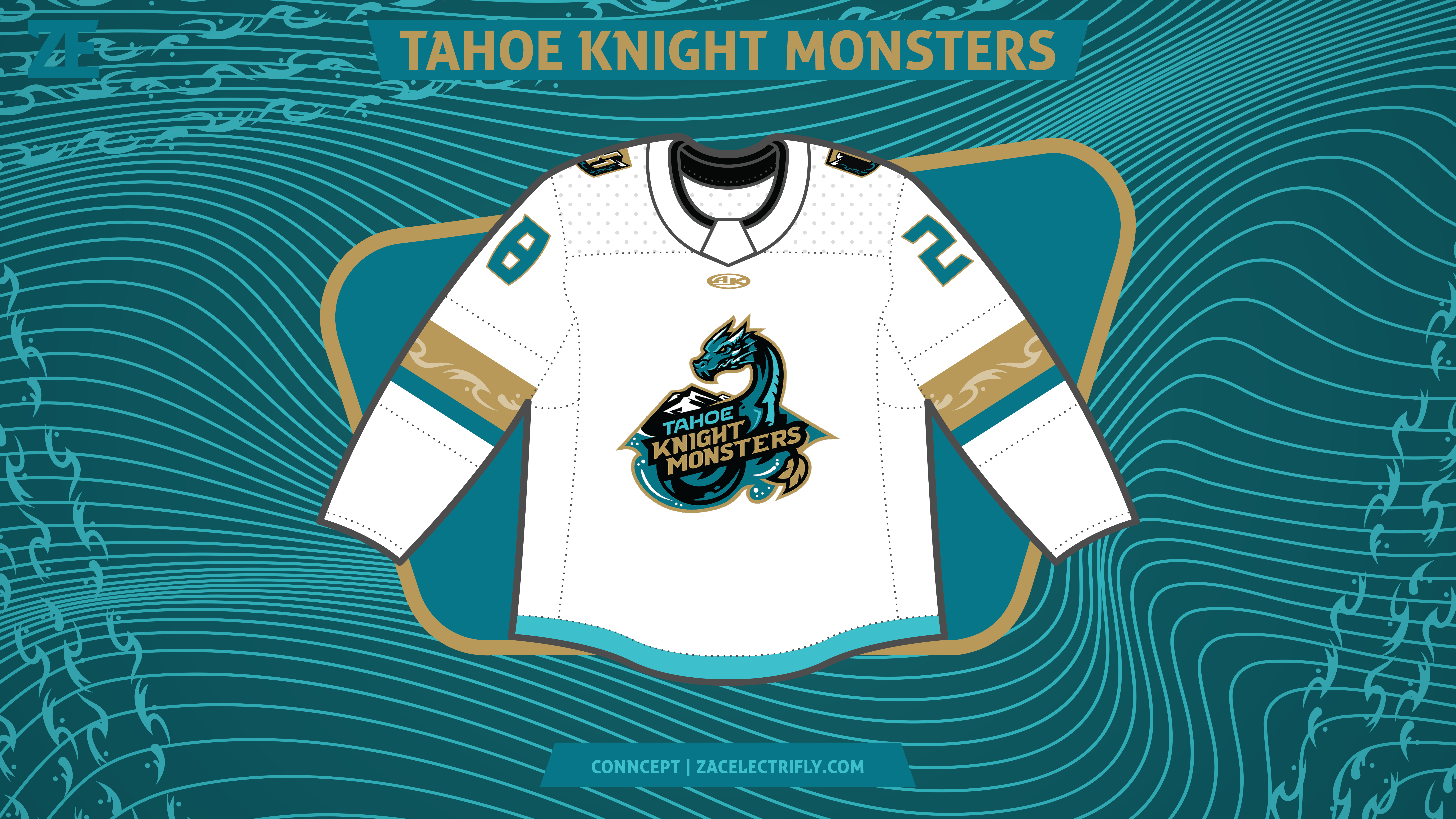
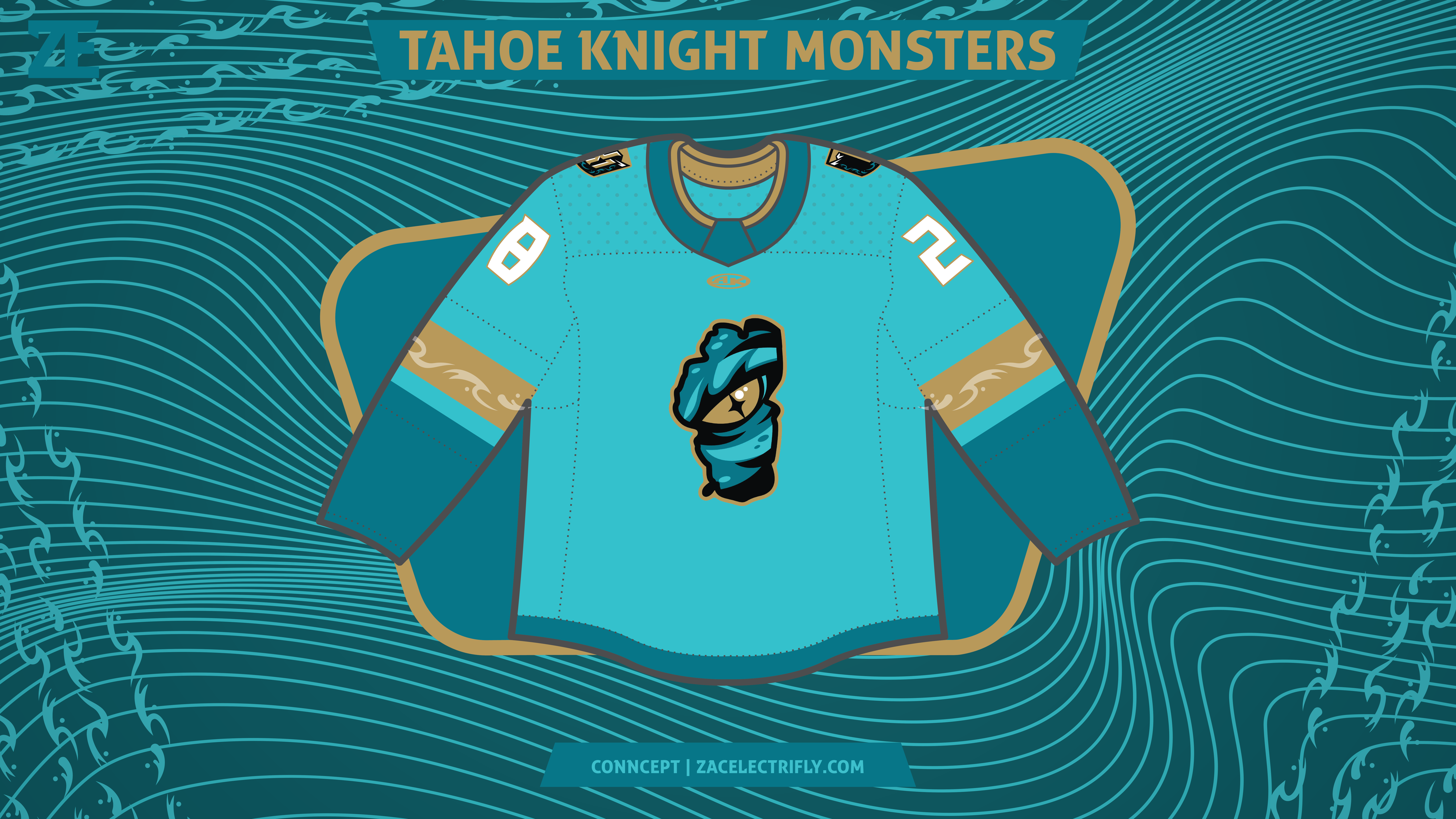
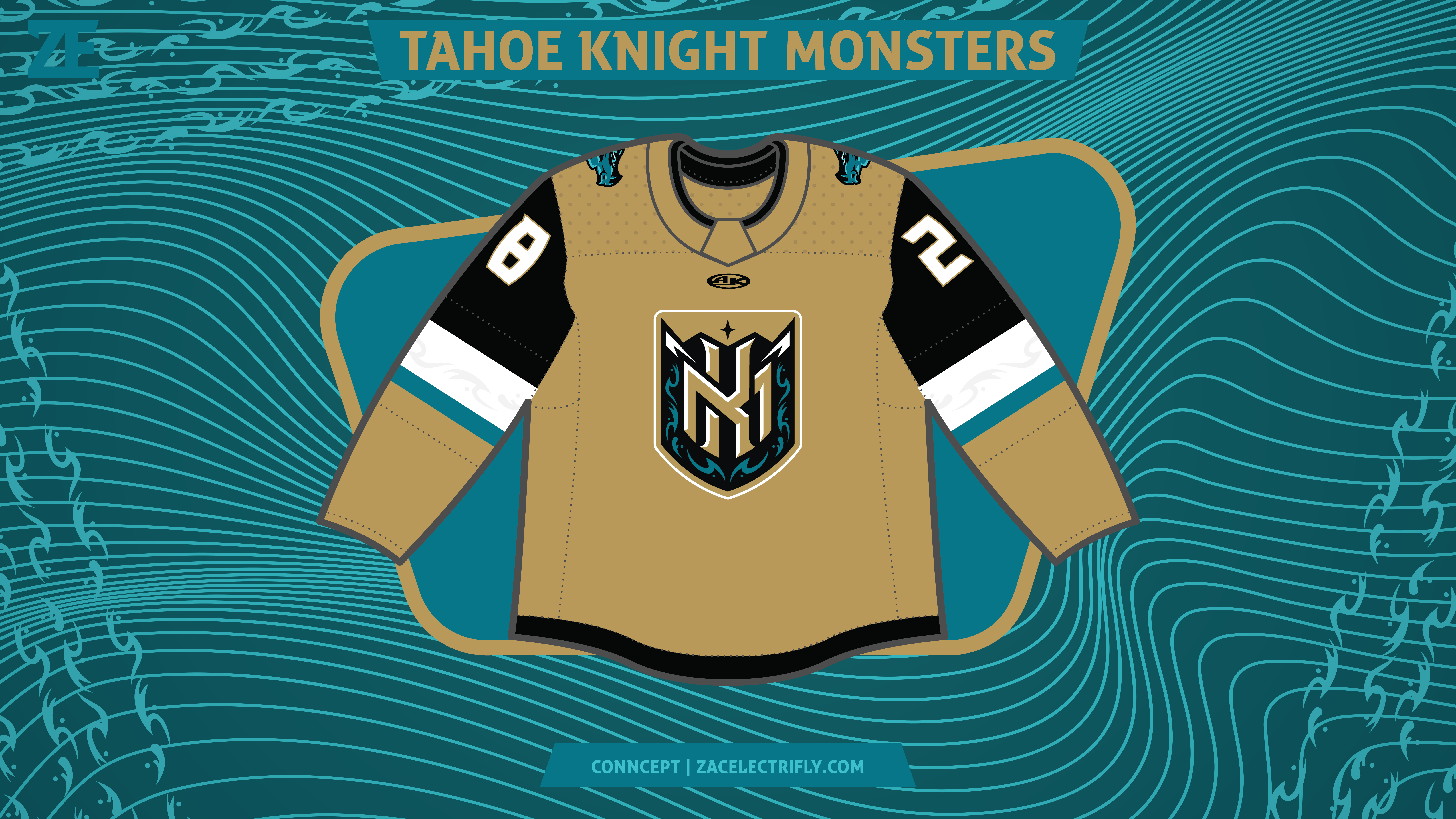
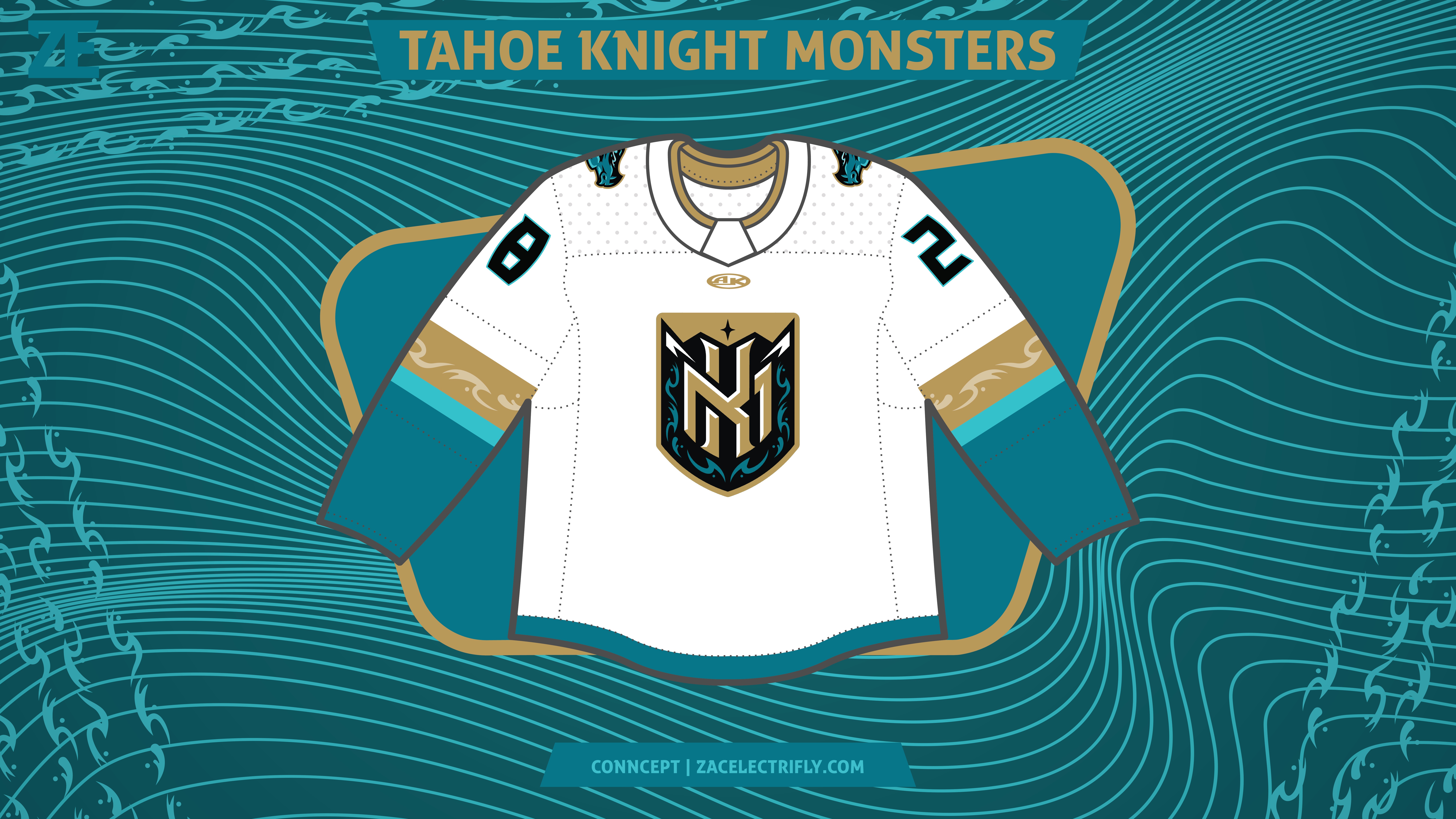
All of the jerseys in this concept are also inspired by the Vegas Golden Knights. They are all also Athletic Knit jerseys who is the current jersey provider of the ECHL. The first jersey is Tessie Teal, black, and Vegas Gold. On the front is the Tahoe Tessie head logo. On the shoulders are the shield logos. The second jersey is white, Vegas Gold, Tessie Teal, Tahoe Turquoise, and black. On the front is their Tessie logo with the team name. On the shoulders are the shield logos. I designed these two jerseys to be home and away jerseys. I decided that the away jersey should have the Tessie logo with the team name as away fans may not know who the team is. This is common in college sports. On the home jersey I went with the Tahoe Tessie head logo because the home fans will recognize it and I have already head people say they want it on a jersey.
The third jersey is Tahoe Turquoise, Tessie Teal, and Vegas Gold. It has the Lake Tahoe shape logo on the front. On the shoulders are the shield logos. This jersey was designed to be the alternate jersey in the first set of jerseys. I think the Lake Tahoe logo should go on a jersey but I think it shouldn’t be on the home or away jersey. I initially designed it as a city jersey but it also works as the first alternate jersey.
The four jersey is Vegas Gold, black, white, and Tessie Teal. On the front is the KM monogram shield logo. On the shoulders is the Tahoe Tessie head logo. I initially designed it to be an Affiliate Remix jersey like the ones seen in my AHL concept, but I think it could also work as the home jersey for the second set of jerseys. The fifth jersey is white, Tessie Teal, Vegas Gold, and Tessie teal. It has the same logos as the fourth jersey. It would be the second away jersey in this concept.
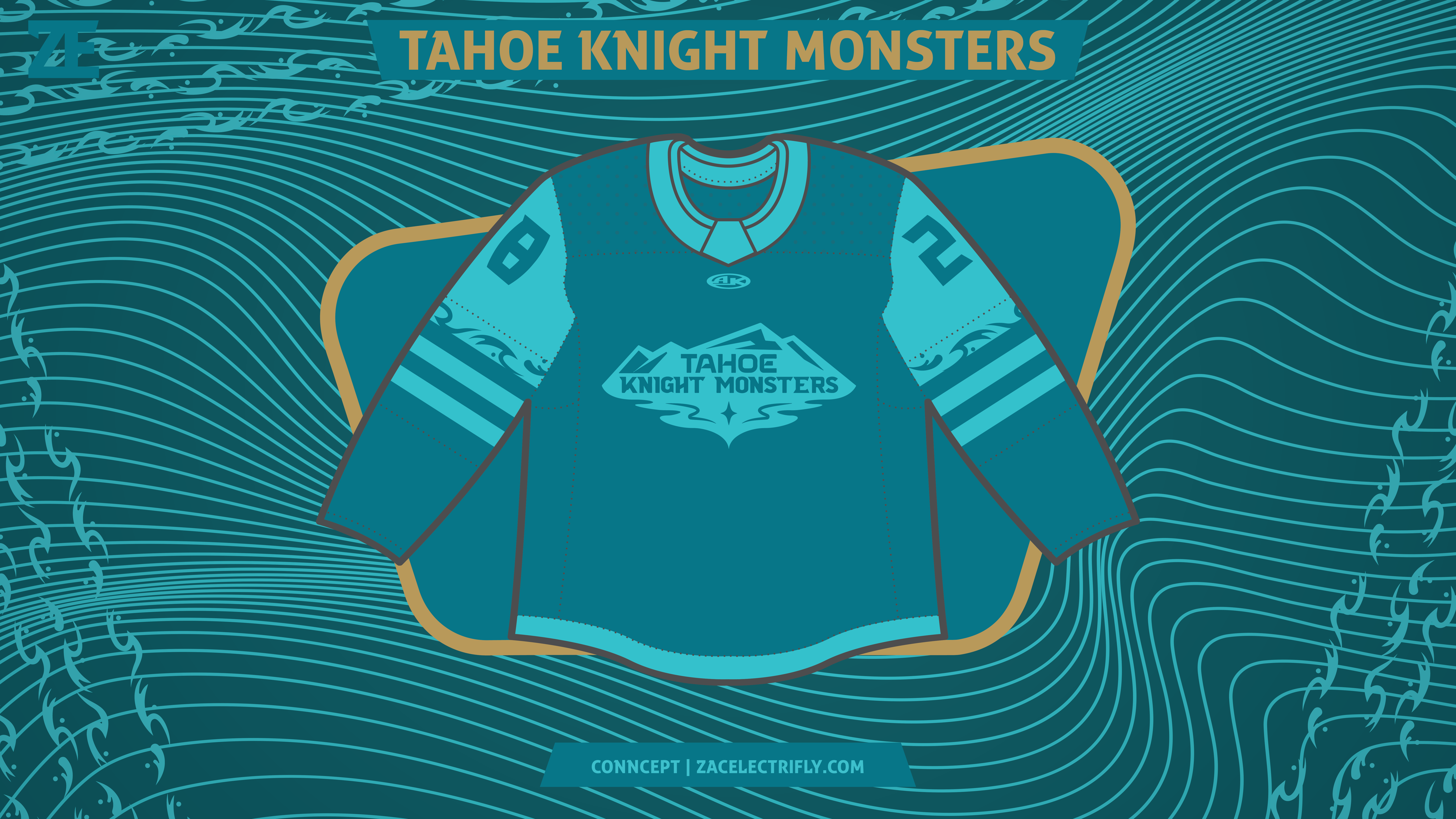
The sixth jersey is Tessie Teal and Tahoe Turquoise. On the front is the wordmark logo with mountains behind it. It does not have any shoulder logos. I initially designed this one as a Color Rush type jersey. I think it works as the second alternate jersey in this set. I really liked the color combination of this jersey. It reminds me a lot of looking at Lake Tahoe.





Leave a comment