In this post I will be ranking all fifty eight Super Bowl field designs. The Super Bowl has been going on for fifty eight years. The first Super Bowl between the American Football League and National Football League champions took place in 1967. That year was the last year the Toronto Maple Leafs won the Stanley Cup. So the Toronto Maple Leafs have not won a Stanley Cup since the first Super Bowl. The Super Bowl is the youngest championship between the big four leagues. There are a lot of great designs and some terrible ones. Join me in going through them all.

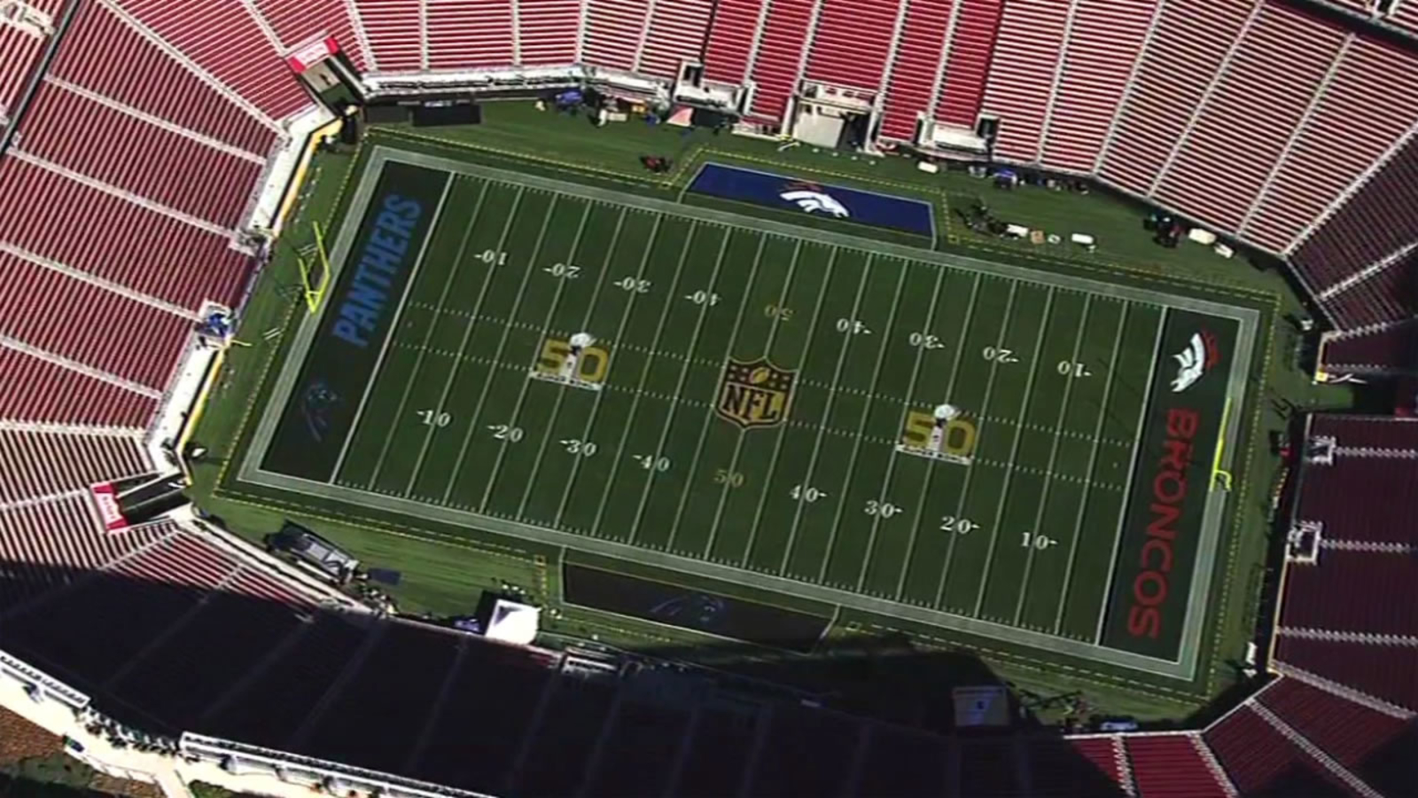
In the S tier is Super Bowl 1, Super Bowl 50, and Super Bowl 54. I really like the football crown logo of the first Super Bowl. The only time the NFL used a gold logo was for Super Bowl 50. I think most leagues could use a gold logo for their championship. With Super Bowl 54 I really like the NFL 100 logo. I also really liked the 49ers end zone with the throwback helmet logo.
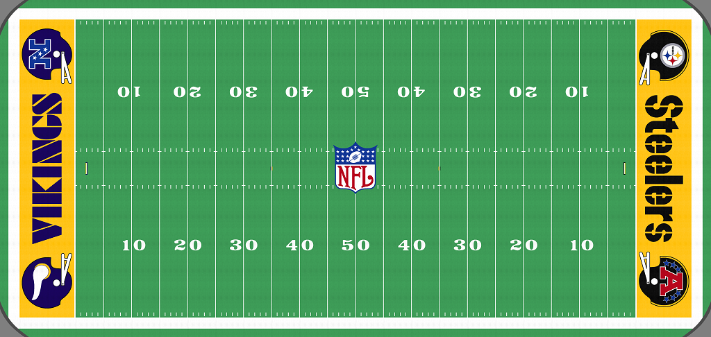
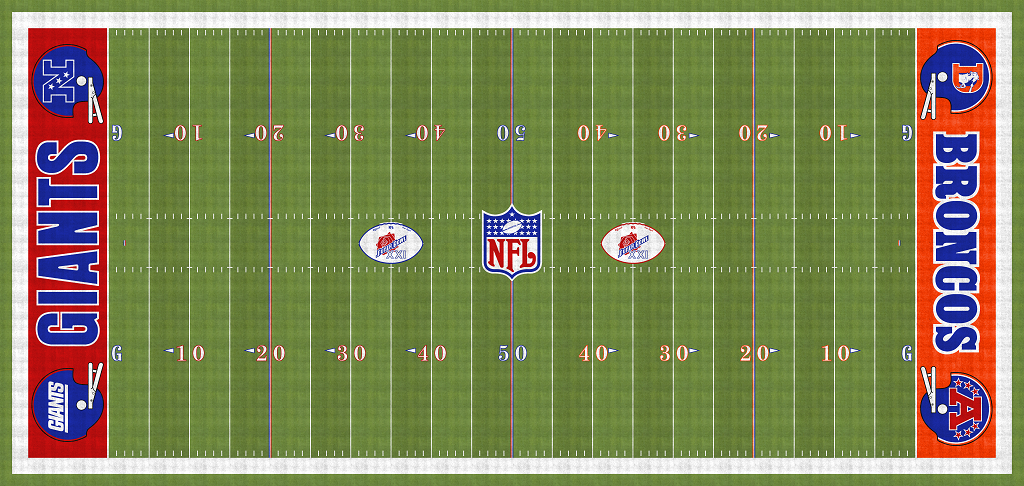
In the A tier are Super Bowl 2, Super Bowl 5, Super Bowl 29, and Super Bowl 36. I liked the helmet logos at center field with Super Bowl 2. Super Bowl 5 is the only Super Bowl to feature the trophy with nothing else on the fifty yard line. I think it is really clean. Super Bowl 29 was amazing with the 75th logo. The only thing holding it back is the helmets in the end zones with the NFL logo. Super Bowl 36 made the A tier because of the USA Super Bowl logo and the USA balls for each bench. The helmets on the field are solid as well. They could have done better with the end zones.
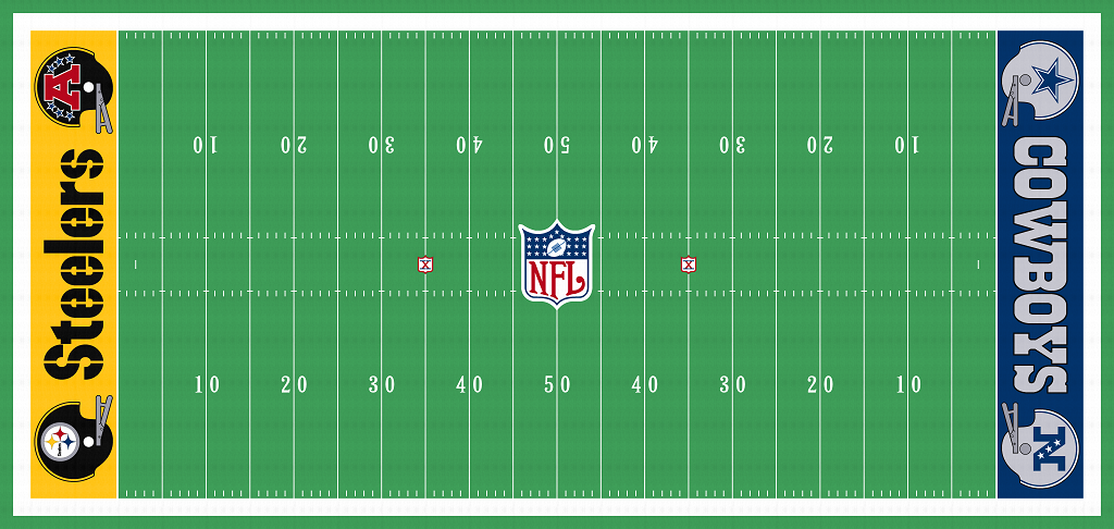
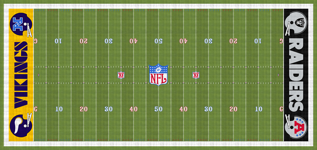
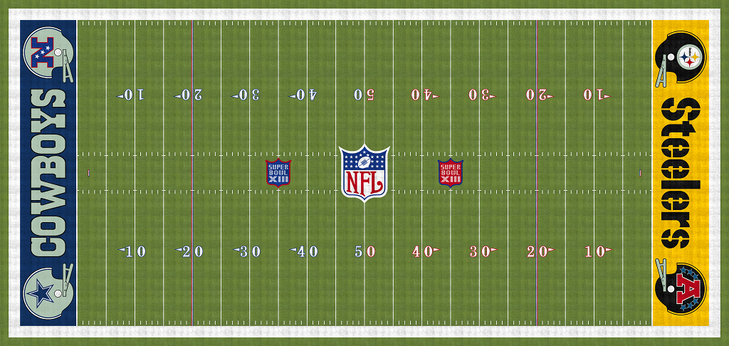
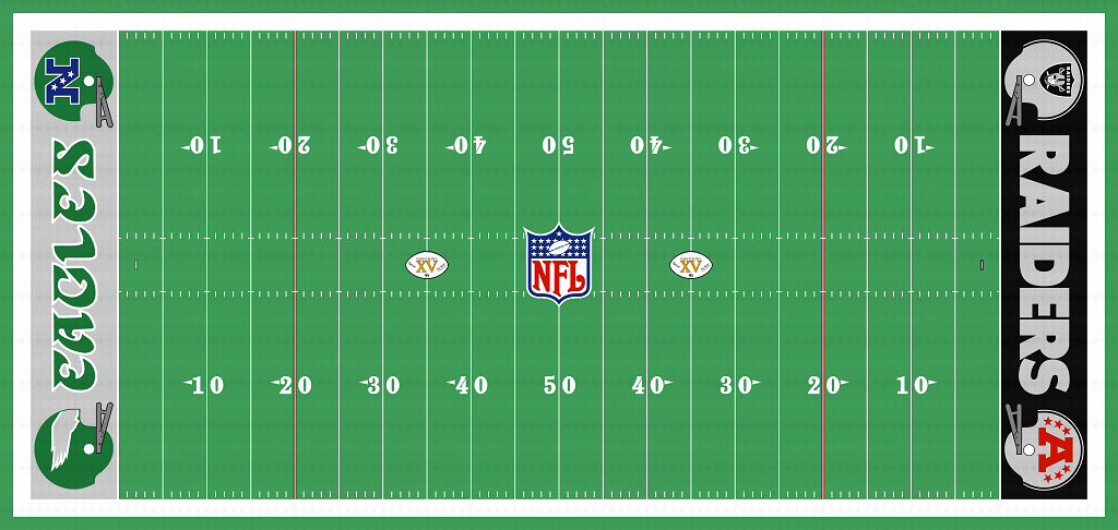
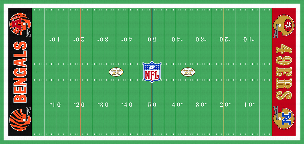
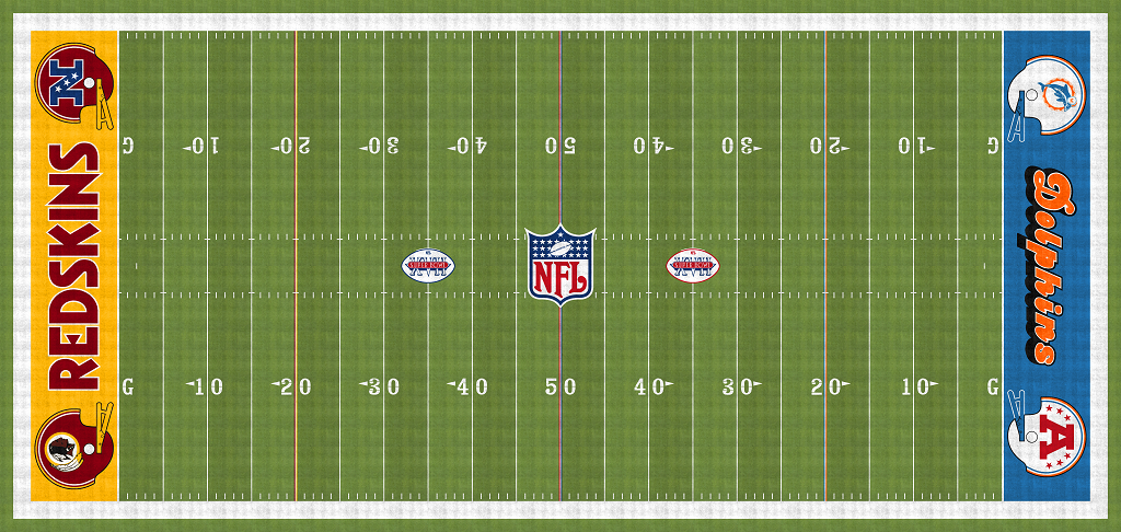
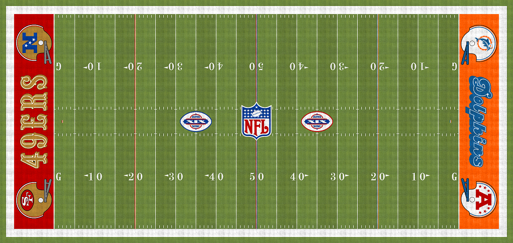
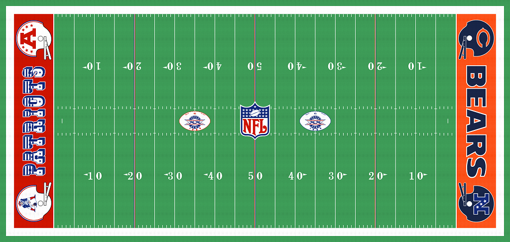
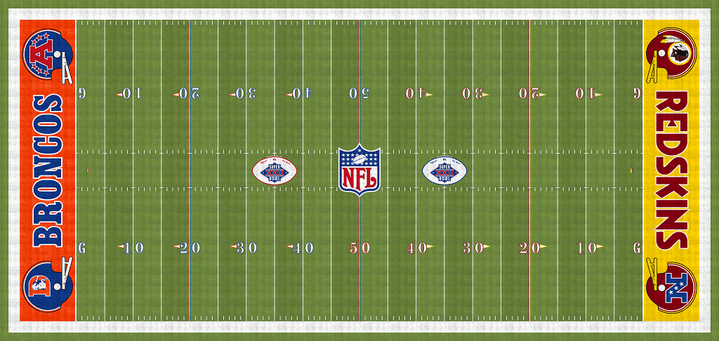
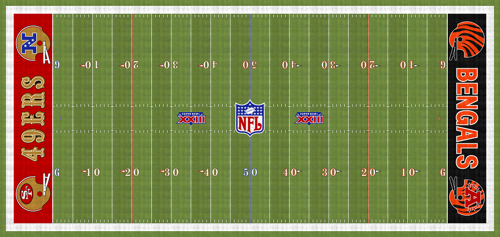
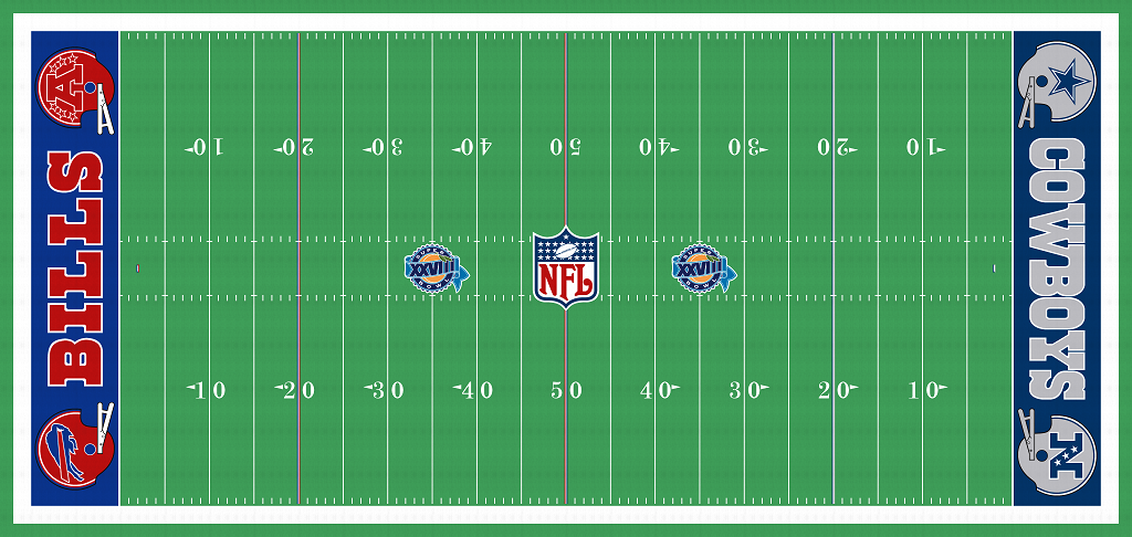
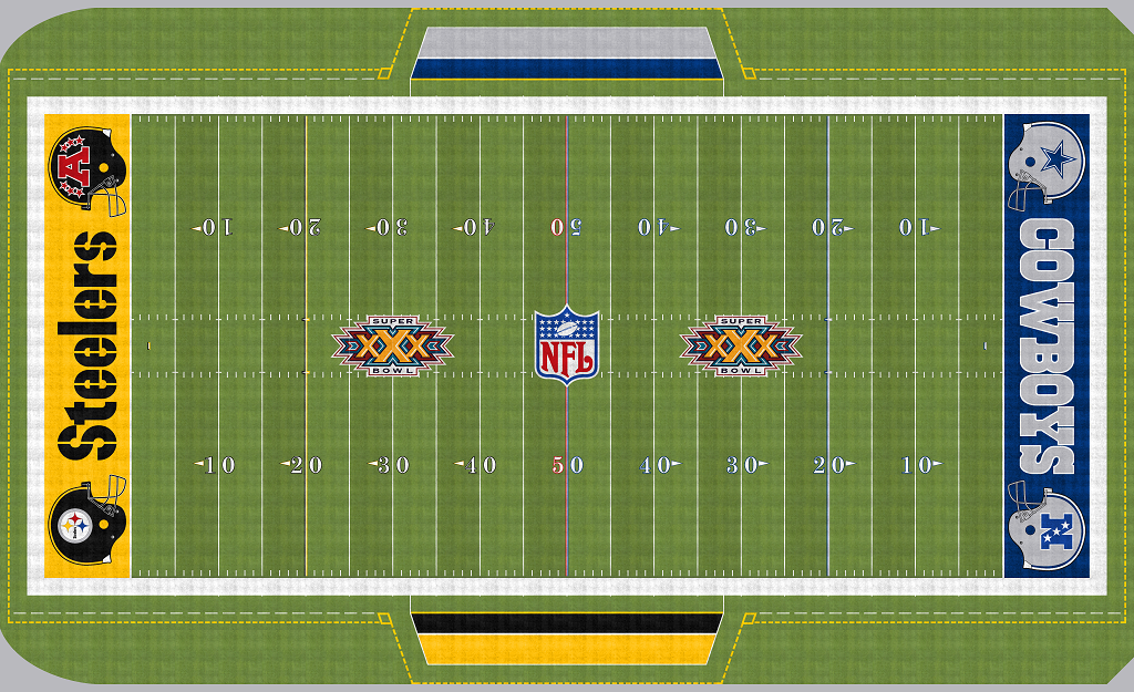
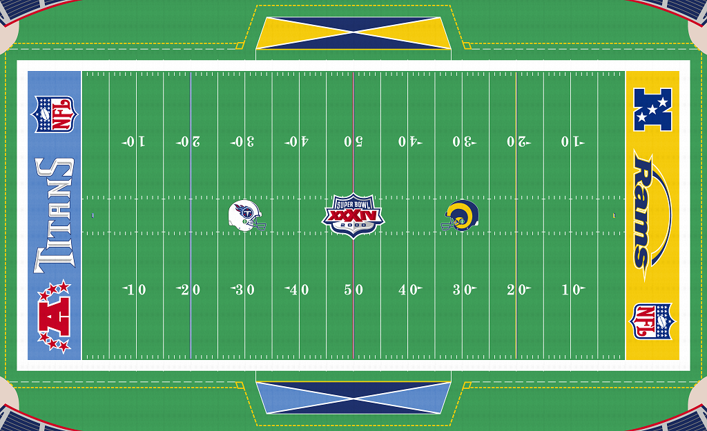
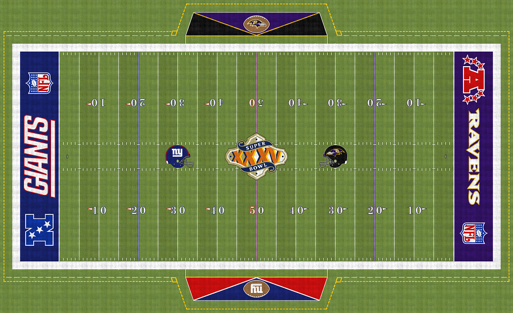
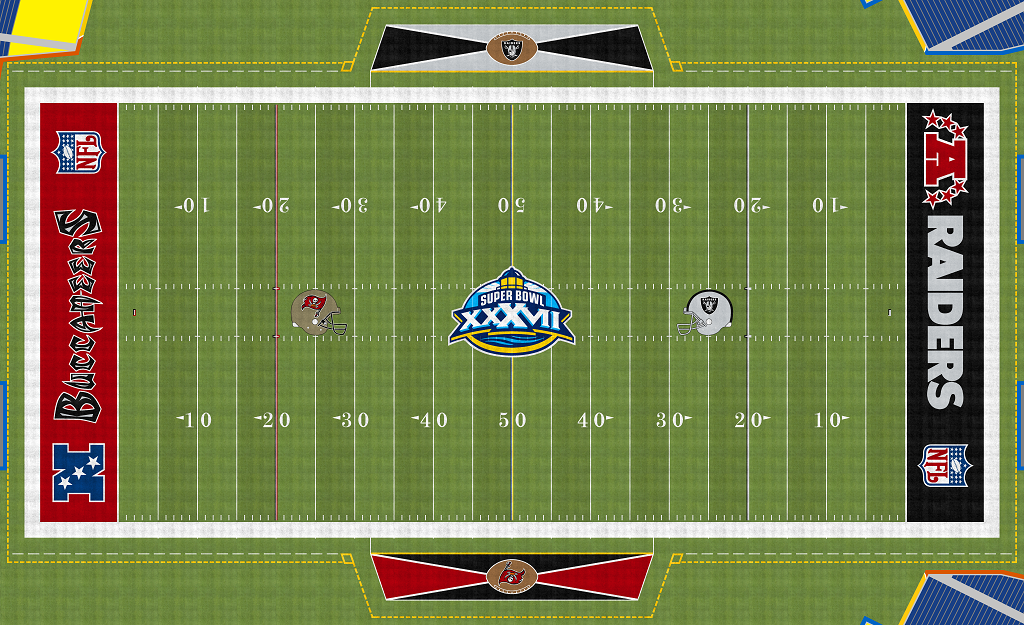
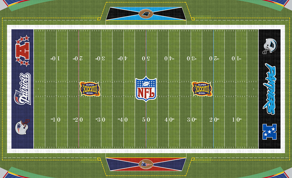
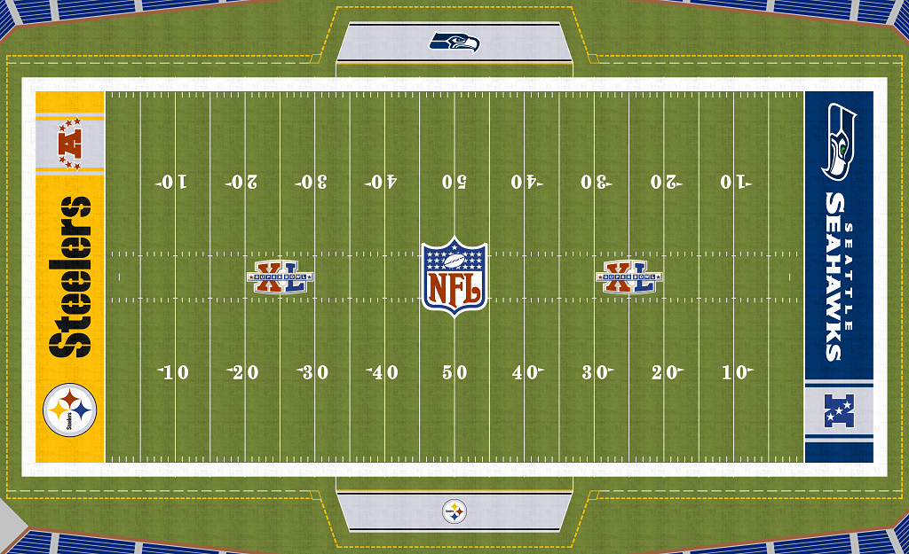
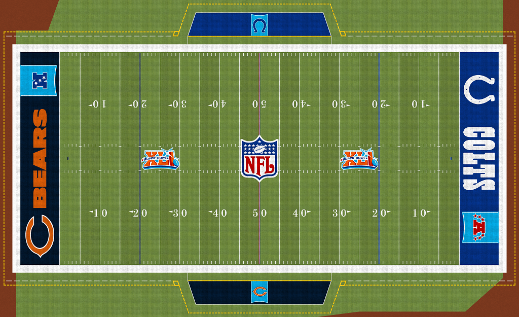
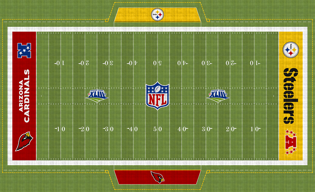
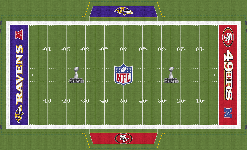
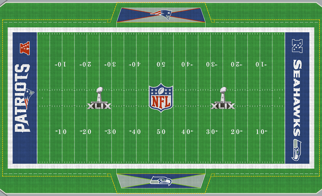
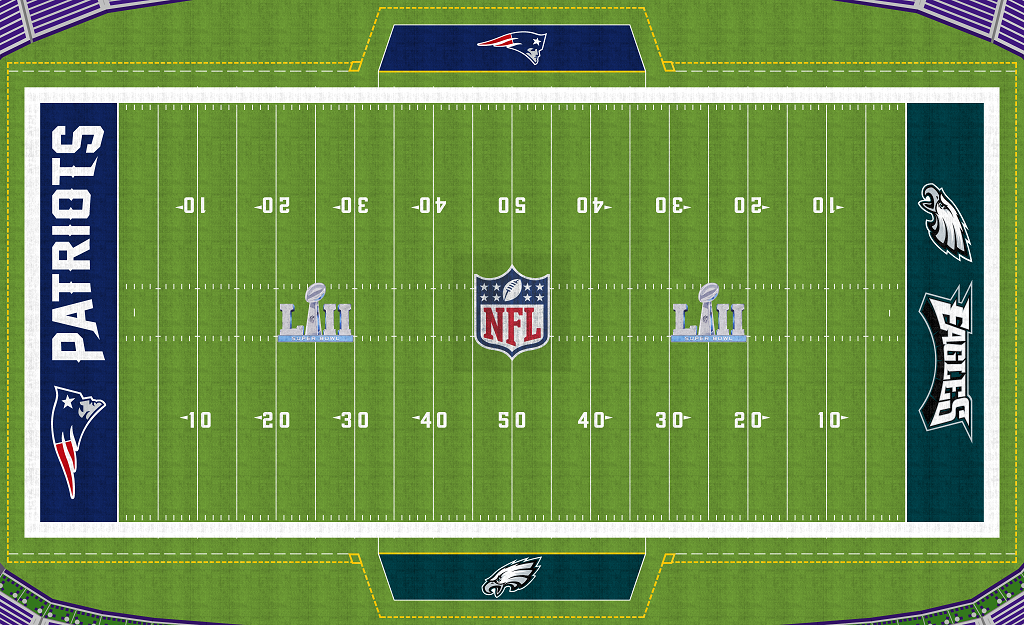
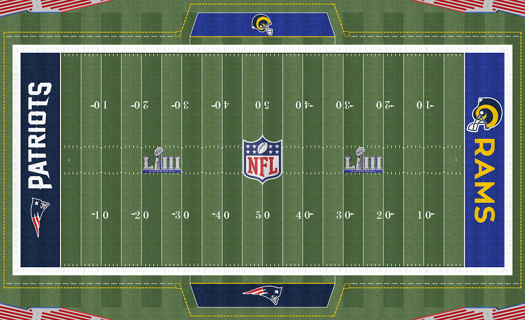
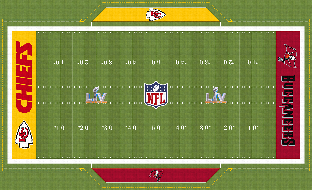
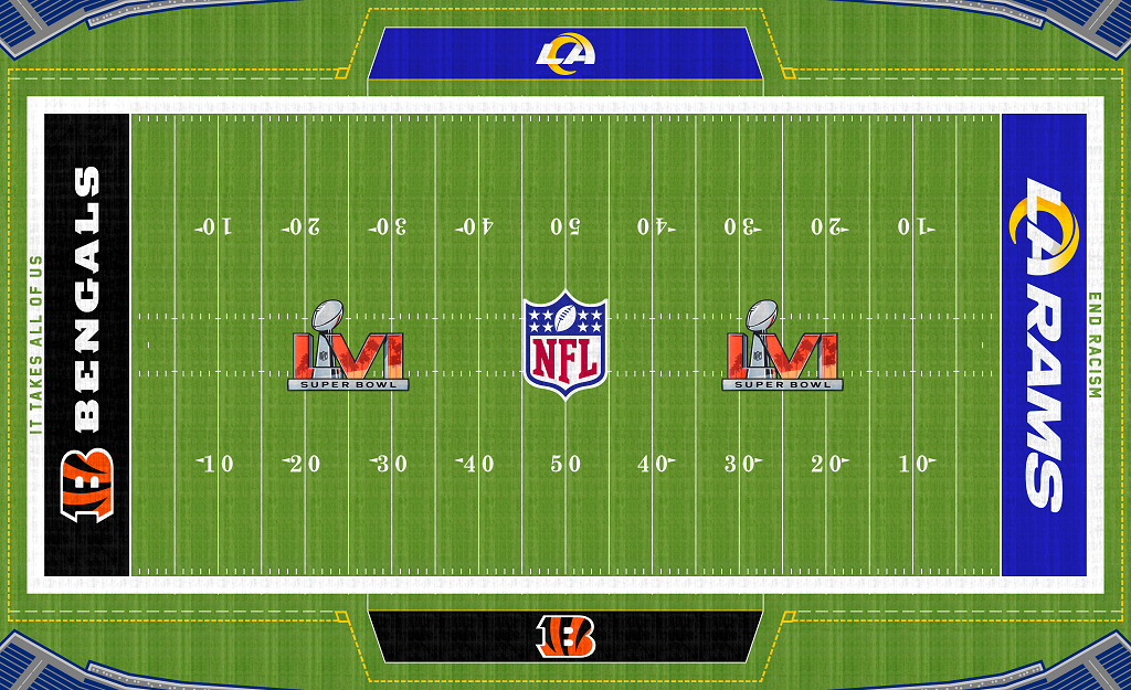
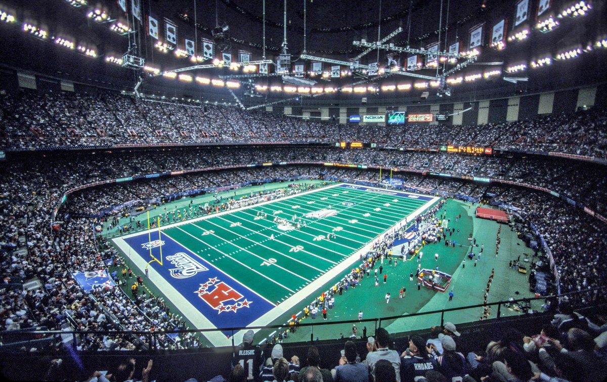
In the B tier is Super Bowl 3, Super Bowl 4, Super Bowl 7, Super Bowl 25, Super Bowl 31, Super Bowl 32, Super Bowl 33, Super Bowl 34, Super Bowl 35, Super Bowl 37, Super Bowl 40, Super Bowl 41, Super Bowl 44, Super Bowl 49, Super Bowl 53, Super Bowl 57, and Super Bowl 58. Super Bowl 3 and 4 are alright. I like the trophy in the middle but there are other elements there that I don’t like. One of them being the blue background behind the trophy. I think Super Bowl 7 has a clean classic look but it is not as good as the S tier or A tier fields. Super Bowl 25 is in the B Tier because I like the Super Bowl logo at the fifty yard line. I do not like anything else about this one. Super Bowl 31 to Super Bowl 35 and Super Bowl 37 are in the B tier because I like football helmet logos. Super Bowl 40 and Super Bowl 42 is in the B tier because I like how unique the designs are. Super Bowl 44 is in the B tier because I really like that Super Bowl logo. Super Bowl 49 is in the B tier because I like how the bench areas look. Super Bowl 53 is in the B tier because I like the Rams helmet logo. Super Bowl 56, Super Bowl 57, and Super Bowl 58 are in the B tier because I like the current era of Super Bowl logos over the previous era.
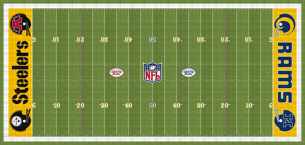
In the C tier is Super Bowl 6, Super Bowl 8, Super Bowl 9, Super Bowl 10, Super Bowl 11, Super Bowl 12, Super Bowl 13, Super Bowl 14, Super Bowl 15, Super Bowl 16, Super Bowl 17, Super Bowl 18, Super Bowl 19, Super Bowl 20, Super Bowl 21, Super Bowl 22, Super Bowl 24, Super Bowl 26, Super Bowl 27, Super Bowl 28, Super Bowl 30, Super Bowl 38, Super Bowl 39, Super Bowl 42, Super Bowl 43, Super Bowl 44, Super Bowl 51, Super Bowl 52, Super Bowl 55. Super Bowl 6 is not to bad is just too plain. Most of the C Tier fields have the problem of having an ugly football helmet design with the NFC or AFC logo. The way the AFC and NFC logos are displayed is unpleasing to the eye in most of the C tier fields. The Super Bowl logos from 2011 to 2021 excluding Super Bowl 50 dragged a lot of these fields down as well. It was a lot better when the Super Bowl logo was unique from season to season.
In the D tier are the Super Bowl 23, Super Bowl 45, Super Bowl 47, and Super Bowl 48. Super Bowl 23 is in the D tier because of the Bangles helmet with the AFC logo on it. It hurts to look at. I know it is not the only field with it. Super Bowl 45 is in the D tier because there are two different stencil fonts in an area of fields that could have been a lot better. Super Bowl 47 is in the D tier because again it is in an weak era of Super Bowl Fields but it also has poorly spaced out logos in the end zones. Like they look cramped but also small and off center and the AFC and NFC logos have more room to breath for some reason.


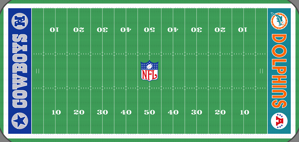


My fifth overall pick is the Super Bowl 5 field. From 1971 Super Bowl 5 had an attendance of 79,204 and was played at the Miami Orange Bowl. The game was between the Dallas Cowboys and the Baltimore Colts. The Colts won the game 16 to 13. This is my fifth overall pick because I really like the trophy in the middle. It completes a clean design. While I am not a fan of the AFC or NFC logos in the end zones, I do think it is done in a great way here.
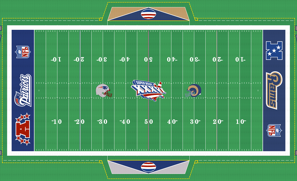
The Super Bowl 36 field is my fourth overall pick. Super Bowl 36 was played in 2002 at the Louisiana Superdome. There was a crowd of 72,922. The game was played between the St. Louis Rams and the New England Patriots. The Patriots won the game 20-17. This game was played a few months after the September 11th attacks. The branding for this Super Bowl was completely overhauled to go from a New Orleans theme to a patriotic USA theme. The United States theme and the Helmets on the field is why I like this so much.

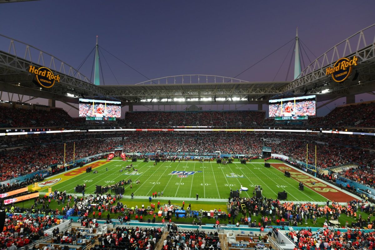
The Super Bowl 54 field is my third overall pick. From 2020 this super bowl was played at Hard Rock Stadium in front of a crowd of 62,417. The game was between the San Fransisco 49ers and the Kansas City Chiefs. The Chiefs won the game 31-20. This is my third overall favorite because of the San Fransisco 49ers end zone. I absolutely love the classic helmet design and the wordmark logo. What also makes this field look great is the NFL 100 logo in the middle. While I am not a fan of this era of Super Bowl logos, I think they hit it out of the park with this one.

The Super Bowl 50 field is my second overall pick. In 2016 Super Bowl 50 was played at Levis Stadium in front of a crowd of 71,088. The game was between the Carolina Panthers and the Denver Broncos. The Broncos won the game 24 to 10. This is a good example of what I think the Super Bowl end zones should look like. The gold NFL logo should be used at every Super Bowl. Just like the gold logo in the FIFA World Cup.

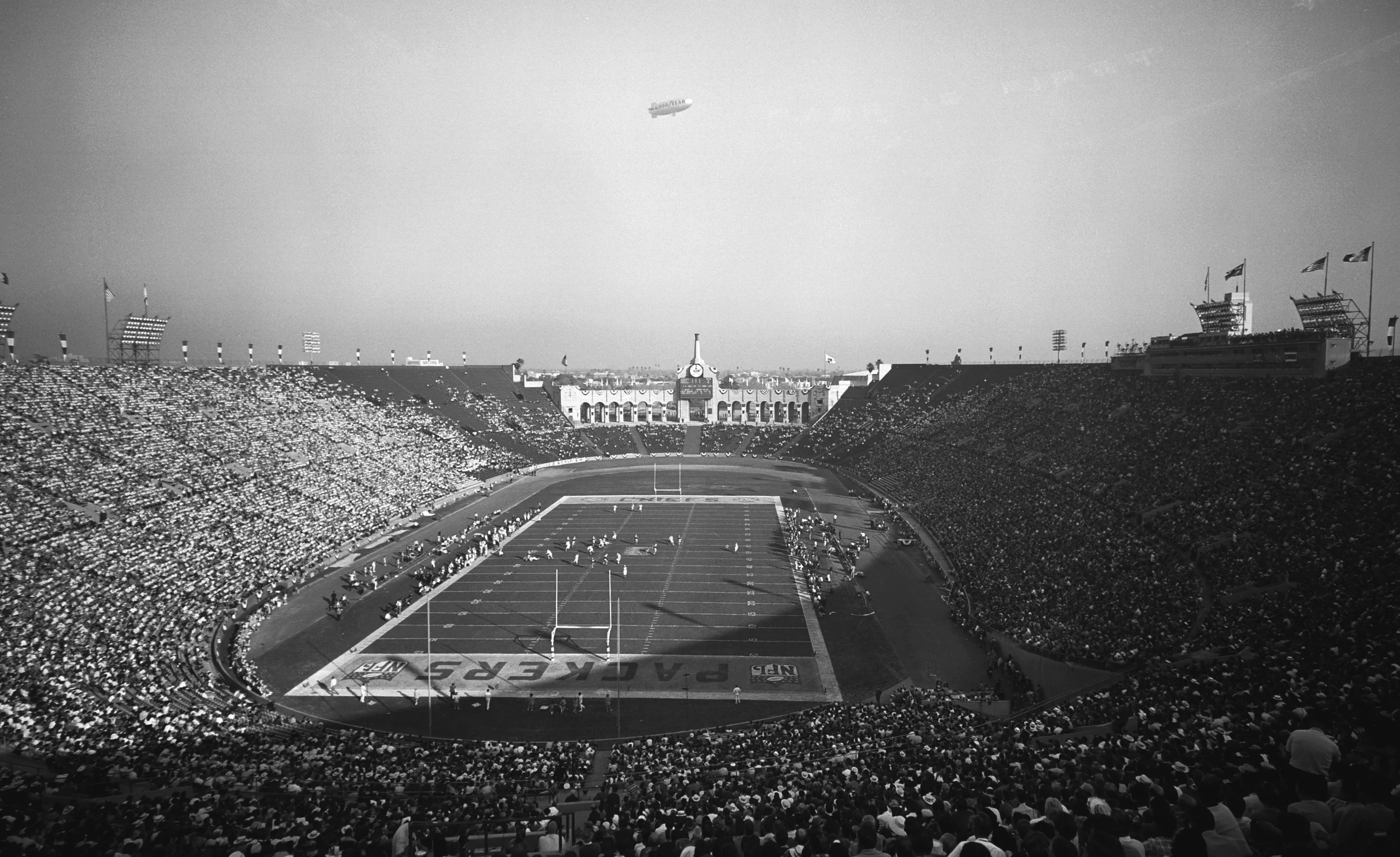
My top pick is the first Super Bowl field. The first Super Bowl was in 1967. It took place at the Los Angeles memorial coliseum. There was a crowd of 61,946. The game was between the Kansas City Chiefs and the Green Bay Packers. The Packers won the game 35-10. This field is classic. I am still not a fan of the NFL or AFL logos in the end zones. The AFL logo and NFL logo are a lot better than the NFC and AFC logos in the end zones. Not having the team logos in the end zones and fully committing to the NFL and AFL logos makes this field look so much better than the later ones. The crown football logo is so unique and was never used again. I really like it and wish they continued to use it and expanded on it. I do like the idea of having colored yard labels. Ii think a field like this is what every pro bowl field should look like.
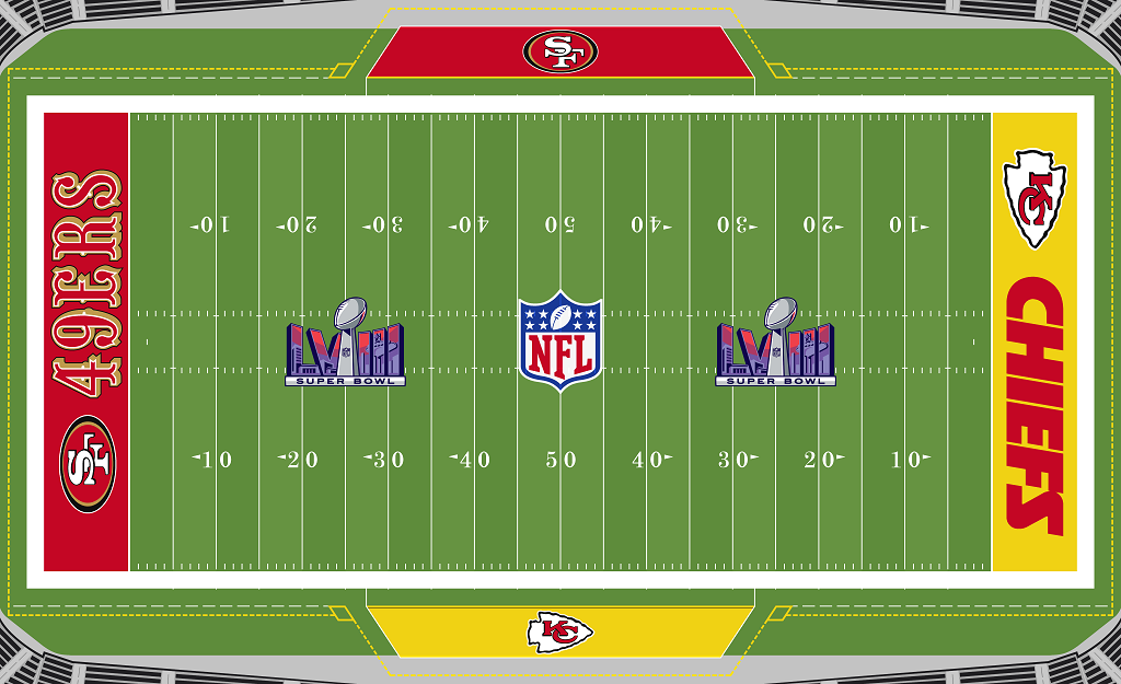
The Super Bowl 58 field is basic. I like it though. They didn’t mess up the end zones by adding the NFC or AFC logos. What I would change is putting the Super Bowl logo where the NFL logo is. I would put the NFL logo on the 25 yard line like a college football conference logo. I would also use the gold version of the logo. I would add helmet logos where the Super Bowl logo currently is. I would add the NFC and AFC logos to the bench areas. I would also add each teams championship in the out of bounds areas at the top of the end zones.

Leave a comment