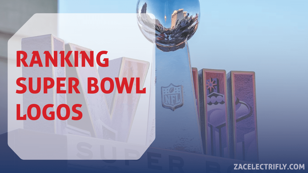
In this post I will be ranking all fifty eight Super Bowl logos. I ranked all of the fields in my last Super Bowl post. The logos were a lot easier to rank than the fields. Basically Super Bowl logos have five eras. There is the beginning era, the creative era, the silver era, the bad times, and the current era. In the beginning the logos were mainly wordmarks. Then they got creative. Then the NFL wanted them to all look the same. There are now three different eras where the logos all look the same.
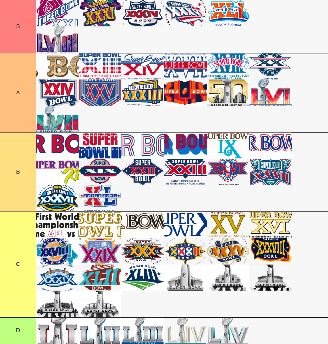
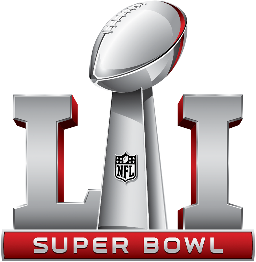
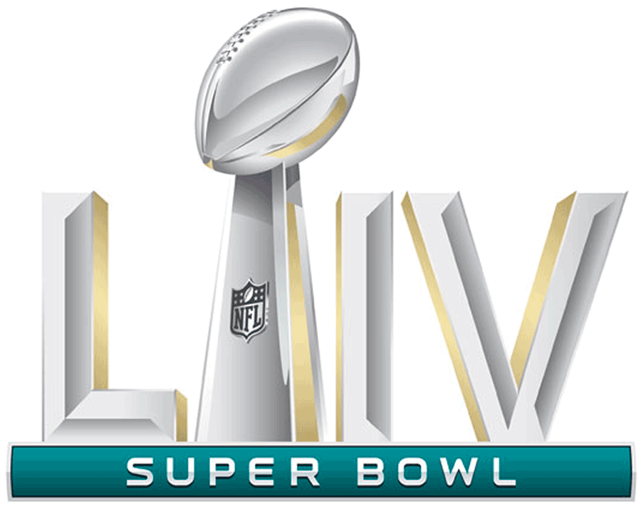
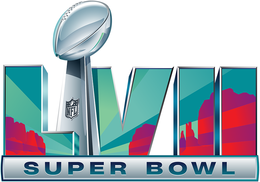
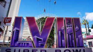
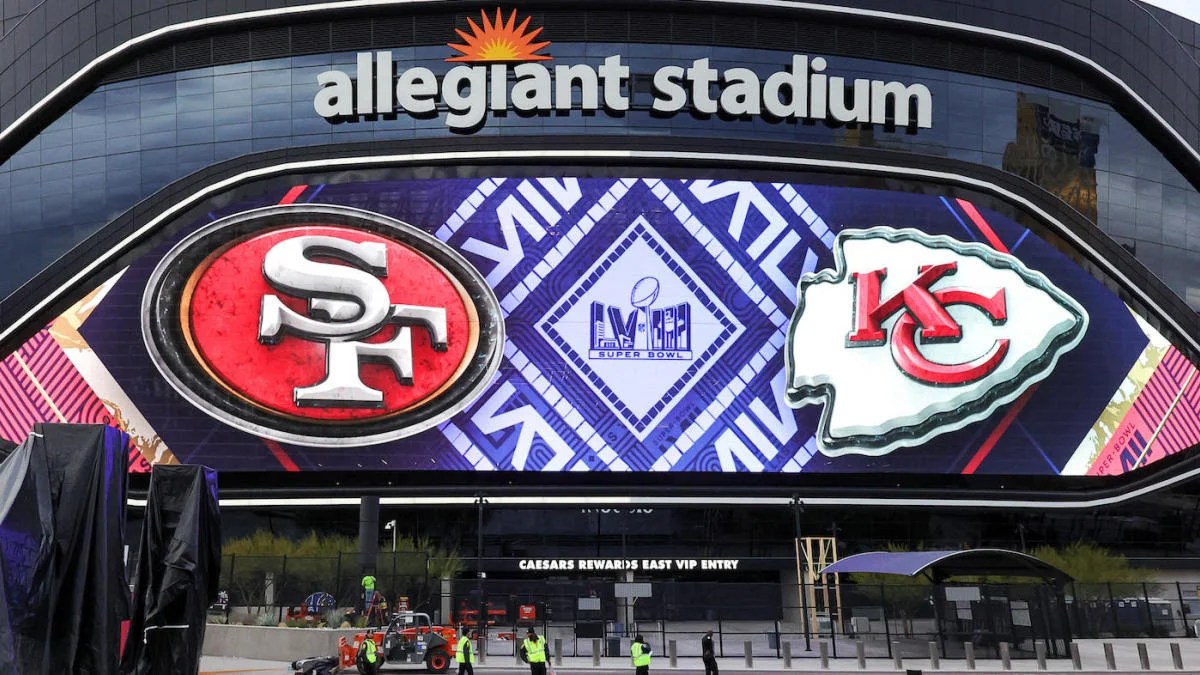
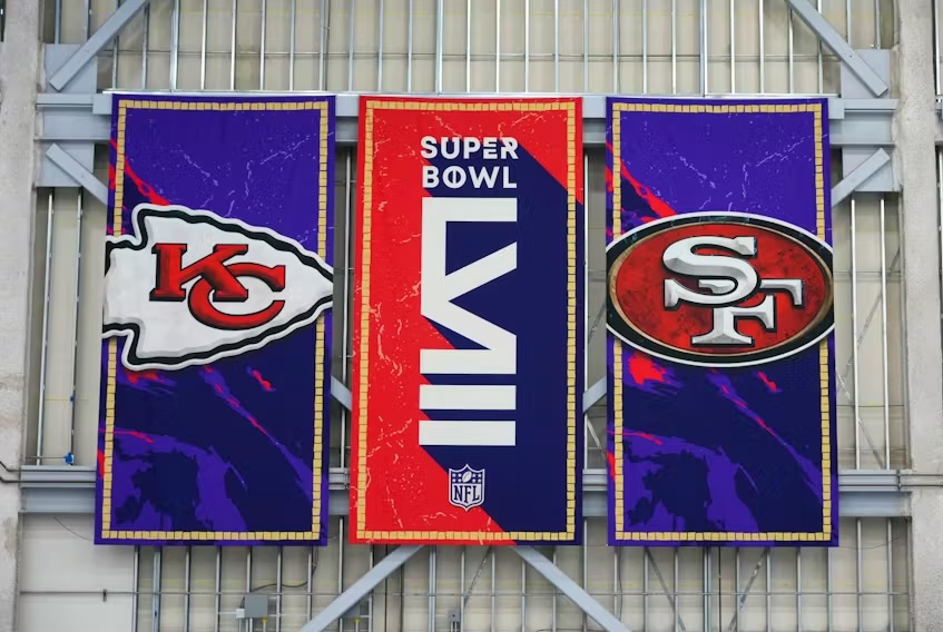
In the S tier is Super Bowl 21, Super Bowl 31, Super Bowl 34, Super Bowl 36, Super Bowl 41, Super Bowl 58. Super Bowl 21 has an eye capturing rose design. Super Bowl 31 has great colors with a crown and a colorful theme. The use of the shape of the NFL logo for super bowl 34 is great. Super Bowl 36 has that great United States branding. Super Bowl 41 has great use of color. Super Bowl 58 hit it out of the park.
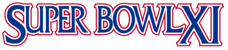
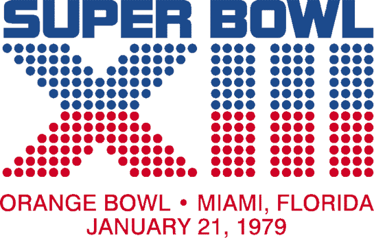
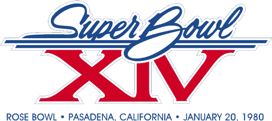
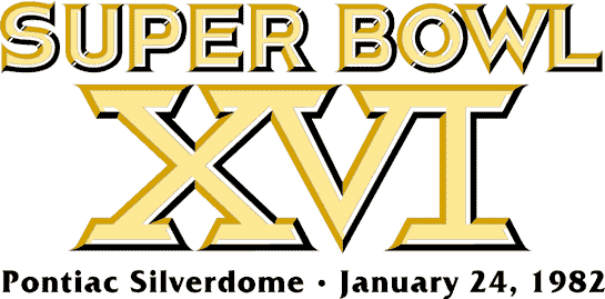
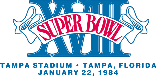
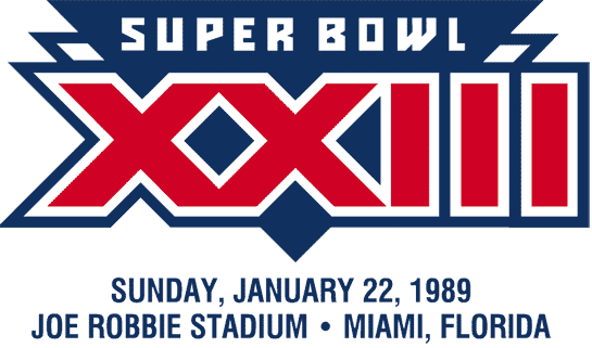
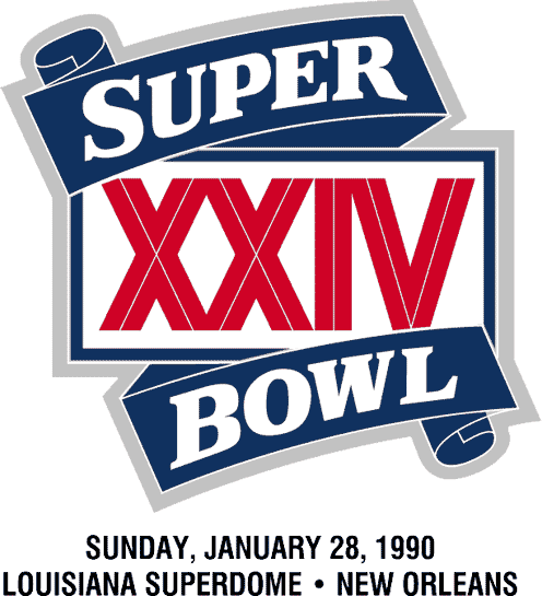
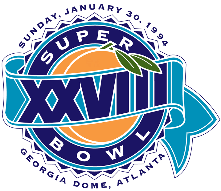
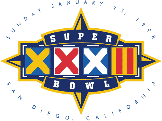
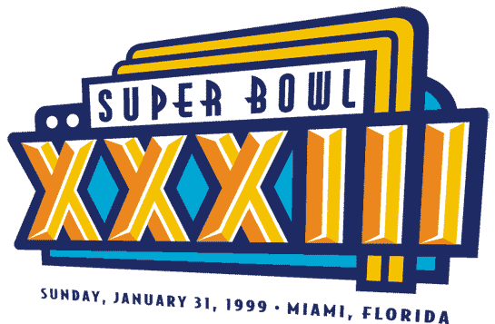
In the A tier are Super Bowl 6, Super Bowl 13, Super Bowl 14, Super Bowl 17, Super Bowl 18, Super Bowl 20, Super Bowl 24, Super Bowl 25, Super Bowl 33, Super Bowl 44, Super Bowl 50, Super Bowl 46, and Super Bowl 57. Super Bowl 6 has amazing typography. Super Bowl 13 is the first one to really be creative. Super Bowl 14 has a private airline feel that elevates the whole event. I like Super Bowl 17 because it reminds me of Sonic The Hedgehog. Super Bowl 18 has a lot of personality. Super Bowl 20 looks like a jet logo. Super Bowl 24 is another one with a lot of personality. Super Bowl 25 looks great in the shape of a ring. Super Bowl 33 has an old diner feel to it but it very creative. Super Bowl 44 is a good example of what three demential logos should look like. Super Bowl 50 is solid because of the gold. Super Bowl 56 is the first of the contemporary era. It has a lot of creativity in the small details. The colors on the Super Bowl 57 logo were great.
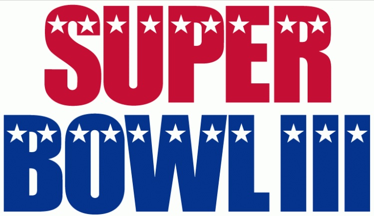
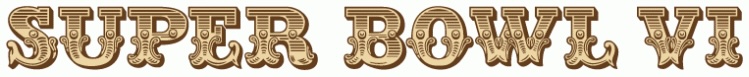
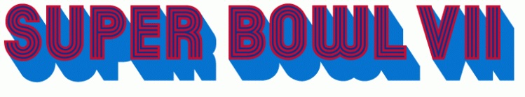
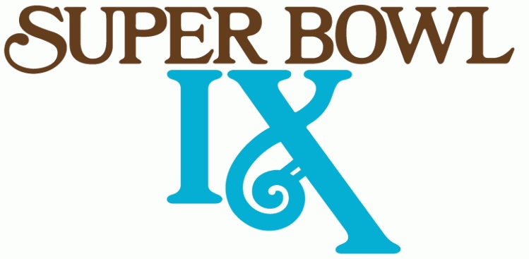
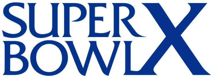
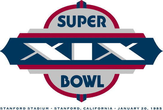
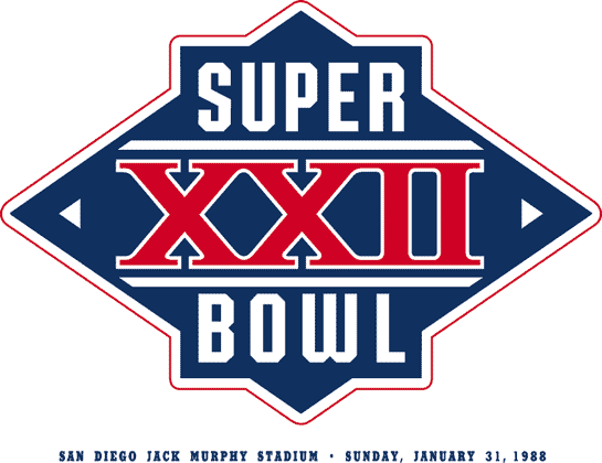
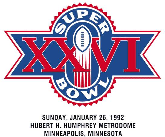
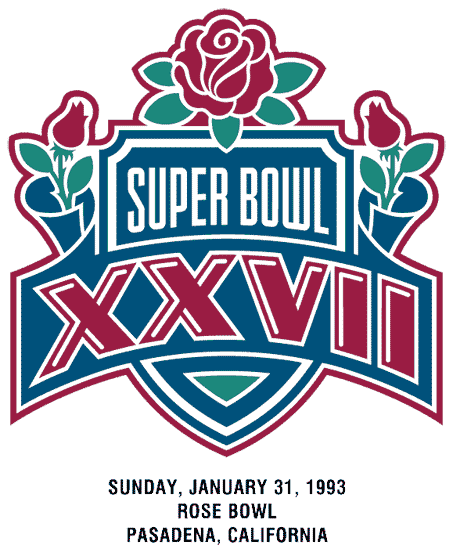
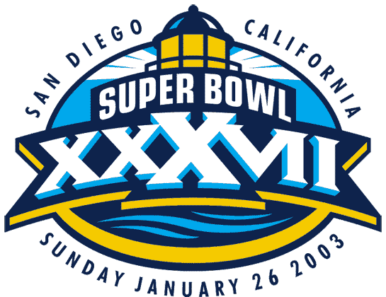
In the B tier is Super Bowl 2, Super Bowl 3, Super Bowl 5, Super Bowl 7, Super Bowl 9, Super Bowl 11, Super Bowl12, Super Bowl 19, Super Bowl 22, Super Bowl 23, Super Bowl 26, Super Bowl 27, 37, and Super Bowl 40. Super Bowl 2, Super Bowl 3, Super Bowl 5, and Super Bowl 7 are here because while good they are just wordmark logos. There was a poor choice in colors for the Super Bowl 9 logo. Super Bowl 11 is another wordmark logo that does not feel like it is trying. Super Bowl 12 seems like they tried really hard to make an interesting workmark but it has just the worst colors. Super Bowl 19 is kind of bland. Super Bowl 22 is boring. Super Bowl 23 seems like they didn’t try again. I like the football in the Super Bowl 26 logo but I do not like any of the other elements. The colors don’t in the Super Bowl 27 logo. I like the colors in the Super Bowl 37 logo but overall it falls short of being a great logo. The Super Bowl 40 logo is another one where they didn’t try.
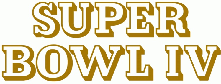
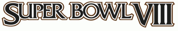
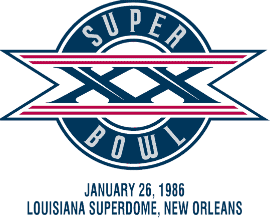
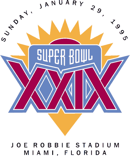
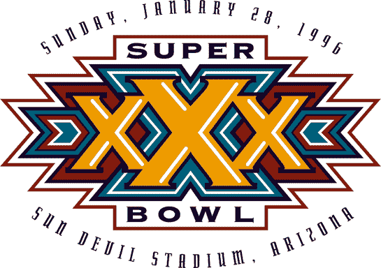
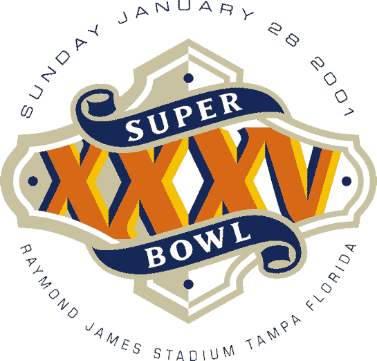
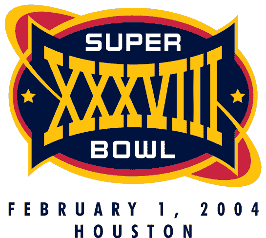
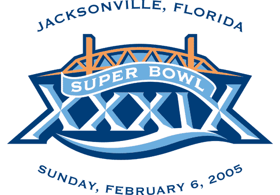
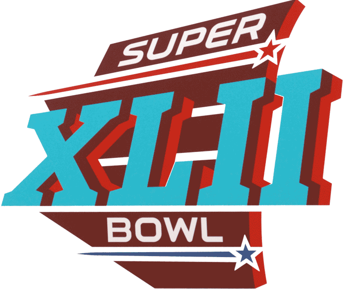
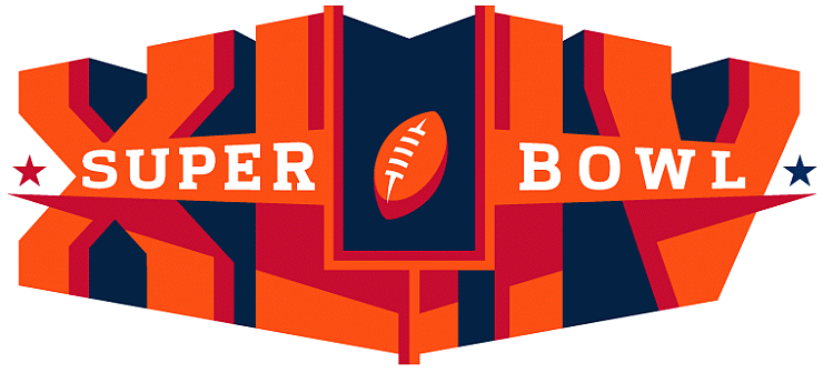
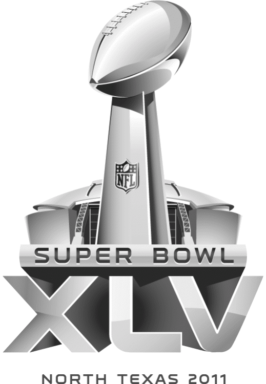
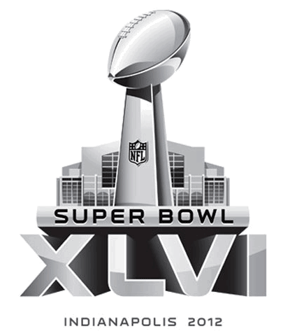
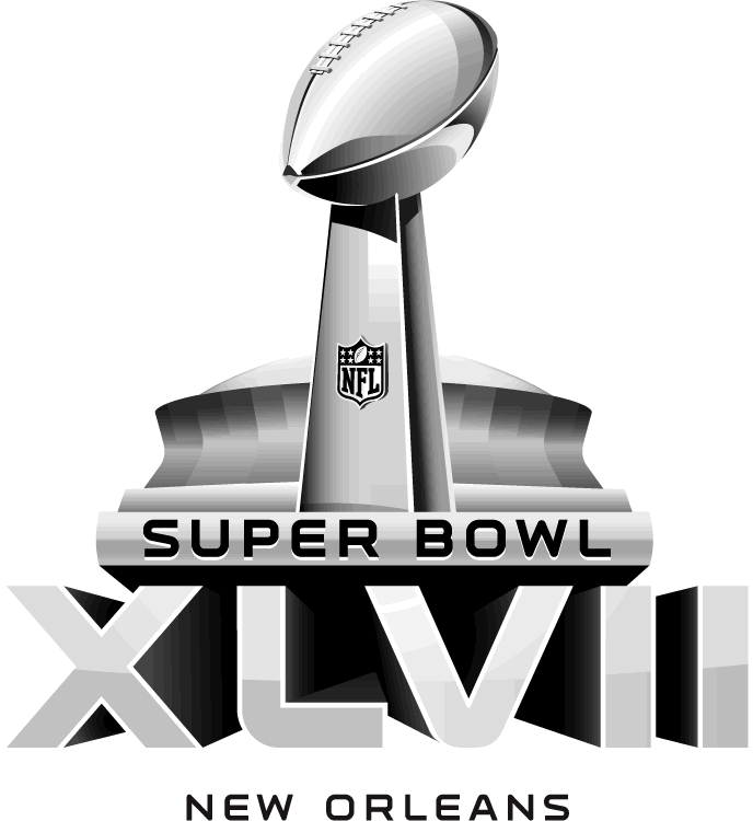
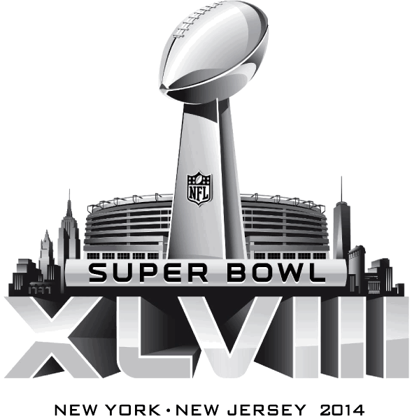
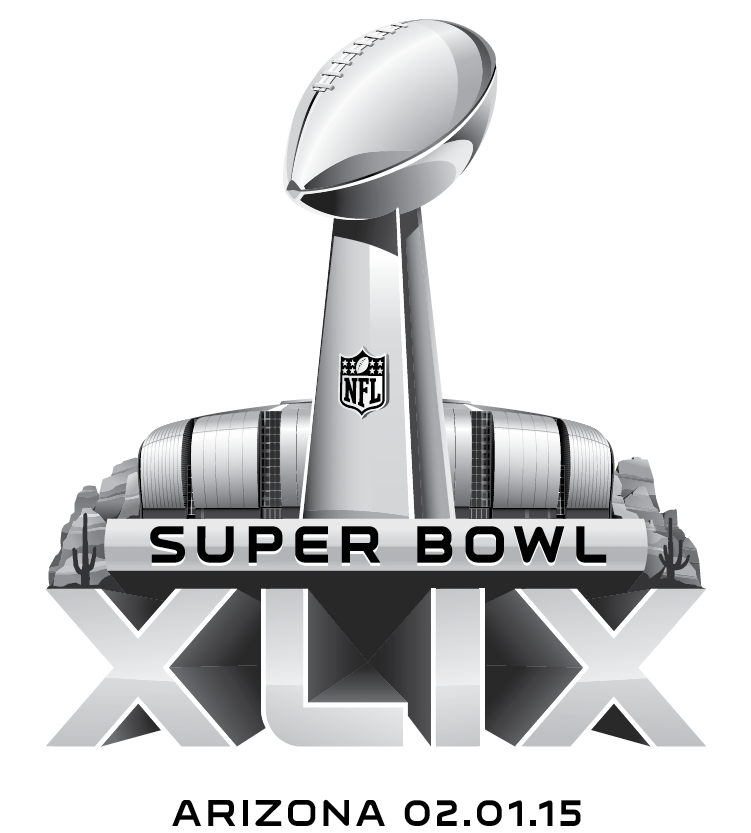
In the C tier is Super Bowl 1, Super Bowl 4, Super Bowl 8, Super Bowl 10, Super Bowl 15, Super Bowl 16, Super Bowl 28, Super Bowl 29, Super Bowl 30, Super Bowl 32, Super Bowl 35, Super Bowl 38, Super Bowl 39, Super Bowl 42, Super Bowl 43, Super Bowl 45, Super Bowl 46, Super Bowl 47, Super Bowl 48, and Super Bowl 49. Super Bowl 1 is a wordmark logo that doen’t even look like an event logo. Super Bowl 4 is another one that looks like they didn’t even try. Super Bowl 8 is like why. Super Bowl 10 is just so boring. Same thing with Super Bowl 15 and Super Bowl 16. Super Bowl 28 had too much going on. Super Bowl 29 has poor color choices. Super Bowl 30 and Super Bowl 32 have too much going on. Super Bowl 35 suffers from poor colors. Super Bowl 38 just does not work for me. Super Bowl 39 has a lot going on with poor colors. Super Bowl 42 again the colors dragged this one down. Super Bowl 43 is trying to be three demential while still being flat. Super Bowl 45, Super Bowl 46, Super Bowl 47, Super Bowl 48, and Super Bowl 49 are all just not good logos.
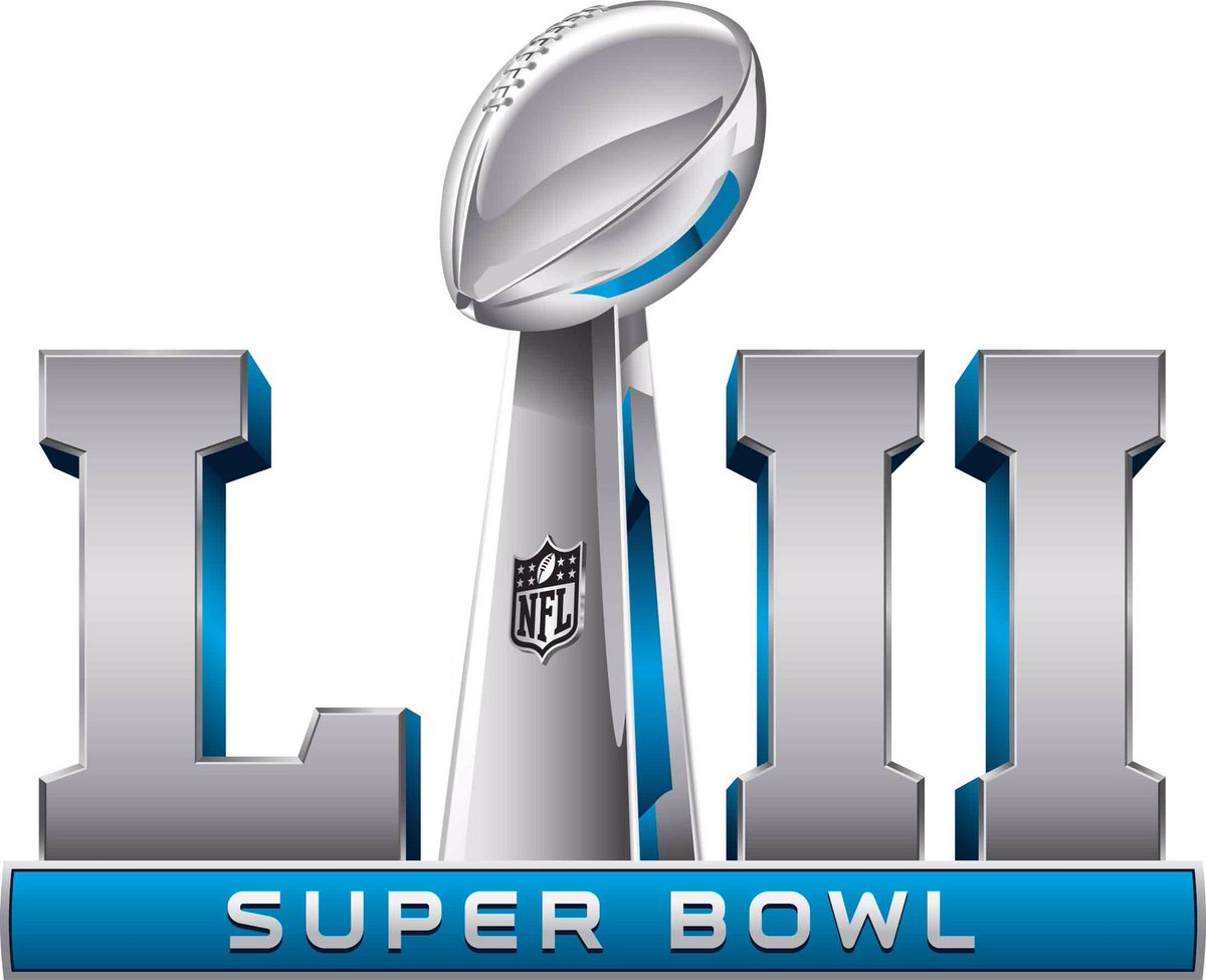
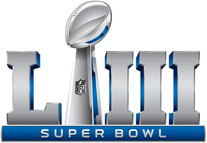
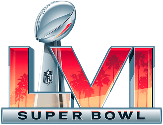
In the D tier are Super Bowl 51, Super Bowl 52, Super Bowl 53, Super Bowl 54, and Super Bowl 55. These logos represent the bad times eras. There was nothing in these logos that represented anything but the NFL. They look like logos used by a company in a dystopian future. There is no personality. Nothing sets them apart aside from the colors.


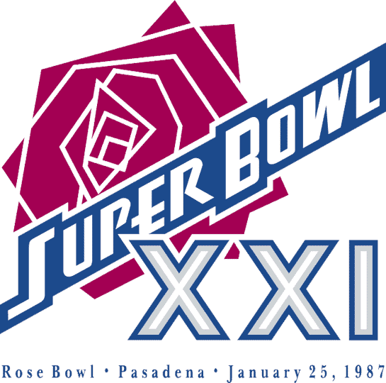
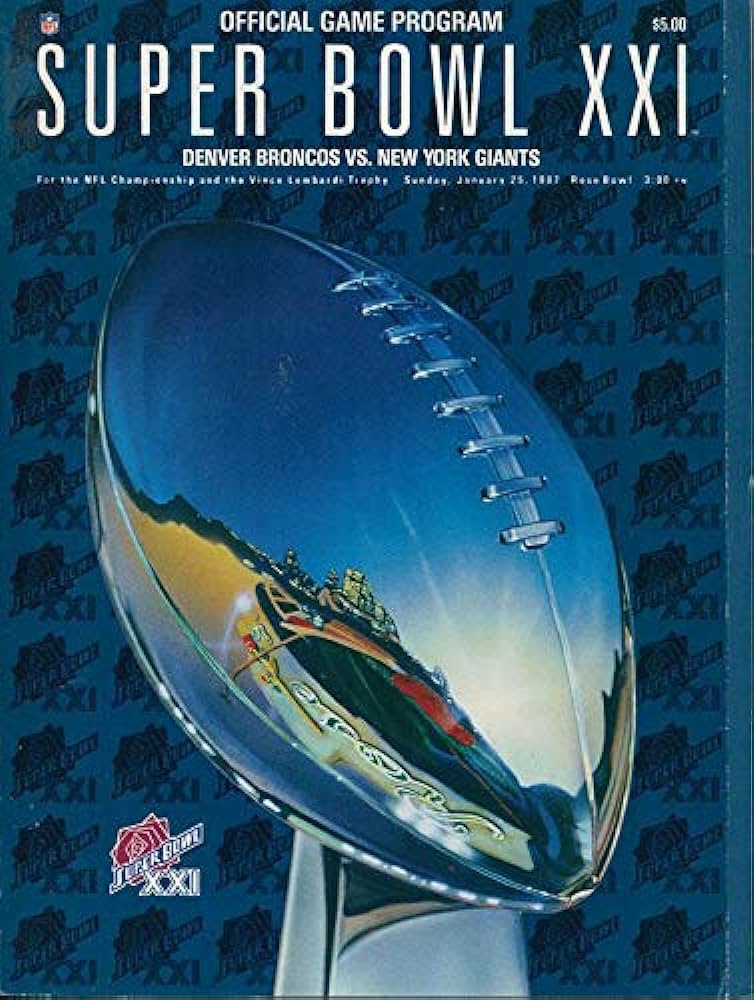
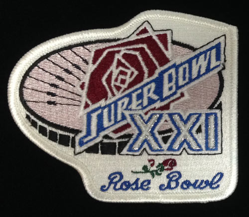
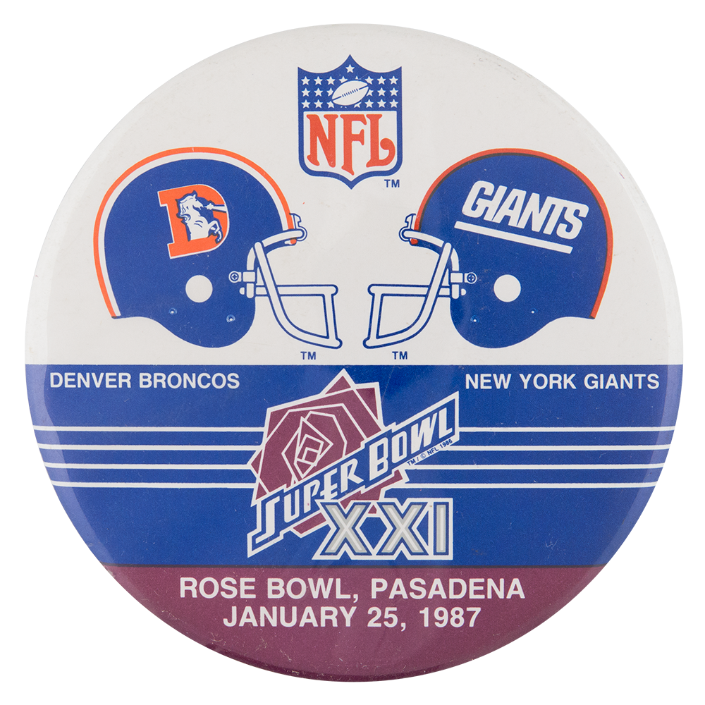
My fifth overall pick is the Super Bowl 21 logo. Super Bowl 21 was in 1987. The game was played at the Rose Bowl in front of a crowd of 101,063. In that game the New York Giants beat the Denver Broncos 39-20. The logo has good colors with a rose design. The rose design is what puts this logo in the top five.

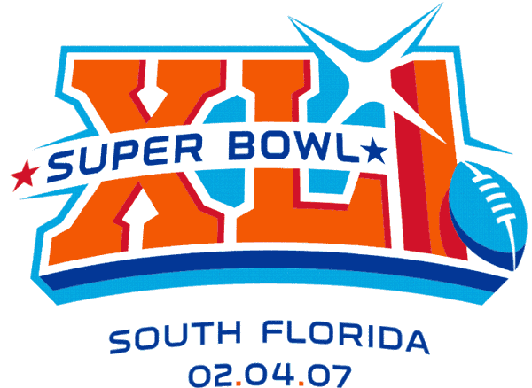
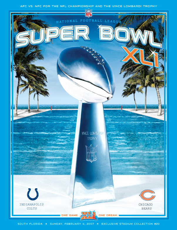
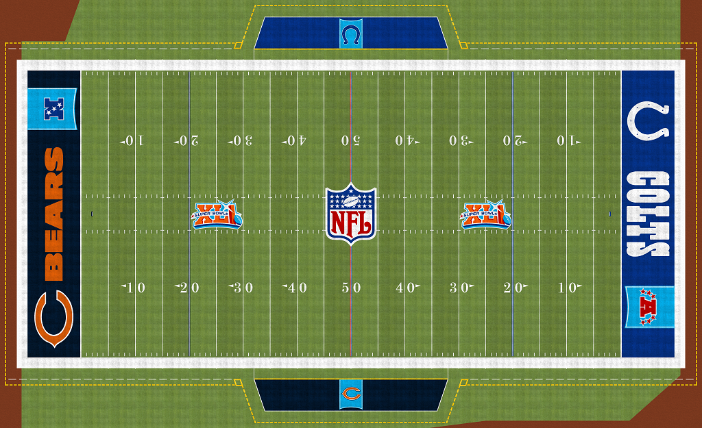
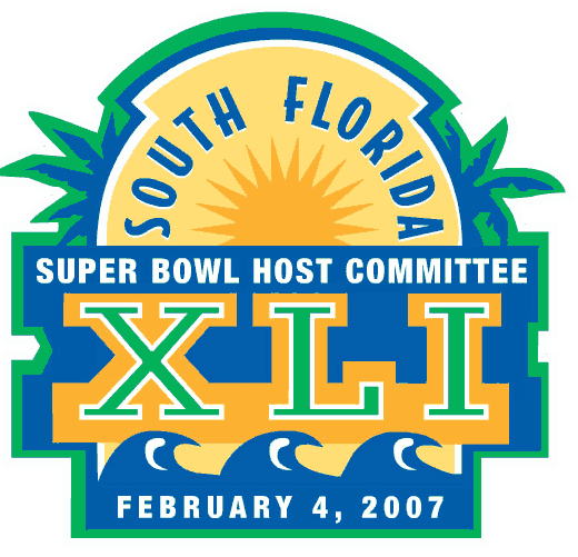
My fourth overall pick is the Super Bowl 41 logo. Super Bowl 41 was in 2007. The game was played at Dolphin Stadium (now Hard Rock Stadium) in front of a crowd of 74,512. In that game the Indianapolis Colts beat the Chicago Bears 29-17. The colors are great. The overall design is really eye catching.


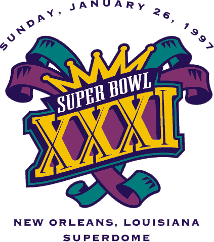
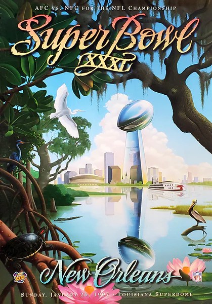
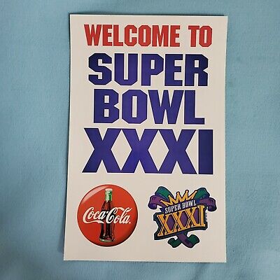
My third overall pick is the Super Bowl 31 logo. Super Bowl 31 was in 1997. The game was played at the Louisiana Superdome in front of a crowd of 72,301. In that game the Green Bay Packers beat the New England Patriots 35-21. The colors are very festive. The mardi gras theme is great. This is the only Super Bowl logo with a crown besides the logo seen on the Super Bowl one field. This logo says were going to have a lot of fun.

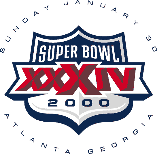
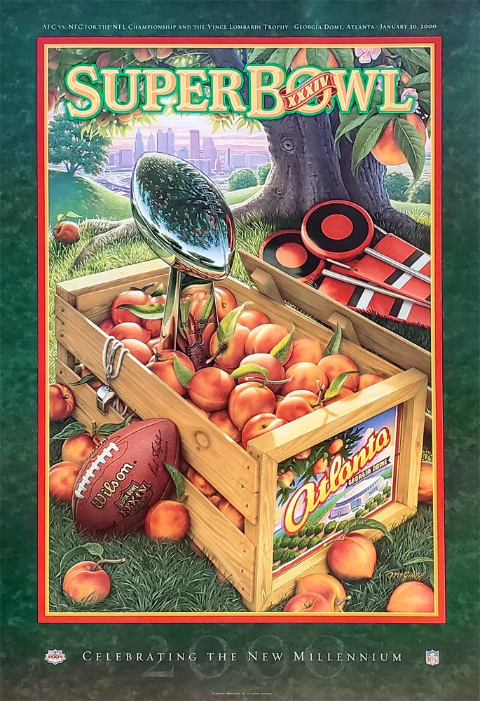
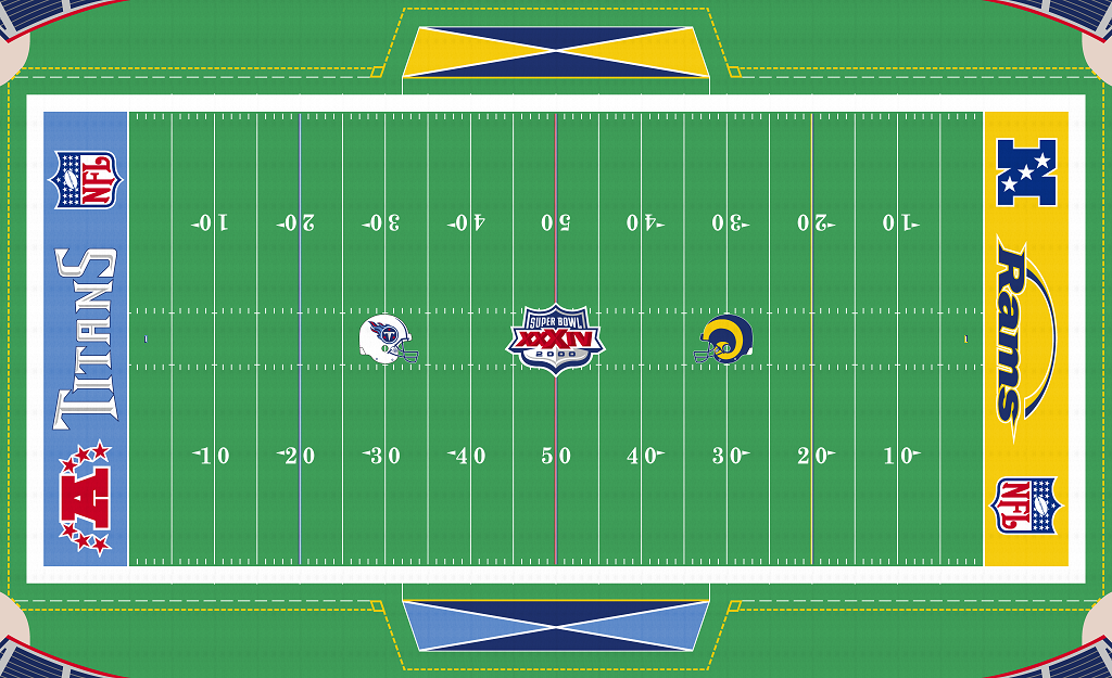
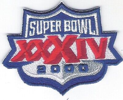
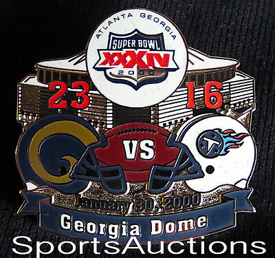
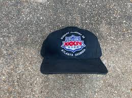
My second overall pick is the Super Bowl 34 logo. Super Bowl 34 was in 2000. The game was played at the Georgia Dome in front of a crowd of 72,625. In that game the St. Louis Rams beat the Tennessee Titans 23-16. When I see this logo the NFL on Fox theme plays in my head. This is like the perfect use of the shape of the NFL logo as an event logo. Like the football crown logo I would have liked to see more Super Bowl logos incorporate the NFL logo. This logo is imposing and in your face without being too much.

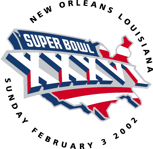
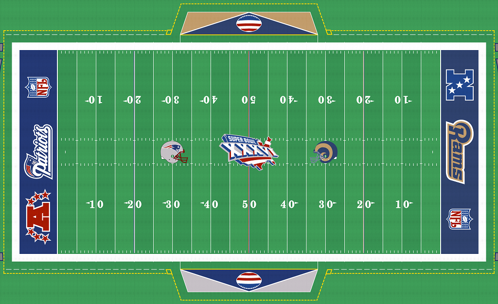
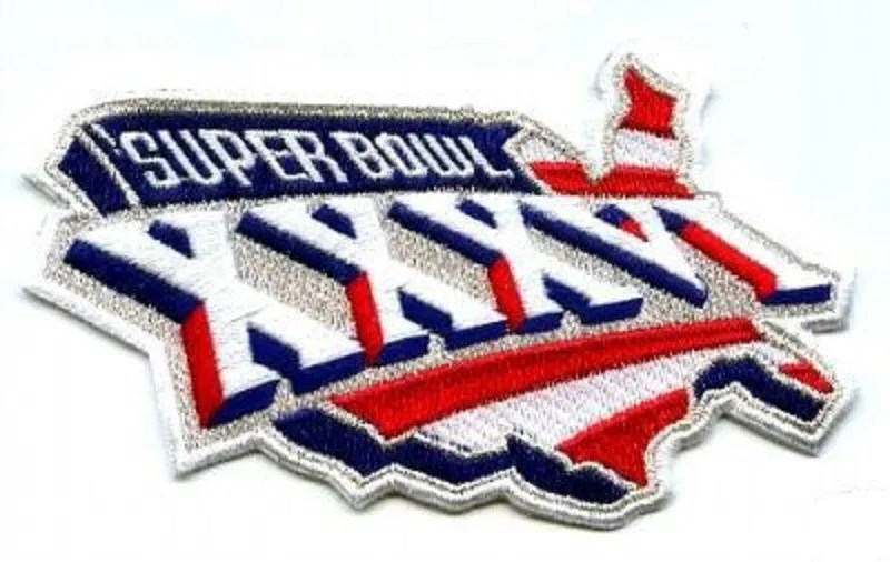
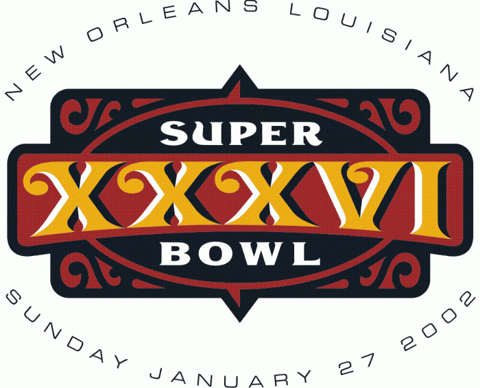
My top pick is the Super Bowl 36 logo. Super Bowl 36 was in 2002. The gqame was played a few months after the 9/11 attacks. The game was played at the Louisiana Superdome in front of a crowd of 72,922. In that game the New England Patriots beat the St. Louis Rams 20-17. The logo was changed. The whole theme was changed to be more patriotic. This is what every Super Bowl logo should try to be. something unique that unites everyone. Having a shape behind that represents the event with the roman numerals is what it should be. I like the flat version of this logo just as much.


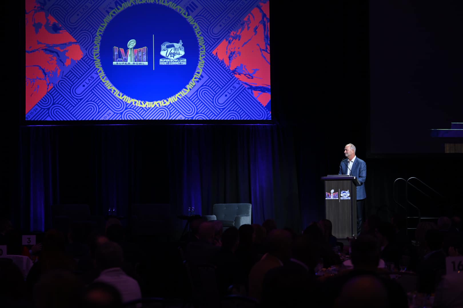
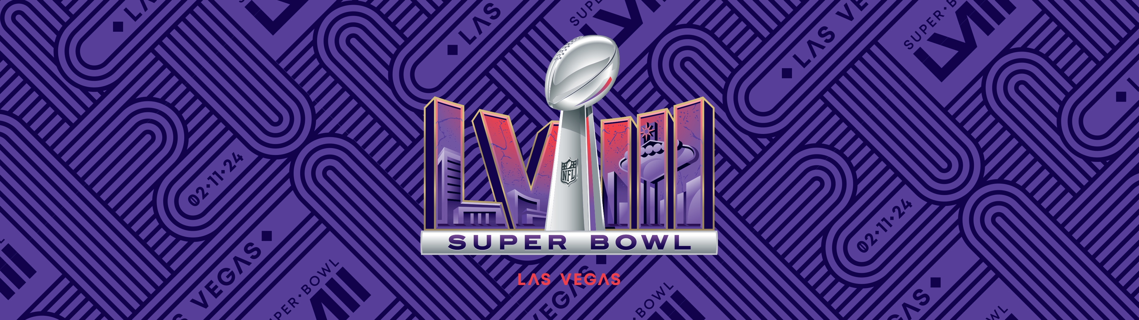
The Super Bowl 58 logo is part of the contemporary era of Super Bowl logos. Since Super Bowl 56 the logos have all kind of looked like this. I think this is the best one since 2007. The colors are fantastic. The Las Vegas sign in the logo is great. What sets this logo above the others in the last seventeen years is that instead of looking flat the roman numerals are curved making the trophy look like it is in front of them.


Leave a comment