It was reported at the beginning of this month that the Los Angeles Kings and Anaheim ducks would be getting rebrands ahead of the 2024-25 season. Both teams would likely show off their new brands prior to the 2024 NHL draft later this month. The Los Angeles Kings hinted at their rebrand yesterday. Today they released their new brand. There are now new logos for the Kings. Their new jerseys are reported to come next week.
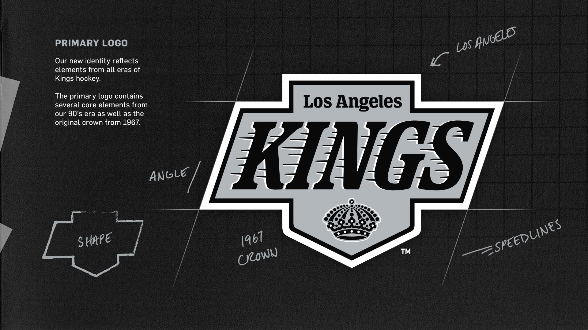
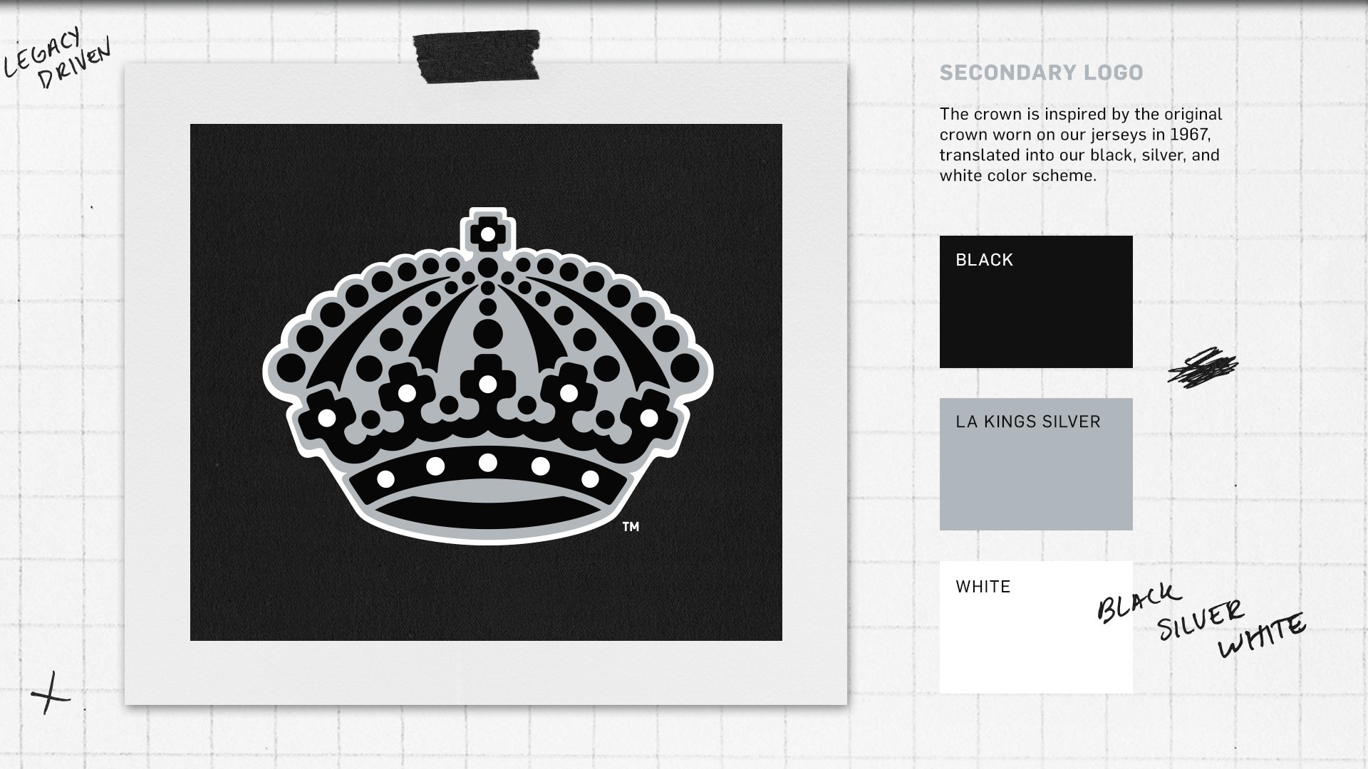
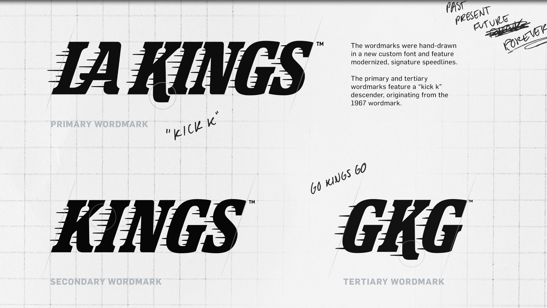
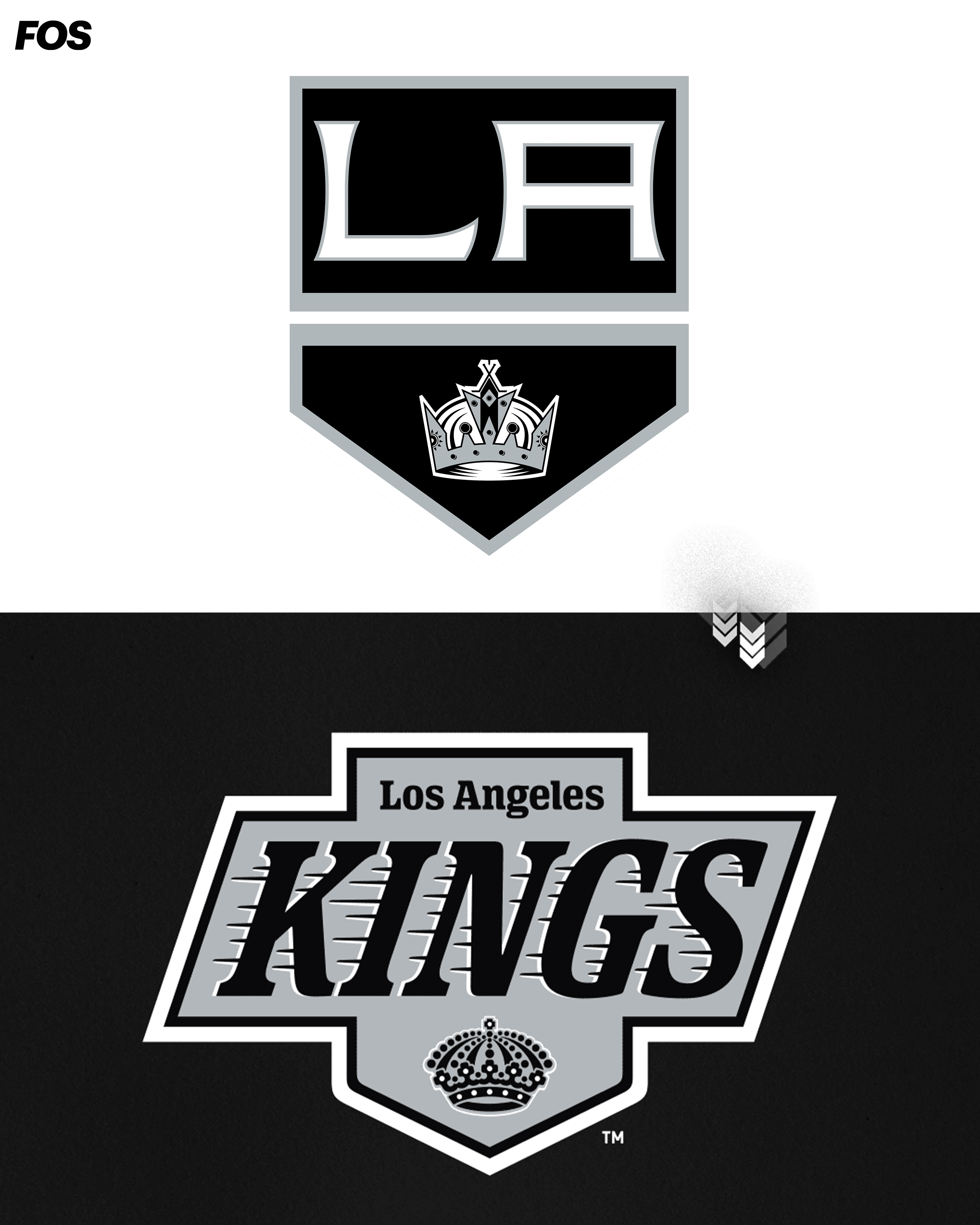
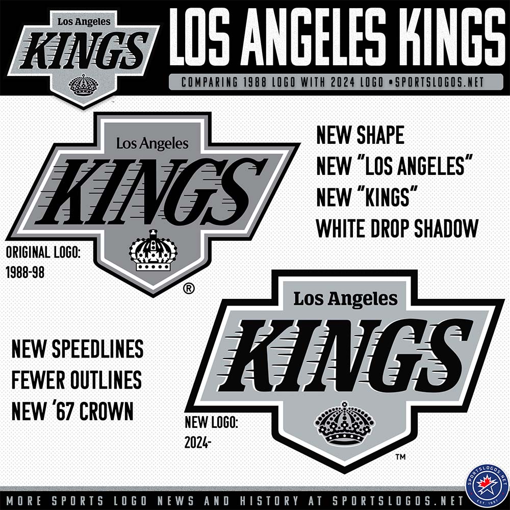
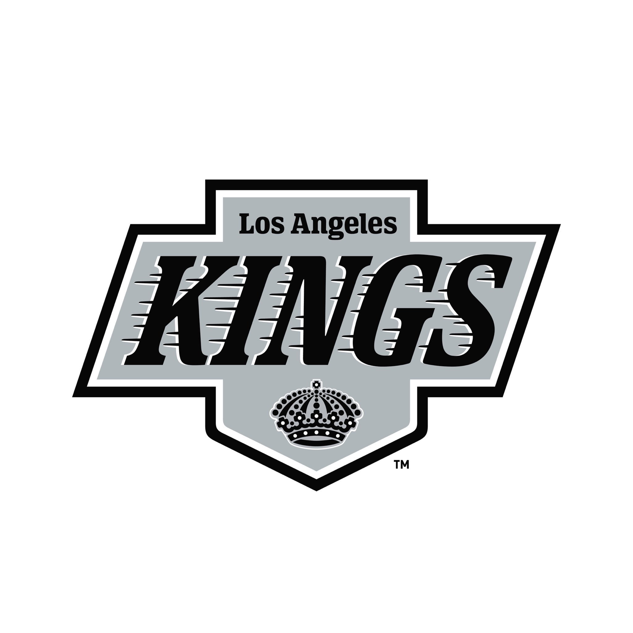
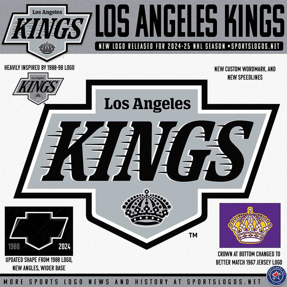
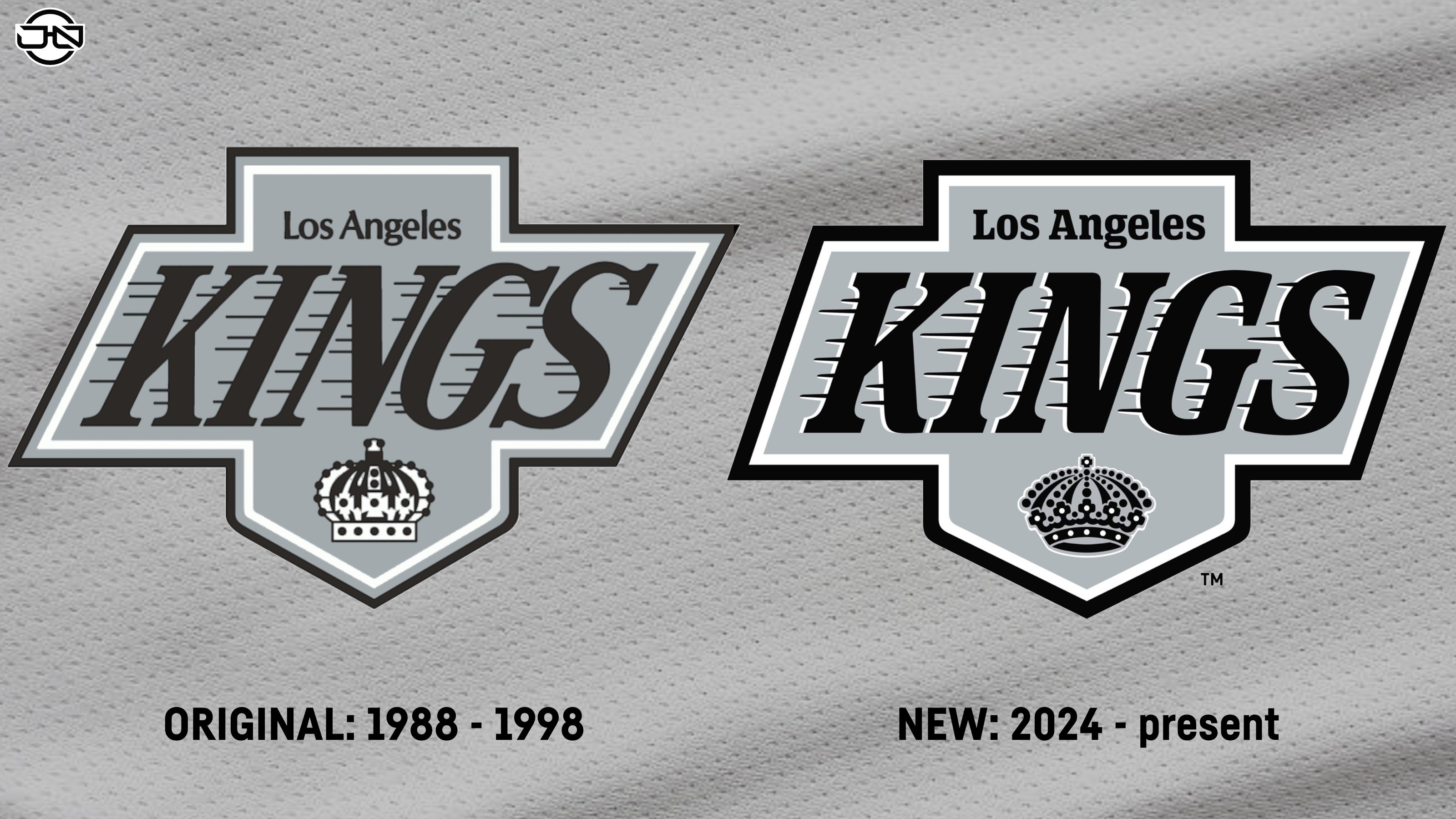
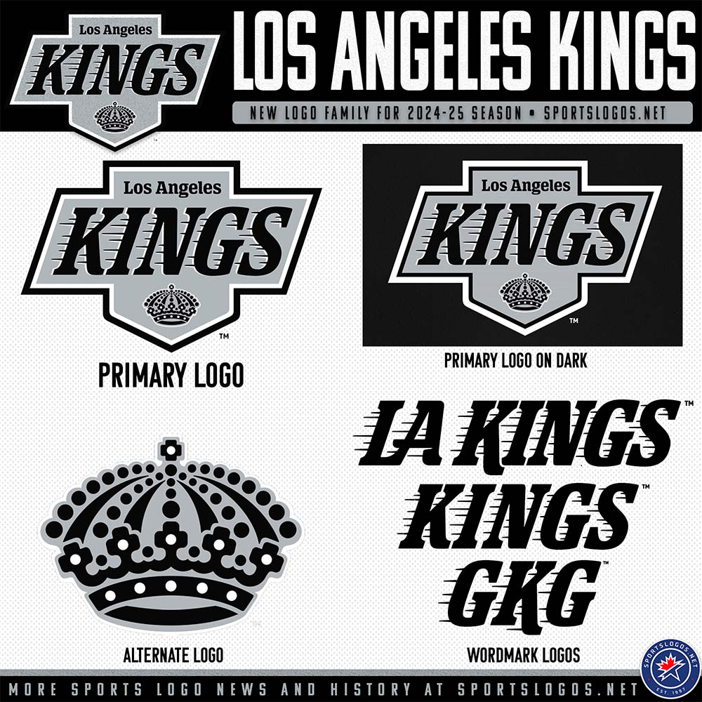
The new Los Angeles Kings primary logo is an updated version of the primary logo they used from 1988 to 1998. The logo is being called the “Chevrolet logo”. It does have a very similar shape to the motor company logo. The Kings are keeping the black, grey, and white colors. Lots of fans were hoping for a return to their old purple and gold colors. I prefer their 1998 to 2011 colors of black, purple, and grey. I think they should have this black, grey, and white as their logos with black, purple, and grey colored jerseys. They could have purple and gold alternate jerseys. That also introduced a new crown logo. The new crown logo is inspired by their original crown logo. This is another NHL brand that has gone backwards instead of pushing the brand forward with something new. This brand change was pushed for by the fans reception to the Los Angeles Kings throwback jerseys. What the Kings have not said is that this might have been done in an effort to separate the Los Angeles Kings brand from the Vegas Golden Knights Brand. Until now the two teams have had similar logos. If things were different in 2020 the Kings may have branded sooner.
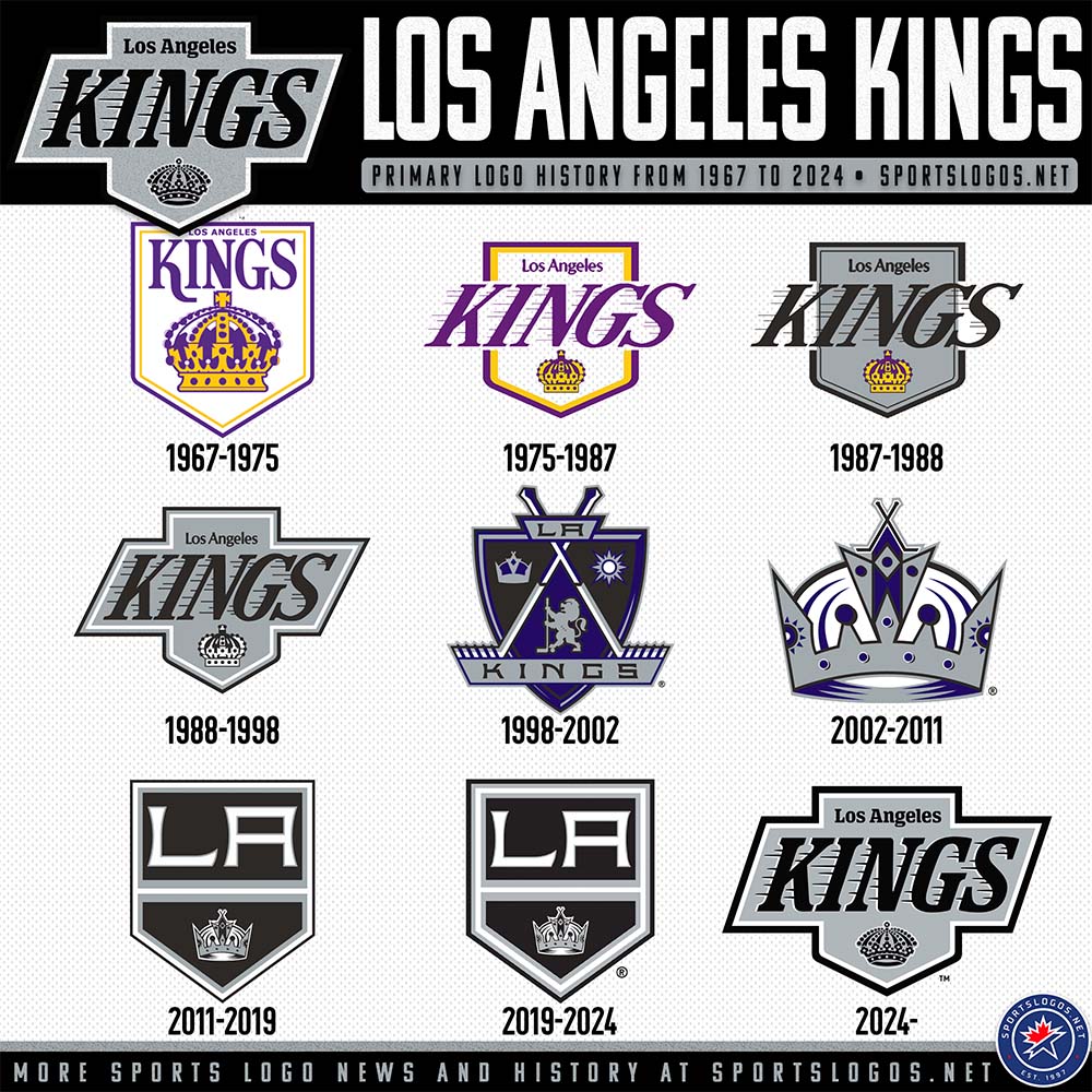
The Los Angeles Kings have had nine primary logos over their fifty six year history. I have always liked the 1998-2002 primary logo. I have never been a big fan of the Los Angeles Kings just using a crown logo. I do like the font in their 2011 logo.

Leave a comment