
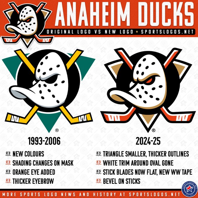
The Anaheim Ducks of there National Hockey League revealed their rebrand on Wednesday. There rebrand included all new logos and jerseys. They were the second team to reveal their new jerseys on Wednesday. They are also the second team this year to reveal new logos. The Ducks did a lot in the lead up to the reveal. This is the third time the Ducks have completely rebranded. Their last big rebrand was in 2006 after the Walt Disney Company sold the team. At the time it was controversial as they changed their name from the Mighty Ducks of Anaheim to the Anaheim Ducks. They also got rid of their iconic logo and colors. At the time living in Bakersfield California I remember the rebrand very well. There were a lot of ducks fans at the time in Bakersfield. The Bakersfield Condors were also the Ducks ECHL affiliate starting in 2008.
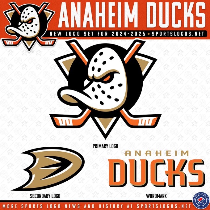
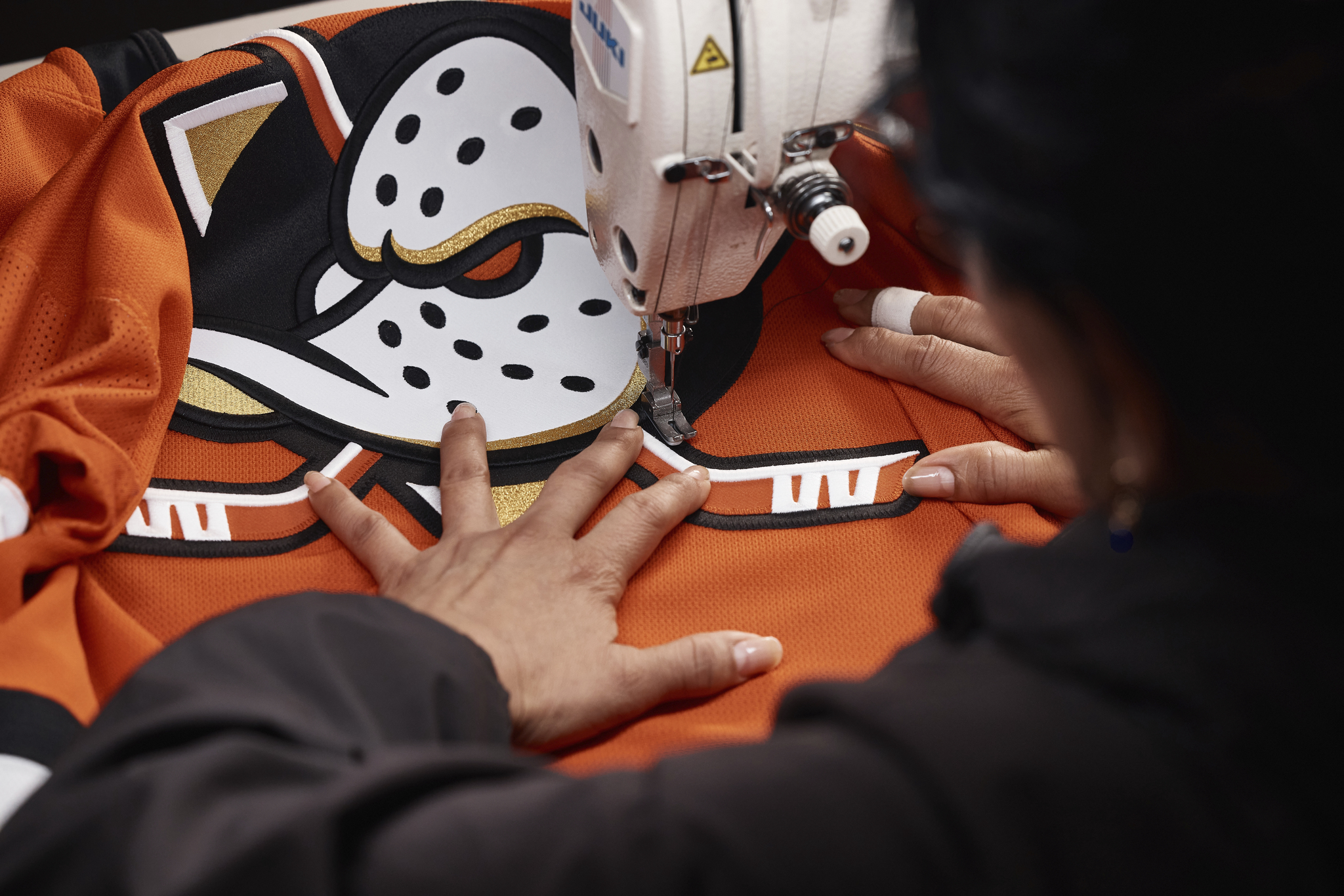
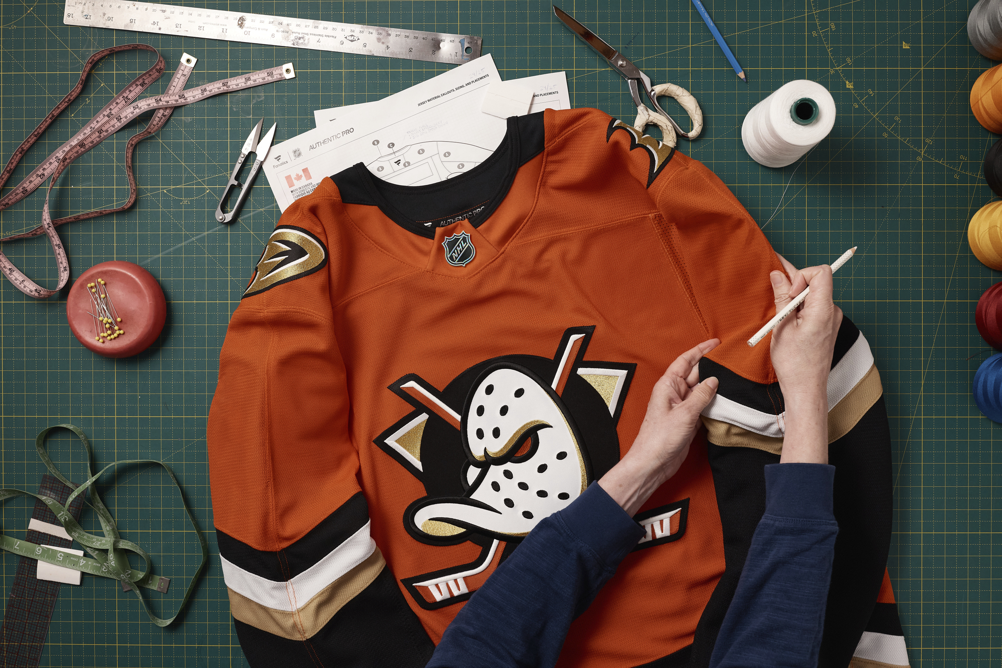
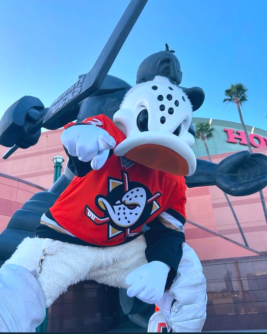
There was a lot of speculation about what the Anaheim Ducks were going to do. They kept the orange, gold, and black colors. They did not go back to their classic colors of green, purple, black, and yellow. Both of those color schemes can be found on ducks in the wild. The Ducks are moving away from the duck foot as their primary logo. Their new primary logo is a redrawn version of their original logo. The logo features a reto hockey goalie mask in the shape of a duck head with two hockey sticks. The background of the logo is a triangle and a circle. They also redrew the duck foot logo and are keeping it as a secondary logo. They also have a new wordmark logo. The Ducks are heavily leaning into the orange with their new branding. The new primary logo is an improvement over the original. The wordmark logo looks great. I like the new duck foot logo. The old one is better but it would not have matched the theme of this new rebrand. Like the Los Angeles Kings the Anaheim Ducks looked to their past for this rebrand. The Ducks did a better job than the Kings at pushing their brand forward. At the same time I still would have liked to see something that didn’t directly take from past branding.
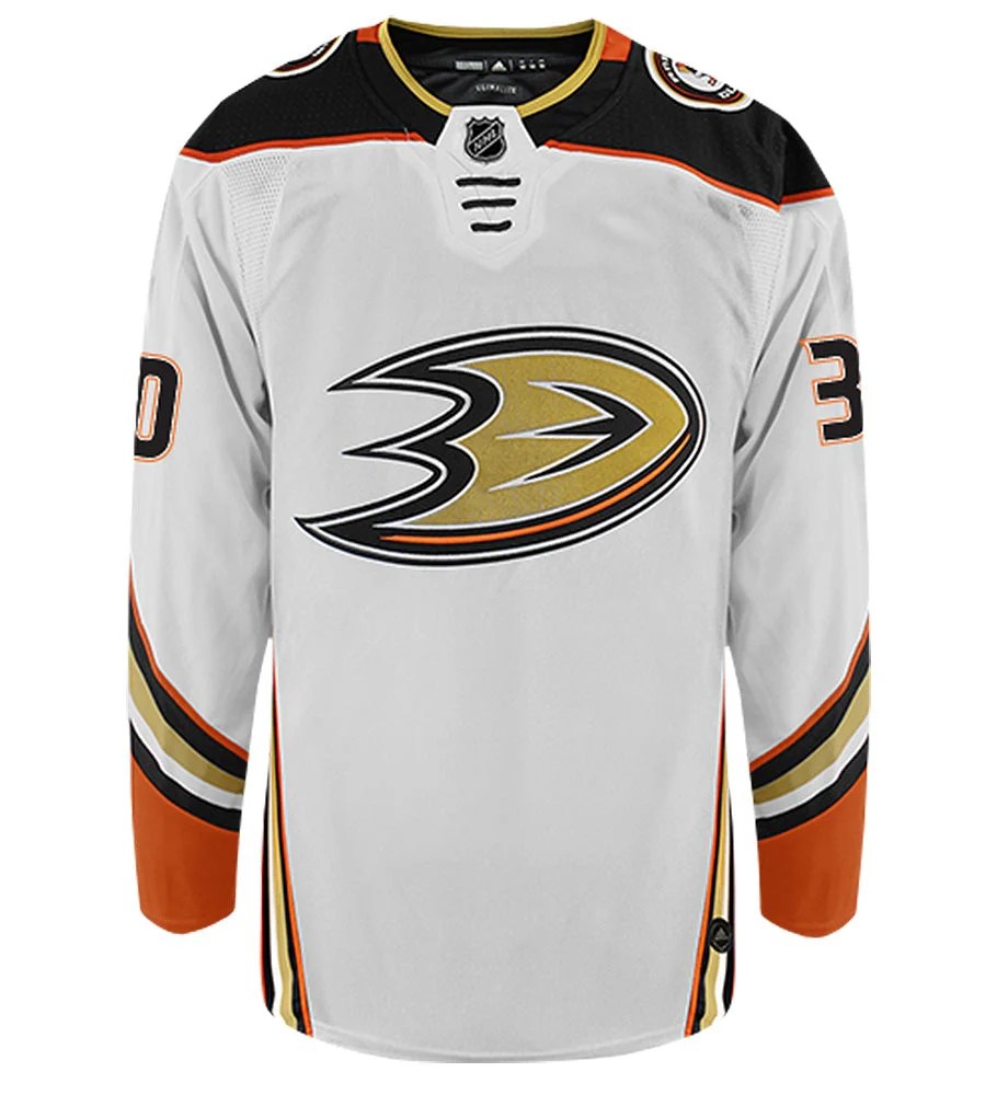
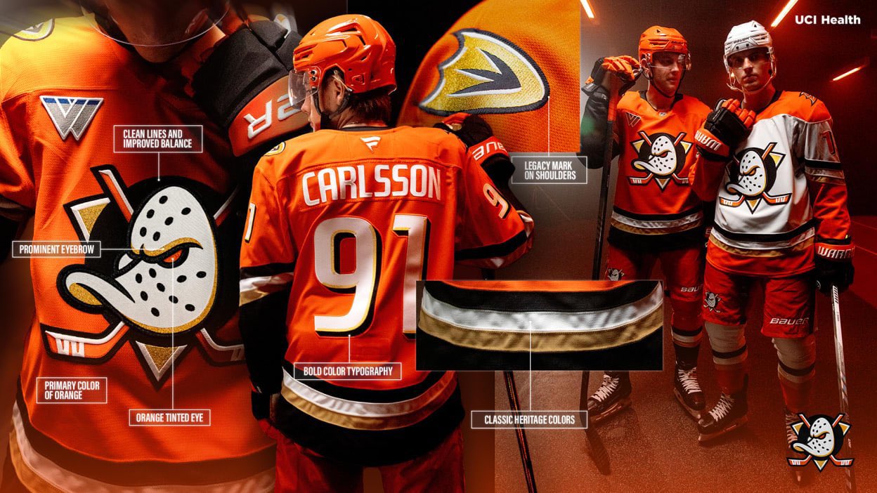
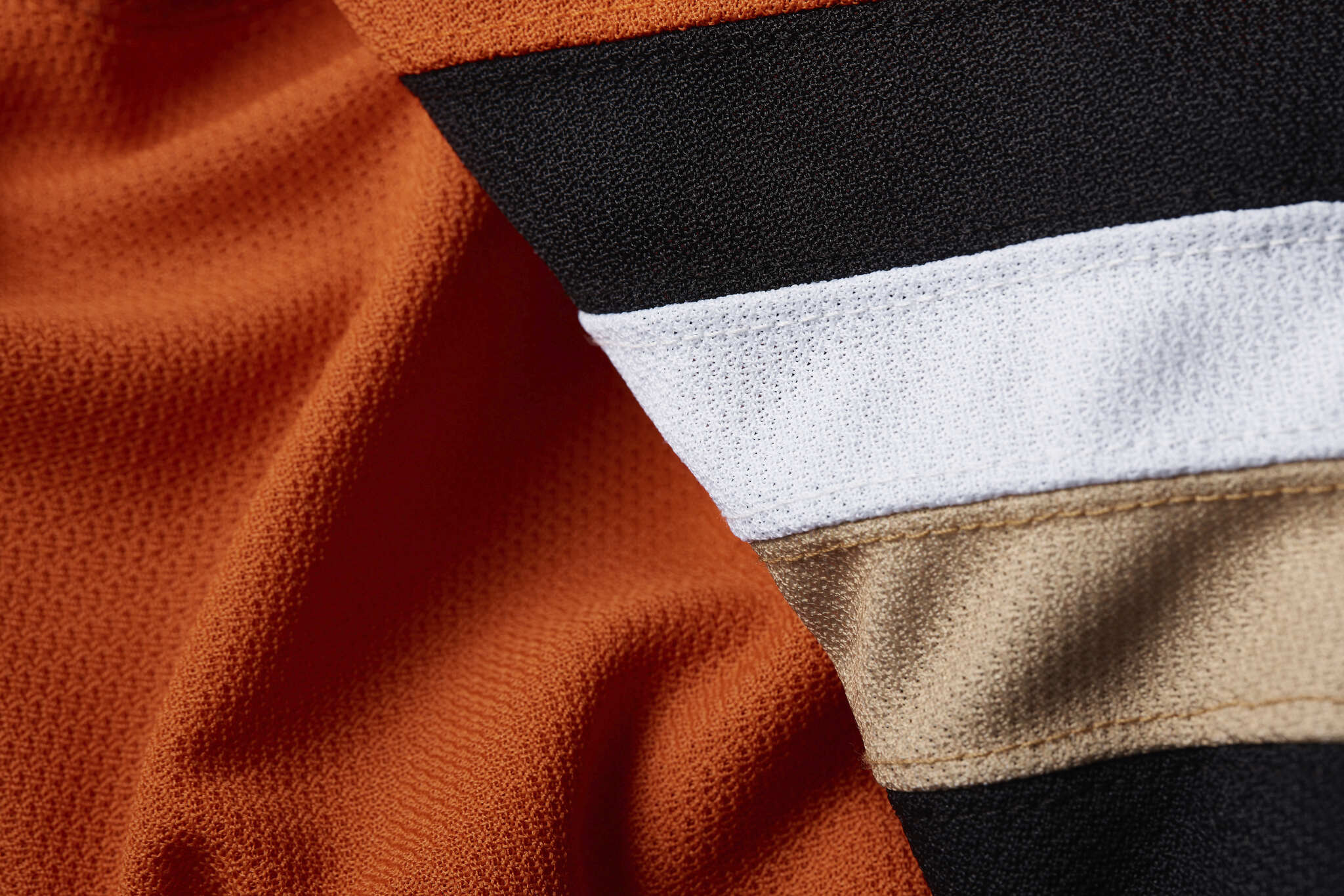
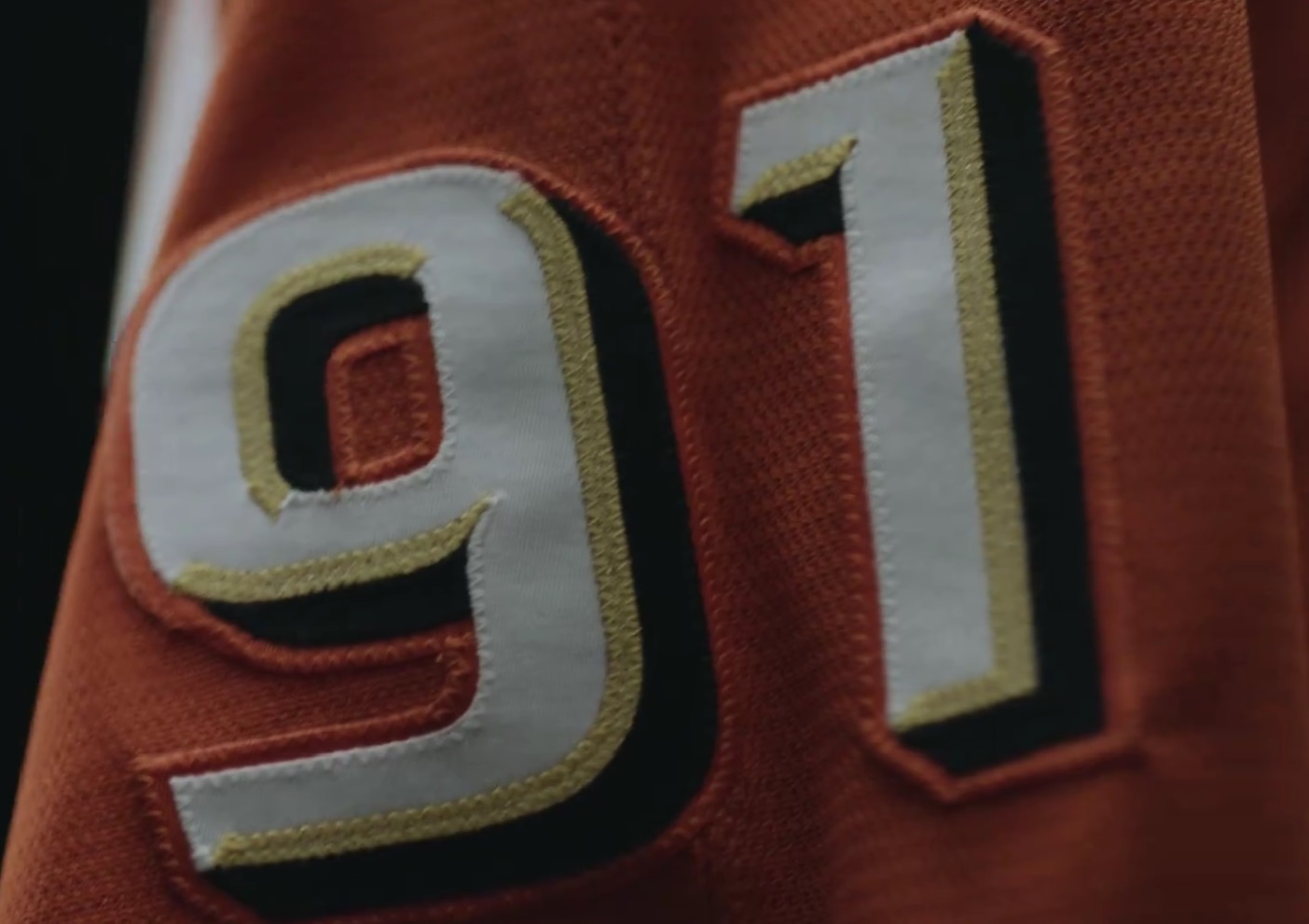
The Anaheim Ducks will now have an orange home jersey and a white away jersey. From 2006 up to last season the Duck had a black home jersey and white away jersey. Their previous jerseys were introduced in 2010 as an alternate jersey. Their new jerseys seem to be inspired by the Mighty Ducks of Anaheim jerseys worn from 1993 to 2006. The stripping on the sleeves is kind of revered of what the original jerseys had. Instead of going diagonal on the bottom of the jersey, the tripes are straight. The white jersey has orange shoulders. On the font is the new primary logo. On the shoulders is the new duck foot logo. The jerseys are solid. I do like them. I like the orange becoming the home color. Black didn’t really work for the Ducks. Their main rival the LA Kings have had black home jerseys since five years before the Ducks existed. As a San Francisco Giants fan I love the colors. The only problem with these jerseys currently is that gold thread is used on the numbers and logos but not on the stripping. Their are two different shades of gold on the jersey. It is not an aesthetic choice. Gold material is available. The Vegas Golden Knights have gold jerseys. A lot of ducks fans were hoping that the Anaheim Ducks 2022 Reverse Retro jersey would become the full time jersey. That clearly didn’t happen but what we got continues to push the brand forward in an arguably better way.


Leave a comment