
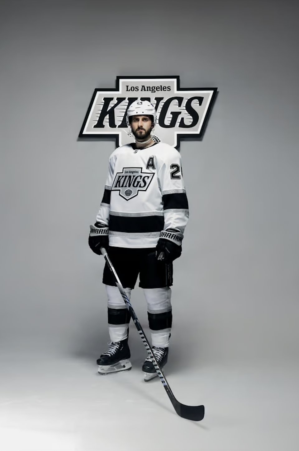
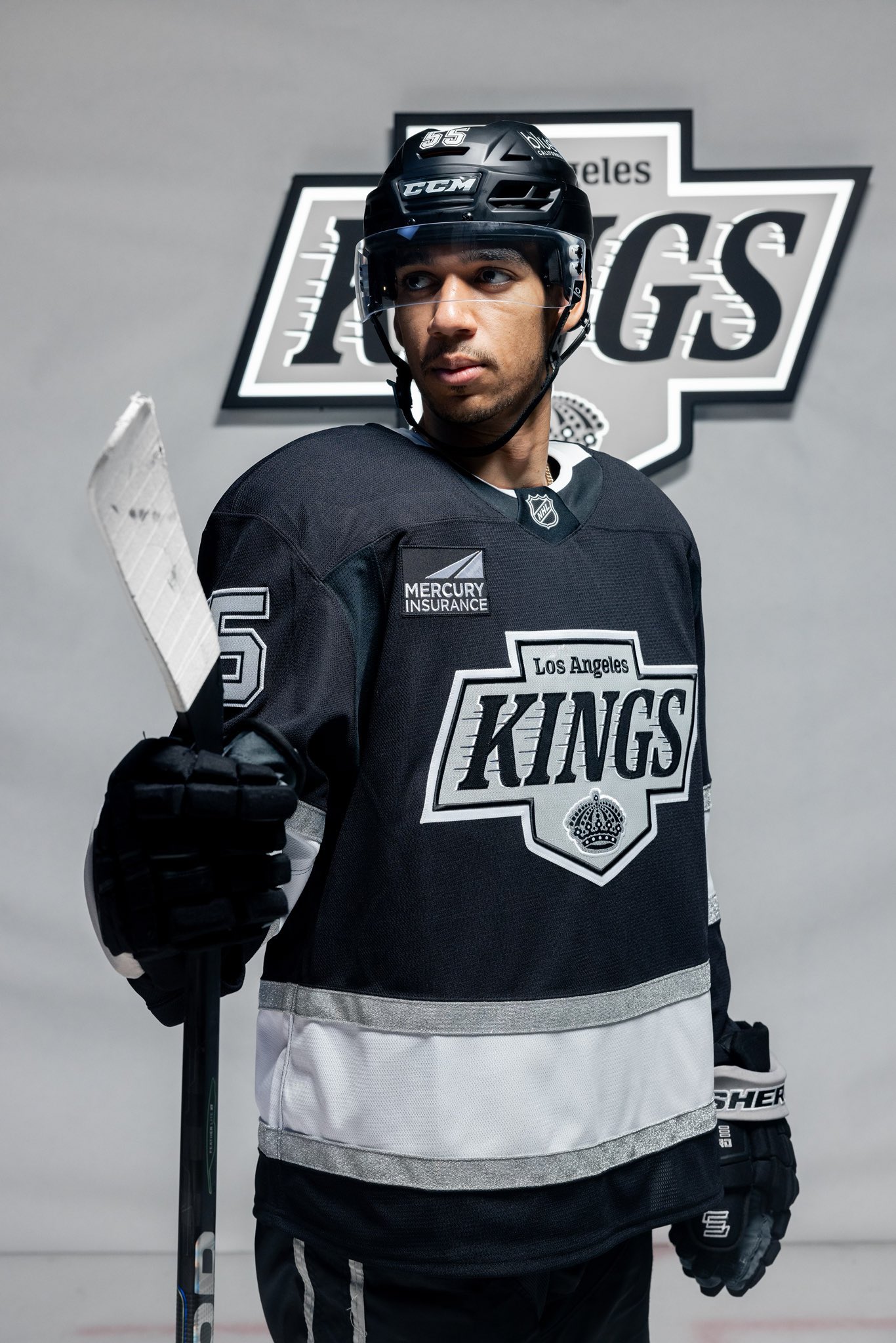
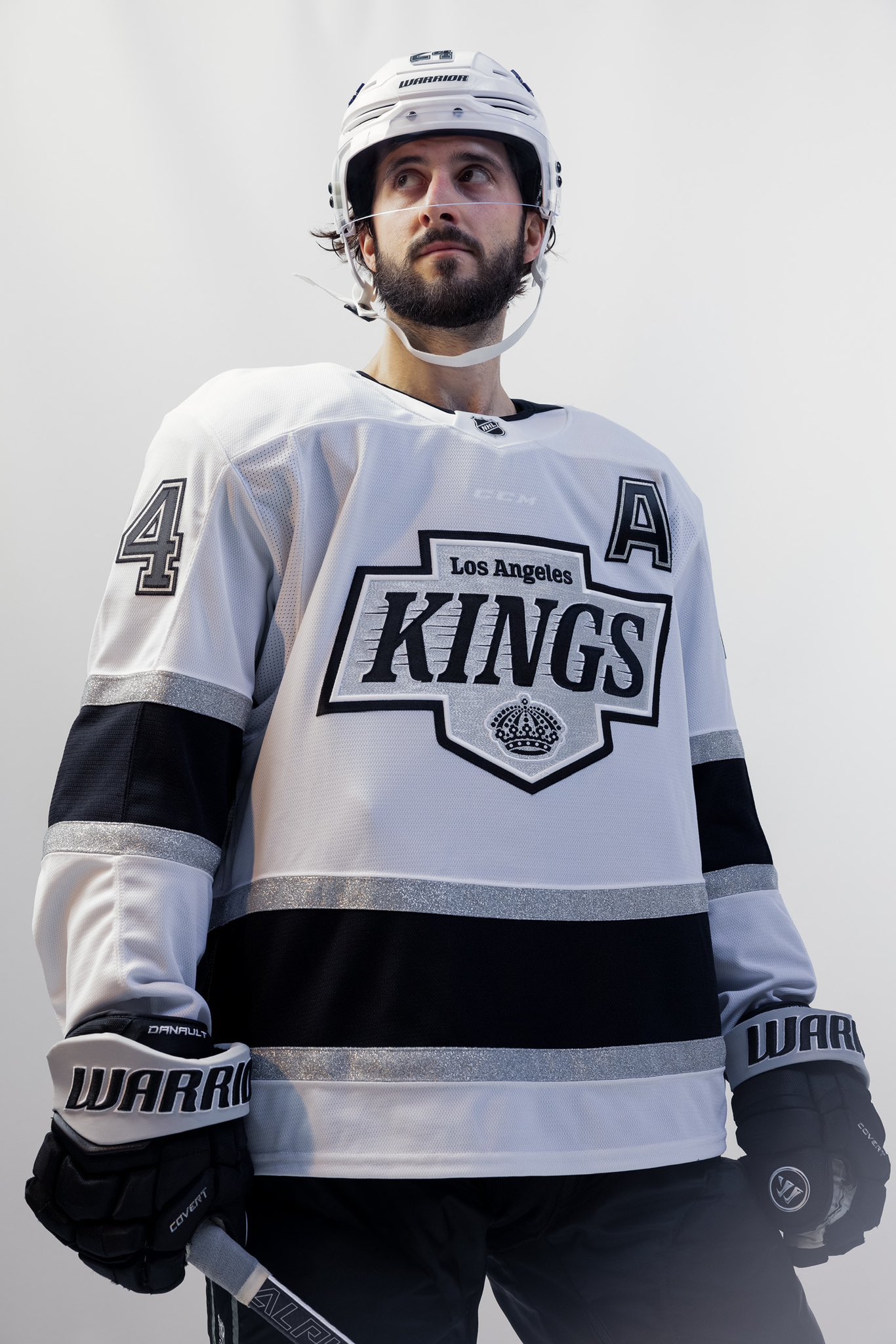
The Los Angeles Kings of the National Hockey League revealed new jerseys on Wednesday. This comes about a week after launching their new logos for the 2024-25 season. Their new brand direction is inspired by the Los Angeles Kings Wayne Gretzky era of the 1990s. The Los Angeles Kings new jerseys were highly anticipated. They fit with the new branding. They were well received by the fanbase.
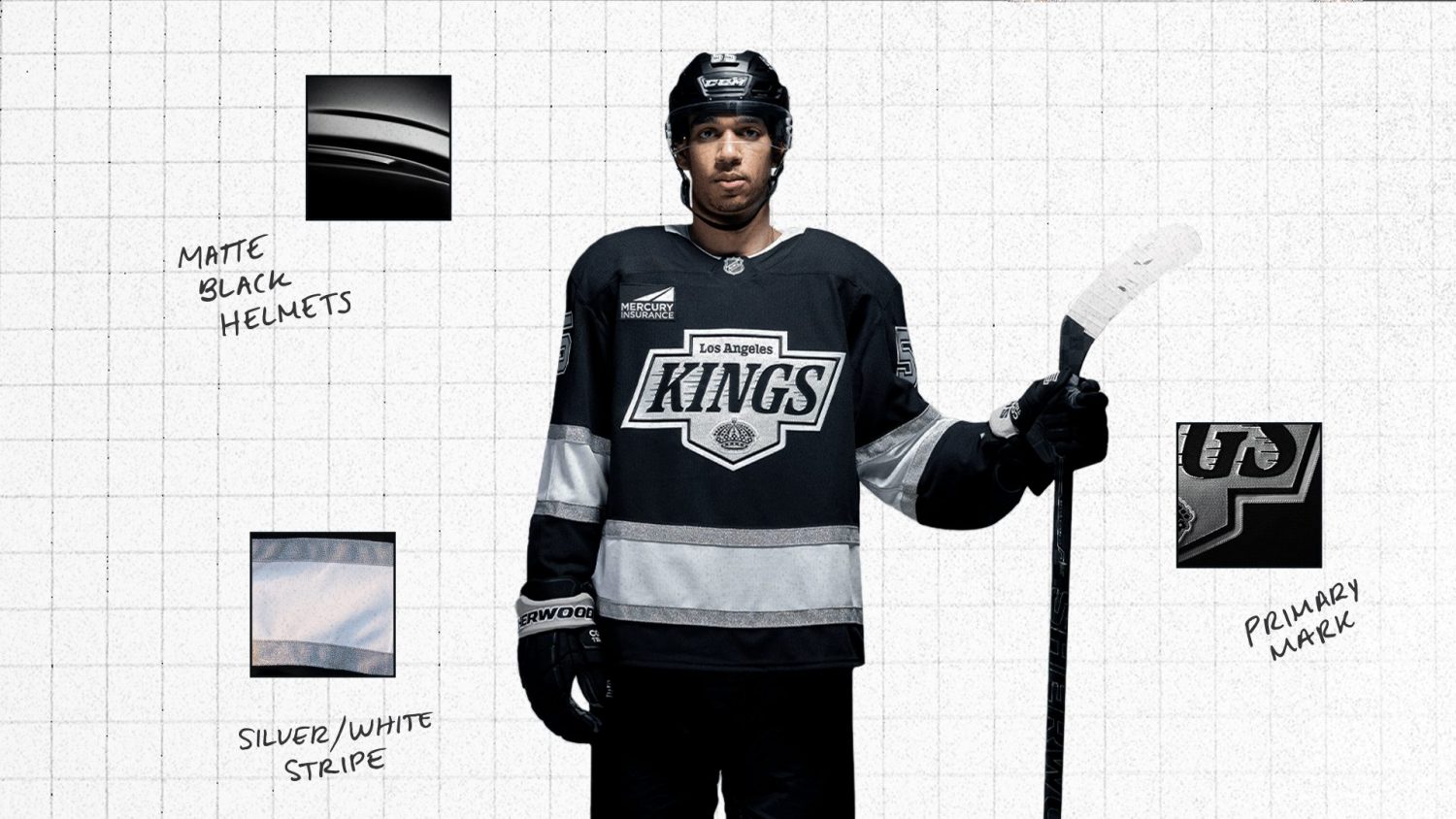
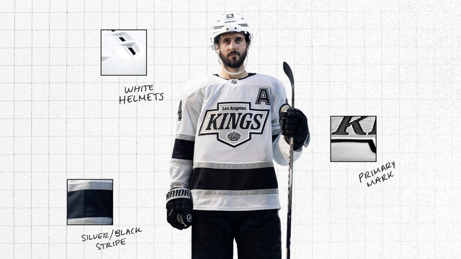
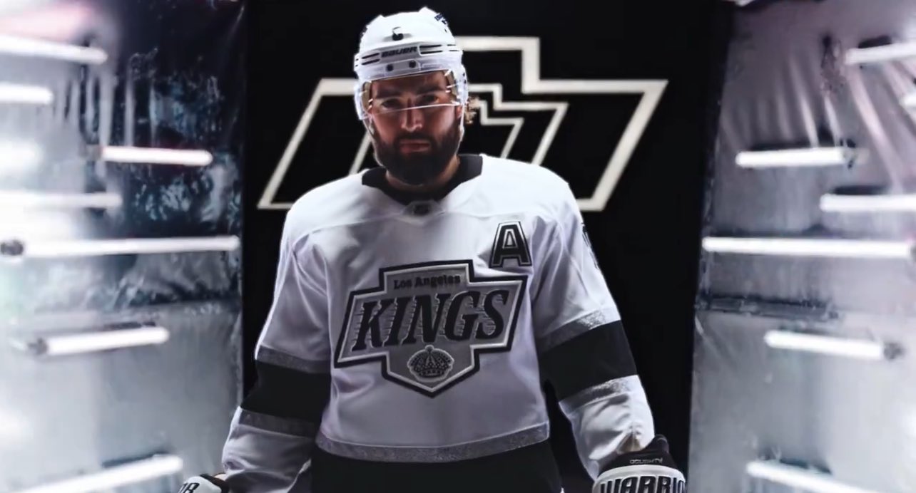
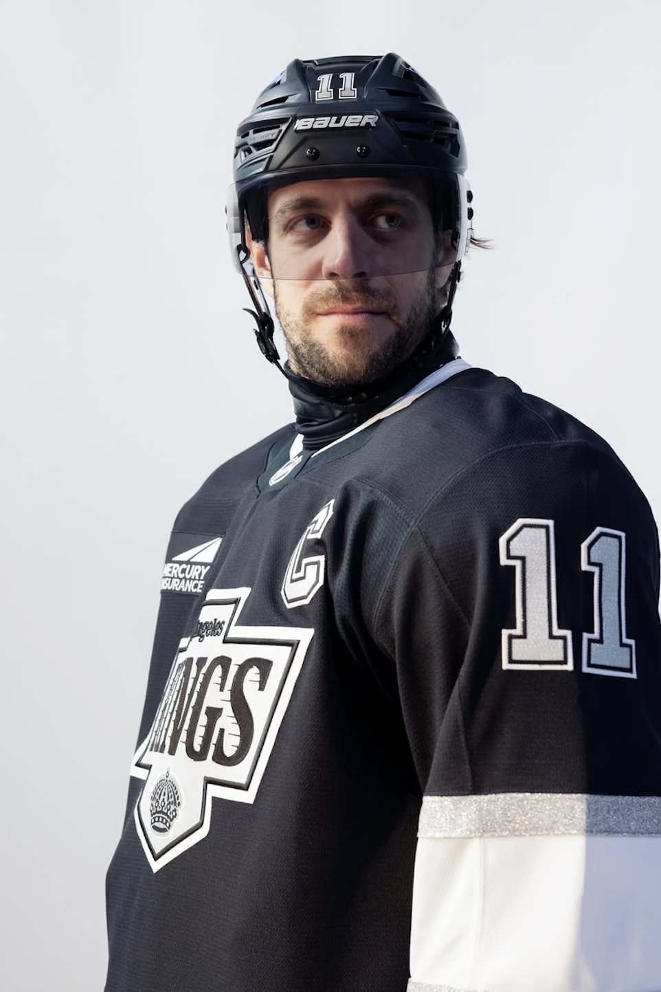
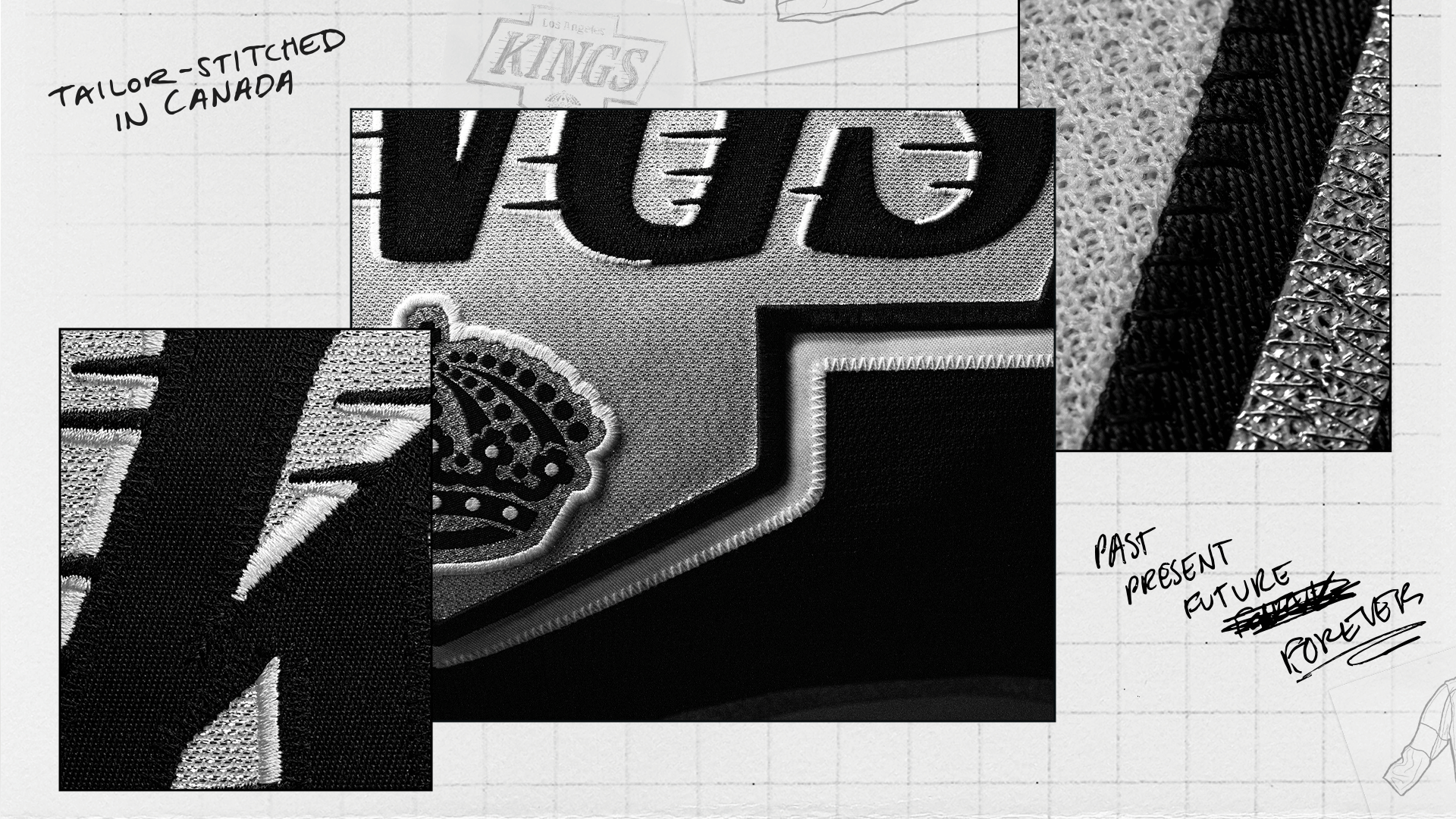
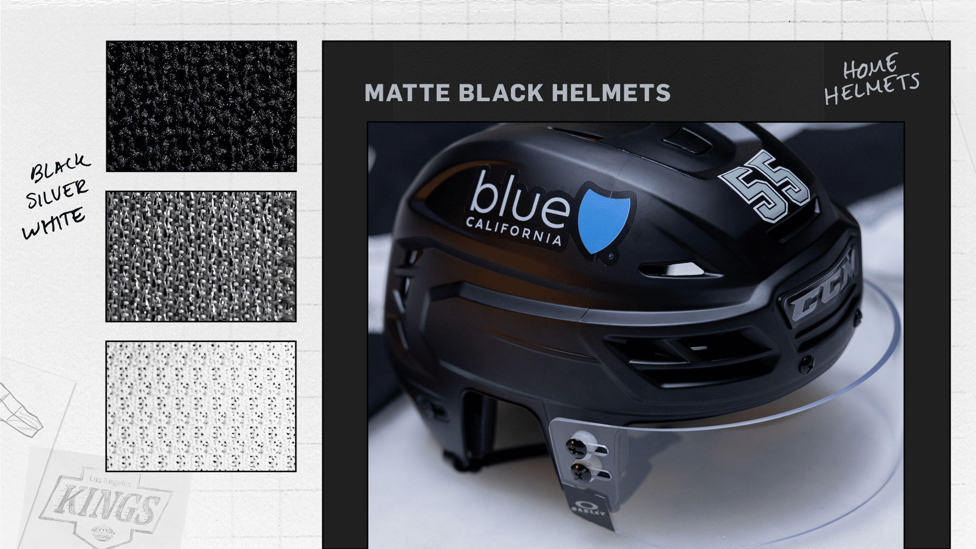
The New Los Angles Kings jerseys are inspired by the ones they wore in from 1988 to 1998. Their home jersey will be black with their away jersey being white. The Kings have had at least one black jerseys since 1988. The first difference between this jersey and the one that inspired it is the number placement. The numbers are higher up on the sleeves in this jersey. With the 1988 jersey the numbers were in the middle of the sleeve on top of the stripping. The most unique and best feature of this uniform are the silver stripes and silver on the logo. The material used makes it shine. The Kings did this before with their previous alternate jersey. To complete the look the helmets will have a matte finish. I don’t like how big the details are on these jerseys. Again like with the new logos I do not like how these jerseys are not really pushing the brand forward.
The new Los Angeles Kings jerseys are similar to the ones they wore last season that were introduced in 2008. The new jerseys do not have a stripe going down the sleeves. The little details on the wrists are gone. The bottom of the black jersey no longer has two thin stripes. The White jerseys have more similarities as they both have a similar three stripe pattern at the bottom of the jersey. Again there is no purple in the jerseys. Some Los Angeles Kings fans were hoping for a return of purple. Either as purple and gold or black and purple.


Leave a comment