The Professional Women’s Hockey League have announced their names and logos. The PWHL had their inaugural season during the 2023-24 season. The PWHL is the latest attempt at a professional women’s ice hockey league. The PWHL had six teams in their first season. All six of the teams were not given names or logos. Despite that the PWHL had a strong first season. They did out preform all of their predecessor leagues. The PWHL had an average attendance of 5,448. They averaged more than the ECHL and almost as much as the AHL. However the PWHL only played 12 games while the ECHL and AHL play 62 and 72. Earlier this month the PWHL announced their team names and logos.
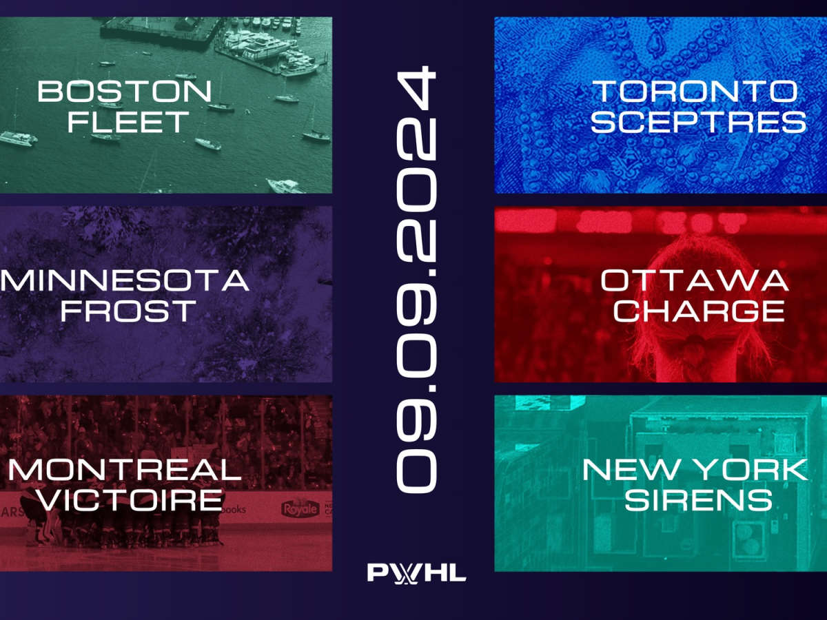
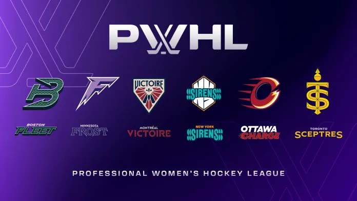
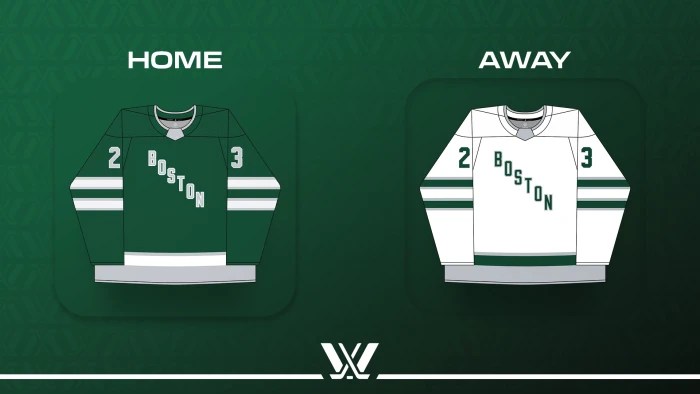
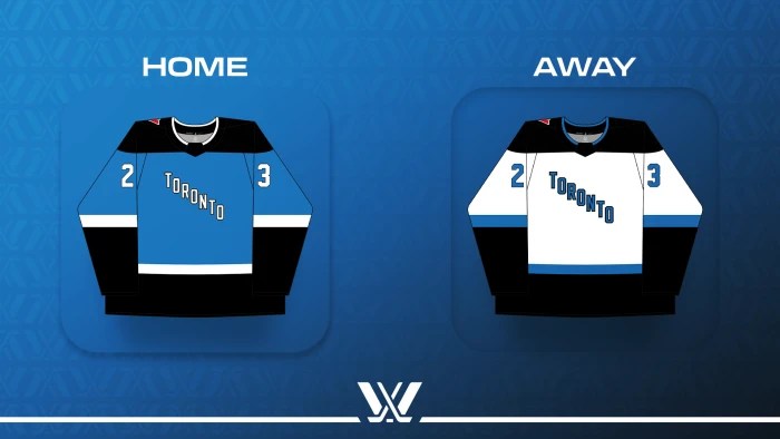
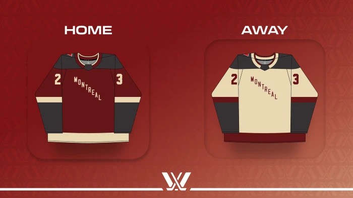
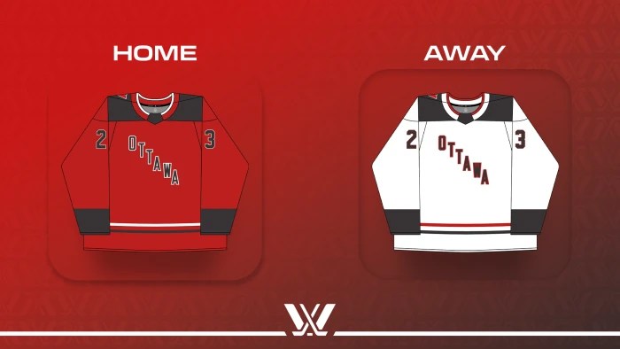
PWHL Boston are now the Boston Fleet. They play at the 6,003 capacity Tsongas Center. PWHL Minnesota are now the Minnesota Frost. They play at the 17,954 capacity Xcel Energy Center which is also the home of the Minnesota Wild of the NHL. PWHL Montreal are now the Montreal Victoire. They play at the 10, 062 capacity Place Bell which is also home to the Laval Rocket of the AHL. PWHL New York are now the New York Sirens. They play in the 16,514 Prudential Center which is also home to the New Jersey Devils of the NHL. PWHL Ottawa are now the Ottawa Charge. They play in the 8,585 capacity TD Place Arena which is also the home of the Ottawa 67’s of the OHL. PWHL Toronto are now the Toronto Sceptres. They play in the 8,100 capacity Coca-Cola Coliseum which is also home to the Toronto Marlies of the AHL.
The Boston Fleet has a revolutionary war vibe to the name. The Minnesota Frost is a solid name for a team from a place know for its cold winters. The Montreal Victoire is another solid name. It reminds me of some of the European hockey team names. The New York Sirens is not a good name. I just can not get on board with it but it is not the worst PWHL name. I get what they were going for but they could have picked a better name. The Ottawa Charge have a solid name. The first thing that comes to mind though is the LA Chargers of the NFL. The Toronto Sceptres have the worst name in the PWHL and possibly all of pro hockey. I would have liked to see the team names be closer related to the cities hockey history. A bear or whalers theme would have fit Boston really well. Minnesota should have been the Arctic Blast. Minnesota also would have done great with a Minnesota North Stars or Minnesota Fighting Saints theme. Montreal have the best branding and I would not change it. It seems that the team is named after an old hockey team. If I had to change their name it would be the Montreal Voyagers with the same branding. Ottawa should have gone with a roman theme. They could have even had a latin name like Lupi (Wolves). Toronto should have had a Toronto St. Pats or Toronto Maple Leafs theme. They could have been the Toronto Torch, the Toronto Shamrocks, the Toronto Crowns.
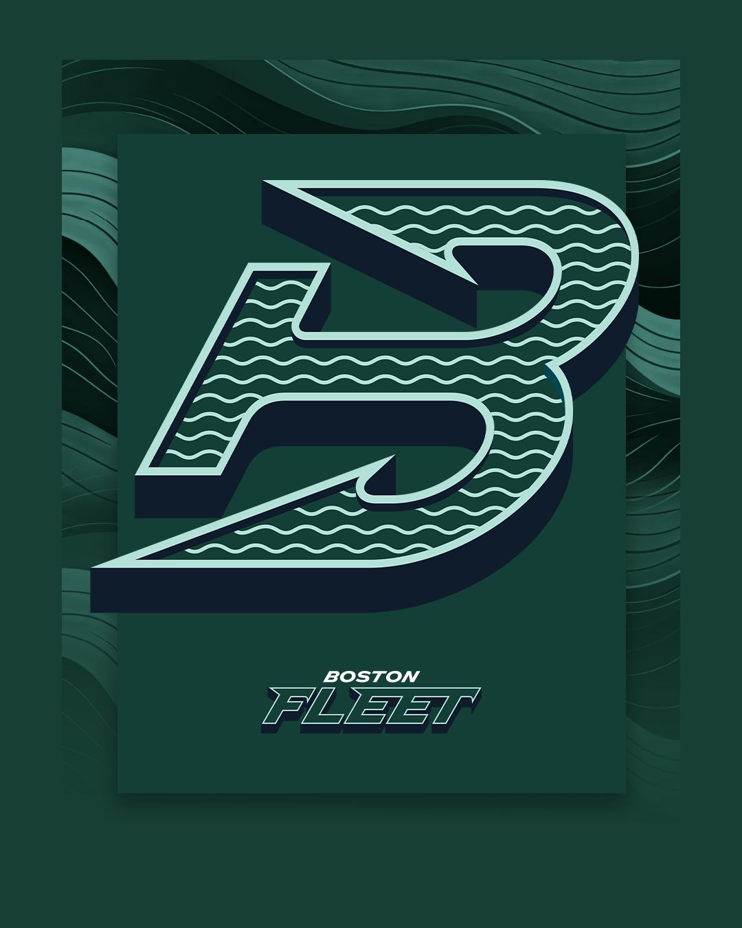
The Boston Fleet logo is an anchor in the shape of a B. The anchor represents Bostons maritime history. The waves represent resilience. The shape of the logo represents the team “sailing towards victory”. the The logo has gained some criticism for being close to the Hartford Whalers logo and the Binghamton Whalers logo. Their colors are forest green, aqua, navy, and teal. They did have grey in their colors last season. It does not look like they will keep grey moving forward. For the Boston Fleet it is hard to overlook the New England sports history that they are referencing. their colors are very similar to the Hartford Whalers. The forest green and navy colors are darker shades of the Hartford Whalers green and blue. The colors could also been seen as a reference to the Boston Celtics of the NBA who have a green and white color scheme. Having the logo as a B is identical to the Boston Bruins who have a B for their primary logo. There are lots of references in this logo that the team have not directly addressed.
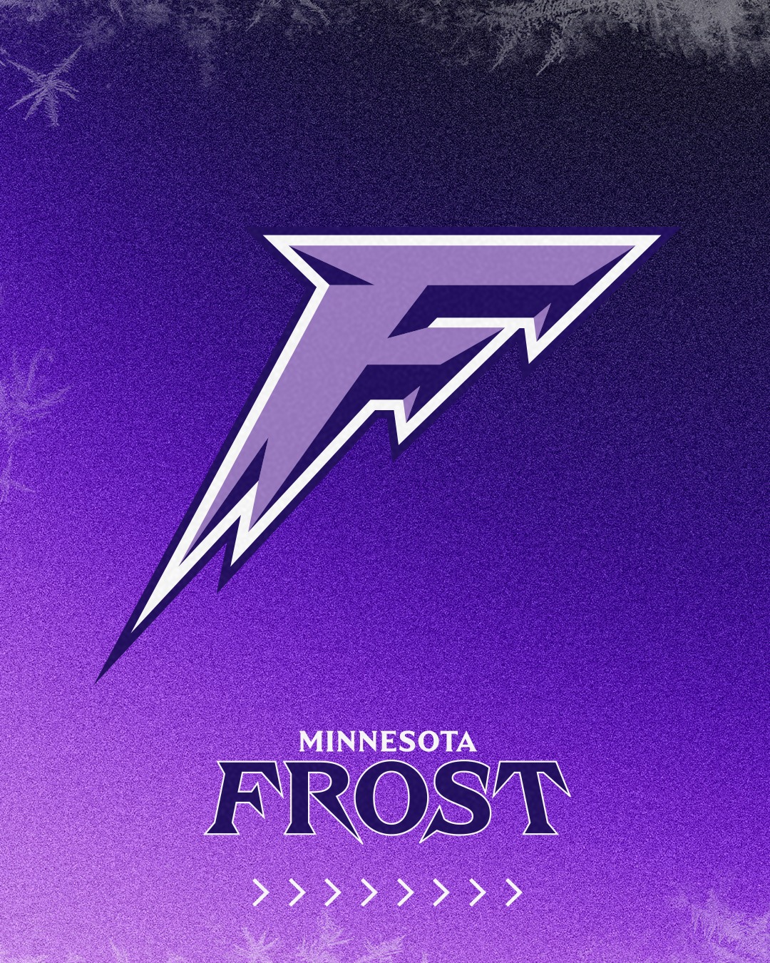
The Minnesota frost logo is an F. Minnesota is sticking with the theme of teams having the letters as their logo. The shape of the logo represents icicles in motion. The sharp edges and points represent “cold precision”. It is also supposed to represent the depth of winter. This logo seems to be a reference to the Minnesota North Stars logo. It is a single letter with depth effect that has elements of the team name surrounding the letter. Their colors are purple, lavender, and white. Last season they were just purple and black. This season it looks like they are ditching the black. I really do like this logo. My problem with the Minnesota Frost logo is that their is no depth or theming beyond the team name. For example they could have had a snow fox logo which could have tied them back in with other local teams having animal theming.
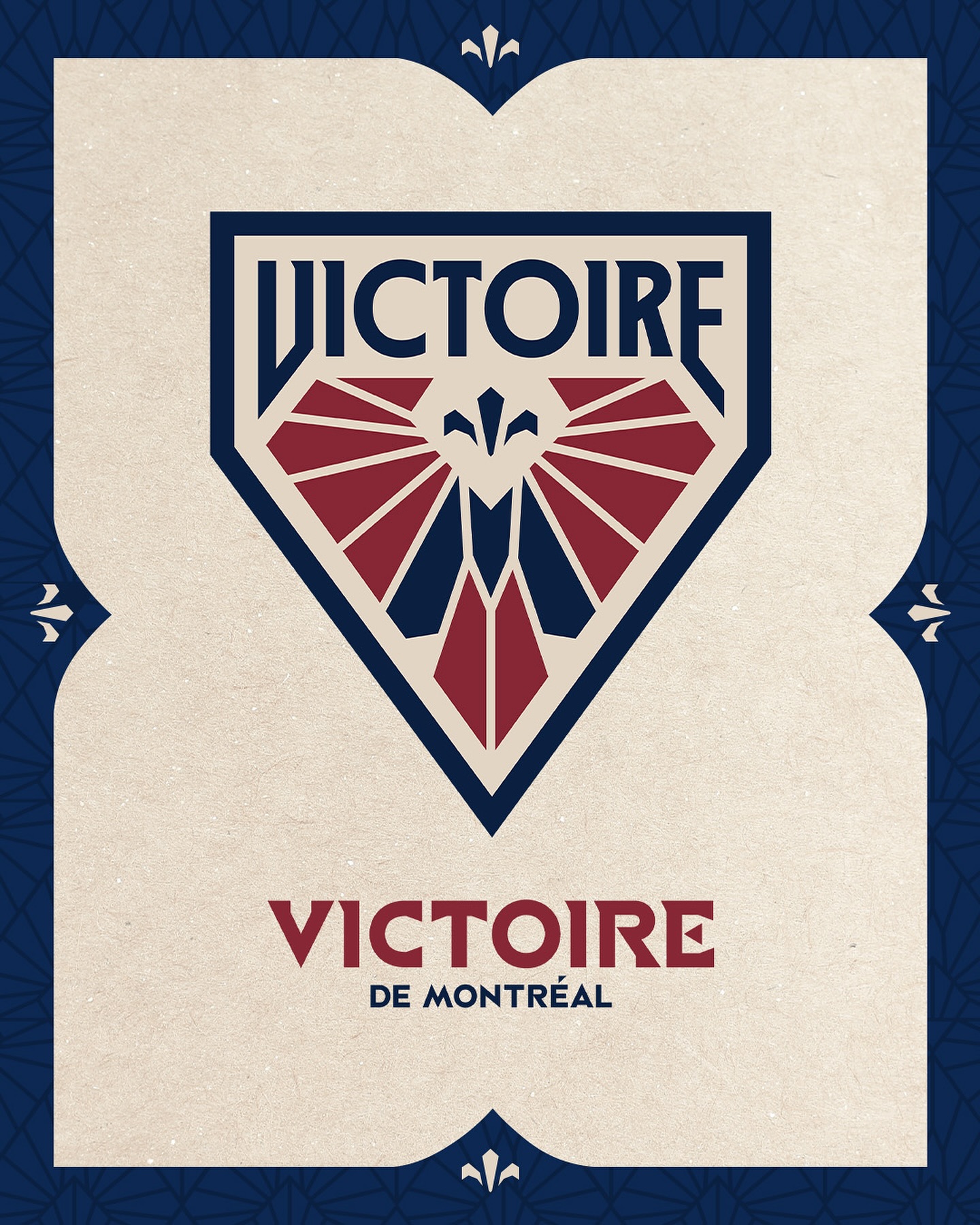
The Victoire de Montreal logo is a crest. It reminds me a lot of soccer crests. The logo is in the shape of an irregular pentagon similar to a home plate in baseball. It includes the team name, an M for Montreal, wings, and a fleur-de-lis. The fleur-de-lis represents the heritage of Montreal. The M represents Montreal. The wings are the “wings of triumph”. The wings also form a subtle V. This logo is a great representation of what the PWHL logos could have been. It is subtle in its imagery. It connects itself to the city. It is simple and complex at the same time. It’s form invokes the ideas of a sports logo or brand without knowing what it is. Their colors are burgundy, sand, and storm. The colors are similar to other sports teams in Montreal. Most of the sports teams in Montreal have similar colors including the Montreal Canadiens of the NHL and the Laval Rocket of the AHL. Last season they had grey in their color scheme which seems to be replaced by storm.

The New York Sirens logo is another logo that screams sports logo. The logo is an NY monogram with the team name in front of it. The logo represents the teams drive. The NY is supposed to represent the iconic city. The S’s are supposed to represent waves of sound. The Sirens logo reminds me of the New York Islanders. Mostly because of the colors. The NY looks odd with the team name cutting through it. I am not a fan of the S design on either side of the team name. The top of the team name is not straight either which bothers me. The shape should look more like a goal light. The elements that are shown are alright. I think they could have done better. Their colors are turquoise, navy blue, white, and orange. These colors are similar to other New York based teams such as the New York Islanders, the New York Mets, the New York Knicks, and the New York Liberty. Last season New York also had grey in their colors. It looks like the grey was replaced by orange.
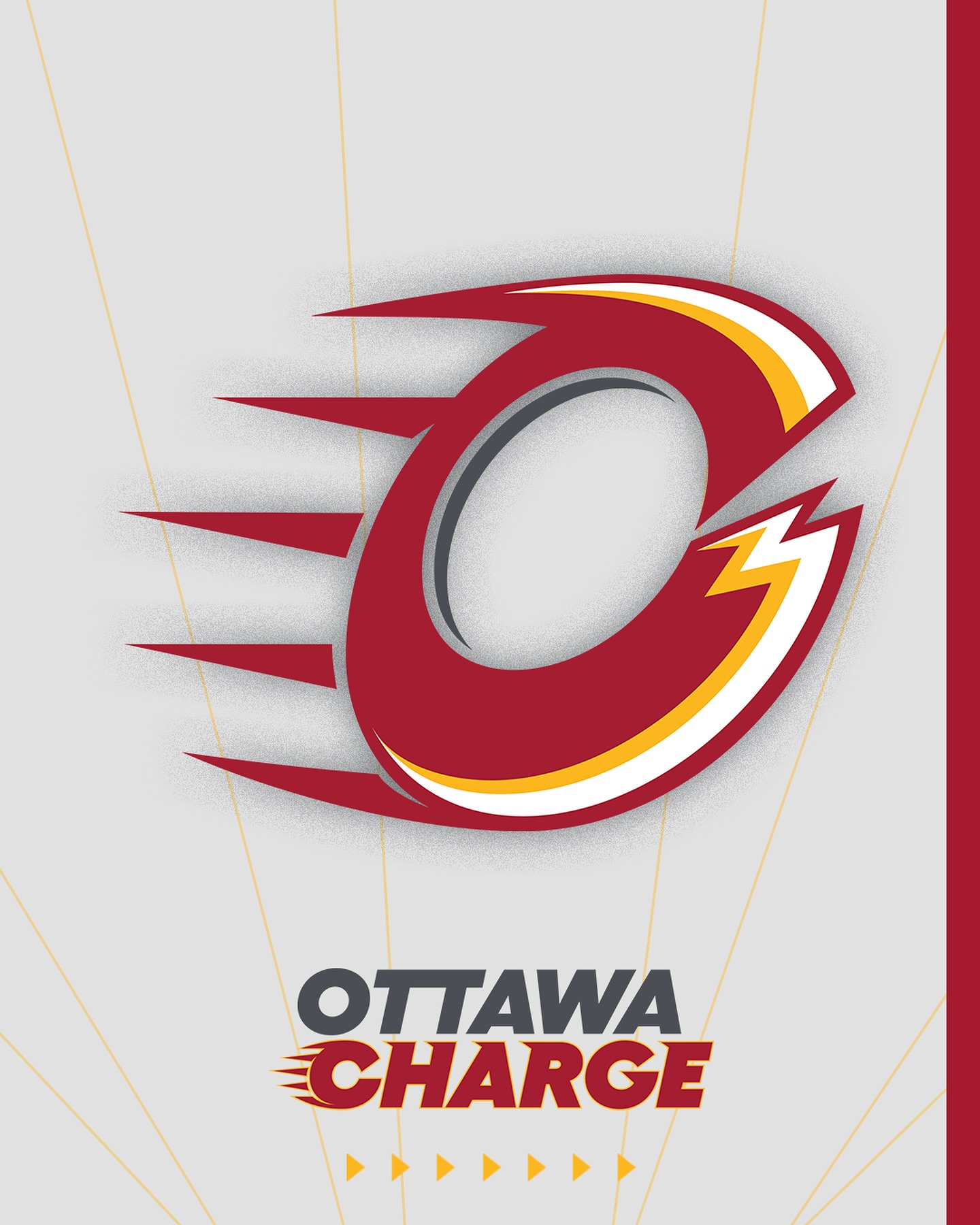
The Ottawa Charge logo is a C. The logo is representing electrifying power. The logo also represents speed and power. The inside is an O for Ottawa. The outside is a C for Charge. It is an effective use of negative space. Again it is another letter logo. This logo is controversial as it looks very similar to the Calgary Flames logo. That is the first thing I thought of when I saw it. It would fit perfectly as a Calgary Flames minor league team. Their colors are red, gold, white, and storm. Their colors match other local hockey teams such as the Ottawa 67s of the OHL and the Ottawa Senators of the NHL. Those are the same colors they used last season except they added gold.
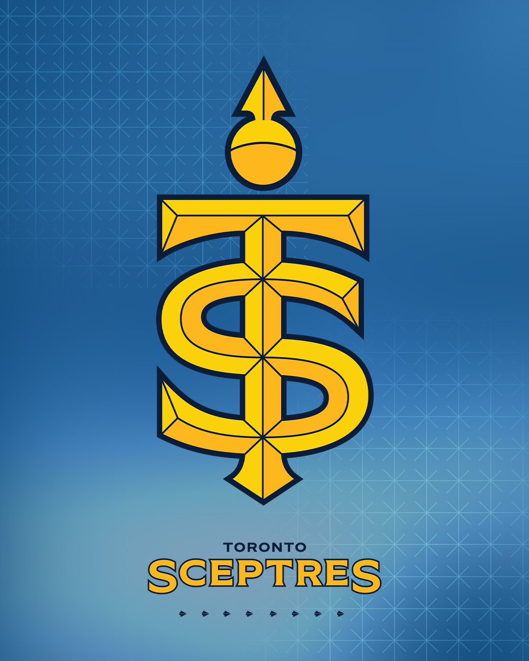
The Toronto Sceptres logo is a monogram that combines T for Toronto and S for Sceptres. Also in this logo is an orb that represents strength. I am not the biggest fan of all of the lines in this logo. The orb and the representation of a scepter could have been better. This logo did come under fire for looking like a Taylor Swift logo. Their colors are blue, navy, gold, and yellow. Last season they were blue and black. It looks like they will be getting rid of the black.
One thing I just want to mention about these logos is that they all look similar. This is likely due to them all coming from the same design studio. This happens to a lot of modern sports leagues. While the designs have unique elements they all seem to look similar. Older leagues have had time to develop their teams identity over time. For most leagues the teams are tasks with creating their own identity. This leads to more creativity than what the PWHL has done. Not to say it is bad but just to say it is a trend I have noticed. I think what could fix this is tasking the teams to get it done themselves either in house or through a local design firm. The United Football League, the XFL, the Alliance of American Football, the United States Football League (2022), the Arena Football League (2024), the BIG3, and the Premier Lacrosse League have all had the same issue.

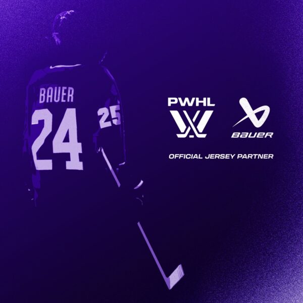
For the 2023-24 season the PWHL used K1 jerseys. The jerseys were sublimated with heat pressed logos, names, and numbers. The design of the jerseys seemed to be rushed. They all look very similar. The PWHL Boston jersey was the only one that looked different. PWHL Montreal and PWHL Toronto had the same jersey design in different colors. It does not seem that these jerseys will return. The team colors are now different. In May the PWHL also announced that Bauer would be the new jersey provider. It looks like all new jersey designs are coming. Hopefully the new jerseys will be fully stitched and not cost $425. This will also be the first time Bauer has been a jersey provider for a professional hockey league in a long time.


Leave a comment