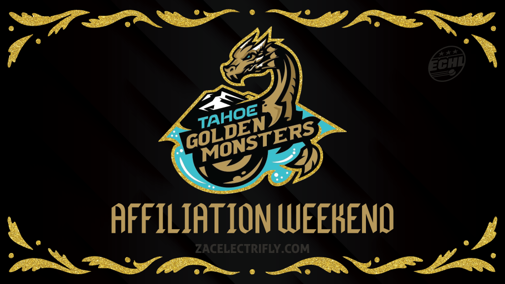
The Tahoe Knight Monsters are going golden for their upcoming affiliation weekend. Back in January the Tahoe Knight Monsters announced that they would become the Tahoe Golden Monsters for affiliation weekend. The Tahoe Knight Monsters are the ECHL affiliate of the Vegas Golden Knights of the National Hockey League and the Henderson Silver Knights of the American Hockey League. The upcoming affiliation weekend is all about celebrating the Vegas Golden Knights organization. For affiliation weekend the Tahoe Golden Monsters will take on the Adirondack Thunder for three games. The games will be this upcoming Thursday, Friday, and Saturday. Today the Tahoe Golden Monsters announced the jerseys that will be worn during the affiliation weekend games. I do not know what is actually going to happen at the games.
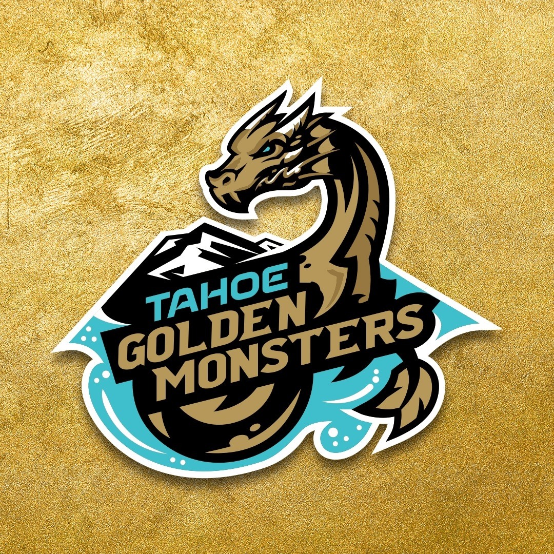
The logo for the Tahoe Golden Monsters is a remixes version of the Tahoe Knight Monsters primary logo. The logo is black, gold, white, and turquoise. The Tahoe Golden Monsters logo adds a shade of gold not seen in the primary branding for team. The teal in the logo is gone. The logo was recolored to make the primary focus gold instead of teal. The word “Knight” is replaced with the word “golden”. It is a solid remix. The only thing that bothers me is the way the black is cropped around the word golden. In the Tahoe Knight Monsters logo the black follows the shape of the word “knight”. Here in the Tahoe Golden Knights logo the black cuts into the turquoise creating a straight line that adds negative space. The straight line and additional negative space does not fit with the flow of the rest of the logo. I still like it. I will still probably buy Tahoe Golden Knights merch. I do not know if the Tahoe Knight Monsters will be remixing any of their other logos for the Tahoe Golden Monsters.
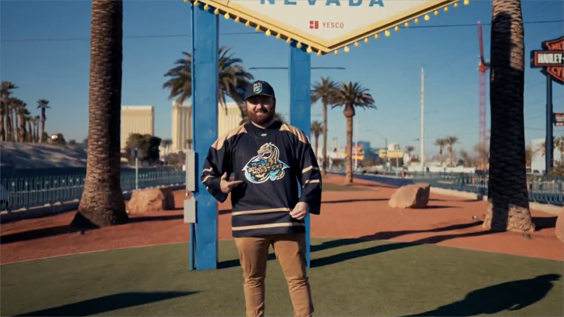
Onto the actual jersey. The jersey is black with gold stripes. The shoulders are gold. The pattern is similar to the Toronto Maple Leafs from 1992 to 2007 and 2010 to 2016. On the front is the Tahoe Golden Monsters logo. On the shoulders are the Vegas Golden Knights primary logo and the Henderson Silver Knights primary logo. I do not know what font the Tahoe Golden Knights are using for the names and numbers on the jersey. It would be cool if they used the same font the Vegas Golden Knights use on their jerseys. It will probably be the Tahoe Knight Monsters regular font. The names and numbers will likely be in gold. The socks will likely match the jerseys. I do not think the Tahoe Golden Monsters will have gold helmets, gloves, and pants for this. Even though that would be cool. I think they will roll with the regular Tahoe Knight Monsters equipment. I do think they will have matching socks. The Tahoe Golden Monsters jersey would look weird with the Tahoe Knight Monsters socks. The reaction to this jersey has been neutral so far. The biggest problem for me is that is does have any connection to the Vegas Golden Knights jerseys. The only connection to the Vegas Golden Knights branding is the colors. The only other criticism I have is that the jersey looks generic. Otherwise I like this jersey. I might end up with one. All of that said. The Tahoe Knight Monsters are doing a great job with this promo.
I think the jersey should have had more ties to the Vegas Golden Knights. Even if it was just a teal recolored Vegas Golden Knights jersey. People would have loved that. The Vegas Golden Knights have a gold version of their jersey. The Henderson Silver Knights have a silver version of the Vegas Golden Knights jersey. It would be perfect to have a teal Vegas Golden Knights jersey for the Tahoe Golden Monsters. A remix of the Vegas Golden Knights 2021 Reverse Retro would be perfect for the Tahoe Golden Monsters too. Wearing a remixed version of the jersey that the Vegas Golden Knights wore during NHL Outdoors at Lake Tahoe would be a fan favorite too. The NHL Outdoors at Lake Tahoe is a huge piece of Tahoe hockey history. The Tahoe Golden Monsters could have connected themselves to that. I know some fans have been looking for a jersey that just says Tahoe on it. A lot of the tourist hockey fans and none Knight Monsters fans have been looking for that. I was hoping one of the shield logos would make their way onto this jersey.
Tahoe Knight Monsters monogram shield logo 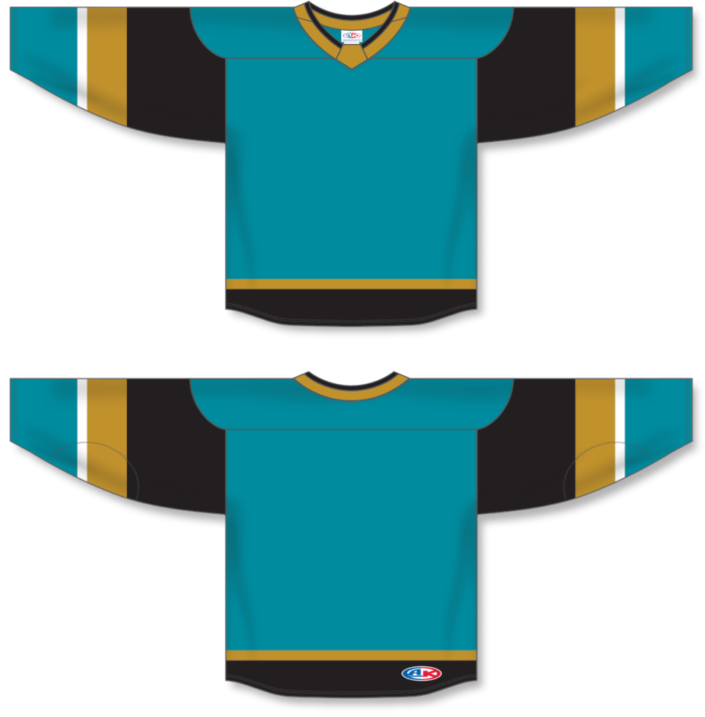
Tahoe Golden Knight concept jersey based on Vegas Golden Knights home/away/alt jerseys 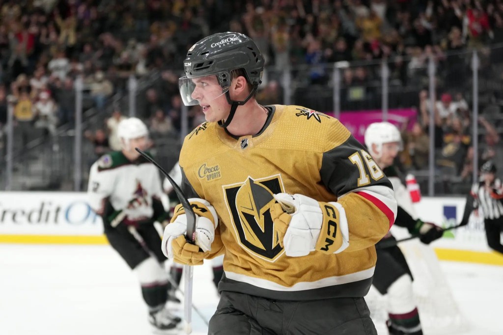
Vegas Golden Knights gold jersey (2021-pres) 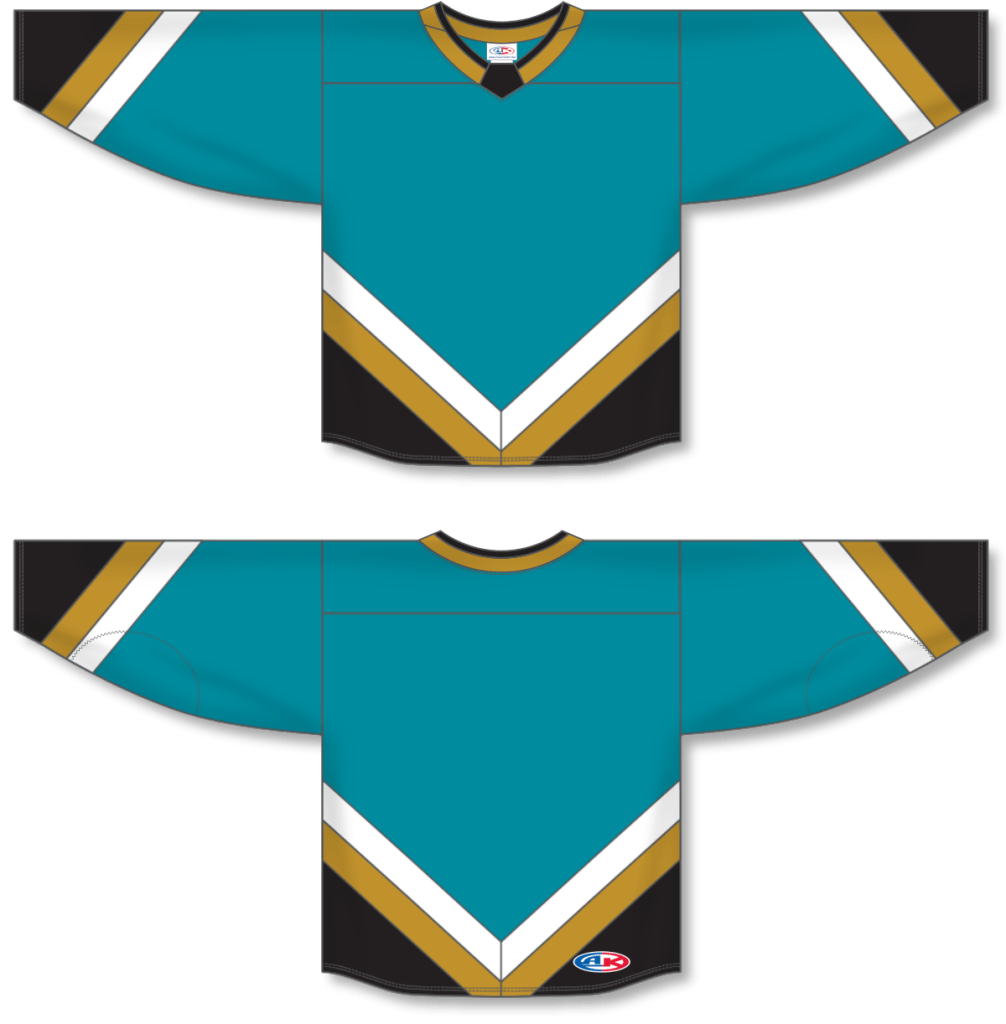
Tahoe Golden Knight concept jersey based on Vegas Golden Knights Reverse Retro jersey 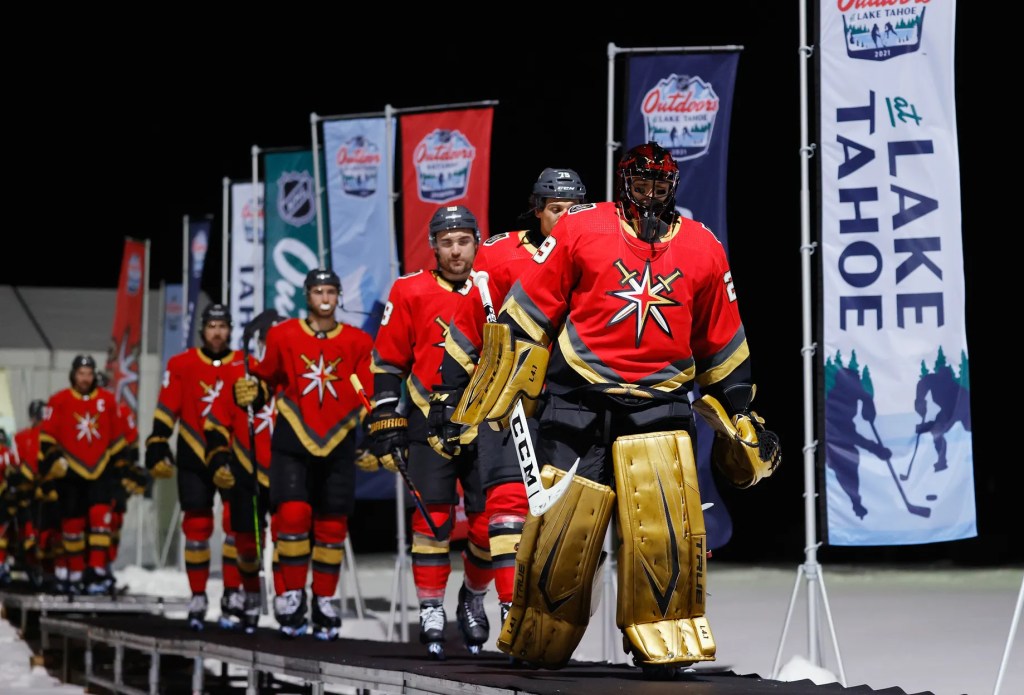
Vegas Golden Knights Reverse Retro jersey 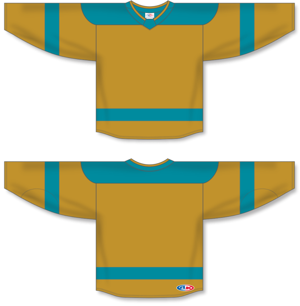
Gold Tahoe Golden Knight concept jersey based on Vegas Golden Knights 2024 NHL Winter Classic jersey 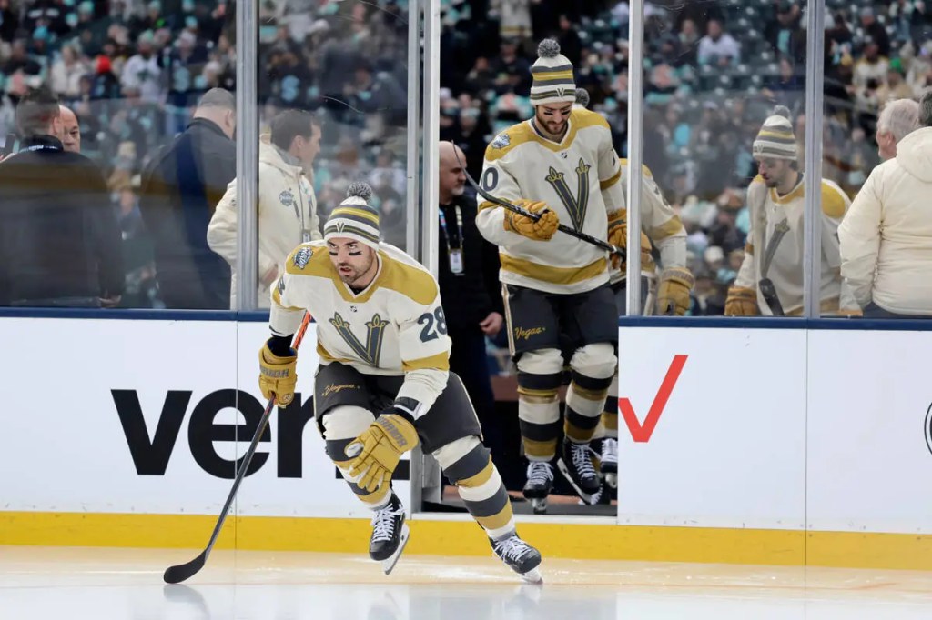
2024 NHL Winter Classic Vegas Golden Knights jersey (2024) 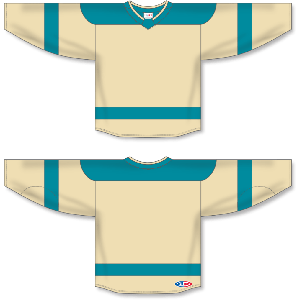
Cream Tahoe Golden Knight concept jersey based on Vegas Golden Knights 2024 NHL Winter Classic jersey 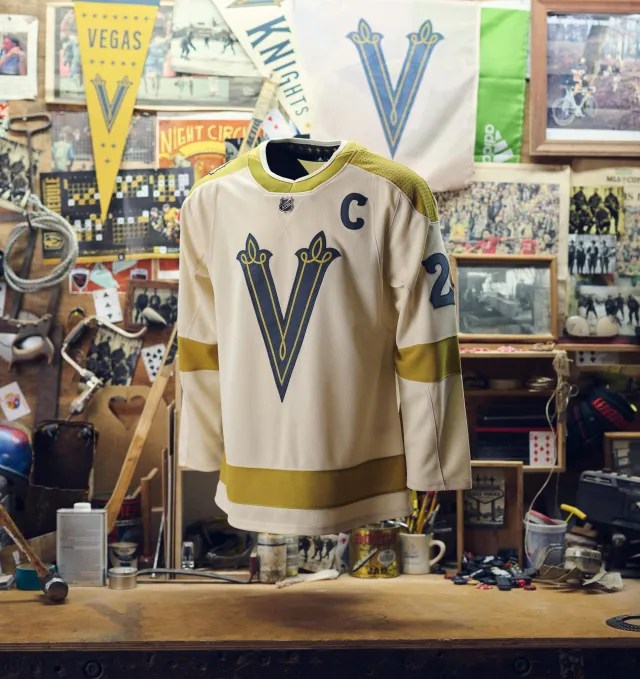
2024 NHL Winter Classic Vegas Golden Knights jersey (2024) 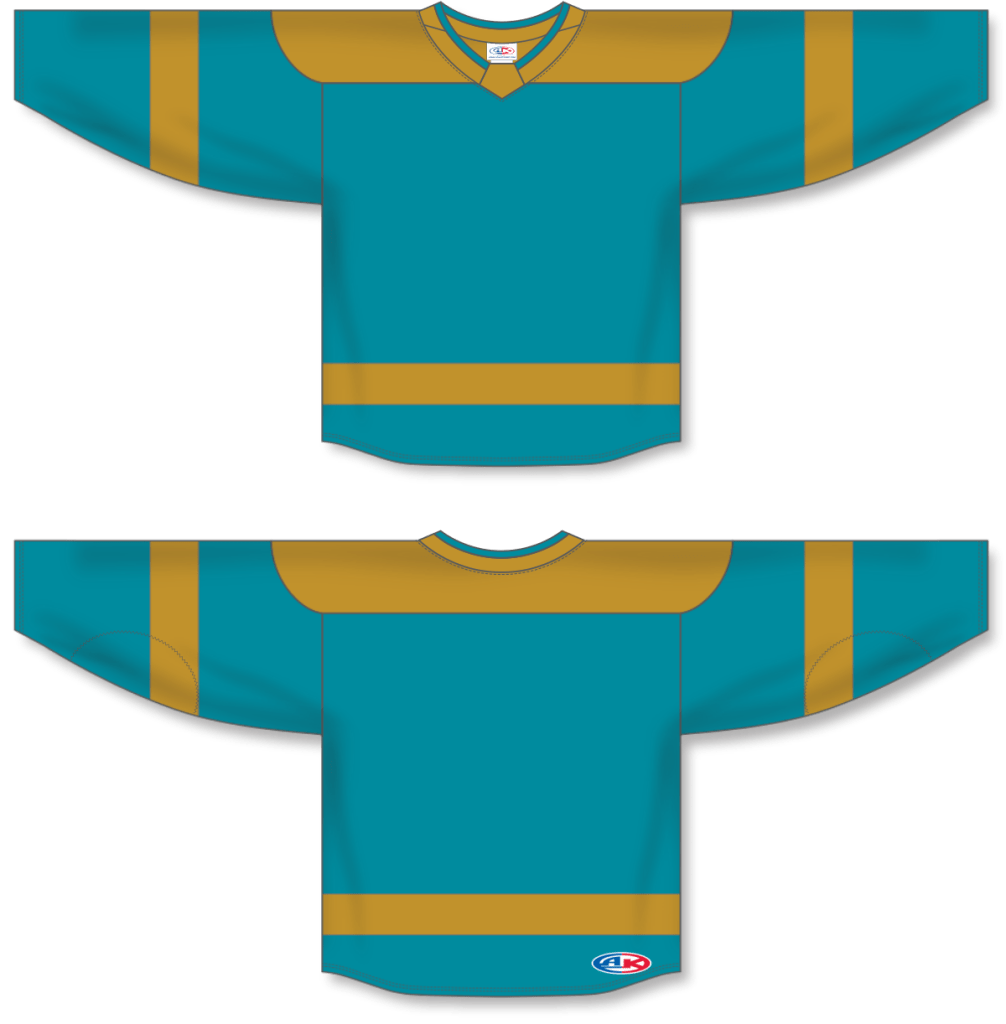
teal Tahoe Golden Knight concept jersey based on Vegas Golden Knights 2024 NHL Winter Classic jersey 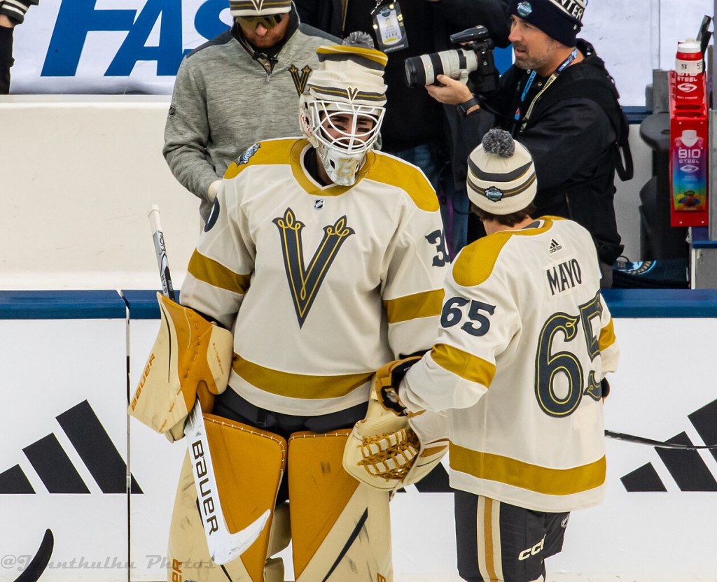
2024 NHL Winter Classic Vegas Golden Knights jersey (2024) 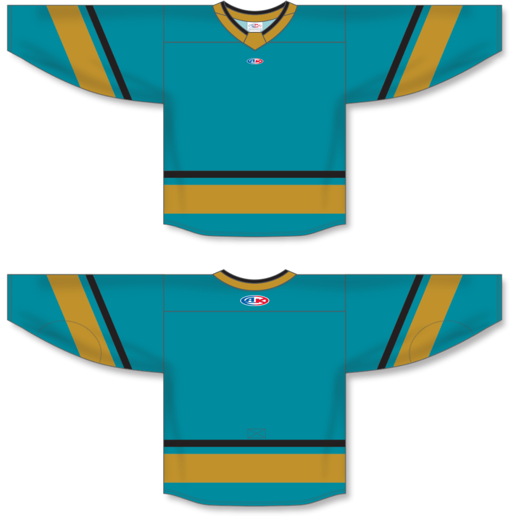
Tahoe Golden Knight concept jersey based on Vegas Golden Knights Reverse Retro 2.0 jersey 
Vegas Golden Knights Reverse Retro 2.0 jersey (2022-23) 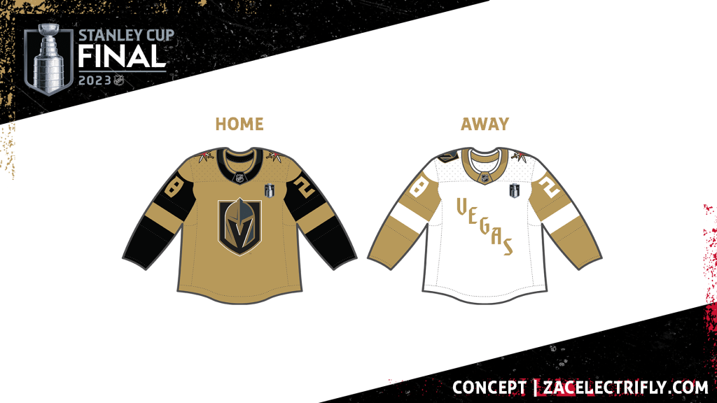
Stanley Cup Finals Vegas Golden Knights Concept (2023) 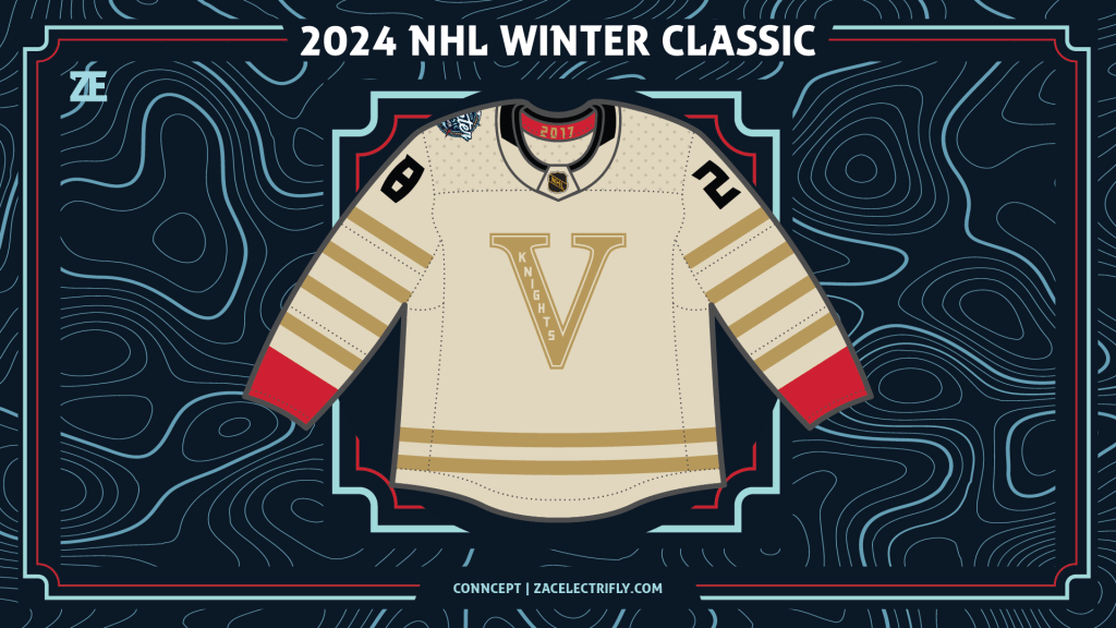
2024 NHL Winter Classic Vegas Golden Knights Winter Classic Concept (2023) 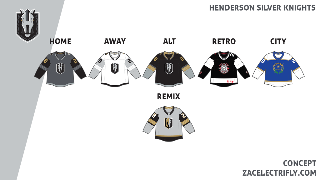
Henderson Silver Knights concept (2023) 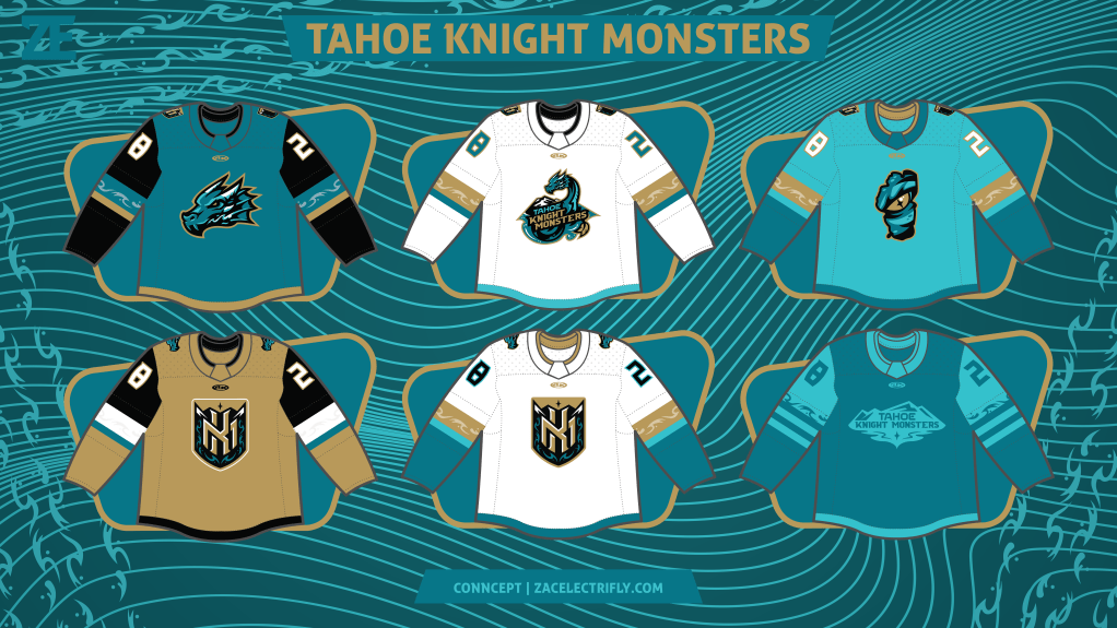
Tahoe Knight Monsters concept (2023)


Leave a comment