
The Tahoe Knight Monsters are set to take the ice for the 204-25 season. They are not the only ECHL expansion team for the 2024-25 season. Bloomington Illinois are also getting an ECHL expansion team. The team is owned by the same owners as the Indy Fuel. The Indy Fuel are another ECHL team. Bloomington was approved to get a team shortly after the ECHL announced it wanted to expand to thirty two teams. For the 2023-24 season the ECHL has twenty eight teams. For the 2024-25 season the ECHL will have thirty teams. The most teams the ECHL has had in a single season is 31.

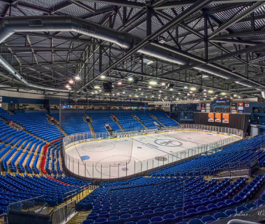
The Bloomington ECHL team will play at the 7,000 capacity Grossinger Motors Arena. Almost consistently since 2006 the arena has hosted ice hockey. Bloomington had pro ice hockey from 2006 to 2014. Since then they have only had junior and college hockey. Their first pro team was the Bloomington PrairieThunder who played in the United Hockey League, the International Hockey League, and the Central Hockey League. Bloomington then got the Bloomington Blaze who played in the Central Hockey League. Then Bloomington got the Bloomington Thunder who played in the Souther Pro Hockey League. Shortly after announcing they would be getting an ECHL expansion team they announced that the name would be the Bloomington Bison.

The name is likely a nod to the Bloomington PrairieThunder. Their colors are light blue, red, white, and black. Their primary logo is a bison holding a hockey stick in a top hat. The logo is also in the shape of a shield with a B and the state of Illinois with a star. The bison on the logo is because they are the bison. It is wearing a top hat in reference to Abraham Lincoln. The B in the logo is for the city and team name. The state with the star is in the logo again to represent their city. There is even.a thunderbolt in the bison design as a nod to the PrairieThunder. There is a lot going on in this logo. I think it is a little cartoony compared for a professional ice hockey logo. It seems like it does not want to be taken seriously. This is the seventh current ECHL logo to depict a character using a hockey stick.

The B seen in the logo is also an alternate logo. The state seen in the logo may also be an alternate logo. They also have a top hat alternate logo but it is hard to tell. The other logo they released with their primary logo is a wordmark logo.

I like the PrairieThunder logo better. In professional hockey logos should be serious. It can have playful elements but the Bloomington Bison logo is too cartoony. A bison wearing a top hat is unique. Is this logo memorable? No. It has a lot going on. I think the bison head without all of the other elements would have been great. I would not be surprised if that is the direction they go in at some point in the future. One of the best bison logos ever was the buffalo sabers logo that is a silhouette of a bison with the team name inside of it. The Bloomington Bison name and logo are not the worst thing ever. The logo just does not fit in the landscape of professional hockey.
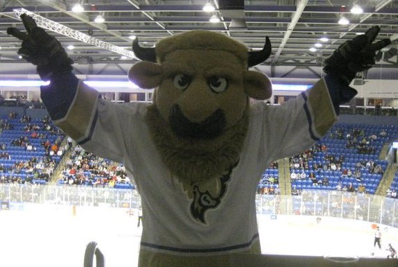
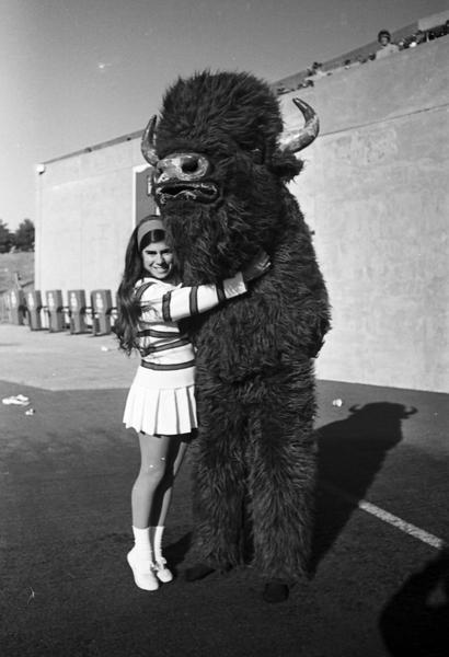
Chip the Buffalo was the Bloomington PrairieThunder mascot. It was just an anthropomorphic bison wearing hockey equipment. I do not know if they will bring Chip the Buffalo back. They likely will have an anthropomorphic bison mascot if they have a mascot at all. Chip the Buffalo could be another thing the logo is referencing. The best bison mascot I have seen has been the Indiana University Bloomington’s old mascot. They had a bison mascot in the 1960s and 1970s. It is tall and really furry. Those are two things we don’t see with a lot of mascots these days.

Leave a reply to 2024-25 ECHL Season Preview – Zac Electrifly Cancel reply