
Next up in my American Hockey League concept series is the Milwaukee Admirals. They are the primary affiliate of the Nashville Predators. They play in the 9,652-capacity UW–Milwaukee Panther Arena. Milwaukee has a population of 577,222. The Admirals were founded in 1970. They joined the IHL in 1977. They joined the AHL in 2001.
For this concept, the Milwaukee Admirals play in the AHL’s International Division in the Western Conference. The other teams in the International Division are the Colorado Eagles, the Iowa Wild, the Manitoba Moose, the Rockford IceHogs, the Springfield Thunderbirds, the Texas Stars, and the Tucson Roadrunners.
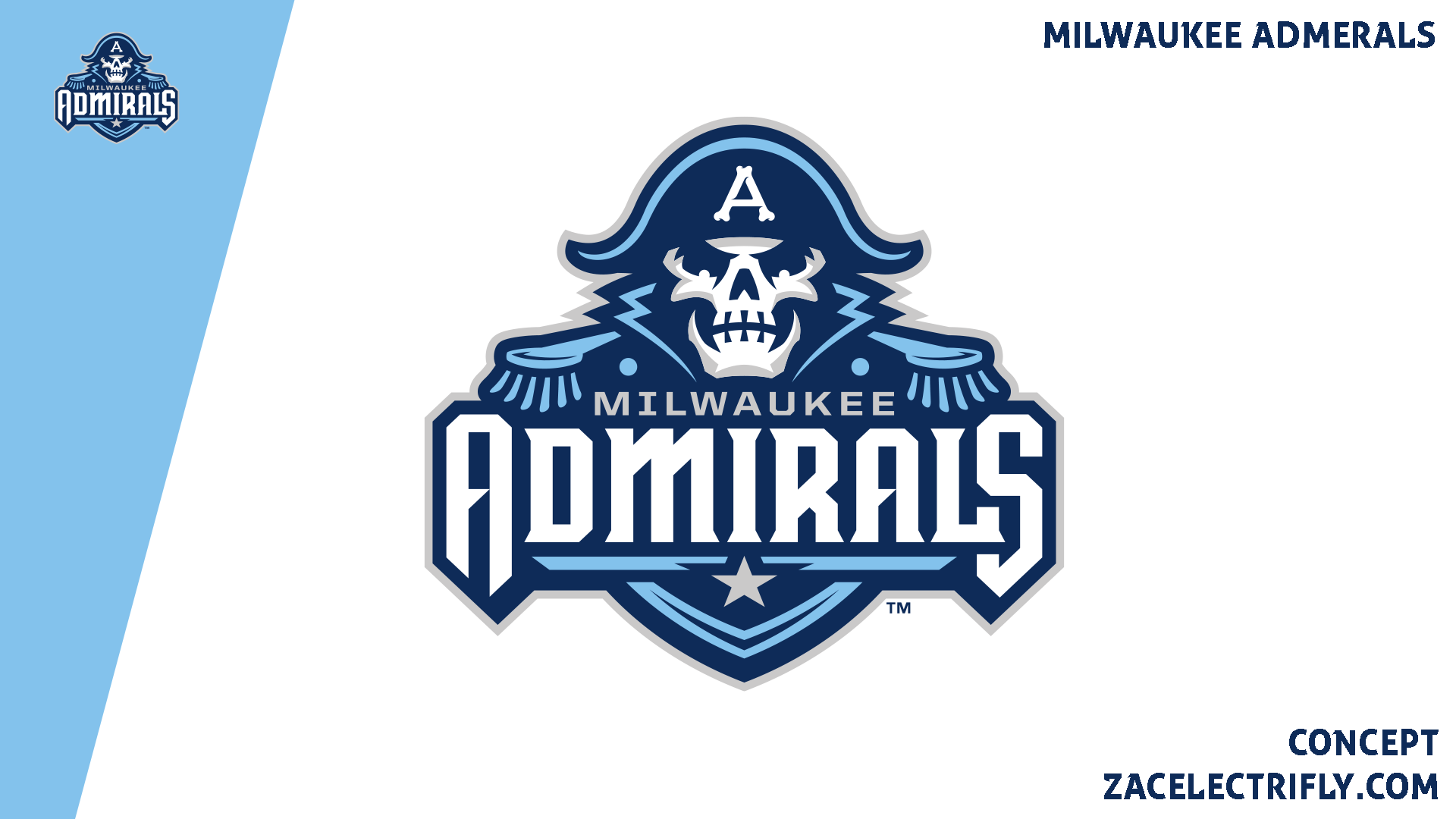

The Milwaukee Admirals colors are navy blue, light blue, grey, and white. Their primary logo is a skeleton wearing an admirals uniform. The logo also has the team name. On the Bicorne is the letter a spelt out with bones. The Admirals have almost always had some sort of admiral as their logo. In 2006 they incorporated the skull/skeleton into their logos. In 2015 they upgraded their look.
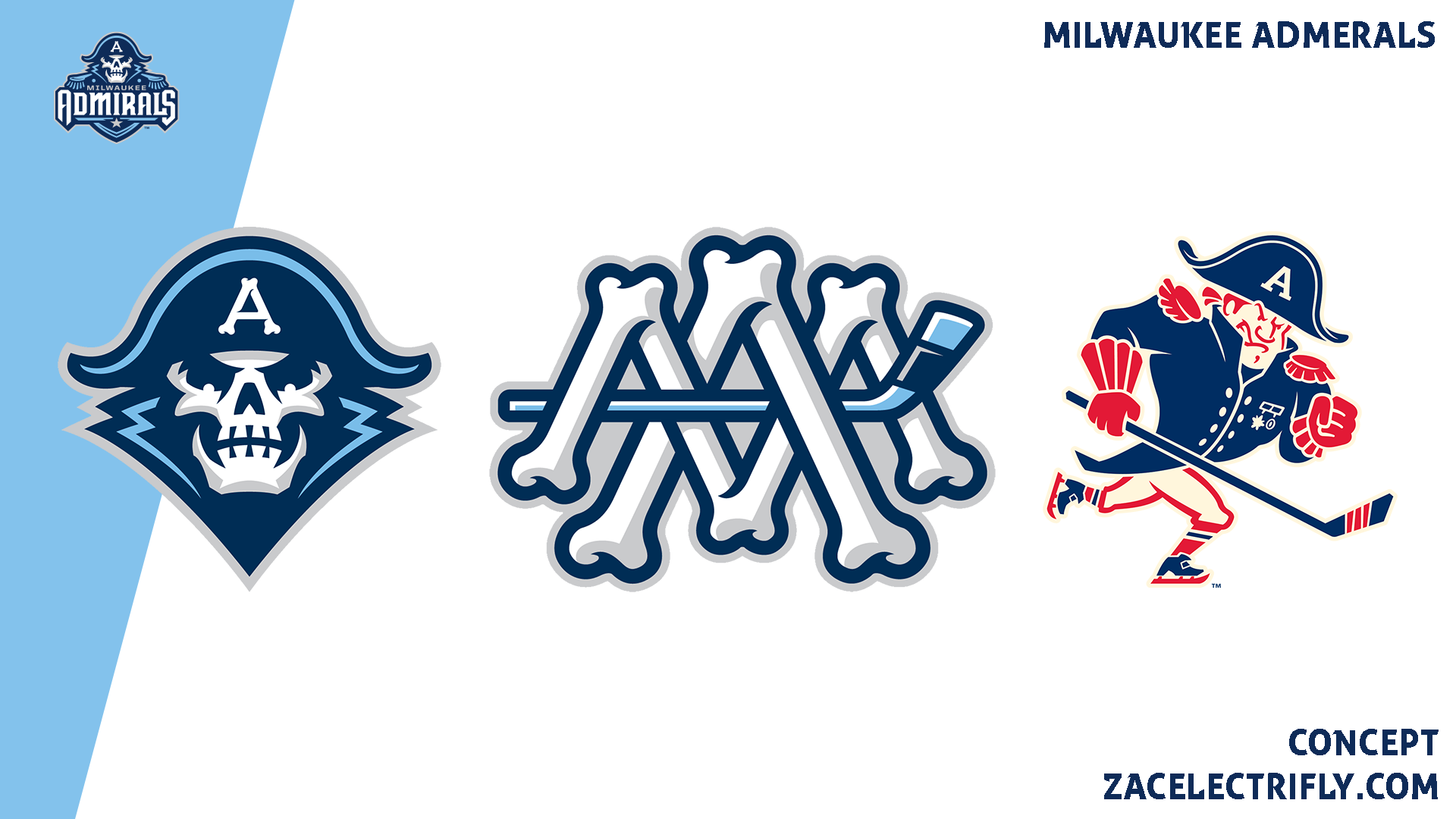

The Milwaukee Admirals first alternate logo is a skull logo. It incorporates most of the elements from the primary logo. Their second alternate logo is an MA monogram with a hockey stick running through it. Their final alternate logo is a fauxback logo. It is a skating admiral logo inspired by the Milwaukee admirals logos of the past.


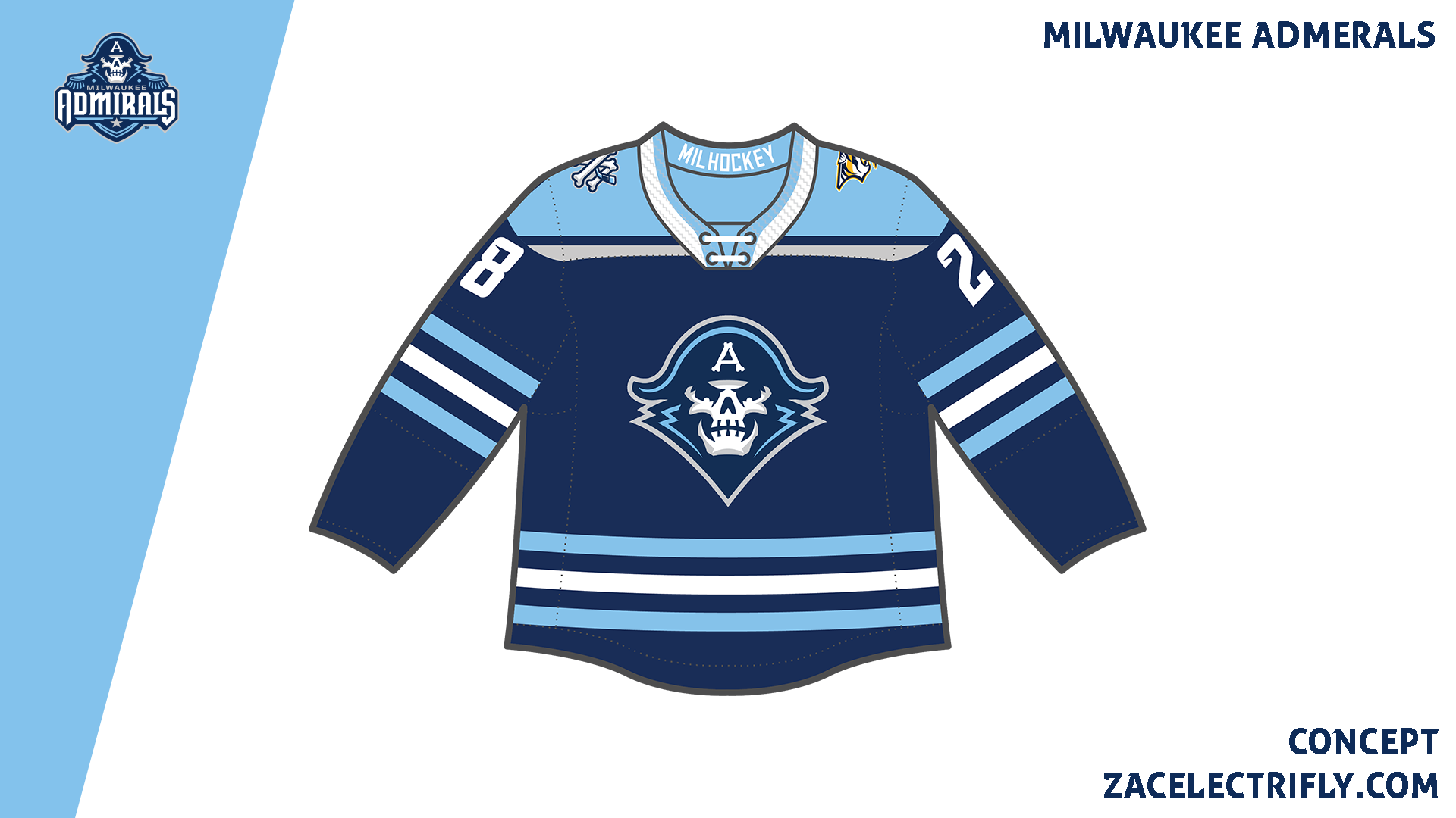
The Milwaukee Admirals home jersey is navy blue, light blue, white, and grey. On the front is their alternate skull logo. On the shoulders are their alternate monogram logo and the Nashville Predators logo. On the collar is “Millhockey” which is the team motto.
The Admirals away jersey is white, navy blue, and light blue. This jersey does have a different pattern than the home jersey. On the front is their primary logo. On the shoulders are their alternate monogram logo. On the collar is “Millhockey” again.
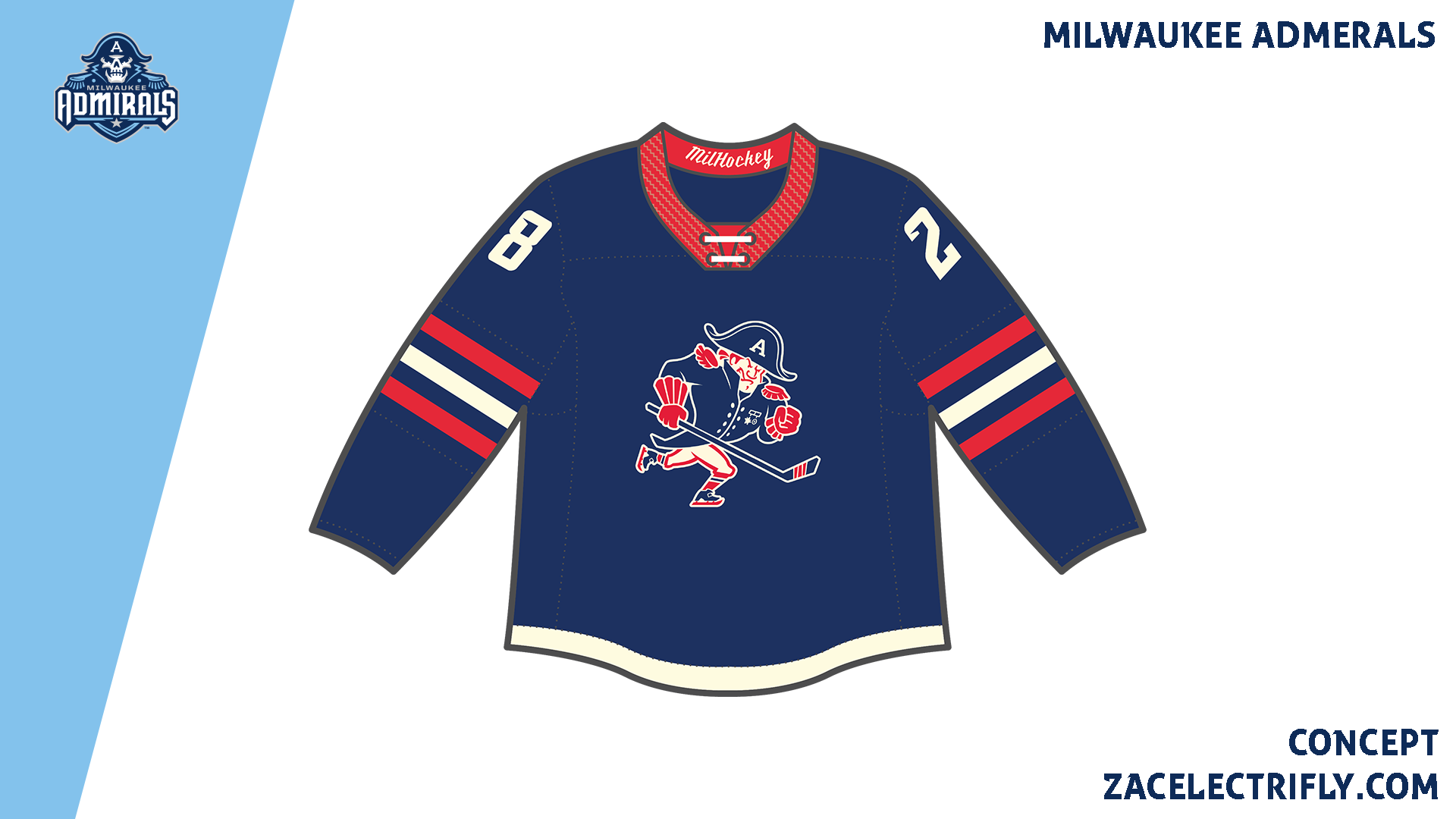
The Admirals Alternate jersey is navy blue, red, and off white. On the front of the jersey is the alternate fauxback logo. There are no shoulder logos. On the collar is “Millhockey” again.
The Admirals Retro jersey is inspired by the red jersey they wore in 2004. The Milwaukee Admirals won their first Calder Cup in the 2003-04 season. The jersey has a wave design. On the front is their old admiral head logo. There are no shoulder logos. On the collar is “EST. 1970” for when the team was founded.
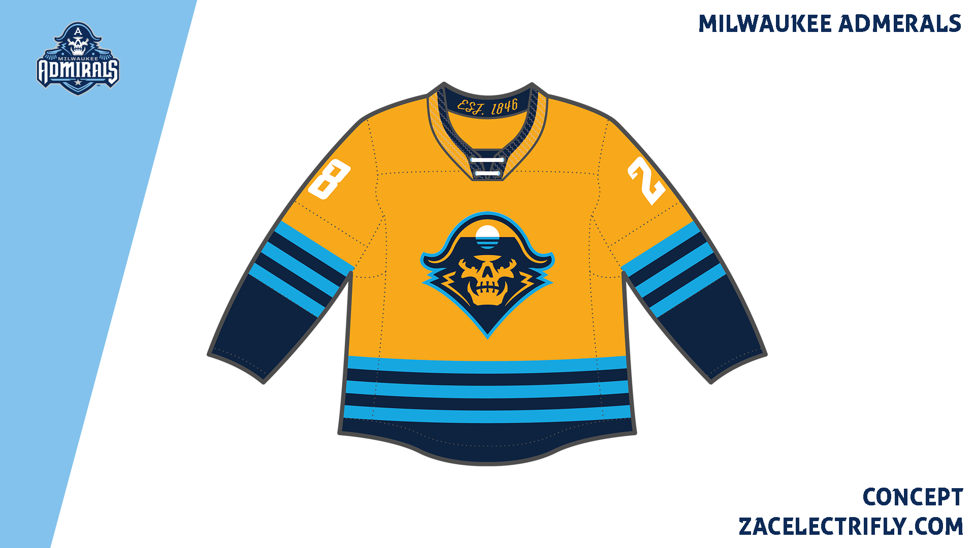
The Admirals City jersey is inspired by “The Peoples Flag” of Milwaukee. That flag was designed in 2016 to replace the current Milwaukee flag. While people love the “Sunrise over the lake” design, it has been stalled taking over as the new flag due to politics. The jersey is designed after the flag. It shares the same colors. On the front is a “The Peoples Flag” of Milwaukee version of the alternate skull logo. The A in the logo was replaced by the flag while the rest of the logo was recolored. There are no shoulder logos. On the collar is “EST. 1846” for when Milwaukee was founded.
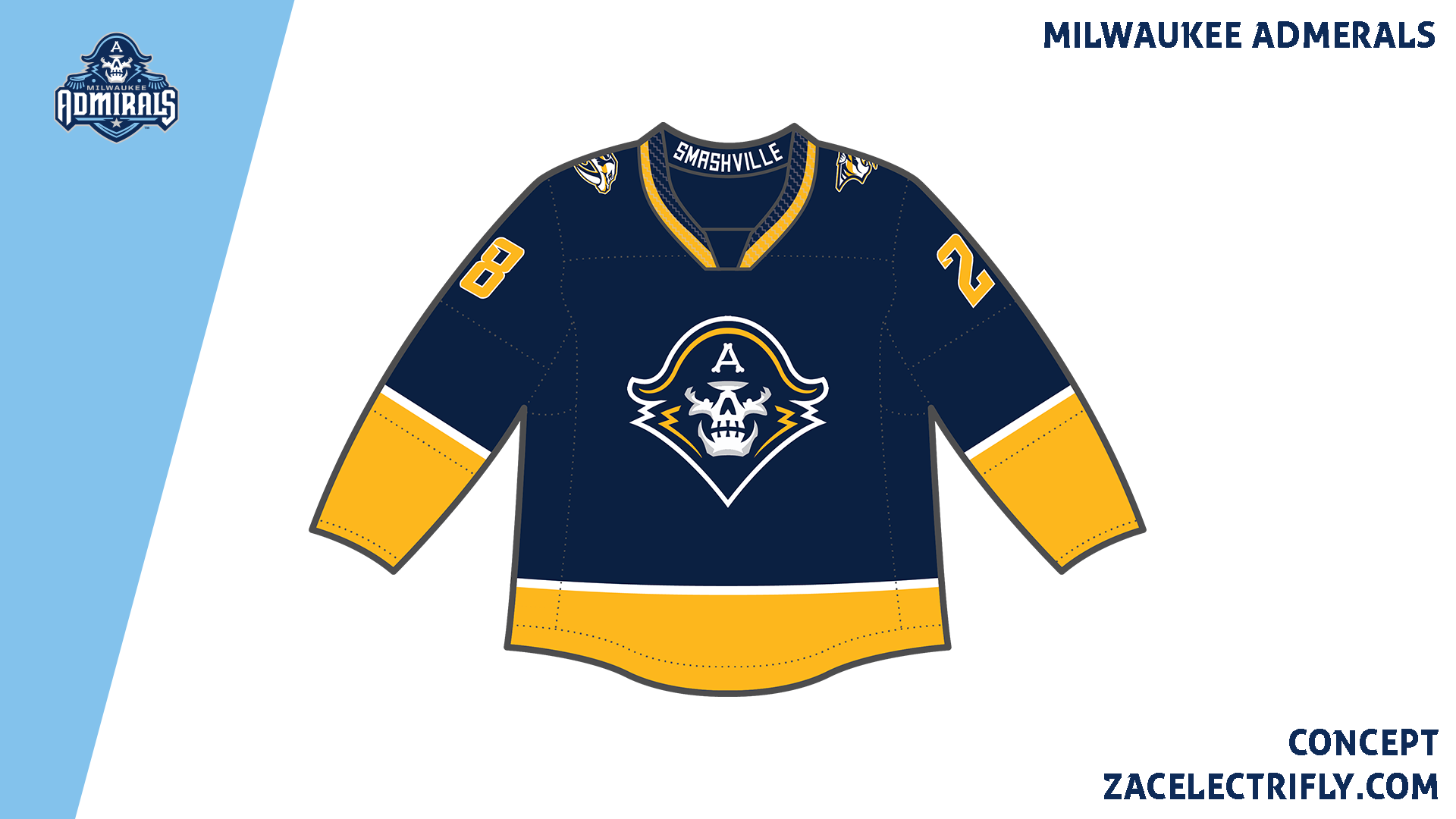
The Admirals Affiliate Remix jersey is navy blue, predators gold, and white. The jersey is inspired by the Nashville Predators home jersey. On the front is the Admirals alternate skull logo recolored in the Predators colors. On the shoulders are the Predators primary logo. Pn the collar is “Smashville” which is the Predators motto.
The Milwaukee Admirals do not have any Heritage jerseys. The Nashville Predators have been almost exclusively affiliated with the Milwaukee Admirals. The Predators were only ever affiliated with one other AHL team for one season. That team is still in the league today.


Next Post>>>


Leave a comment