The title says it all. I am ranking all of the ECHL primary logos. All of the logos are current according to the ECHL website. I am not including alternate logos. It is only primary logos. Their are five possible rankings for each logo. S tier is the best. D tier is the worst. This is just what I think. Don’t get upset if you think your team should be ranked higher. Twenty three out of the twenty nine teams have their name in their primary logo. That is basically eighty percent of the teams. That is a lot. I know some people do not like it. I am ok with it. As minor leagues the teams are not as popular as NHL teams. Having the name on the logo helps with identifying the different teams. It also helps with brand recognition. It gives teams the chance to have one jersey with the team name and one without it. Nine of the teams have a letter as their primary logo or in their design separate from being the team name. Seven teams have the same colors as their NHL affiliates. Fourteen teams have a mascot with a hockey element in their logo or a hockey element in their logo. A lot of the teams logos are characters with the teams name. Four teams have new logos. The Bloomington Bison, the Indy Fuel, the Tahoe Knight Monsters, and the Wheeling Nailers all have new logos for the 2023-24 season.
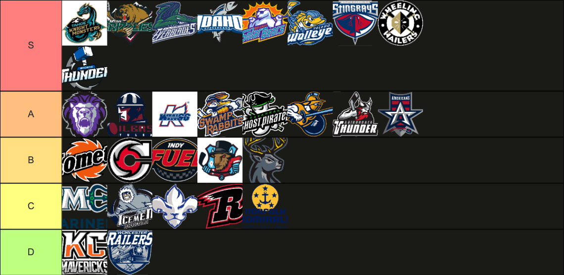
In the S tier are the Tahoe Knight Monsters, the Utah Grizzlies, the Florida Everblades, the Idaho Steelheads, the Orlando Solar Bears, the Toldedo Walleye, the South Carolina Stingrays, the Wheeling Nailers, and the Wichita Thunder. The Tahoe Knight Monsters knocked it out of the park with their logo. The Utah Grizzlies logo is iconic at this point. It is what hockey logos and branding aspire to be. I have always loved the Florida Everblades logo. The menacing alligator and the branding the team have is extremely creative without feeling tacky. The Idaho Steelheads have never had a bad primary or alternate logo. The Orlando Solar Bears is another iconic ECHL logo. Their logo is easily one of the best in all of hockey. The Toledo Walleye have an excellent logo. They are another team that has great branding. They are in a rare class as they basically have two amazing sets of branding. The South Carolina Stingrays have knocked it out of the park better than some other teams with sting ray themes. They are another Iconic ECHL team. The Wheeling Nailers have such a great name, logo, and branding. They are the definition of menacing. The Wichita Thunder logo makes me want to go to battle. They have the branding power to rally the players, fans, and anyone else.
In the A tier are the Reading Royals, the Tulsa Oilers, the Kalamazoo Wings, the Greenville Swamp Rabbits, the Savannah Ghost Pirates, the Atlanta Gladiators, the Adirondack Thunder, and the Allen Americans. The Reading Royals logo is great. I like it a lot. It just dies not have that edge that would put it in the S tier. The Tulsa Oilers logo is great. It just seems stuck in the 90s. The Kalamazoo Wings logo is another iconic ECHL logo. It has the same problem as the Tulsa Oilers. It just looks and feels like the 90s. The Swamp Rabbits logo is great but there is a lot going on in the logo. The Savanna Ghost Pirates logo is great. I love the colors. I love the branding. The flow of their logo is off. The character is going in a different direction of team name. The Atlanta Gladiators logo is good. I love how they went back to the Atlanta Thrashers colors. They are not S tier because the logo does not make me feel anything. The character is facing right making it appear to be moving away. The Adirondack Thunder logo is an S tier logo and is iconic in the ECHL. The reason it is not is S tier is because that logo is Stockton. I hate how they just took the branding from one team and moved it while Stockton had to change their name. I don’t think branding should ever relocate like that without the team. I think the rebranding in Stockton is partially what lead to the team eventually moving to Calgary. The Allen Americans have a great logo. The only reason it is not in S tier is because I think some of the smaller elements in the logo are holding it back.
In the B tier are the Fort Wayne Komets, The Cincinnati Cyclones, the Indy Fuel, the Bloomington Bison, and the Iowa Heartlanders. The Fort Wayne Kkomets logo is good but it is holding back a way better logo. Their alternate spaceman logo should be their primary logo. The Cincinnati Cyclones logo is another good logo. They needed to add more to the logo. It is a good idea but it is a half finished idea. The Indy Fuel logo seems like the trend of corporate logos removing defining elements. The new and old logos are similar but the new logo feels like it is lacking the personality of the original logo. I would love to see them embrace branding close to the Indianapolis Ice. The Bloomington Bison logo has just way to much going on. There is no subtly in any of its imagery. It also incorporates a lot of small elements. It is a fine logo but it would have been better if they simplified it a little more. The Iowa hartlanders have a solid logo but to me it just seems like standard buck logo.
In the C tier are the Maine Mariners, the Jacksonville Icemen, the Trois-Rivieres Lions, the Rapid City Rush, and the Norfolk Admirals. The Maine Mariners feel like they have a half baked idea. Their alternate logos are better then their primary logo. I like the trident but they should have done more with the overall logo. I never really liked the Jacksonville icemen logo. I like their older logos better. They had the chance to update their branding when they relocated to Jacksonville but they didn’t. Their logo has an early 2000s vibe. The swooshes were always off putting to me. It is supposed to be a cave man but it has modern sticks and gloves. They can pretty much have whatever logo with the name Icemen. The Trois-Rivieres Lions just have an odd logo. I get what they were going for. For me the two elements of the logo never really mashed together. I look at it and see one thing. I look at it and see another but never as the those two things put together. There are a lot of directions they could have gone in with a lion logo. The Rapid City Rush logo is just unimpressive. They also have the problem where they have a way better alternate logo. The R is just so underwhelming. The Norfolk Admirals have this problem where they heavily downgraded with their last rebranding. Their last logo was s tier worthy. Their current logo is not even close. Their current logo does not do a good job at mashing two different elements together. At the same time it feels boring and uninspired.
In D tier are the Kansas City Mavericks and the Worcester Railers. These are just two logos I do not like. Kansas City got a downgrade with their rebrand. If they are going to just have KC and the team name as your logo to match their affiliates they should have just used the KC from the Kansas City Scouts logo. Moving away from the horse that was in the teams branding since their first season was a mistake. If they were going to leave the horse behind, they should have gone all in with a Kansas City Blades or Kansas City Scouts themed rebrand. The Worcester Railers have two huge issues. They have too much going on in their logo. The colors make it all blend together. They do have a round logo that looks a lot better. They also have a lot of options with train logos.
My fifth overall pick is the Wheeling Nailers logo.
My fourth overall pick is the Orlando Solar Bears logo.
My third overall pick is the Florida Everblades logo.

My second overall pick is the Utah Grizzlies logo.
My first overall pick is the Tahoe Night Monsters logo.





Leave a reply to Tahoe Knight Monsters 2024-25 Season Preview – Zac Electrifly Cancel reply