
Conceptober rolls on with Day 3, and this time the prompt was AHL/ECHL. I think the idea behind the prompt was to choose one league or the other, but if you have been following along with my Conceptober designs, you probably already know I was not going to make the easy choice. Instead of picking between the AHL and ECHL, I decided to create a concept for both leagues. That means Day 3 gets us started with my AHL concept, with the ECHL design coming next. For the AHL concept, I decided to go with the Toronto Marlies, the AHL affiliate of the Toronto Maple Leafs. The Marlies were an easy choice for this concept because there is a lot of history and visual identity to work with. The team has been part of the AHL since 2005, and I wanted to create something that felt connected to that history while also taking the Marlies in a completely different visual direction.
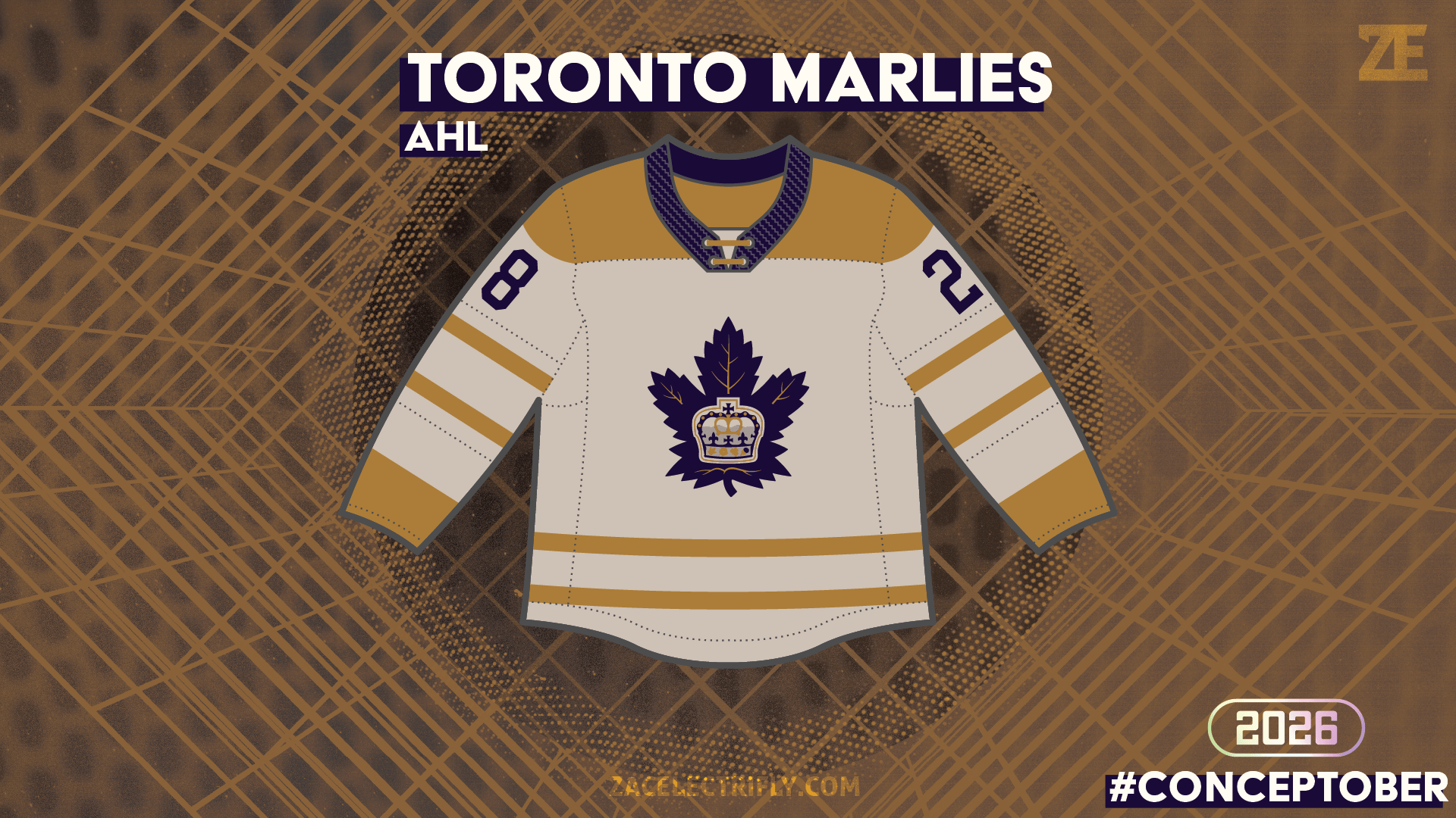
The inspiration for this design actually came from a Toronto Maple Leafs New Era Cream/Tan Colorpack hat. The colors immediately caught my attention. Rather than using the traditional blue and white associated with the Maple Leafs organization, the cream, tan, and darker tones gave the design a completely different personality. To me, those colors immediately felt like fall colors. That became the foundation for the entire concept. The goal was to create a Toronto Marlies jersey that looked like it belonged in the fall. I wanted something that would feel right at home with the leaves changing colors, cooler temperatures arriving, and the overall transition into the autumn season. Hockey already has a natural connection to that time of year, so I thought it would be fun to lean into those seasonal colors rather than simply creating another traditional hockey jersey. For the base of the jersey, I looked back at the Marlies’ 2005-06 inaugural-season jerseys for inspiration. The overall jersey design is based on those original Marlies uniforms, giving the concept a connection to the team’s early identity while allowing the colors to completely change the look. I really liked the idea of taking an older Marlies design and reimagining it through a modern color palette. The primary color of the jersey is tan, which immediately gives the uniform a much warmer appearance than the traditional Marlies color scheme. From there, I added brown accents to reinforce the fall-inspired theme. Brown works especially well with the tan base because it gives the jersey some additional depth without overwhelming the design. The third major color is a darker blue that fits the overall theme. Blue might seem like an unusual choice when creating a fall-inspired jersey, but I think it is one of the elements that makes the design work. The darker blue was used on the collar, logo, and numbers, creating a strong contrast against the tan and brown. That contrast was especially important. I didn’t want the jersey to become nothing more than a collection of muted fall colors. The darker blue gives the design some energy and helps the most important elements of the jersey stand out. The numbers are easier to read, the logo has more presence, and the collar provides another visual break against the tan base. For the front of the jersey, I used a recolored version of the Toronto Marlies logo. Recoloring the existing logo allowed me to maintain the connection to the team while making it fit naturally into the new color palette. I also decided not to use any shoulder logos. With the combination of the tan base, brown accents, dark blue details, and large front logo, I felt the jersey already had enough visual information without adding additional elements to the shoulders. Overall, I really like how this concept came together. The idea started with a simple cream/tan Maple Leafs Colorpack hat, but it eventually turned into a full fall-inspired Toronto Marlies identity. The combination of the 2005-06 Marlies jersey inspiration and the fall color palette gives the concept a vintage-inspired foundation while still feeling different from anything the team has traditionally worn. That’s one of my favorite parts of Conceptober. A simple prompt can lead to a completely different design direction once you start experimenting with colors, history, and visual inspiration. Instead of simply creating another Marlies jersey in their traditional colors, this concept gave me an opportunity to explore what the team could look like through a completely different seasonal lens.
And with the AHL portion of Day 3 complete, there is still one more design coming. Up next is my ECHL Conceptober concept. Follow along for more Conceptober designs and more hockey design work here on Zac Electrifly.


Leave a Reply