The New Jersey Devils recently released their first ever third jersey. It was not well received. A lot of the jerseys that have been released in the last month haven’t been well received. Team Canada, Team USA, the New Jersey Devils, the Nashville Predators, the Tampa Bay Lightning, have all released poorly received jerseys in the last month.
Current Jersey
This is the jersey the Devils released and will be wearing as a third jersey this season. First off it is not a bad design. The use of “Jersey” on the jersey was a bad idea, and it looks too much like the Chicago Blackhawks 2019 winter classic jersey. That does not make it a bad jersey. Add a few more elements to make it stand out from the Chicago jersey and it works. My main problem with this jersey is that the NHL could do better. It’s a long process to create a jersey in the NHL. Millions of dollars are usually spent over the course of years to get to get a jersey on the ice. The NHL could do better and owe it to the fans spending money on the jersey to do better.

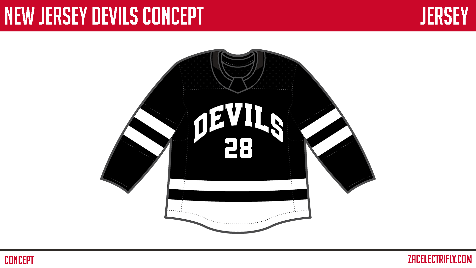
My design is simple. It is black and white. It stands out from the Chicago Blackhawks. The sleeve stripes are inspired by the current home and away jerseys. The wordmark on the front of the jersey is inspired by the Nework Bulldogs. The Nework Bulldogs being the main inspiration behind the current jersey. I took the sleeve design and added it to the bottom of the jersey. I then had that design cover the bottom of the jersey. I didn’t want the bottom to be just two stripes. I also didn’t want the single bottom stripe like what is on their current home and away jerseys.

I had a few different ideas. I had a few different jersey pattern ideas. Those weren’t working. I ended up making one that I thought worked. I then had some ideas for logos. eventually I settled on what I have now.


Leave a comment