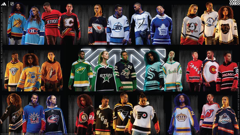
The National Hockey League and Adidas officially announced the Reverse Retro 2.0 line this morning. This line is a follow-up to the 2021 Reverse Retros. For this lineup of jerseys, Adidas remixes retro NHL jerseys. There were a lot of leaks. A lot of the big ones were leaked prior to the official announcement. There was also a lot of rumors. People have been taking about this lineup since last season. In this post I am just talking about the jerseys. I will be doing another post ranking them.

Anaheim Ducks
The Ducks reverse retro jersey is their original white jersey in their current colors. The Ducks used this jersey template from 1993 until 2006. For the 2006-07 season, the Ducks rebranded. That is when they introduced their current colors. The logo is a recolor of their original logo. This is different recolor than the recolored duck mask logo the ducks use for their third jersey.
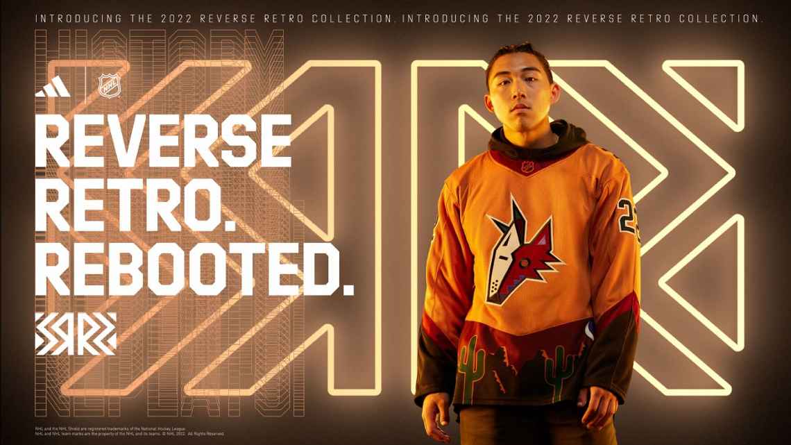
Arizona Coyotes
The Coyotes are using the same template as their last Reverse Retro jersey. It is based on their original third jersey released in 1998. Their last one was this but purple. This one is tan. The original one was green. I think I like the purple one the best. This is one of my favorite 2022 Reverse Retro jerseys.

Boston Bruins
The Bruins bring back the Pooh Bear. This jersey is based on their third jersey that was used from 1996 to 2006. I like the template. I think this is better than their last Reverse Retro jersey.
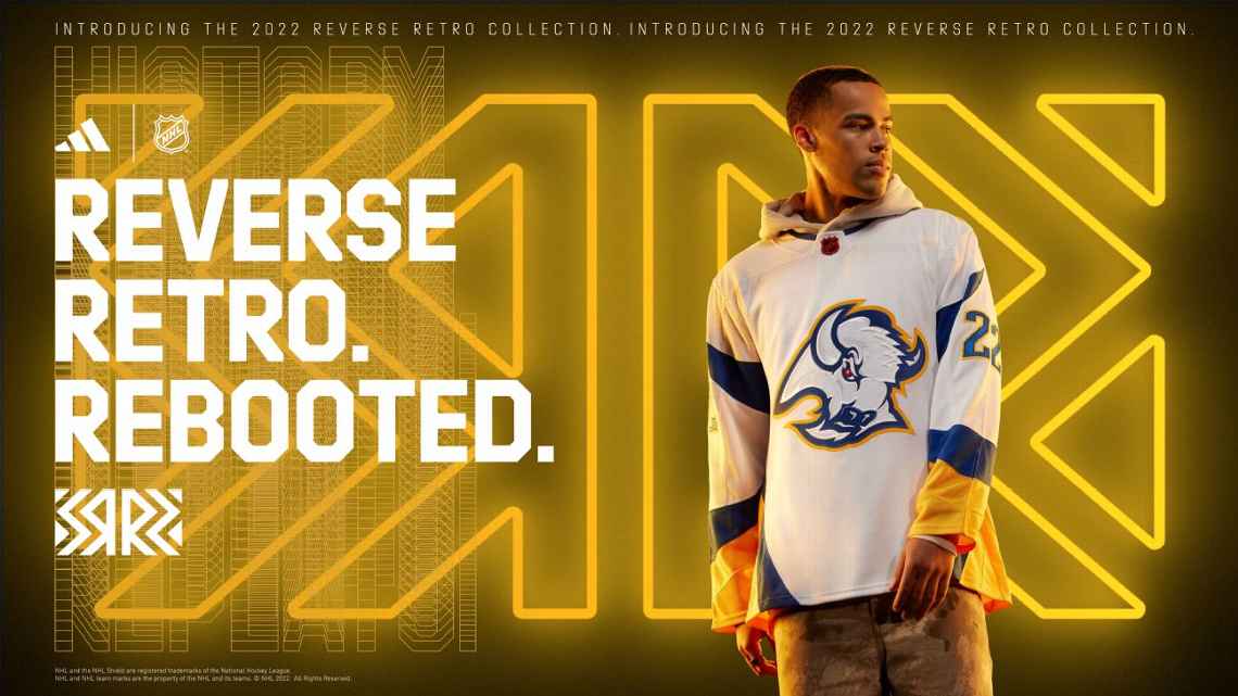
Buffalo Sabers
The sabers have the same color scheme they did with their last Reverse Retro jersey. This jersey is based on the jersey they introduced back in 1996. It was used up until 2006. The logo is a slightly altered version of the logo introduced in 1996. The original jersey was white, black, red, and grey. This jersey is just white, blue, and yellow. This logo and jersey get a lot of hate but I like them.
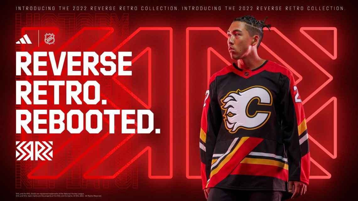
Calgary Flames
The Flames jersey is based on a jersey introduced in 1995. I was never a fan of these jerseys. I don’t like the front of the jersey. I think it would be way better if there was only a design on the sleeves. If there were only designs on the sleeves it would be a 10/10. instead, it is a 3/10.
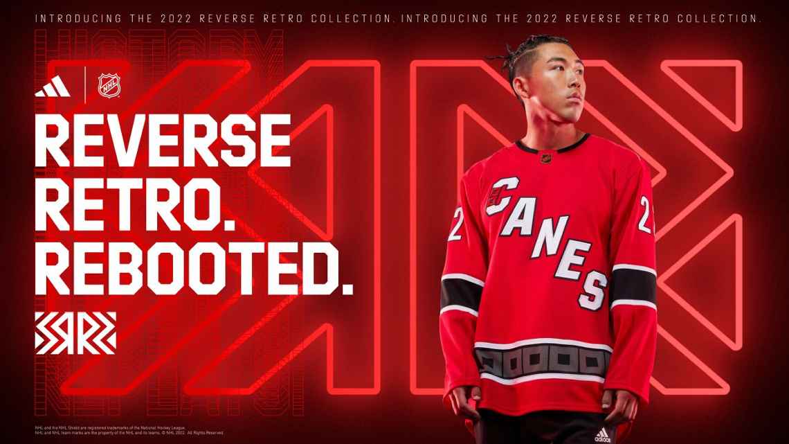
Carolina Hurricanes
The Hurricanes jersey is a remix of their current white jersey. I like the jersey. They knocked it out of the park with their Whalers jersey last time. There is a lot they could have done but didn’t do. They kind of get a b on the assignment here because yeah it’s good but does it really capture the spirit of the idea. I think another Whalers jersey in the Hurricanes colors would have been better.
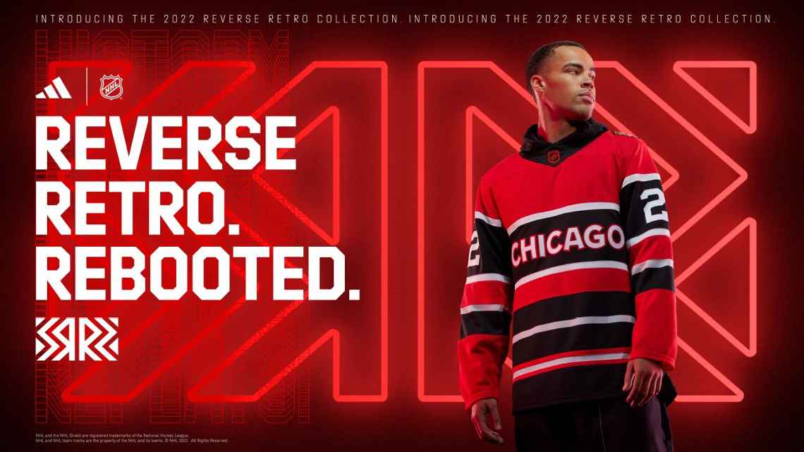
Chicago Blackhawks
The Blackhawks jersey is based on their jersey from the 1930s through the 1950s. This is the first Blackhawks jersey to use a wordmark logo on the front. For them, it was always going to be hard to top their last Reverse Retro jersey. I like this jersey. I really do. I just don’t think it is a good as their last one.
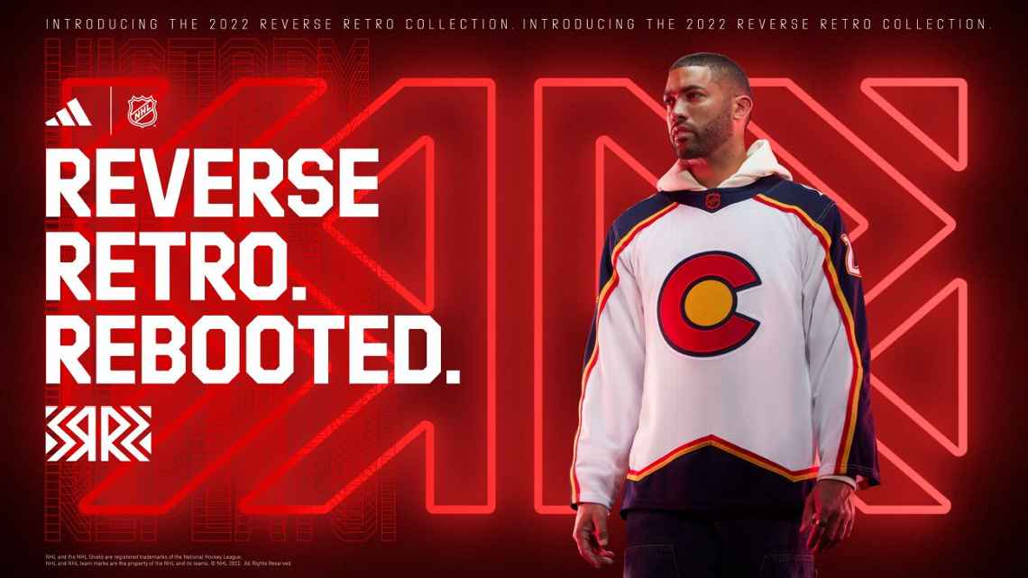
Colorado Avalanche
The Colorado Avalanche jersey is identical to the Reno Renagades original jersey. I really like this jersey. The colors are the Colorado Rockies (NHL 1967-82). It also uses the colors of the state flag. This would make a perfect city jersey. I hope they adopt this jersey long term.

Columbus Blue Jackets
The Columbus Blue Jackets jersey is based on the third jersey introduced in 2003. I do like the colors on this jersey. Think they should have used a different logo. Among the other Reverse Retros, this one doesn’t really stand out.

Dallas Stars
The Stars jersey is based on their original white jerseys that were used from 1993 to 1999. The Minnesota North Stars used the jersey this is based on prior to their move to Dallas from 1991 to 1993. It is a great jersey. I think it could be better without the bottom design. I think they should find a way to incorporate this logo more.

Detroit Red Wings
The Red Wings jersey is based on the 1927 jersey that was also used in 1991. It is also their first jersey to have black in it.
Edmonton Oilers
The Oilers jersey is based on the third jersey they used from 2001 to 2007. I’ve always liked this logo. I am glad to see it made a comeback. The jersey is ok. It is a little underwhelming. I just love to see that logo.
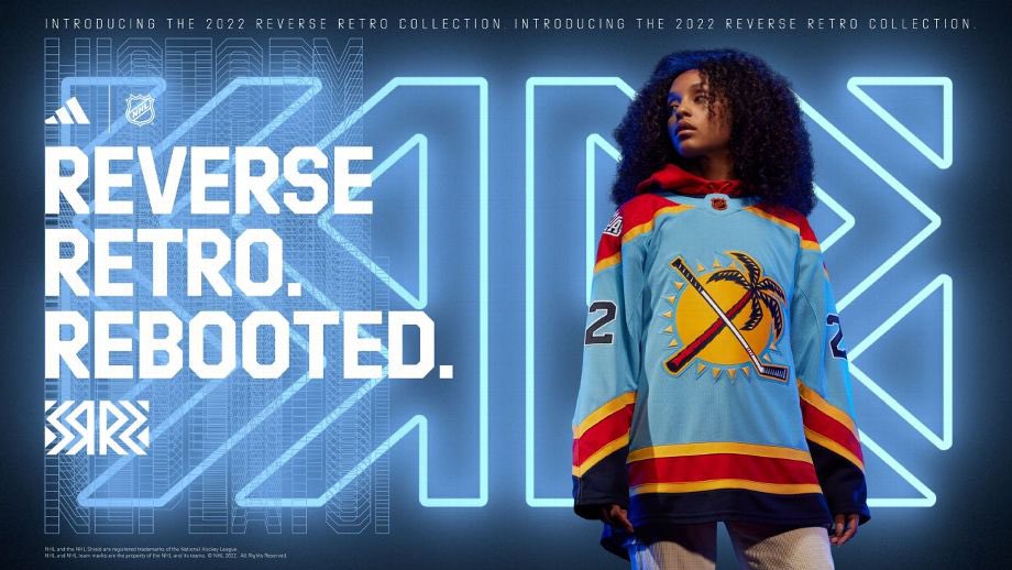
Florida Panthers
The Panthers jersey is based on their jerseys from 1993 to 2007. It is a slightly different template. This is the first jersey they have that uses the sun hockey stick palm tree logo on the front of the jersey. This is also their first light blue jersey. ESPN has this ranked as their number-one Reverse Retro jersey at the moment. I think they should use these as their permanent colors.
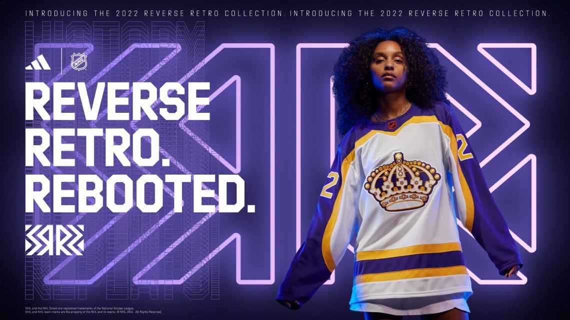
LA Kings
The Kings jersey is based on the jerseys they used from 1980 to 1988. The template is retro. The logo is old school. I like this a lot. I think the kings should go back to using the Lakers colors permanently. They did use these colors in their last Reverse Retro jersey. I think this one is better though.
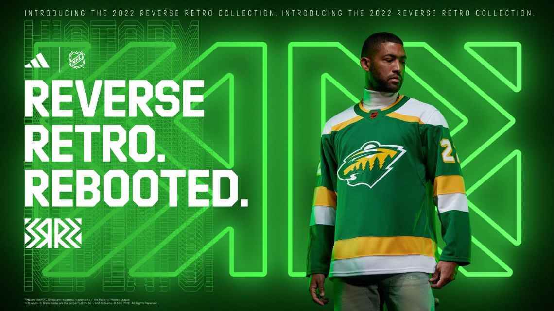
Minnesota Wild
The Wild jersey is the Minnesota North Stars jersey used from 1978 to 1988. It does not remix the jersey at all. The only difference is the logo on the front. It is very close to their last Reverse Retro. They are the second team to have a Reverse Retro 2.0 jersey inspired by the Minnesota North Stars. I like it. It is a good jersey. It is by far one of the least creative Reverse Retro jerseys.

Montreal Canadiens
The Canadiens jersey is inspired by the Montreal Expos. The NHL team is paying homage to the former MLB team with this jersey. The influence comes in the form of colors here. The Expos wore powder blue jerseys. The Canadiens have basically always had the same jerseys. They don’t have a lot to work with in the retro department. I give them a lot of points for creativity for this one. Would have been nice to see the Expos logo on the elbow area. They could have done that like they did with some of their older jerseys. 1,000 times better then their last Reverse Retro.

Nashville Predators
The Predators jersey is based on the third jersey they introduced in 2001. That jersey saw use until 2007. The only thing they changed about the jersey is the front yellow. It went from a mustard yellow to the current yellow they use. I have always been a fan of this logo. I am not really fond of the Predators original jerseys. This is another one where I think it is ok but could have been better.
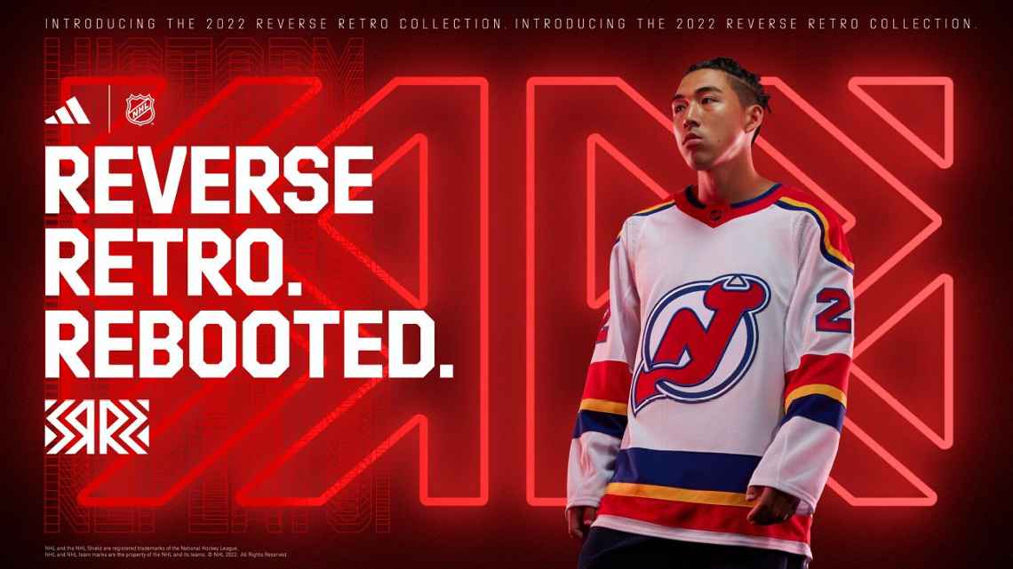
New Jersey Devils
The New Jersey Devils jersey is inspired by the Kansas City Scouts (1974 to 1976). I like the jersey. I like the colors. It would have been cool to see the Scouts logo on the shoulders or something. It is not a 10/10 but there is definitely a lot of creativity going on here.

New York Islanders
The Islanders jersey is inspired by their brief 1995 to 1998 rebrand. Islanders fans are finally getting what they wanted. The Islanders had an extremely disappointing first Reverse Retro jersey. Since then fans have been calling for the return of the fisherman. I think this looks way better than what they did in 1995. I would love to see more of the fisherman era logos make more of a permanent comeback.

New York Rangers
The Rangers jersey is based on the third jersey they used from 1996 to 2007. It was also the inspiration for their last Reverse Retro jersey. I like it. All they really did here is change the navy blue to a royal blue. Like with so many other teams I would love to see these logos find a more permanent place.
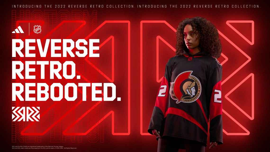
Ottawa Senators
The Senators jersey is based on the third jersey they wore from 1997 to 2007. I do like this one better than the old one. I am glad they did not just recolor the jersey but updated it. I did like their last Reverse Retro better. I do think this should have been a red jersey that way Ottawa has a black, white, and red jersey and not a black, white, and black jersey.

Philadelphia Flyers
The Flayers jersey is based on their 1970s jerseys. It is close to their current jerseys. I do like it better than their current jerseys. I think they take this template and run with it. It is better than their last Reverse Retro jersey but is it too close to their current jerseys to really stand out as a Retro jersey.
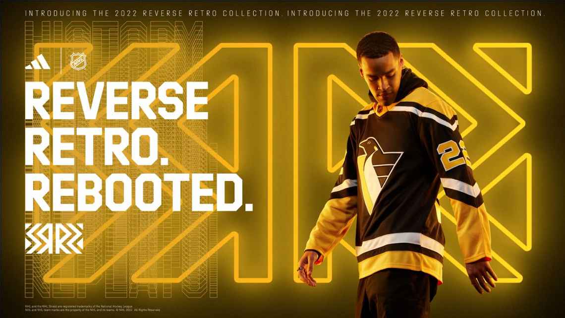
Pittsburgh Penguins
The Penguins don’t miss. The Penguins jersey is based on their robopen jerseys from 1992 to 2002. I love the robopen logo. I am glad to see it make a return. I love this jersey. This could easily be my favorite out of all of the Reverse Retro jerseys. It is another logo I wish made a more permanent comeback.
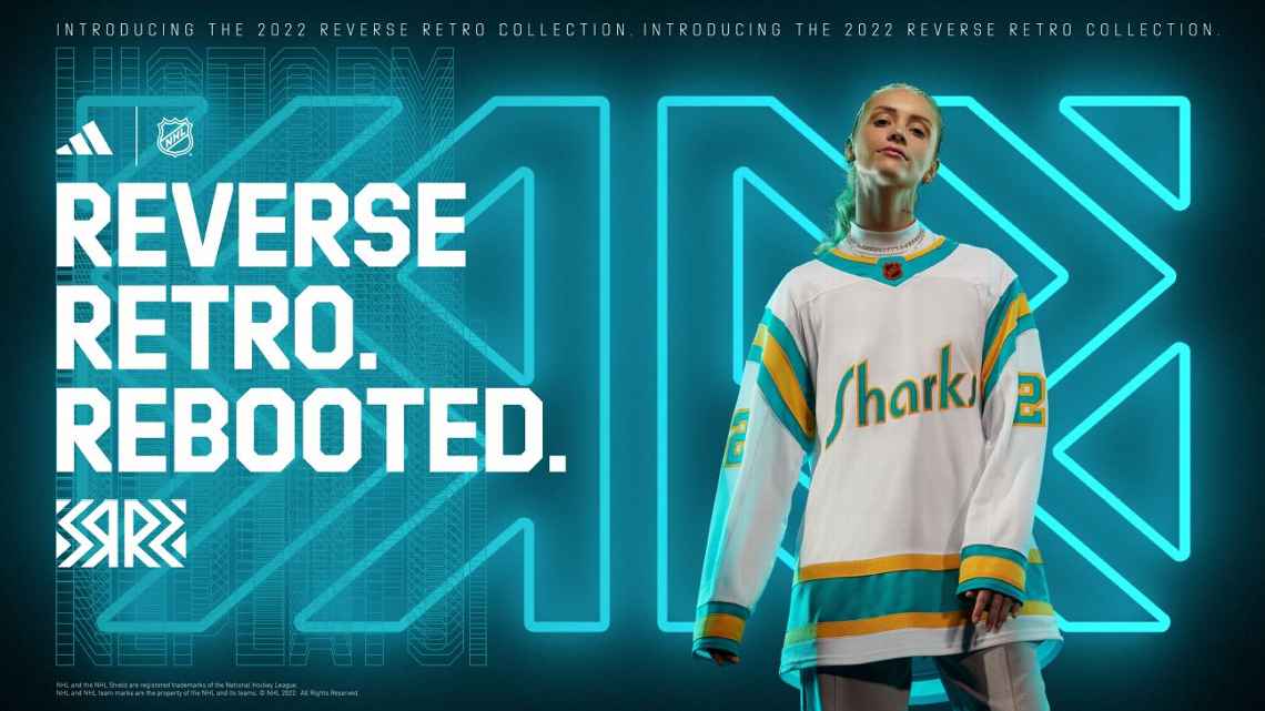
San Jose Sharks
The Sharks jersey is based on the California Golden Seals (1967 to 1976) jerseys that were used from 1974 to 1976. These are the most iconic California Golden Seals jerseys. The Sharks did change up the colors on the jersey a little bit. The biggest change is the Sharks wordmark logo on the front. This is the first Sharks jersey with a wordmark logo on the front. I am not a huge fan of this jersey but I am a huge fan of these colors. I did like their last Reverse Retro better.
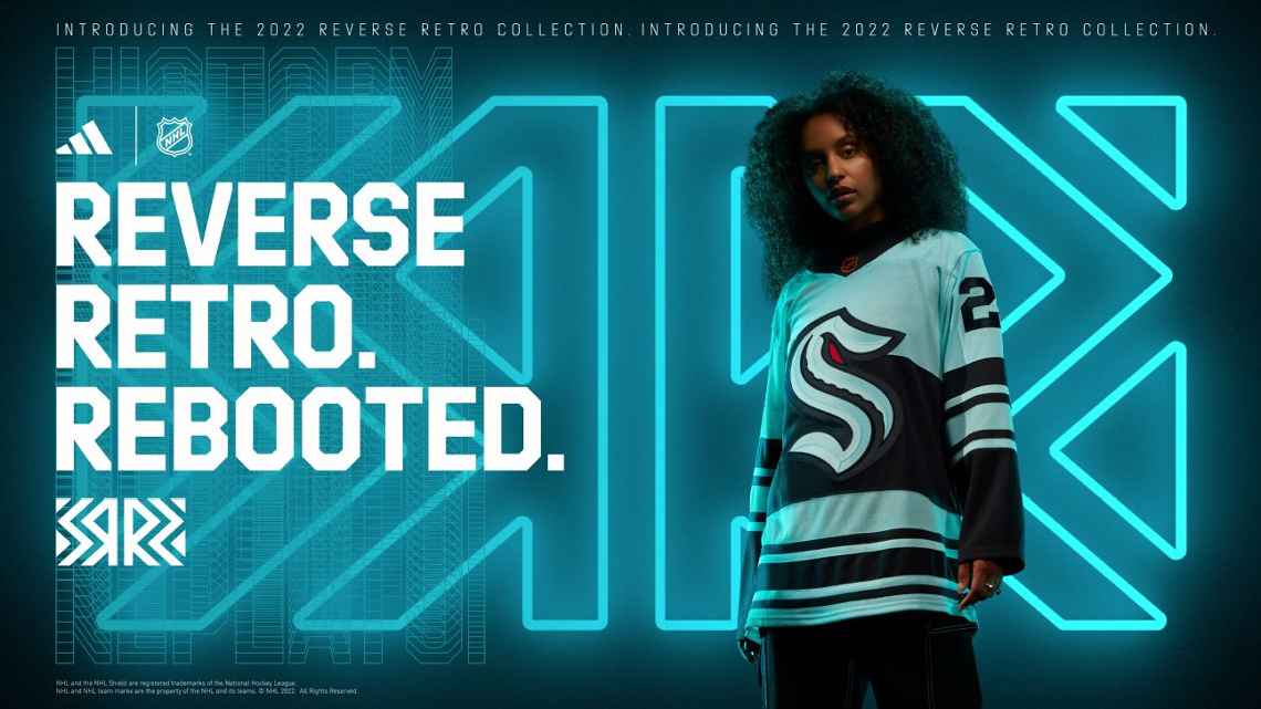
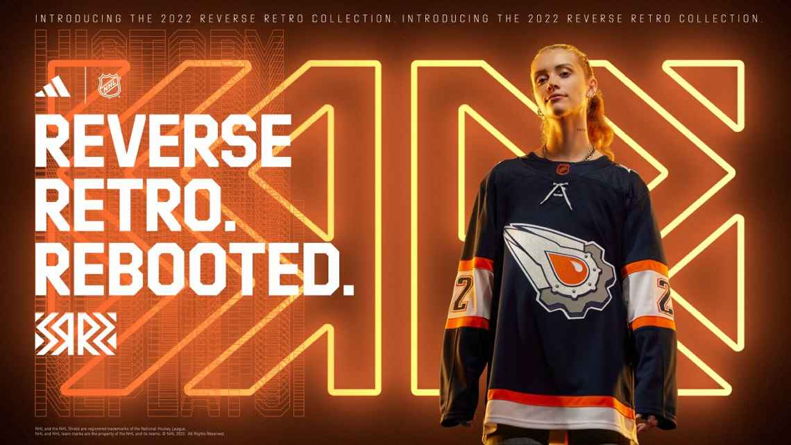
Seattle Kraken
This is the Krakens first-ever third jersey. It is inspired by old Seattle hockey teams. It fits the theme really well. I wish they would have come up with a different logo though.

St. Louis Blues
The Blues jersey is based on their original prototype jerseys. This is the first yellow jersey for the Blues. They really did go all out creatively for this jersey. That is something that I do respect. I like the logo I think it fits really well with the jersey. This definitely has a retro vibe. It is not a 10/10 for me but they do get an A+ for understanding the assignment.
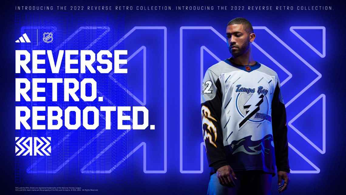
Tampa Bay Lightning
The Lightning jersey is based on the third jersey they used from 1996 to 1999. They killed it with their last Reverse Retro. With this one, they improve on their old jersey design. There is still a lot going on in this jersey. I think they could have improved the jersey more like the Islanders did. This one is tough as there is so much going on in the jersey.
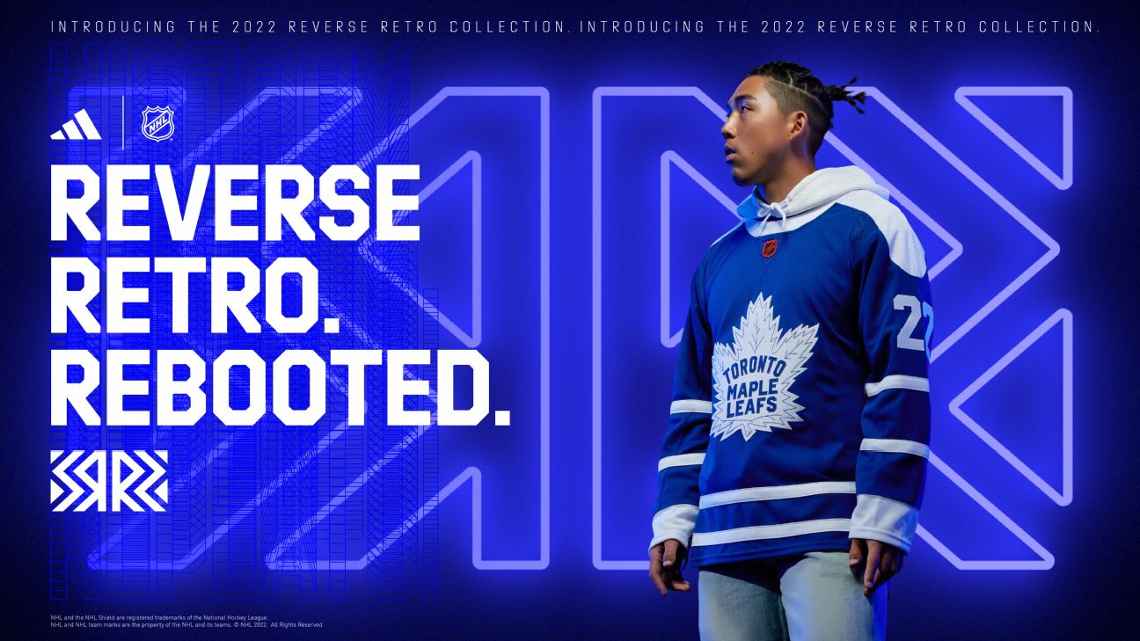
Toronto Maple Leafs
The Maple Leafs jersey is based on their jerseys from 1958 to 1967 and 2000 to 2007. The Maple Leafs did a great job with their first Reverse Retro. They do another great job here. This is one of my all-time favorite NHL jerseys. They did a great job recreating it. This jersey is a masterpiece.

Vancouver Canucks
The Canucks jersey is based on the Vancouver Canucks of the WHL. The logo is amazing. The jersey fits the logo very well. It doesn’t give off a retro feel to me. I think if they used a wordmark like the jersey this is based on it would feel more retro.
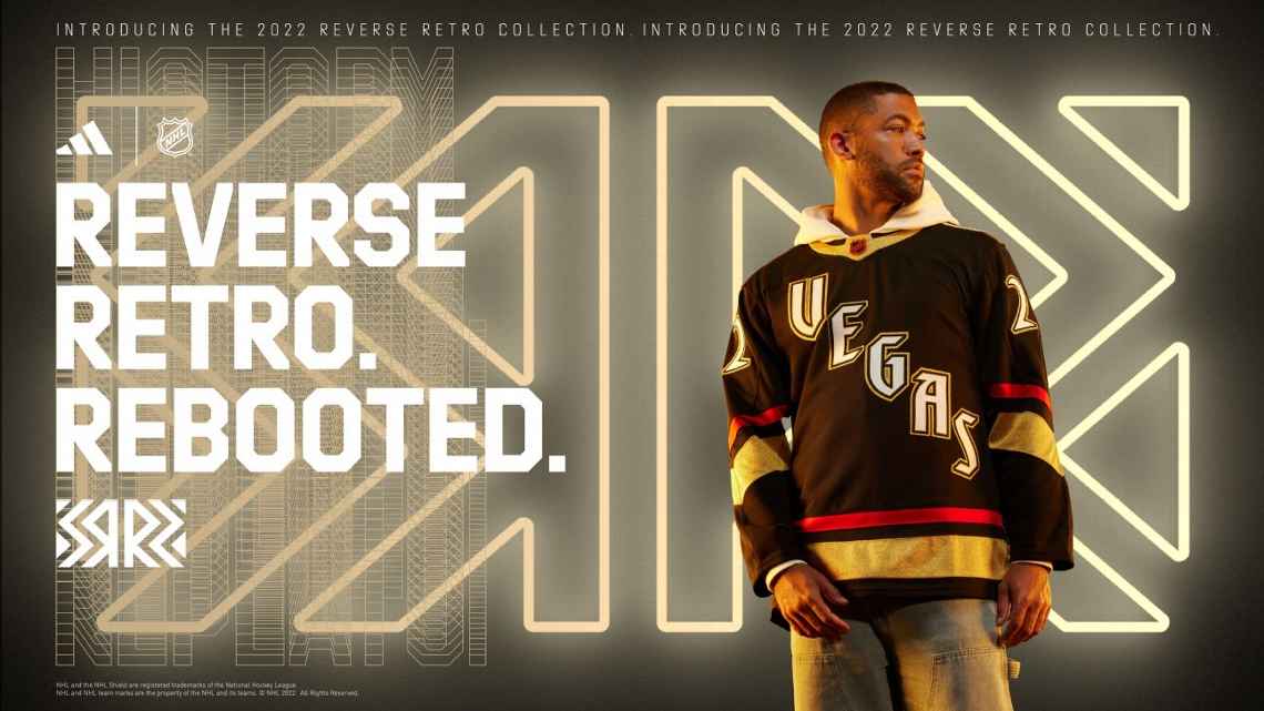
Vegas Golden Knights
The Golden Knights jersey isn’t based on anything. It is just supposed to give off a retro Vegas vibe. I think it does that pretty well. I don’t think it works as a Reverse Retro jersey. It kind of captures the idea of a retro jersey while not fully embracing the Reverse Retro idea.
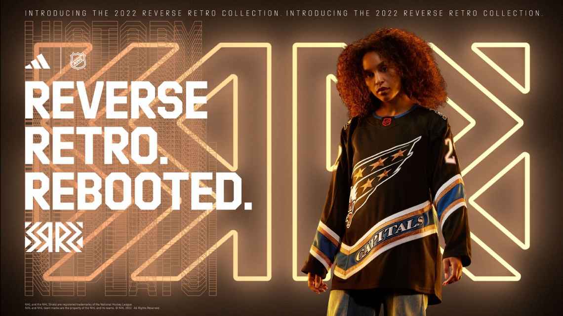
Washington Capitals
The Capitals jersey is based on their 1995 to 2007 jerseys. This is the Capitals first black jersey since 2007. I like the logo. This jersey is very close to their last Reverse Retro. I think their last one was better. It was better because It took the old jersey and put it in their current colors. I think this jersey would look way better in their current colors.
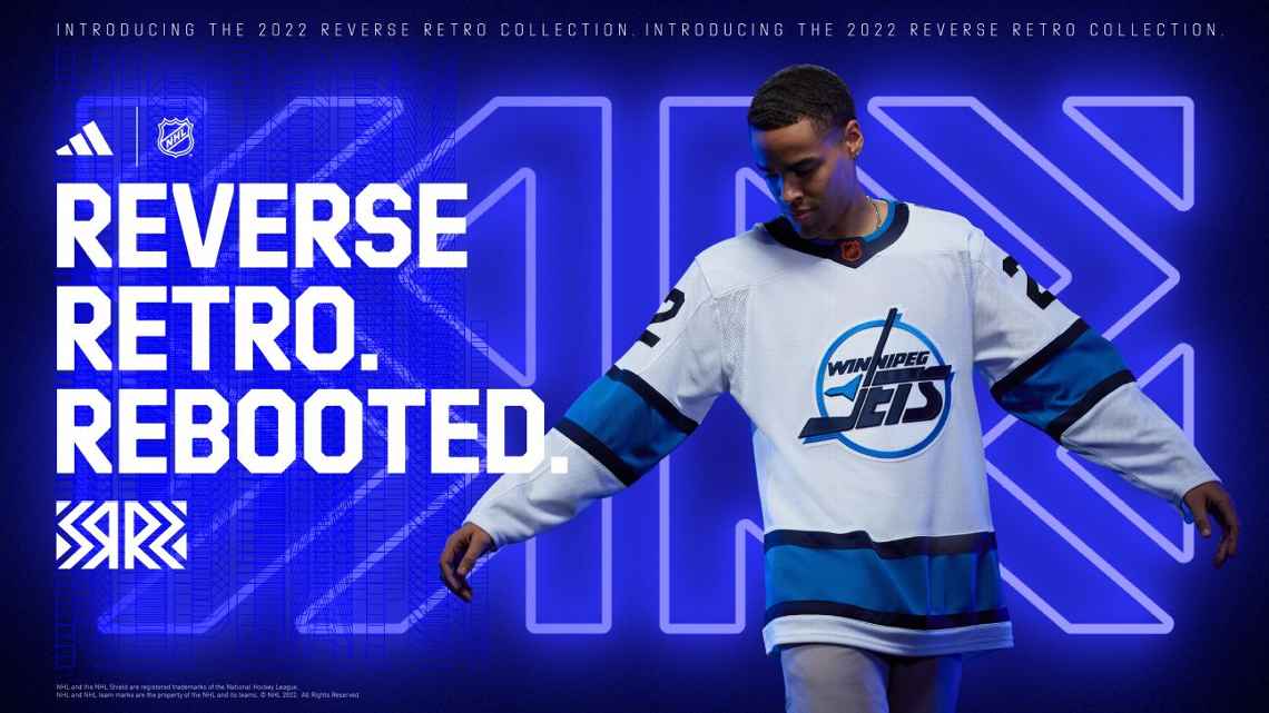
Winnipeg Jets
The Jets jersey is inspired by the Jets jersey from 1990 to 1996. I like the colors. One thing I can not ignore is that it is just a recolor of their third jersey from 2018 to 2021 with a different logo. I still like it.


Leave a comment