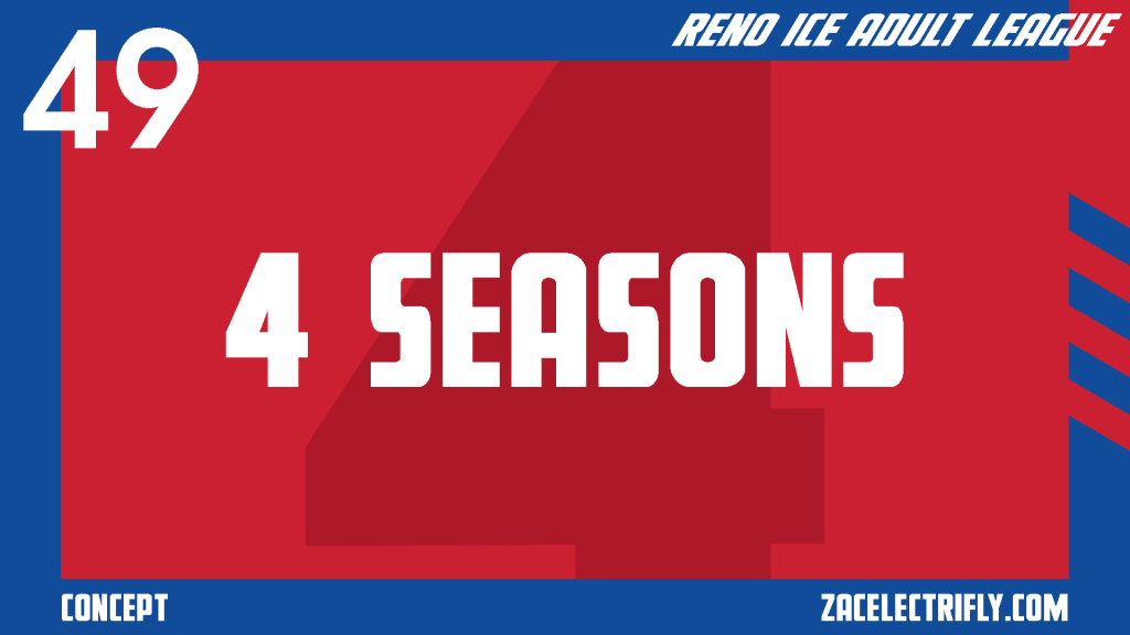
Up next in the Reno Ice Adult League concept are 4 Seasons. For this concept, their full name is Hockey Club 4 Seasons Reno. They are an expansion team owned and operated by 4 Seasons Heating & Cooling.
In this concept, 4 Seasons are the first B-League expansion team. They are the first of three B-League expansion team for season two. They are joining Reno Pond Hockey, Reno Sriracha, and the Slappy Gilmores in the Reno Division of the B-League.
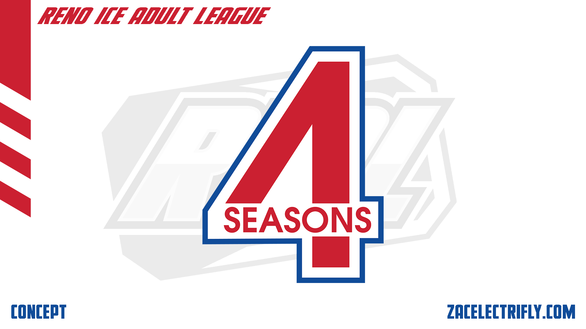

The 4 Seasons logo is a number four with seasons integrated into it. Their colors are red, white, blue, and silver. Their branding is inspired by the NHL all-star game, the NBA all-star game, the Wisconsin Badgers, and HC CSKA Moscow.
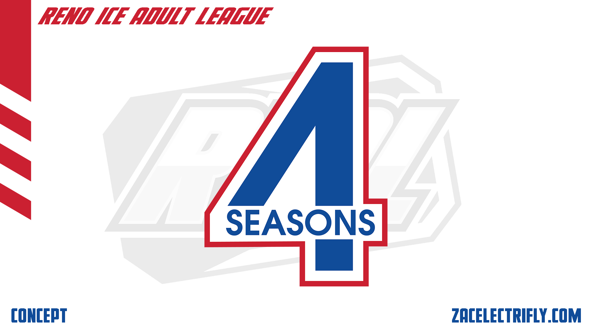

The 4 Seasons secondary logo is a recolor of their primary logo.
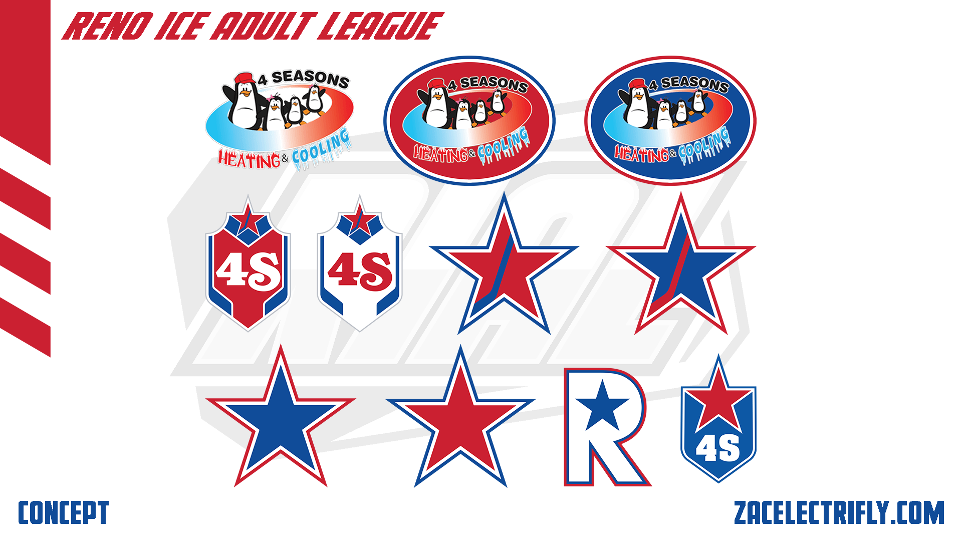
The 4 Seasons first alternate logo is the 4 Seasons Heating & Cooling logo. The next two are put the 4 Seasons Heating & Cooling logo into an oval for better application on jerseys. The first two logos in the middle row are crests with a star and 4S for 4 Seasons. The crest and star have hockey sticks integrated into them. The next two logos are the stars from the crest logos. The first two logos on the bottom row are stars. The next logo is an R with a star in it. That logo is designed for the City jersey. The R stands for Reno. Their last logo is a crest with a star that has 4S on it. It is an alternate throwback logo. As an expansion team 4 Seasons does not have throwback logos.
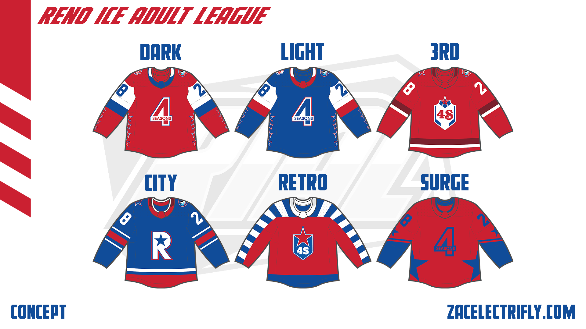

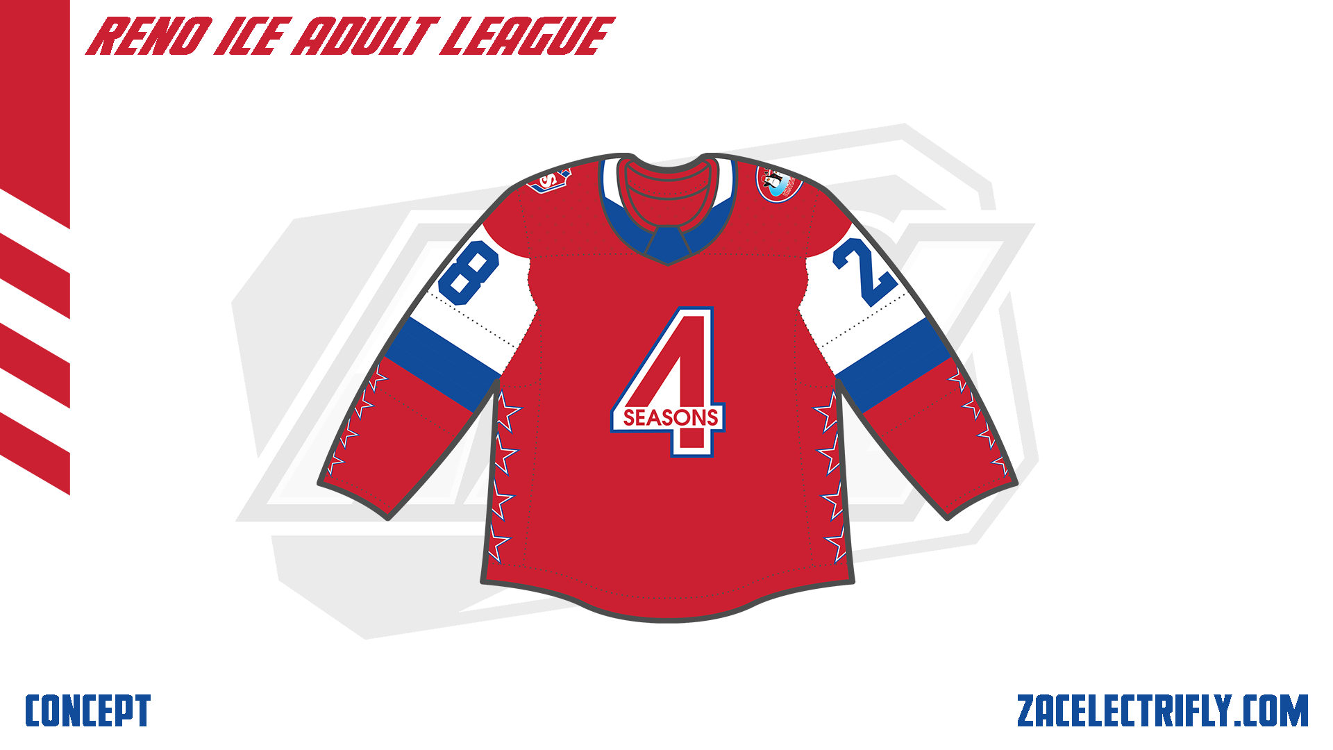
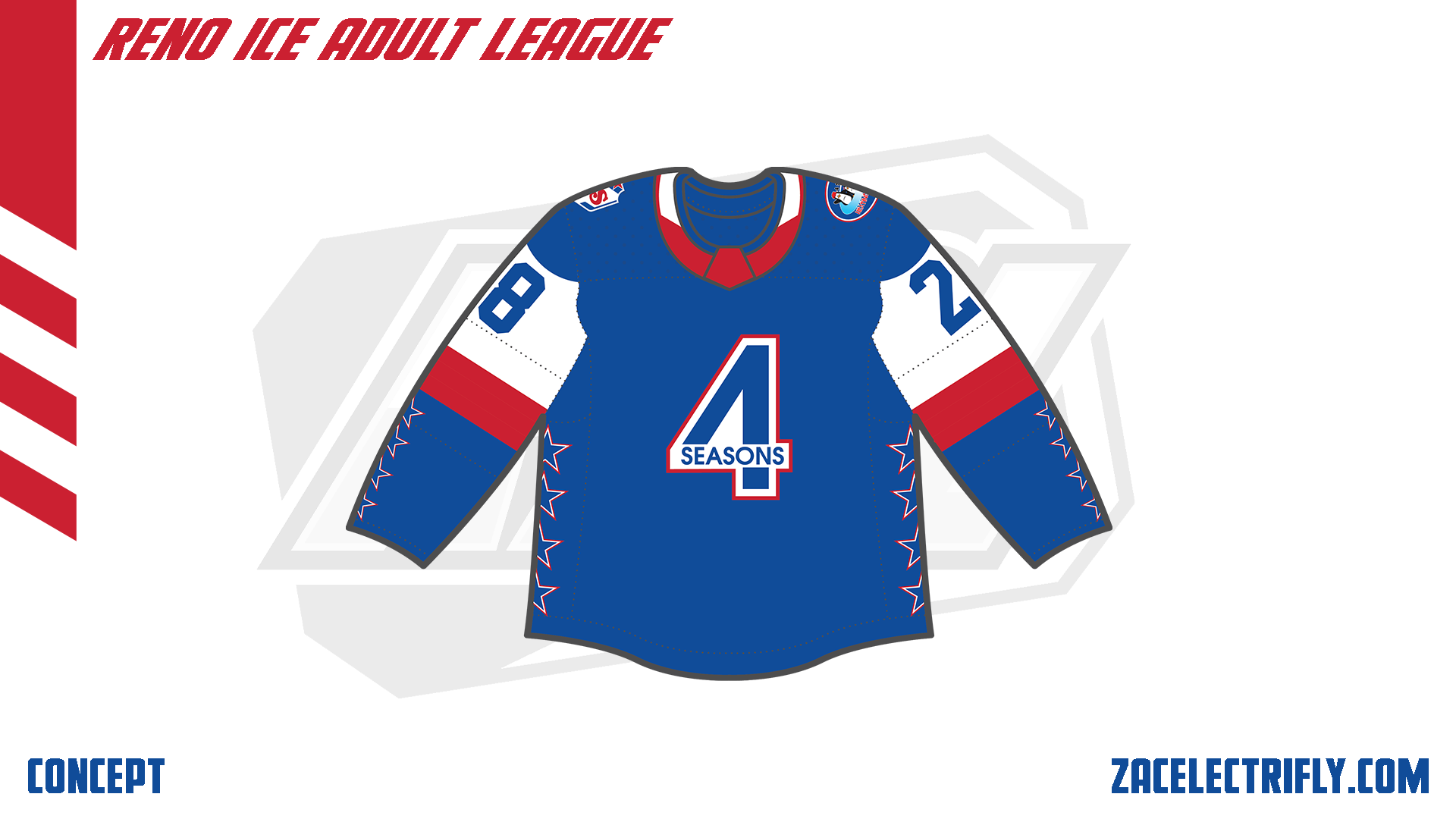
The Dark jersey is red, white, and blue. It has their primary logo on the front. On the shoulders are the 4 Seasons Heating & Cooling alternate logo and one of the alternate 4S crest logos. The jersey also has four stars in four different locations. The Light jersey is blue, white, and red. On the front is the secondary logo. On the shoulders are the 4 Seasons Heating & Cooling alternate logo and one of the alternate 4S crest logos.
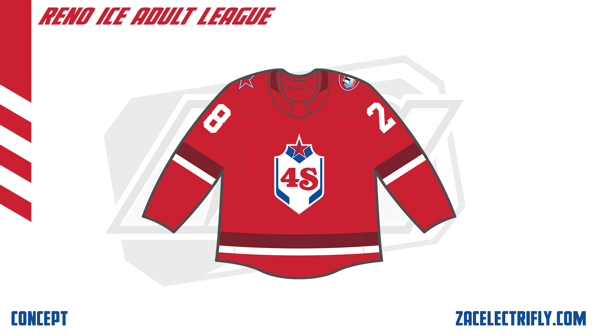
The 3RD jersey is red, dark red, and white. On the front is the white alternate crest logo. On the shoulders are the 4 Seasons Heating & Cooling alternate logo and the alternate star hockey stick logo.
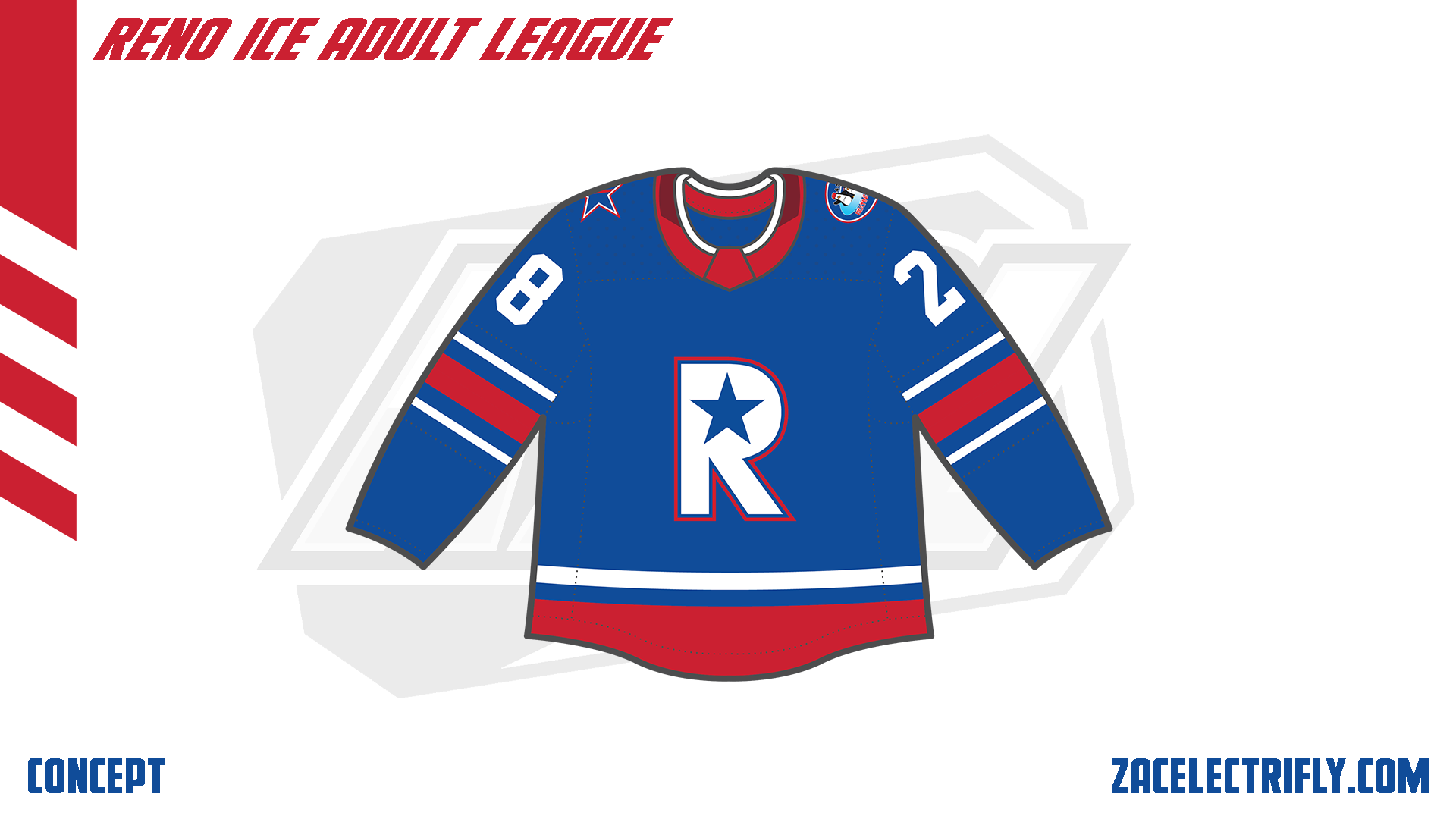
The City jersey is blue, red, and white. It has the R star logo on the front. On the shoulders are the 4 Seasons Heating & Cooling alternate logo and the alternate star hockey stick logo.
The Retro jersey is red, blue, and white. It has the alternate retro logo on the front. It does not have any shoulder logos.
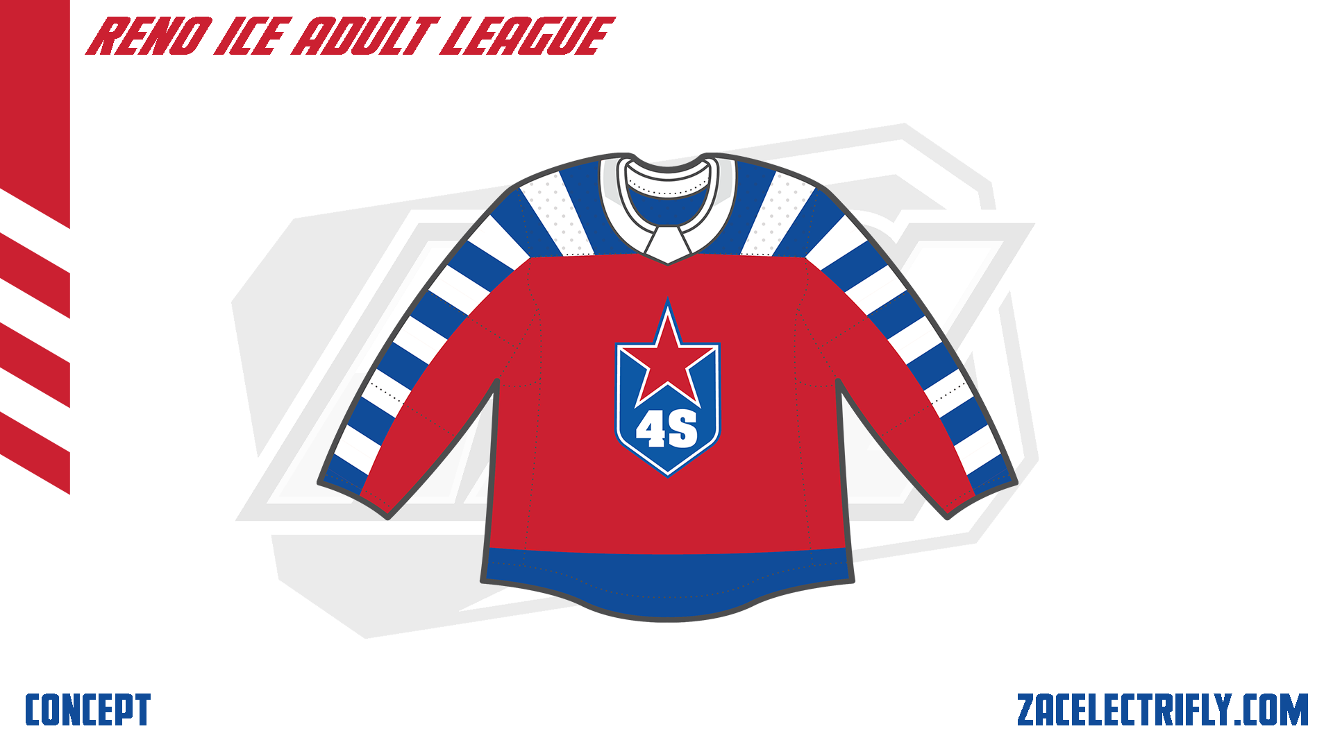
The Surge jersey is red and blue. It has a recolored version of the primary logo on the front.


For 4 Seasons goal horn, the horn is the Grand Rapids Griffins horn. The song is Levels by Avicii. The goal horn and the win horn use the same song.

Leave a reply to B-League Update | Reno Ice Adult League Concept Part Fifty Two – Zac Electrifly Cancel reply