Back in may FIFA released the logo for the 2026 FIFA World Cup. The 2026 FIFA world cup will be in North America with host cities across the United States, Mexico, and Canada. This is the first time North America has hosted the event since 1994 when the United States hosted the event. The FIFA World Cup 2026 will also see expansion of the event with more teams added than ever before. It will also be two years before the United States hosts the Olympics. It is a huge event and needs a logo, branding, and identity that represents that.

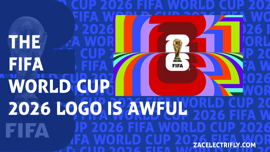
The logo itself is very basic. It has a twenty six behind an image of the world cup. Immediately there was a lot of backlash for this logo. The main problem I have with this logo is that it has no personality. It does nothing to represent the hosts. It says very little about the event. all it conveys is the year and that it is the FIFA World Cup. A lot of people have said it is too minimalistic. I can see the minimalistic elements in it but I don’t think it is minimalistic due to the detail in the image of the world cup. It is just a picture of the world cup not a design or anything to represent the world cup. However it does look “trendy” to me. Like someone was trying to make a logo that looked like a lot of other trendy logos. It is lacking and is not good. North America is the biggest exporter of culture and art in the world. North America leads the world in design. It is extremely disappointing that this is what they came up with.

They tried to explain that the different elements mean something in the design. All they mean is 2026 which is the year the event is happening and that it is the FIFA World Cup. There is nothing in the logo that represents the United States, Mexico, or Canada. This will be the first time Canada has host world cup matches. I am sure Canadians are very happy that there is nothing on the logo that shows that. The United States 1994 logo is iconic not to mention the countless other iconic event logos logos that the United States has had across sports. That makes this logo even more disappointing as a United States fan. Mexico also has some iconic logos like the FIFA World Cup 1986 logo and the 1968 Olympics logo that helped define Mexican design for decades.


I get what they did. I think they did it to be trendy and to match the design of the LA 2028 Olympics. I think the FIFA World Cup 2026 logo is designed in for the 26 in the background to be filled in with logos, flags, patterns, videos, and other designs. It is designed to be a template that can be remixed. We see that with the LA 2028 Olympics logo where the A in LA is designed differently to represent different things and create a variety of logos that use the same template. I think we could see the same thing here. The reason I think that is because of the images that have already been released. If they were upfront about that I think the logo wouldn’t get as much hate. If they let people know in the beginning that there will be other verations with a wide variety of representation I think people would get behind it more. I still don’t think it makes it that much better though. I think it goes from an F to a C and it still not the super iconic logo we should be getting.


Below is the history of the world cup logo. The United States and Mexico have hosted the event before. Mexico hosted the event in 1970 and 1986. The United States hosted the event in 1994. This will be the first time Canada hosts the event. This will also be the first time multiple countries host the FIFA World Cup. My favoite FIFA World Cup Logo is the 1994 FIFA Wold Cup Logo. I also like the Russia 2018 logo, the Mexico 1986 logo, and the Italy 1990 logo.


These are the two best concepts I have seen for the FIFA World Cup 2028 logo. I am working on my own concept for the event as well that should be out soon. The first concept just updates the already existing log. It keeps the same theme of the logo being trendy and contemporary while adding representation for the host countries in the 26 and turning the trophy from an image to a stylized logo. The second concept uses different cultural elements from the United States, Mexico, and Canada to create the trophy.


Leave a comment