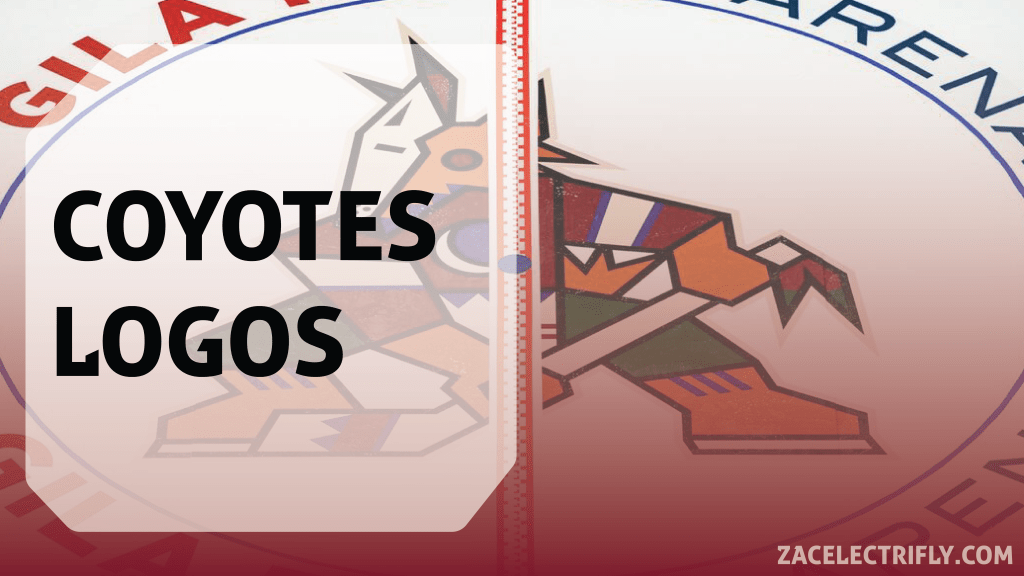
The Arizona Coyotes have moved to Salt Lake City Utah. The Utah NHL team still does not have a name. They still do not have jerseys. I will get into whats going on with the Utah NHL team in another post. In this post I am taking a look back at the Arizona Coyotes Logos. I will be looking at all of their logos they used over the past twenty five years. I will not be going over any of their one off or specialty jersey logos. This is just about the Arizona Coyotes primary, secondary, alternate, and anniversary logos.

Above is how I ranked all of their logos. My favorite era of the Coyotes is the 2015 to 2021 era. I really like the howling coyote logo. I think it works really well with the second AZ state logo and paw logo. I do like it better than the kachina branding. I do like them both. The Coyotes brand reached its peak in 2021 when both the kachina branding and howling coyote branding were being used together. I also like the jumping coyote logo a lot. The jersey that logo was on was not the best but it is shame that the team did not try to incorporate the logo more after retiring the jersey. I’ve always like the gila monster logo. The simplicity of it with the angles and harsh lines has always stood out in the NHL. The kachina logo is a classic. It has achieved a status a beloved logo that few other brands in the NHL have. It works best with the tan outline. It is at its worst with the black around the tail. I also really like how they incorporated it into the twenty fifth anniversary logo.
The purple moon logo is nice. I think it always complemented the kachina branding very well. The kachina head logos are good especially on the purple Reverse Retro jersey but I do not think it is the best the Coyotes have to offer. The Paw print roundel logo was always great. The Arizona wordmark logo introdiced in 2022 was good. It showed that the brand was not just looking towards the past. I have always liked the Coyotes script word mark. The kachina logo with the white outline is still good but not as good as the kachina logo with the tan outline. I really liked the newer wordmarks the team introduced. The twenty fifth anniversary logo with the howling coyote logo was always nice but not as nice as the kachina version. I really like what they did with the design of Arizona on the twentieth anniversary logo.
The original PHX state logo was great when it was introduced but it became better when the AZ version was introduced. The howling coyote logo would have been better with a tan outline instead of a white one. The latest Coyotes wordmark logo that incorporates the kachina logo was not as good as it could have been. The original wordmark logos are good but could have been better without the outline surrounding the logo. The original wordmark logo that incorporated the kachina logo should have been the original primary logo. That could have give the original Coyotes jerseys more differences between the home and away. The red moon logo I did like better than the purple moon logo except for the white outline. Their inaugural season roundel logo was solid. I think that logo could have replaced the primary logo on the original home jersey to make a jersey worn for a game or two. I really like the fifteenth anniversary logo but it has a bunch of elements put together and doesn’t really blend together well. The original AZ logo without the star is not as good as the eventual redesign.
The 2003 to 2008 wordmark logo misses the mark and seems bland when compared to the rest of the Coyotes branding. The fifth anniversary logo is also not that good but I did like the cacti elements. I do not know what they were thinking when they but black where there was an outline before on the kachina logo. Any of the logos with text in front of the moon logo I did not like. There is also too much going on in their other inaugural logos.
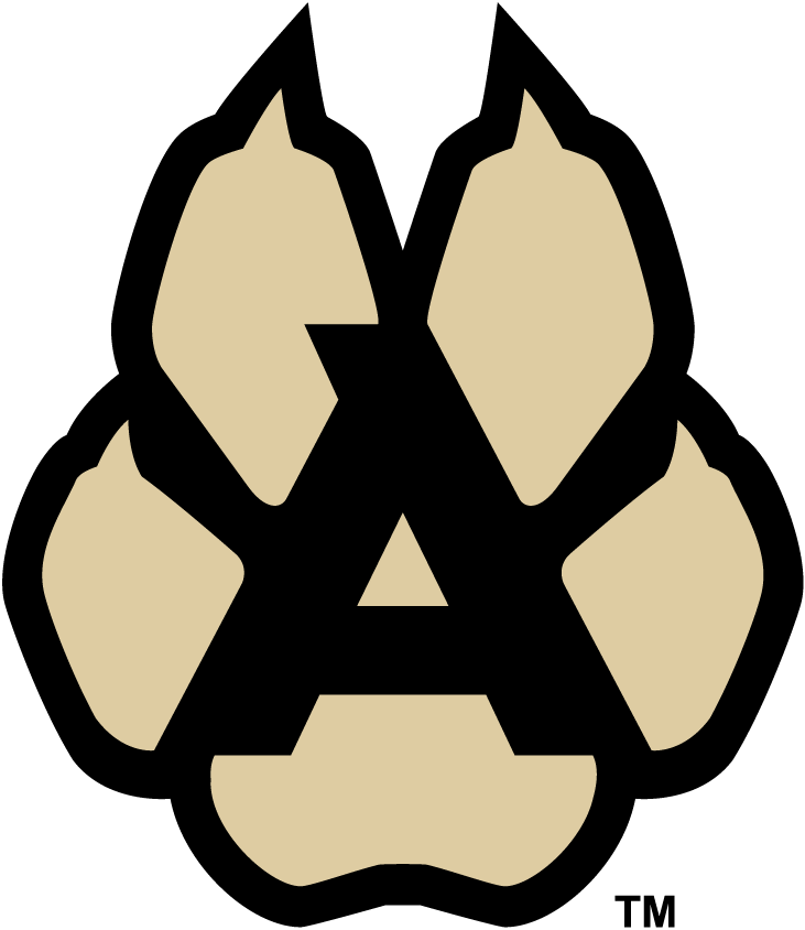
#5 – 2015 to 2022 alternate paw logo
Using the negative space of a coyote paw to create an A for Arizona is brilliant. This logo works brilliantly with the rest of the Howling Coyote branding.
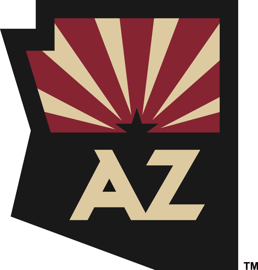
#4 – 2015 to 2024 alternate Arizona state logo
This logo is the perfect evolution of the Coyotes state logo. It started off with the PHX state logo and after a couple of redesigns it ended up as this. It has a lot of elements in it without it being overwhelming. I would have loved to see this on the front of a jersey.
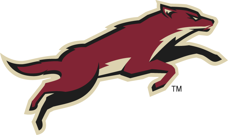
#3 – 2008-2024 alternate leaping coyote
This logo is a coyote in an action pose. I love it. It showed the Coyotes doing something that most other teams were not doing at the time. According to sportslogos.net the logo did continue to see use until the teams relocation. Part of what makes this logo so amazing is that it captures the form of the coyote without too many details. Almost like the gila monster logo.
#2- 2021 to 2024 primary Kachina logo
The Kachina logo with the tan out line is the best version of this logo. The Kachina branding is now iconic. They should not have made a full return to it like they did. I think it works beautifully as a retro brand or a alternate brand. I love the Native American art style. It is so cool to see it in pro sports without it being subject to backlash. All over the Phoenix area is so much similar design. This logo really captured what Phoenix and Arizona are. So many people wanted it back just because of nostalgia. The Coyotes were going through a lot when it comes to an arena and the future of the team. A lot of people wanted a return to when the team was selling out games in Phoenix. That’s why the Kachina branding returned. The issue with its return is it got rid of the howling coyote branding while not moving the brand forward. The whole branding became playing on nostalgia. I do think that the Kachina branding is goo but it should have continued to exist with the howling coyote branding or they should have moved in a different direction.
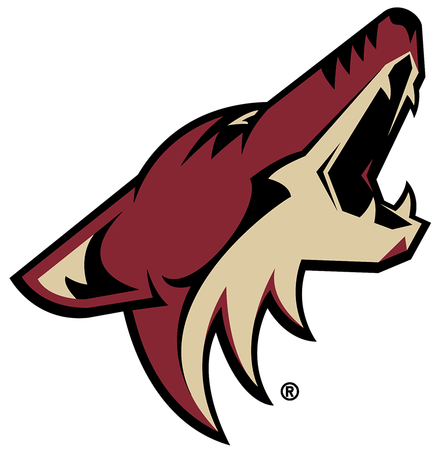
#1 – 2003 to 2021 howling coyote primary logo
I love this logo. I get that not everyone likes it. It is a contemporary logo and is what each sports team should try to strive for. Ultramodern is the name of the game. Moving the brand forward is what the sports leagues should look to do. I think this logo was best paired with the paw and state logos. Moving forward I think they should have tried to continue that. Who knows what to expect in the future. There is a lot of time between now and if or when the Arizona Coyotes return.


Leave a comment