The United States Soccer Federation officially launched its 2022 uniforms today. They are launching the new uniforms ahead of the FIFA World Cup. The jerseys did leak quite some time ago. The new uniforms are what the United States will wear during the 2022 FIFA World Cup in Qatar. The reaction to them has not been positive either. I will talk about all of that in this post.
The uniforms did leak a while ago. The leak was exactly what we got. I think the leak was done on purpose to get an early reaction and build up excitement. The hype video was still nice.
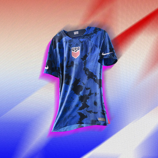
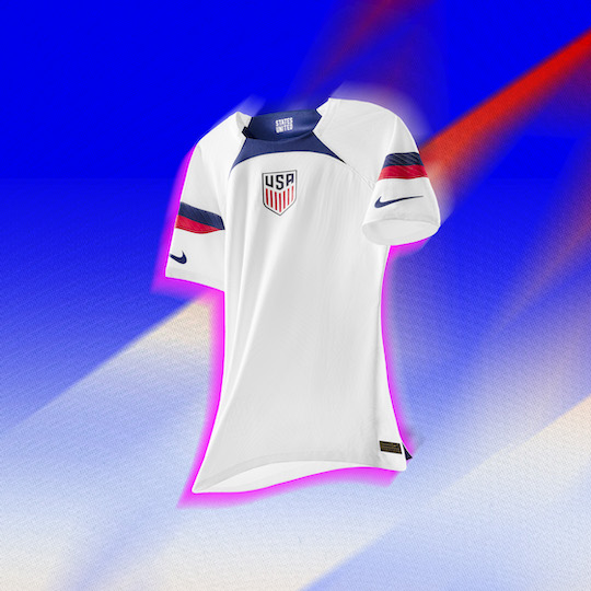
There is a blue and a white jersey. The blue jersey has a tie-dye pattern. The white jersey has blue and red stripes.
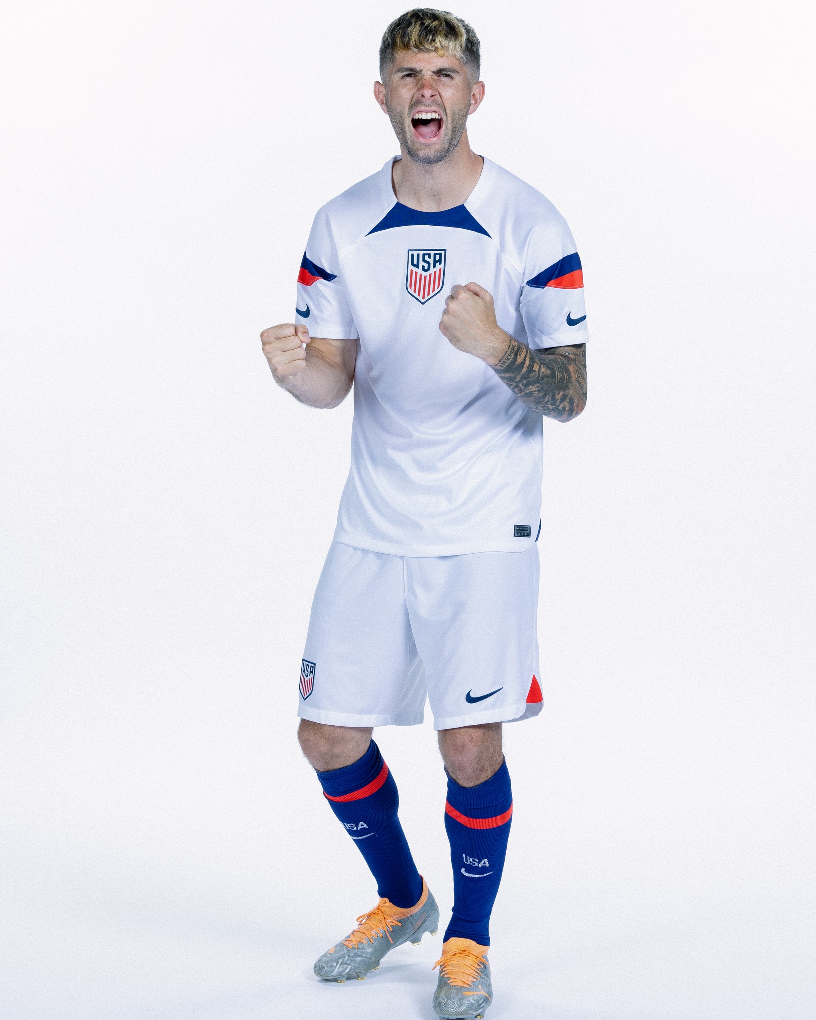
It looks like the United States will have white and blue socks to go with both jerseys.
The uniforms launched by Nike and the USSF are fairly plain. There is almost nothing going on. On the white uniform, there is nothing to attract the eye. While there are elements on the sleeves and collar, the majority of the jersey feels empty. It’s just white. The tie-dye pattern on the blue jersey is kind of random. I would have like to see more integration of red, white and blue on both jerseys. The blue jersey could use some more to the design other than just a pattern.
These will be the uniforms the United States will use for the 2022 World Cup. The launch has left a lot of fans disappointed. I think the blue jersey isn’t the worst. I think with the resources Nike has and the money they spent to get to this point the uniforms should be better. The main criticism seems to be how uninspired the jerseys are. Nike responded to criticism before the jerseys even released. The attitude from Nike is that they don’t care about the criticism. They basically said we don’t care you’ll buy it anyway. They kept coming back to the idea that If the United States does well at the world cup it won’t matter what the uniforms look because people will buy them. This idea that people will learn to love them isn’t crazy but it’s not something anyone wants to hear from Nike. Nike seems to think that as long as their logo is on it people will buy it and the design doesn’t matter.
The goal of Nike seems to be not to generate sales through good design but to push for sales through team performance. I understand performance has an effect on sales. There is no reason to not have a good design to go with it. Nike is a multibillion-dollar company. There is no reason to have a poorly received design followed by comments that are mocking in tone telling consumers and critics they will buy it anyway.
In the end, this is corporate soccer. There is nothing more or less to expect. Tens of millions of dollars go into this. Whether the uniforms look good or not, the USSF and Nike will make millions of dollars. What it comes down to at the end of the day is Nike needs their logo on the USSF uniforms. Brand and logo recognition is more important than good design. Loyal United States and Nike fans will buy it no matter what. That alone is worth millions of dollars. If the United States does well in the World Cup that will be a few more million worth in sales. That is for one product alone. With this kind of perspective it’s easier to see why the United States uniforms look this way.
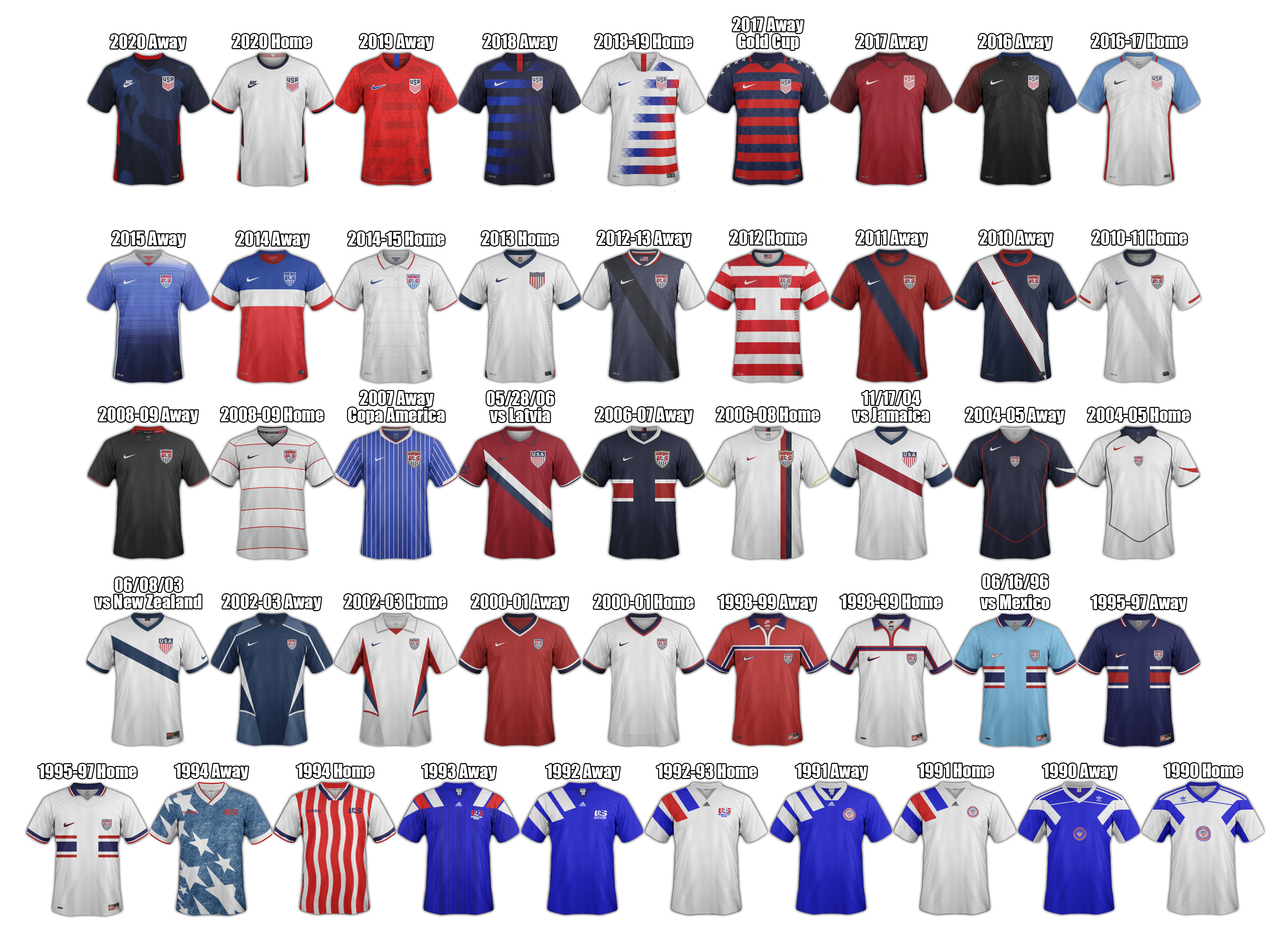
Something else that I did see that I would like to address is that someone said the United States does not have a “kit identity”. Meaning that the United States doesn’t really have any commonality between uniforms. That is wrong. Vertical stripes can be found across United States soccer jerseys. The United States has had vertical stripes on its jerseys since 1995. I think the United States establish a strong visual identity with their 2010 to 2012 uniforms. In 2017 they came back to that until 2019. I think especially when on the world stage for competitions like the FIFA World Cup, they should have designs inspired by the 2010 away jersey and 2011 home jersey. A lot of teams have one jersey that is in line with their historical identity expectations. The second or third jerseys are usually reserved for more creative designs that stray away from historical identity expectations. It would be nice to see the United States move towards that.


Leave a comment