
The FIFA World Cup Qatar 2022 is coming up fast. I am excited about it. This will be the third major international sporting event in two years. 2021 saw the Tokyo Summer Olympics. Earlier this year was the Beijing Winter Olympics. Now we have the FIFA world cup. These events have had a lot of controversy but like the 2022 Olympics I will for the most part not be talking about it. A lot of the politics and controversy surrounding FIFA and the 2022 World Cup was covered in the Netflix series FIFA Uncovered. I watched it and highly recommend it.
In this post I will be talking about the kits (uniforms) that will be used at the world cup.
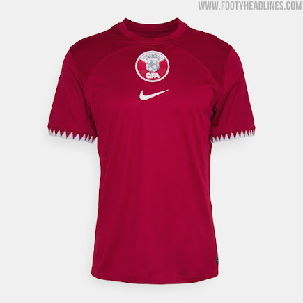
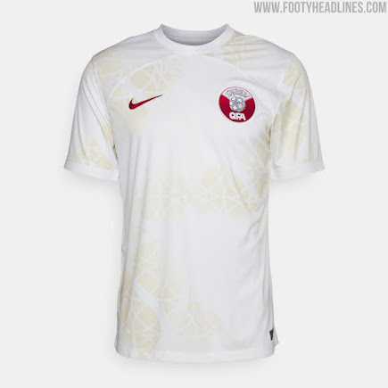


Qatar – The first two kits seen above are the Qatar kits. The kits are kind of plain. That isn’t a problem exclusive to them. I do not like how the position of the crest is in two different spots. If they are going to go centered they should both be centered. The pattern they have on the white jersey makes it look dirty.
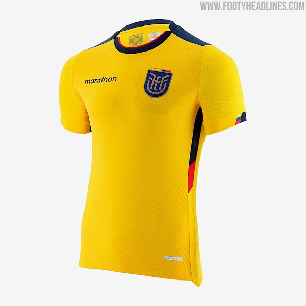
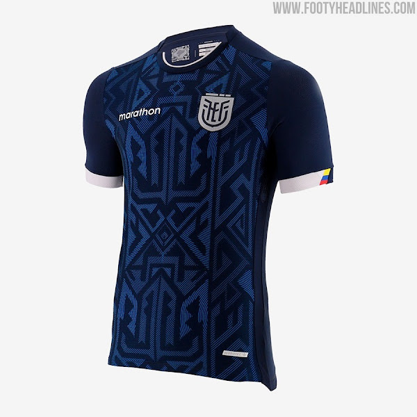
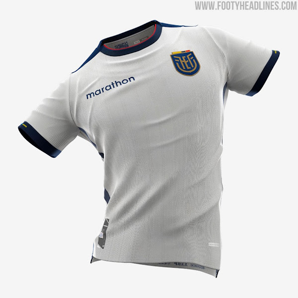
Ecuador – The second three kits seen above are for Ecuador. Their blue kit is definitely their strongest. They are one of only a few teams to have three jerseys. Not see here are all of the small details in the kit that make them stand out.
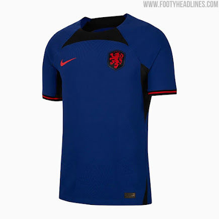
Netherlands – The next two kits are the Netherlands. Their orange jersey looks straight out of the 90s. I am not a fan of shiny material used in jerseys like this. Their blue kit is better. Both of them suffer from being plain.
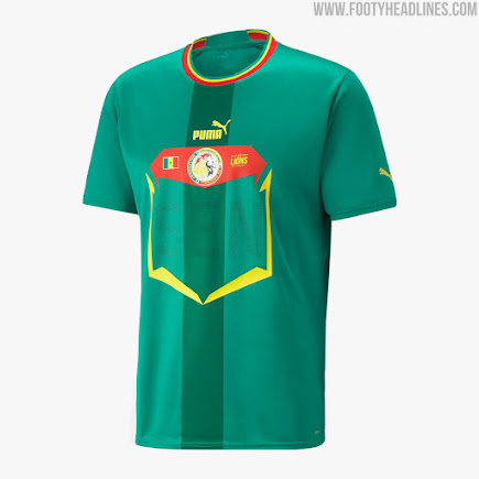
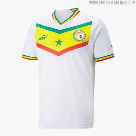
Senegal – The next two kits are for Senegal. The green kit is ok. I am not a fan of what Puma is doing this year for their kits. Each of their teams has a front design that reminds me of the numbers that marathon runners wear. I will give them props for creativity with their designs. Way better than Nike. I like the Senegal white kit. It is inspired by their flag and they did a good job with that.

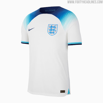


England – The first two kits are England. The red kit is ok. I am not huge on the light blue color. I like their white kit a lot more. The gradient is really interesting. It may be one of my top Nike jerseys for this world cup.
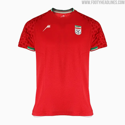
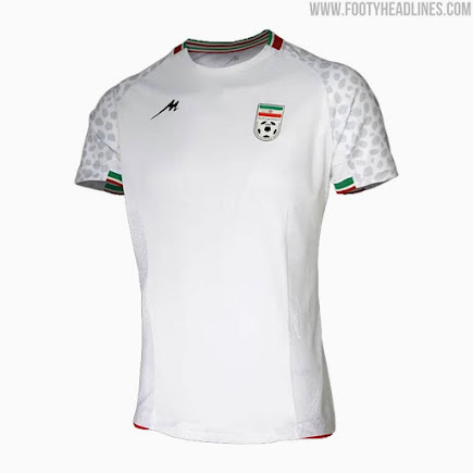
Iran – The second two kits are Iran. I like the pattern on the jerseys but that’s all I can really say about them. There isn’t much to them.
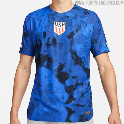
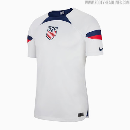
United States – The next two kits are the United States. I talked about this in their own blog post. US Soccer Launches Their 2022 Uniforms. The big thing with them is that they are plain. The issue surrounding the USA kits was the fans didn’t like them and Nike’s response to that.
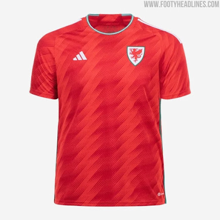
Wales – The last two kits in group b are for Wales. I really like their new crest. I like the pattern on the red jersey. I like the collar on the white jersey.
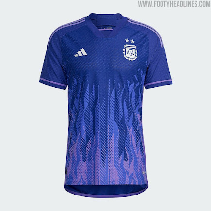


Argentina – The first two kits here are Argentinas. The first one is purple with flames. I think that is really cool. Their other kit is white with blue stripes which is expected of them.
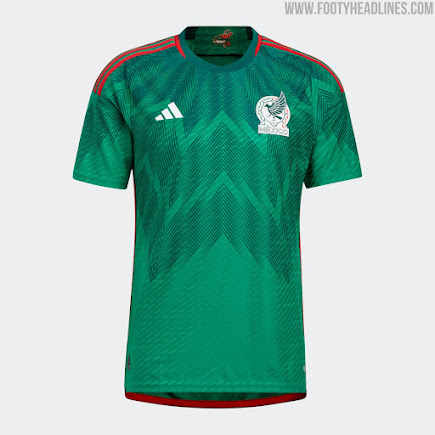
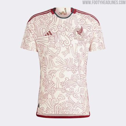
Mexico – The next two kits are Mexico. Mexico has had some stunning kits in recent history and these are no exception. The pattern on the green kit was executed really well. The pattern and colors for their white kit is amazing.
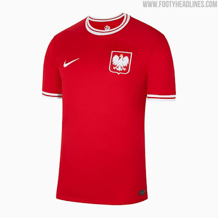
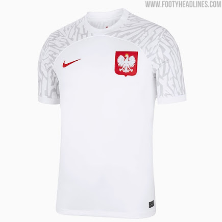
Poland – The next two kits are Poland. The red kit is basic and gives off a retro vibe. The retro vibe makes it way better than most of the other Nike kits. The white jersey has a pattern on the shoulders. It is not as good as their red jersey.
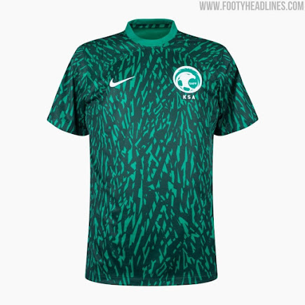
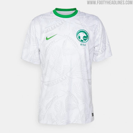
Saudi Arabia – The last two kits in group c are Saudi Arabia’s. Both of their kits are ok. Both kits have similar ideas to what Mexico did. Mexico had better execution of the idea. I get a real “can I copy your homework vibe from these kits”.
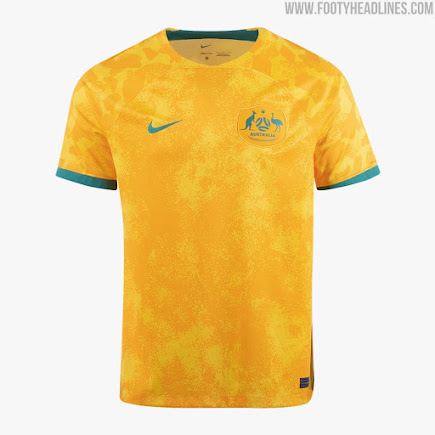
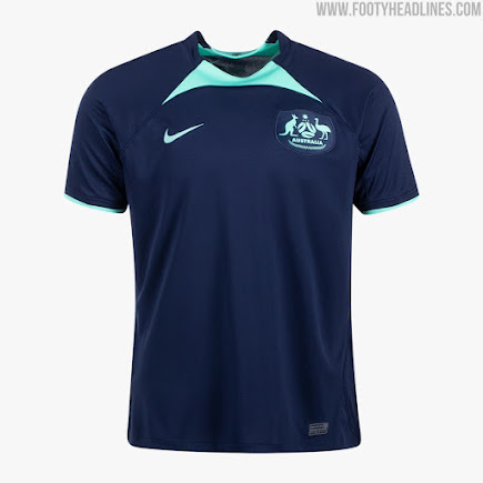


Australia – The first two kits are Australia. Their yellow kit has a tie-die pattern like the United States kit. I’m not a big fan of that pattern but I like it better on the Australia kits. I like the colors on their blue jersey. I just wish they would have done more with the jersey than just that little piece next two the collar.
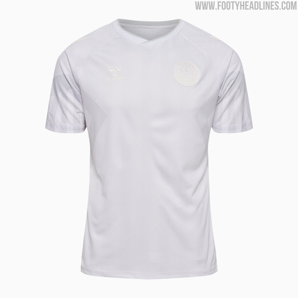
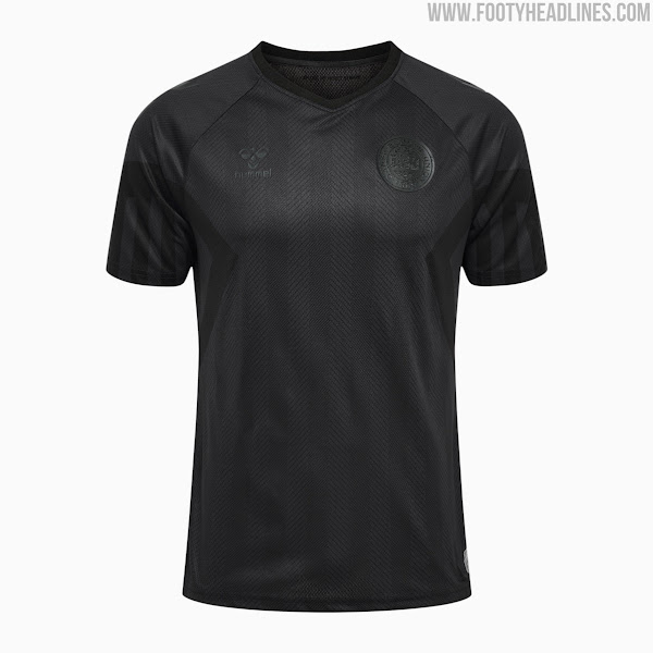
Denmark – The next kits are Denmark. They have three kits. The red one is by far their best. They remind me of fashion jerseys, not ones meant to be used in a game. They are definitely unique amongst the rest of the 2022 kits. the patterns and crest are hard to tell. I think if they would have made the patterns and crest darker for visibility they would be perfect.
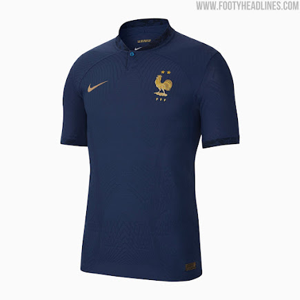
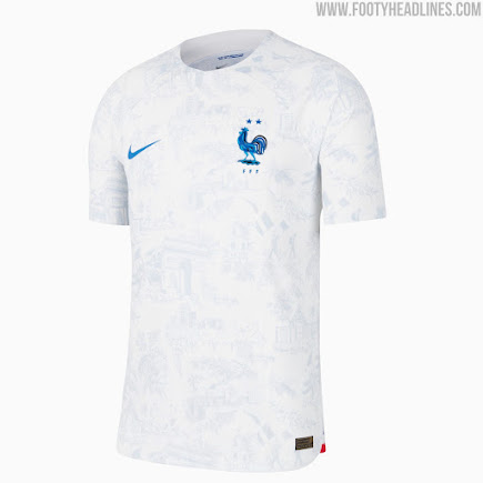
France – The next two are France. I like the collar on the blue jersey. Both of their kits are pretty boring. The pattern on the white kit is interesting. It looks like a work of art. However, it is only visible closeup.
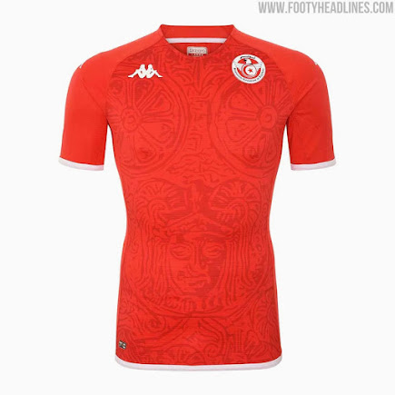
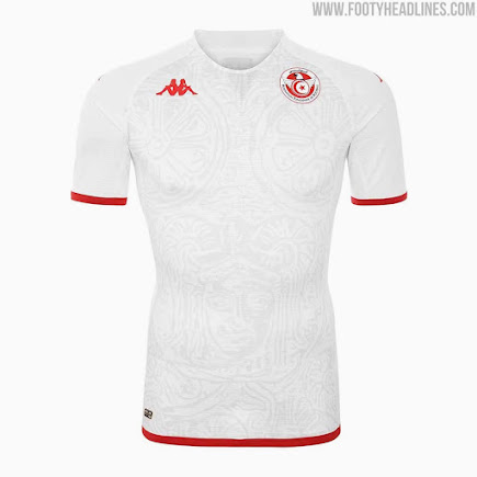
Tunisia – The last two group d kits are for Tunisia. One is red. One is white. They both have the same pattern. They are not eye-catching but are still better than some of the other kits.
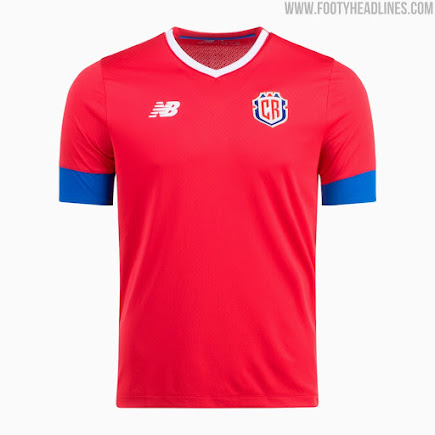


Costa Rica – The first two kits here are for Costa Rica. The kits are pretty plain. I am not huge on the design of the sleeves. They are still better than the plain Nike kits.
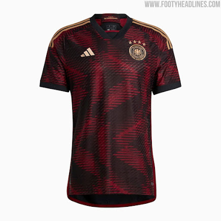
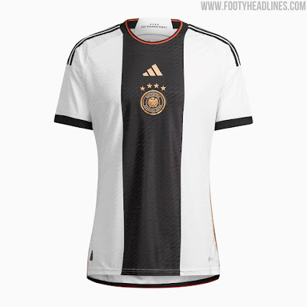
Germany – Possibly the best kits this world cup. The dark jersey is amazing. I like the pattern. The colors really work for the kit. The white kit is just as stunning. The only problem I have is the placement of the crest is not the same on both jerseys.
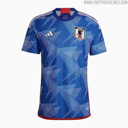
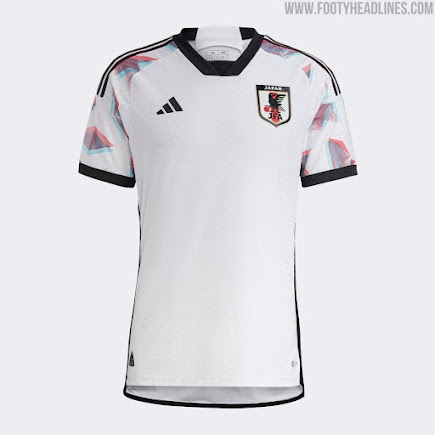
Japan – The next kits are Japan. The blue kit looks really good. I really like the pattern. It reminds me of origami. The white kit is nice too. I like how the pattern has a glitch to it.
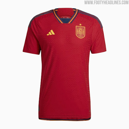
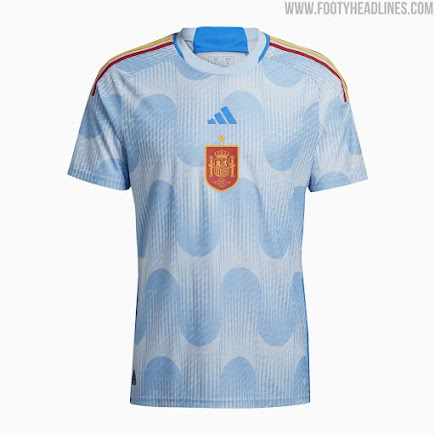
Spain – The last kits in group e are Spain’s. The red kit has a retro vibe to it. The blue kit looks like clouds while also looking like the ocean. It blows my mind at how modern it looks. These kits also use their new crest which I really like.
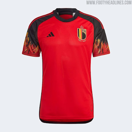


Belgium – First up in group f is Belgium. Their red kit has been nicknamed the Guy Fieri kit. It’s old school. It has an early 2000s vibe to it. I really like what they did with their white kit. The way the pattern is used is like it is hiding behind the white part of the jersey. It is just amazing.
Canada – The Canada jerseys are plain. The pattern on the jerseys isn’t even a maple leaf.
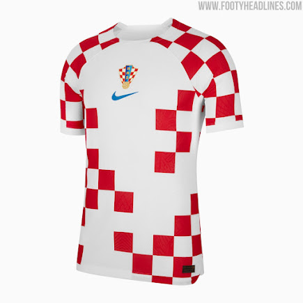
Croatia – Croatia have really good kits. They do not look like the rest of the Nike kits. The broken checkered pattern looks really good. The blur in the checkered pattern of the blue jersey looks really good too. These are good examples of what is expected of modern kits. The modern style is there, the traditional kit elements are there, and the national symbolism is there.
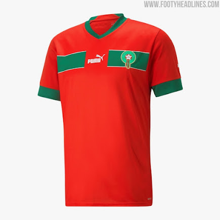
Morocco – The Moroco red kit is kind of boring. I think they could have done more with the elements. I like how the pattern is more muted on the white kit. That makes it way better than some of the other Puma kits.
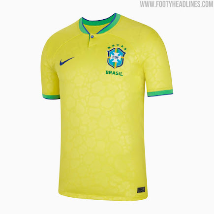
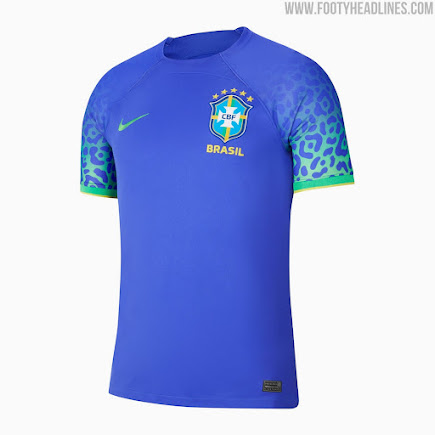

Brazil – These kits are what we have come to expect from Brazil. The yellow kit with a few exceptions has been basically the same since the 50s. The pattern on the blue kit is nice. It helps itself stand out from the countless other Brazil blue kits of the past.
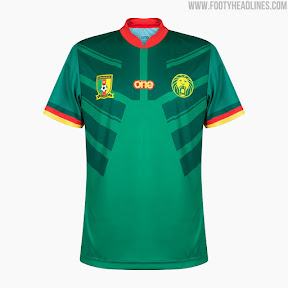
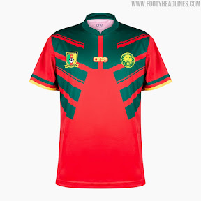
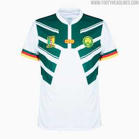
Cameroon – I think Cameroon has some of the worst kits this year. The only real difference in all three of their kits is the pattern. The pattern itself makes it look like whoever is wearing the kit is wearing a vest. They are just terrible.
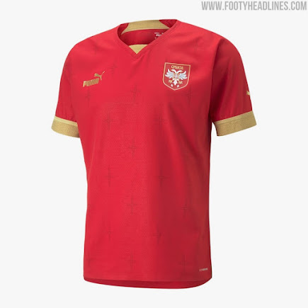
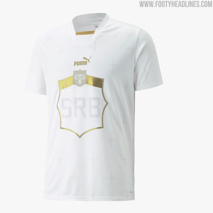
Serbia – I like the colors on the Serbia red kit. I am not a fan of the rest of the design. I really like their white kit. I think the colors and pattern are great. I would have liked to see more on the sleeves though.
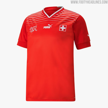
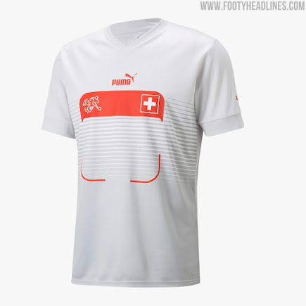
Switzerland – The red Switzerland kit is ok. I like what is going on which the shoulders. I wish they would have done more with that with the rest of the kit. Their white kit is a prime example of the Puma kits looking like marathon runner shirts. I do not like it.
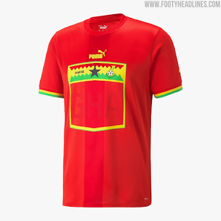
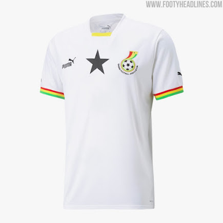


Ghana – The red Ghana kit is another good example of the Puma kits looking like marathon runner shirts. I think part of the pattern but it would look better if it wasn’t a box. Their white kit is pretty plain.
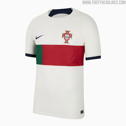
Portugal – Portugal did a good job. I’m not huge on the red jersey. I think they should have done more to expand on the ideas it has. The white jersey though really good for what Nike is offering in 2022.
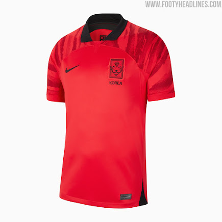
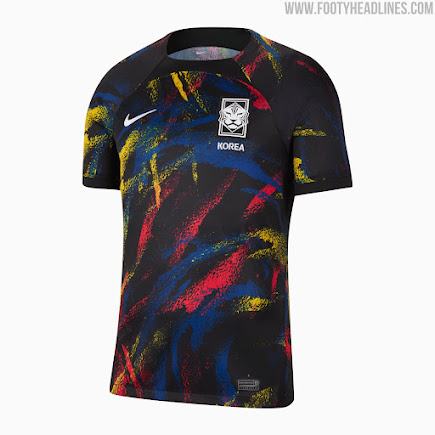
Korea – The Korean kits have been talked about a lot. Their red jersey looks pretty good for a Nike kit. Their black jersey looks like the floor in a roller rink or arcade or laser tag arena. It has gotten a lot of attention because of that. It does look more like a fashion jersey. I think the idea could have been executed better.
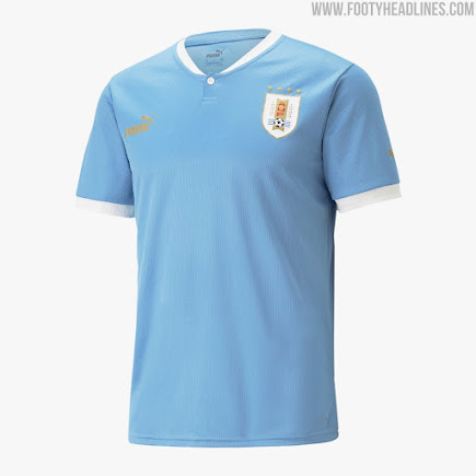
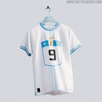
Uruguay – The last kits are Uruguay. Their blue kit has that retro feel to it. That is the only thing saving the kit. Their white kit has some good ideas but I can’t get over that it looks like a marathon runner shirt.


Leave a comment