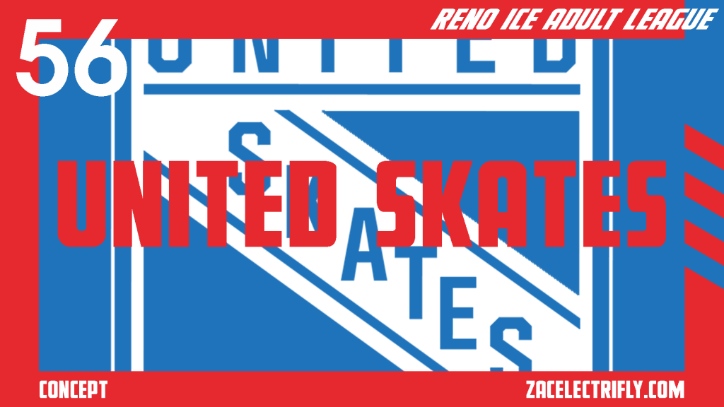
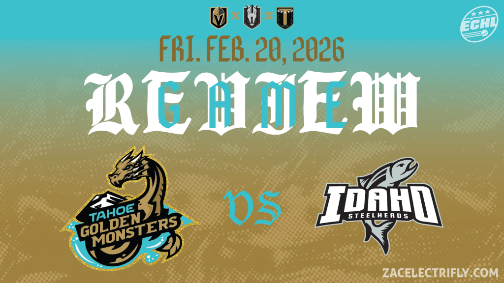
Up next in the Reno Ice Adult League concept are the United Skates. The Trash Pandas are the last season two expansion team. Their name comes from a play on the United States. Their nickname is United or US. In this concept the United Skates are owned and operated by the Reno Ice United States team. All of the players on the United Skates qualify to play for the Reno Ice United States team. The rosters are not be exactly the same but the United Skates exists in this concept to give Reno Ice United States hockey team players the opportunity to play between “international events”.
In this concept, the United Skates play in the North division of the C-League with NPU/TKO Motorsports, Revision Brewery, and Satans Gatekeepers.
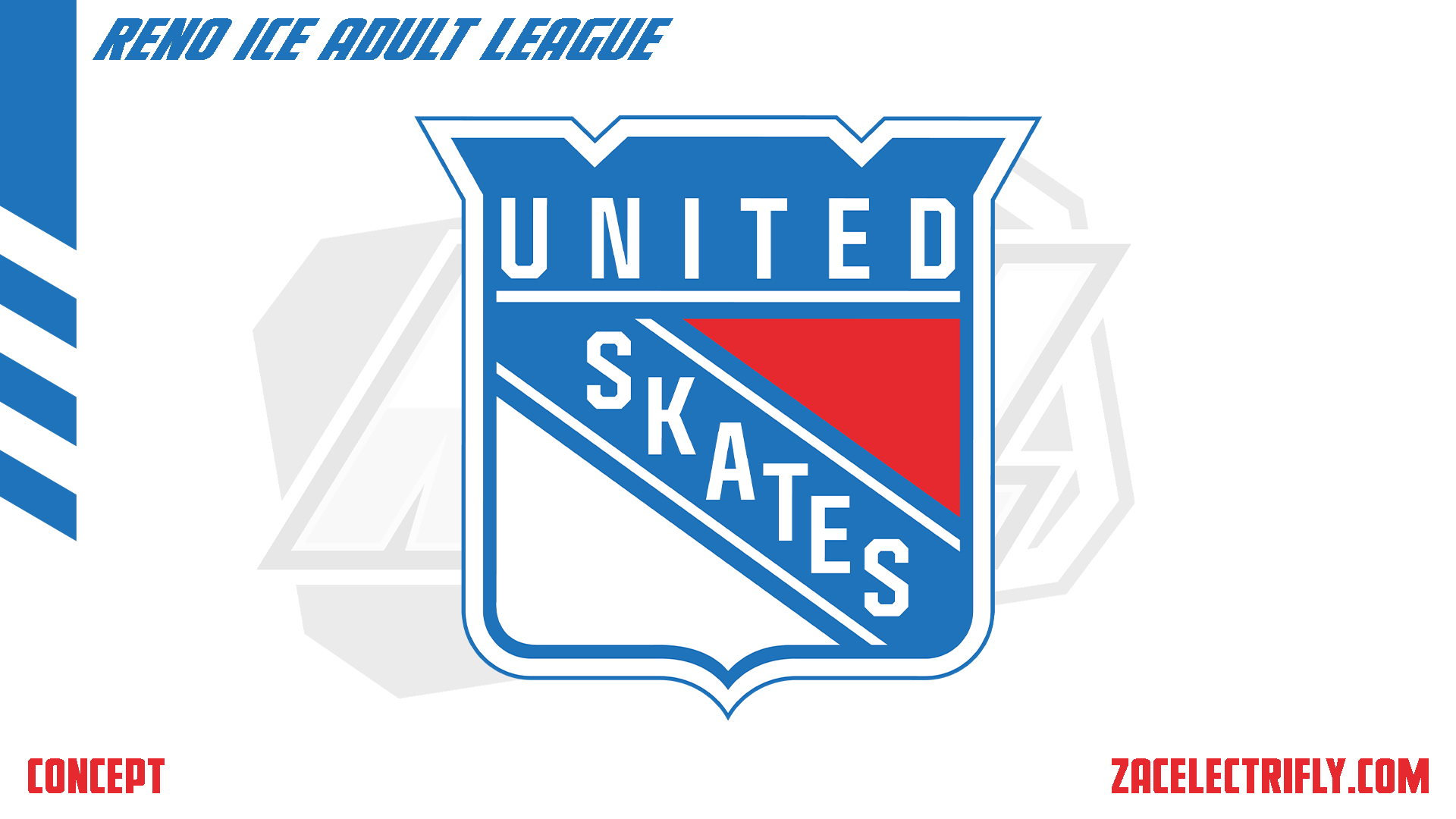
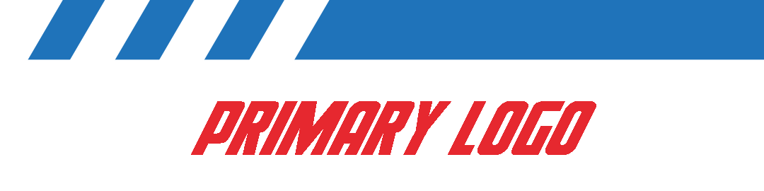
The United Skates primary logo is a shield with the team name. Their colors are blue, red, and white. They also have alternate colors for their their alternate throwback logos. Their alternate colors are dark blue, red, and tan.
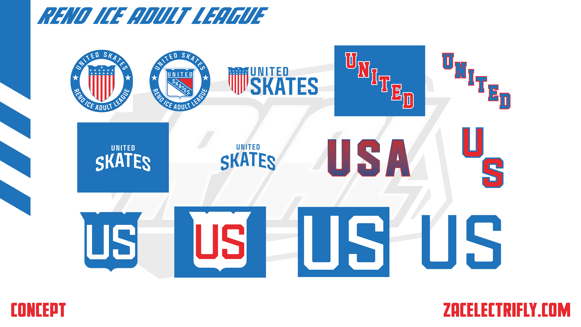
The United Skates have first two alternate logo are shields with a circle. The Circle has the team name and league name. The rest of their alternate logos are pretty much wordmark logos. They do have a USA logo for their city jersey.
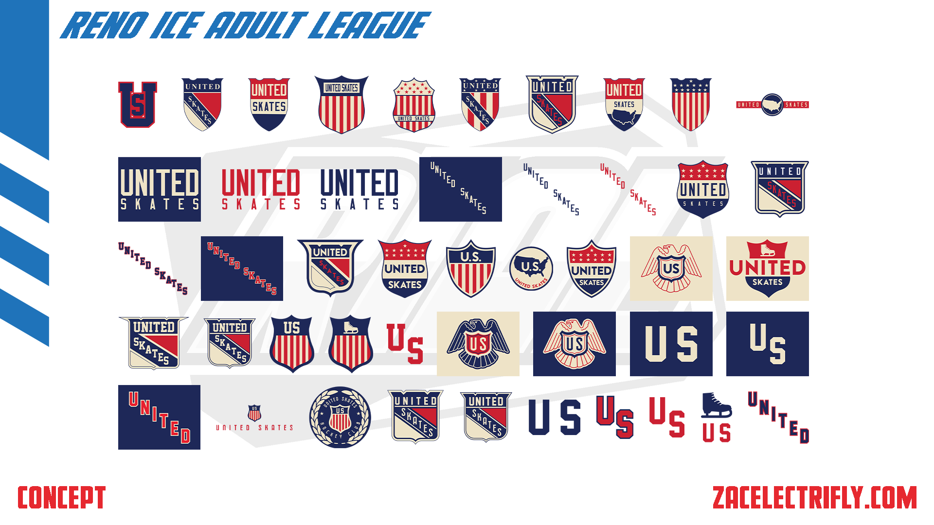
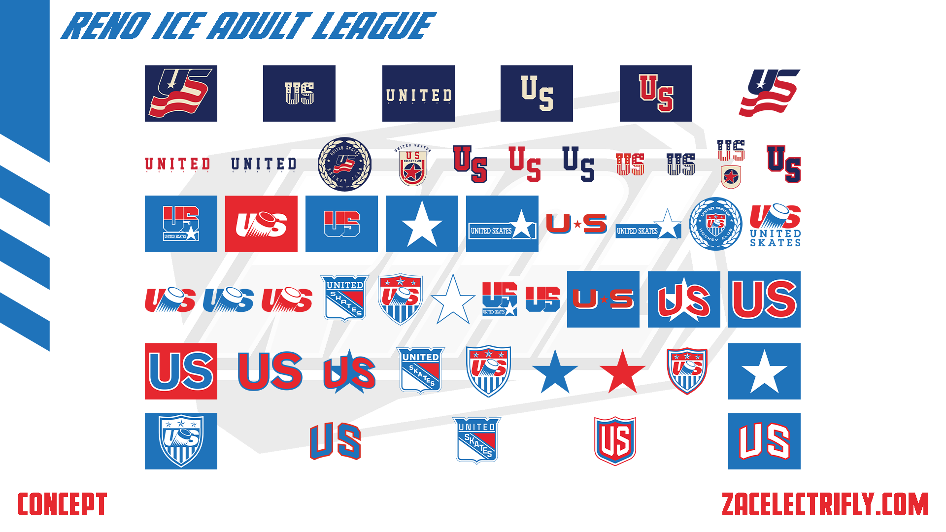
As an expansion team the United Skates do not have any throwback logo. They do alternate throwback logos which are new logos designed to look like old team logos. I went overboard with this part of the concept. That is part of why it has taken so long to get this done. These logo are broken down into two sections. One section is designed to look like the logos are from the 1980s and older. That section uses their alternate colors. The second section is designed to look like the logos are from the 1990s until their current logos. Most of these logos are shield or wordmark logos.
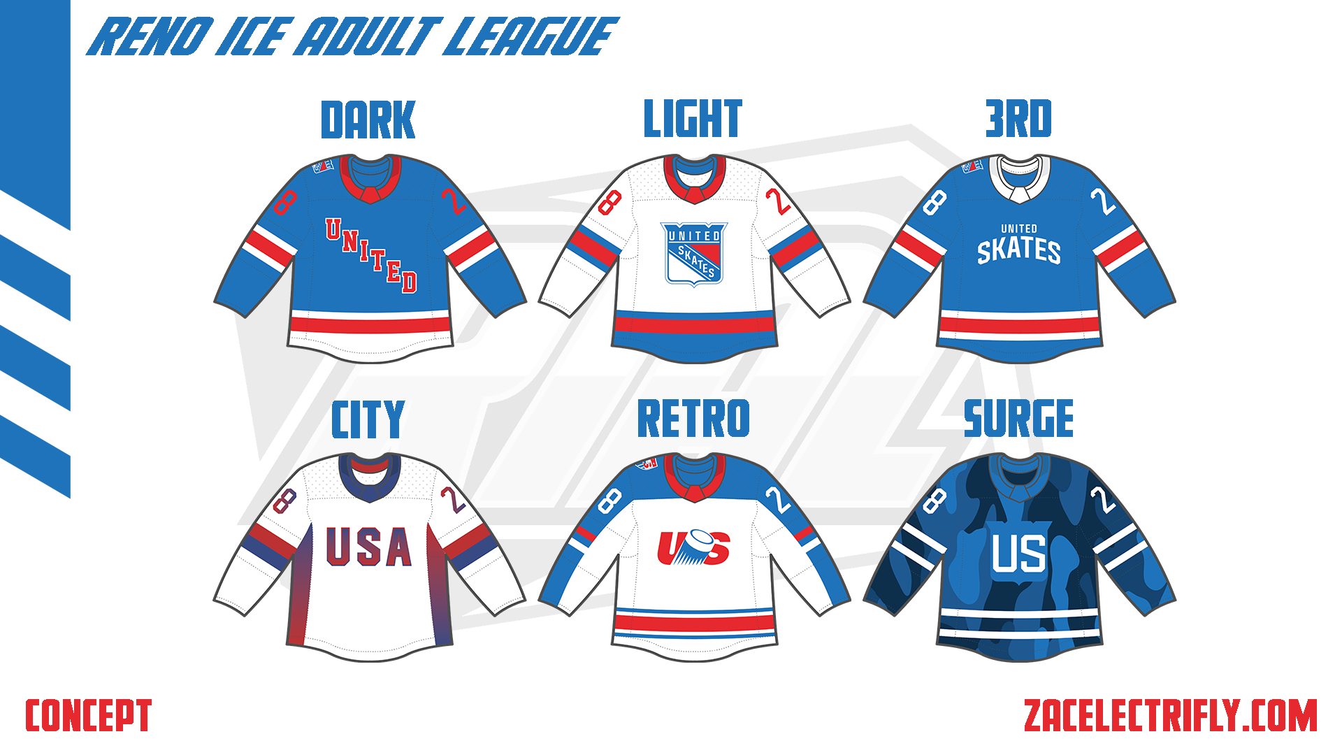

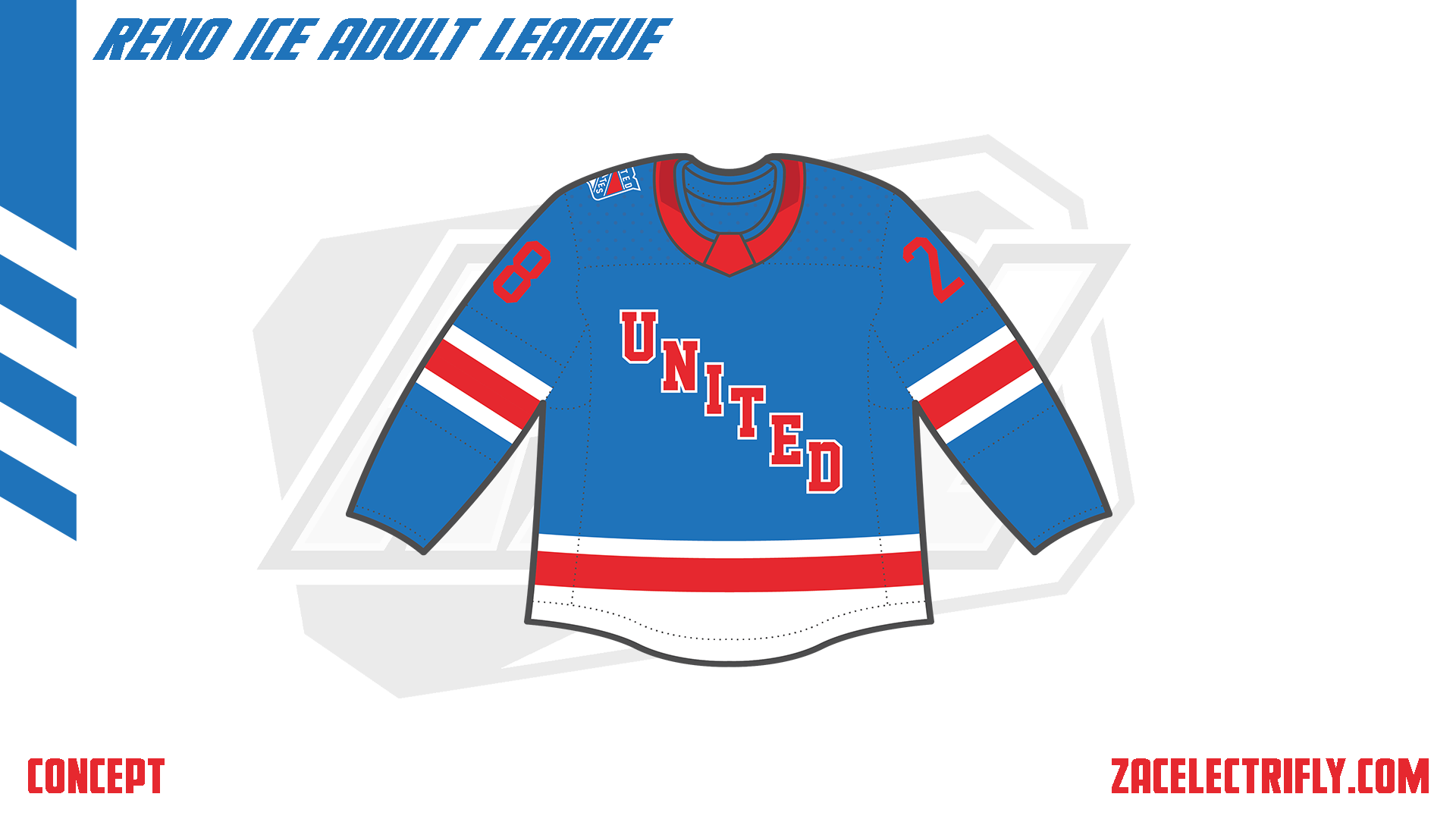
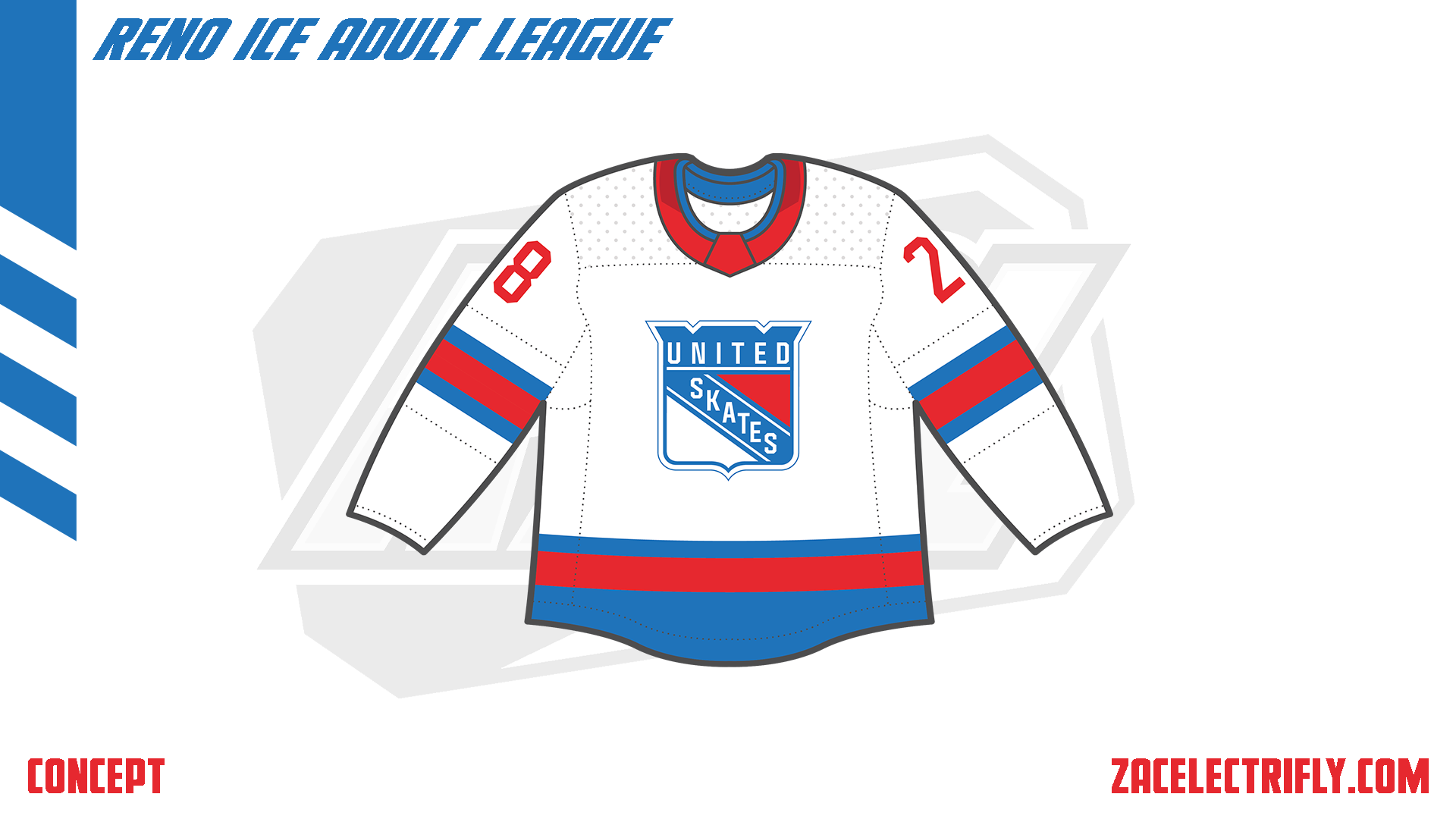
The Dark jersey is blue, white, and red. On the front is a United word mark. On the shoulder is the primary logo. The Light jersey is white, blue, and red. On the front is the primary logo. The Light jersey does not have any shoulder logos. Both the Dark and the Light United Skates jerseys use the same pattern.
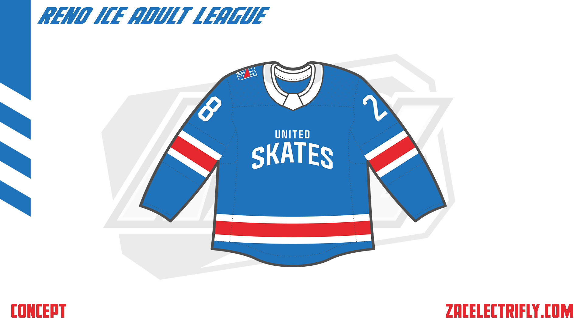
The 3RD jersey is blue, red, and white. It has a wordmark logo on the front. The primary logo is on the shoulder.
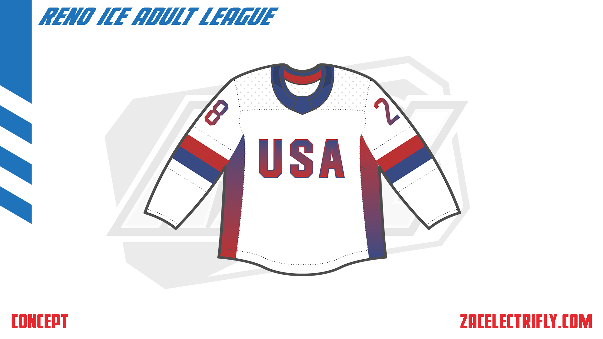
The City jersey is white, blue, and red. On the front is a USA wordmark logo. The jersey is themed after the United States.
The Retro jersey is white, blue, and red. On the front is one of the Alternate Throwback wordmark logos. On the shoulder is one of the alternate throwback shield logos. The United Skates retro jersey is designed to look like what they might have worn as a home jersey in the 90s.
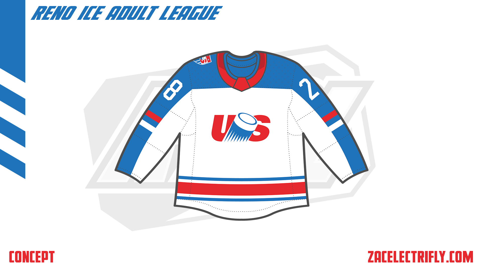
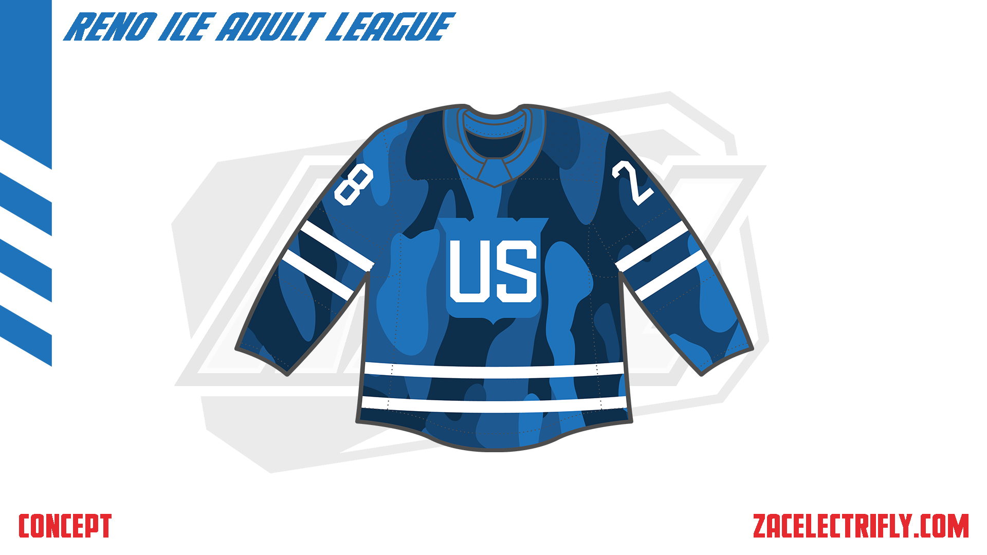
The Surge jersey is blue and white. It has a camouflage pattern on it. On the front is a US wordmark logo inside of a shield.

The United Skates goal horn is the Rochester Americans horn with Born to Rage (USA version) by DADA Life.


Leave a comment