Objective
To redesign Charlotte FC in a way that better represents the city of Charlotte than their current branding.
Current Logo
Other Concepts
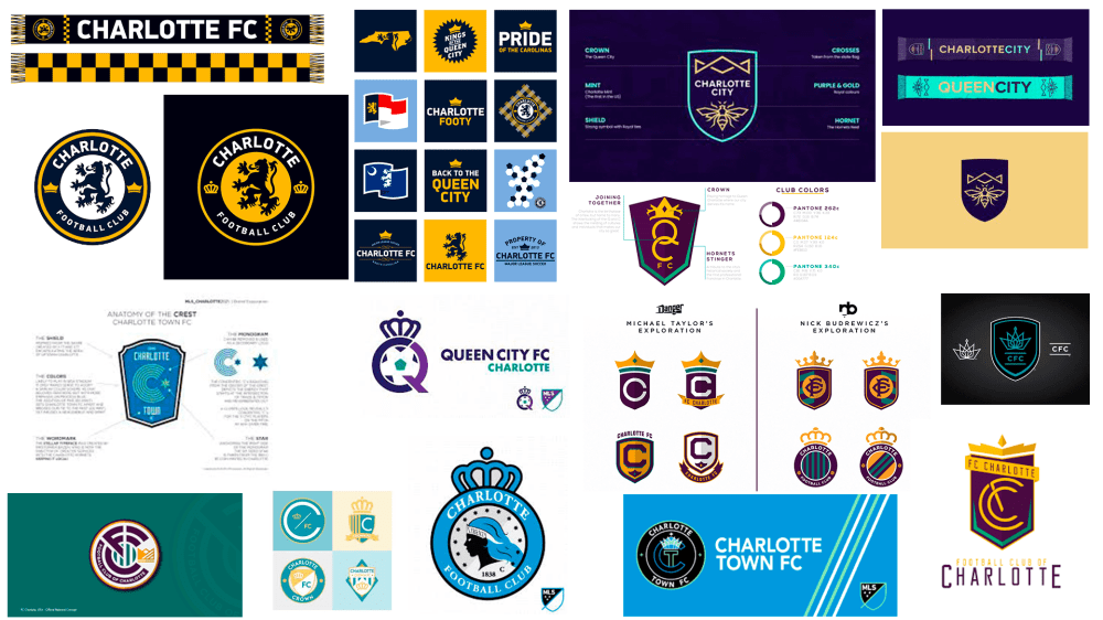
Links to other concepts:
From the Sox Drawer – Charlotte FC by raysox on the Sportslogos.net forums (2015)
Charlotte MLS Branding – QCFC by Eric Paullin on Behance (2017)
Corner Flag Creative – Charlotte FC by Michael Taylor and Nick Budrewicz on Behance (2019)
FC Charlotte, our second #MLS4CLT fan-submitted concept by Soccer ‘n’ Sweet Tea (2017)
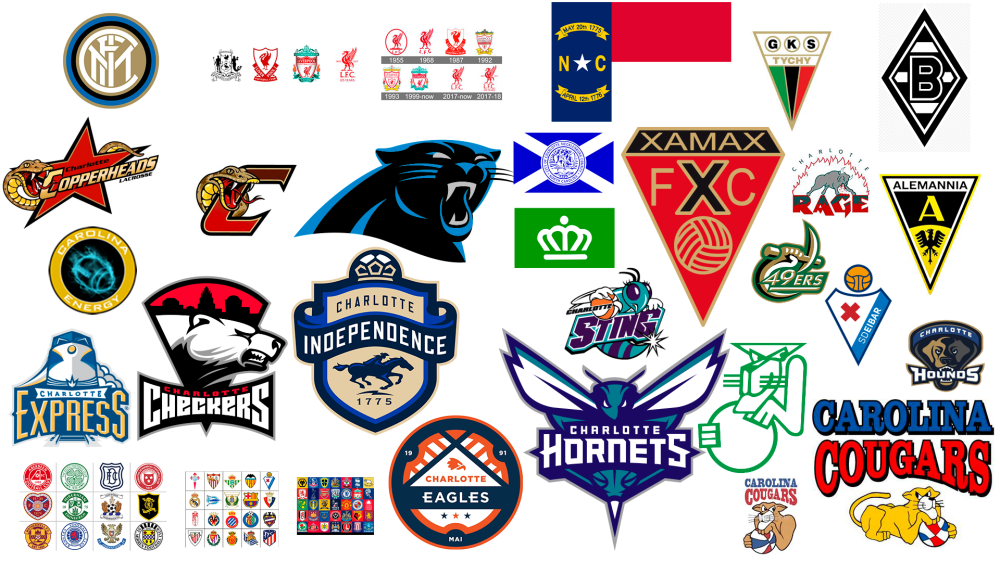
Inspiration
Primary Logo
Secondary Logos
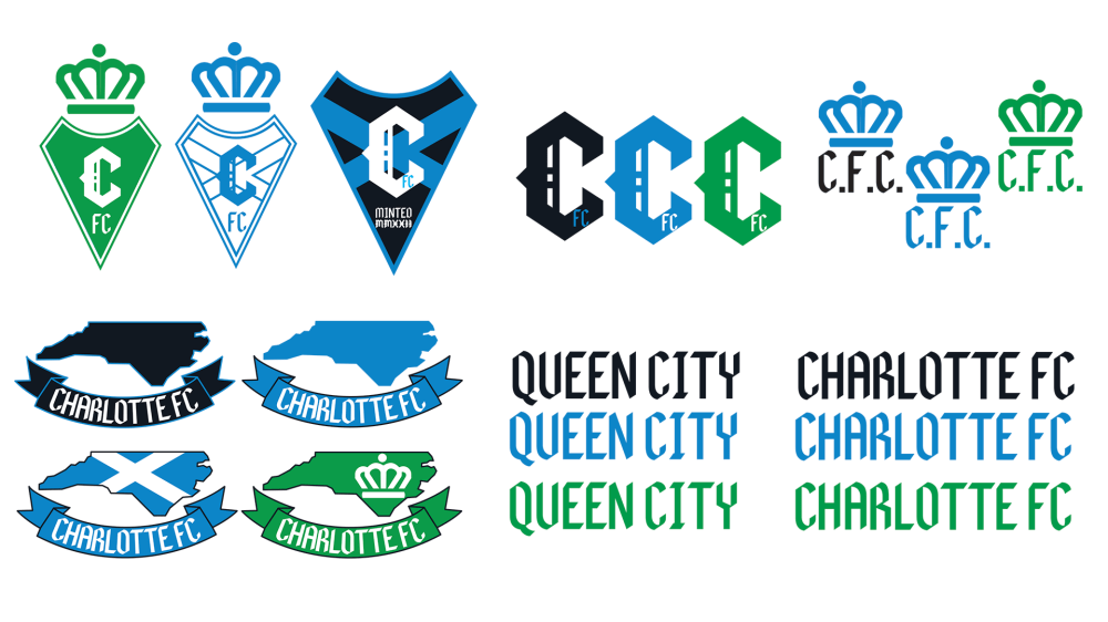
Unused Designs

Information About The Design
I started this process with a general idea of what I wanted to do. When doing research about Charlotte, I found out that they have 2 city flags. That is something that is unique to their city. I wanted to create a logo that used both of the city flags in their design. Later on I used some parts of the North Carolina flag. I also wanted the design to be unique to all of the other Major League Soccer designs.
In using the flags, its something that people already identify with Charlotte. That incorporates the city into the branding. Then the branding (with work) can become synonymous with the city. Then the team can create an identity around the team that is the team isn’t just playing for or in Charlotte but is Charlotte representing the city as a whole. I think soccer branding should be unique to other sports in the way that it’s not just a team in a city but a community of people (players, staff, fans, associated organizations) representing the city.
The current Charlotte FC colors are the same as the Carolina Panthers. I used those colors as the primary colors. It’s the same colors the stadium uses so i think the colors are appropriate. I did add green for the green and crown Charlotte flag. I took out the black in some of the logos to make them white and blue like the blue Charlotte Flag. For this design i think the kits should be black and blue for home, white and blue for away and green and white for the third kit.
Other Thoughts On Charlotte FC
One of the things I don’t like about the MLS is their branding. Most of the team branding is the same. All of the MLS logos are too similar in my opinion. I don’t think that the MLS is trying to be unique or stand out. All of the branding for the league looks similar. The jerseys are all the same with different colors. The social media design is very similar for all the teams. I think the MLS is making it hard on themselves to stand out.
The way Charlotte announced their logo was poor. The logo itself is generic and the name is predictable. The production value on their logo reveal wasn’t up to standard when compared to other major leagues. The NHL’s Seattle Kraken announced there name and logo the same week. It completely over shadowed everything Charlotte FC did. I (a person who follows countless soccer accounts including the MLS itself) didn’t even know they were announcing anything until after it had happened. I don’t even know if the MLS or Charlotte FC told anyone before they did it. On the other hand the NHL was hyping the Seattle reveal for weeks. Seattle even released a video announcing when the announcement video would be released. I just think everything surrounding this launch for Charlotte wasn’t as good as a multi-million dollar launch should be. this launch will effect the team financially down the road. A good launch can lead to massive growth in the fan base. A poor launch can lead to people not wanting to be associated with the team.


Leave a comment