I already did a few MLS concepts. I have done two expansion teams and a fictional team. This post marks the start of a new concept series I will be doing. In this series, I will be rebranding Major League Soccer. This series will start with the league logo.
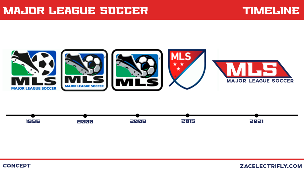
Current Logo

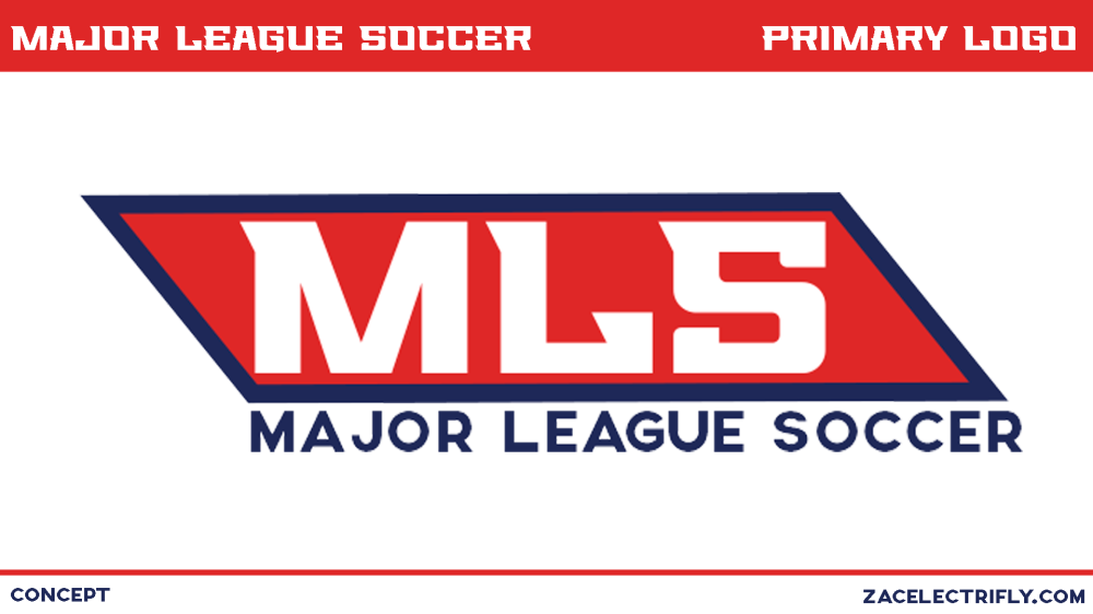
I made a simple logo. I didn’t think that it needed to be anything complex. I made it intending to put in on jerseys. I wanted to make something where the shape was universal. That way the shape of the logo can be used for all league branding. Doing that centralizes the branding. That can be good for branding recognition. Anything with that shape and colors can be recognized as Major League Soccer.
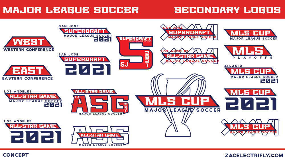
When I started to make the primary logo I started with a pentagon form the soccer ball in the 1994 World Cup logo. That shape ended up being what I used for the eastern and western conference logos. I refined the shape turning it into the shape I used for the final logo.
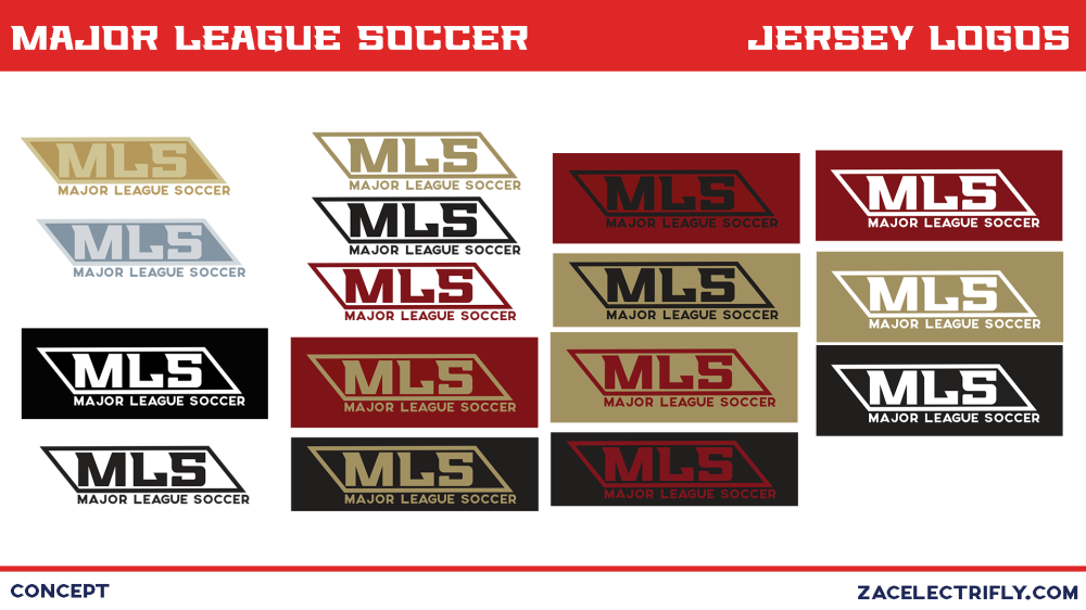
I think the jersey logos are pretty self-explanatory but I’ll explain it anyway. I used Atlanta United as the example team. I used them because they are the first team alphabetically. All of these logos are examples of what the concept logo should look like on jerseys. The gold logo (the logo in the top right corner) is to be used by the MLS team that won the league last season. The silver logo (the logo below the gold logo) is to be used by the MLS team that came in second place. For this concept, this logo wouldn’t be used on MLS jerseys during other competitions like CONCACAF Champions League or the US Open Cup. Those competitions have their own logos that should be used. Some of the secondary logos will also be used as jersey logos in this concept. The MLS playoffs logo would be used during the playoffs. The MLS cup logo with the city name and year would be used in the final. The all-star logo with the location city name and the year would be used on jerseys during the all-star game.

Leave a comment