Objective
To redesign Saint Louis City SC in a way that represents the city.
Current Logo
Read more: MLS Expansion Club St Louis City SC Unveils Name and Logo
Unlike Charlotte FC I don’t think Saint Louis City SC did a bad job with their branding. It’s still very generic and predictable. It’s differently something I would expect from Major League Soccer. I think the branding looks a lot cleaner than some other MLS teams. It looks and feels like modern United States soccer. There isn’t much wrong with their branding but I still went ahead a made a concept.

Links to other concepts:
St Louis MLS Team Logo Concept by Samuel McKinney on Behance (2016)
St. Louis MLS Mockup by Luke Coco on Behance (2020)
St Louis City SC Rebranding by Jesus Gamez Flores on Behance (2020)
Onward – MLS to STL Expansion Bid by DTConcepts on Sportslogos.net boards (2017)
St Louis Missouri Major League Soccer by W. Ross Clites on Coroflot (2018)
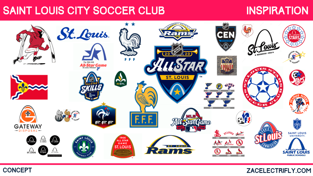
When researching for this concept I knew the arch was going to be a part of the design. It is the cities most identifiable landmark. I learned more about the french heritage of the city and I decided to use that in the concept. A lot of St. Louis logos use the arch. Not a lot of teams use the French heritage in their branding. I thought that that could be something unique for this concept. I did see someone talking about not using the arch or fleur de lis in the branding as it is overused. My thought on that was that if the city identifies with it use it in the branding to make the brand more synonymous with the city.
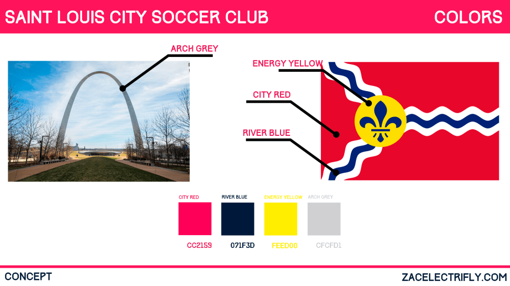
The colors I chose to go with are the same ones as the announced team colors. I think they represent the city pretty well.
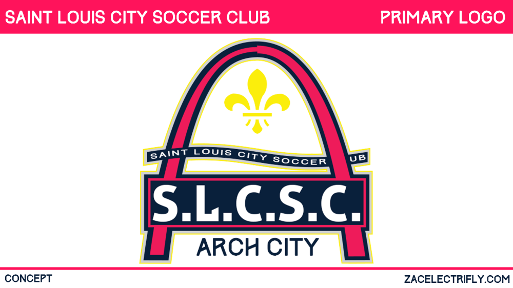
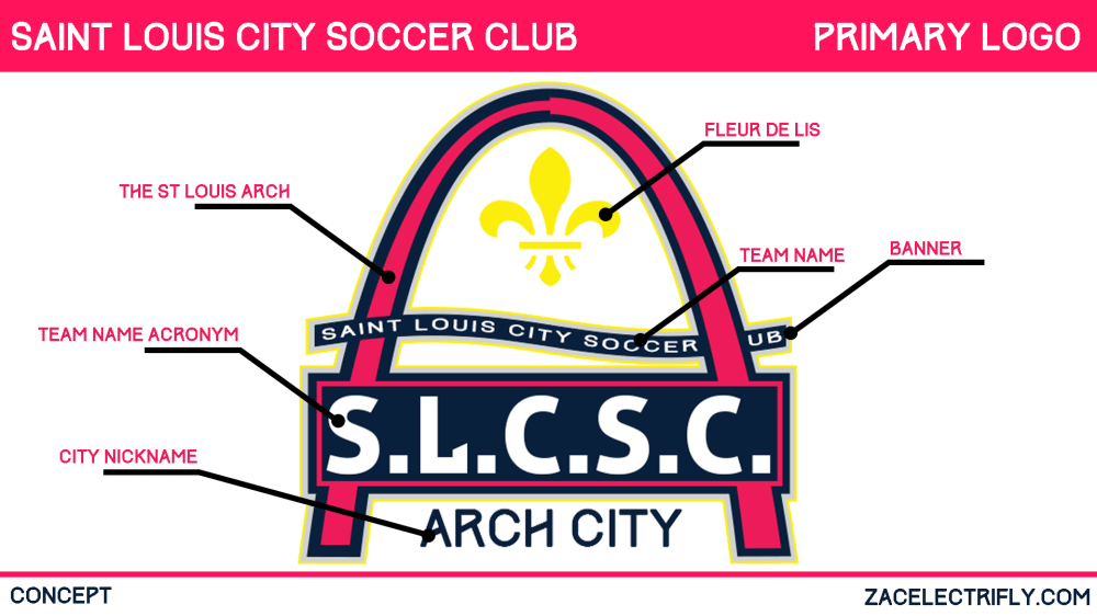
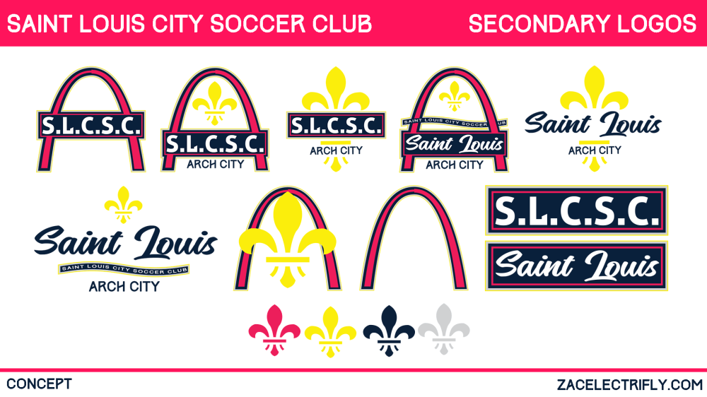
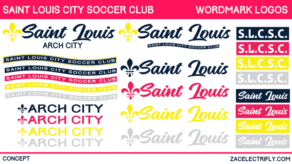
The shape of the logo is the St. Louis arch. The arch acts as a crest. The arch acts as the main piece holding the rest of the design together. In other designs, the design continues below the arch. I thought that doing that would take away from the arch itself. The team name is in an acronym inside of a back in front of the arch. I was inspired to design it that way by the French national soccer team logos. Saint Louis City Soccer Club is also a long name to spell out completely. Having an acronym on the crest would also be unique in Major League Soccer. Above the acronym is a banner going through the arch that holds the team name. The banner is inspired by the Mississippi River. Above the banner is the fluer de lis from the city flag. It represents not only the french history of the city but the city flag. Underneath the acronym is the city’s nickname. I used arch city rather than a gateway to the west. I did this as arch city sounds better for a modern sports team. Gateway to the west is synonymous with pioneer days. For this branding I wanted the club to feel modern. I think gateway to the west sends the wrong message.




Leave a comment