Next up in the Reno Ice Adult League concept is Q&D Construction from B-League. Q&D Construction are the first corporate team in this concept. Unlike previous teams in this concept that are named after businesses through sponsorships, a corporate team is owned and ran by a business. All of the players on that team work for that business. Basically the business pays for a team that their workers play on. This is common in adult softball. Q&D Construction play in the Reno Division of B-League.
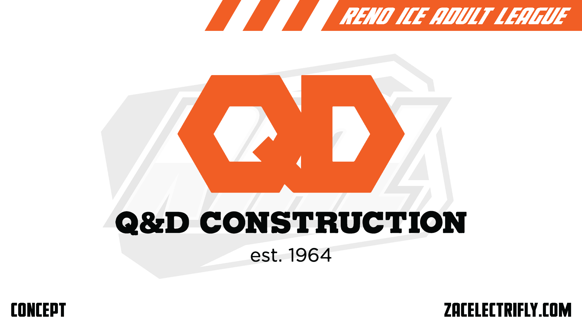
Q&D Construction Primary Logo
Being a corporate team. The branding for Q&D Construction mostly comes from the company. This is the primary logo that the hockey team uses. It’s a QD with the name underneath it. at the bottom is the established year. Most of the designs I did for this are inspired by the Oklahoma State Cowboys, and Philadelphia Flyers.

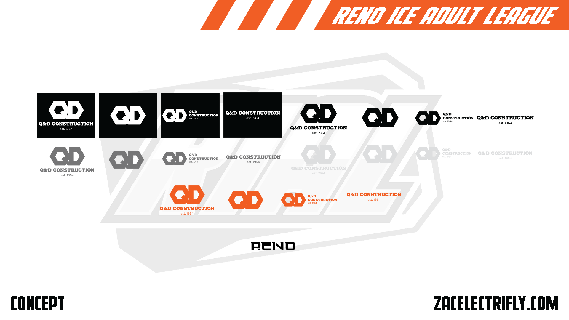
Q&D Construction Alternate Logos
Q&D Construction mainly only have 3 alternate logos. The QD logo, and the wordmark from the primary logo. Then the QD next to a stacked version of the wordmak. Those logos are then put into 5 different colors. They have a Reno wordmark but that is just for the city jersey. They do not have any secondary logos.
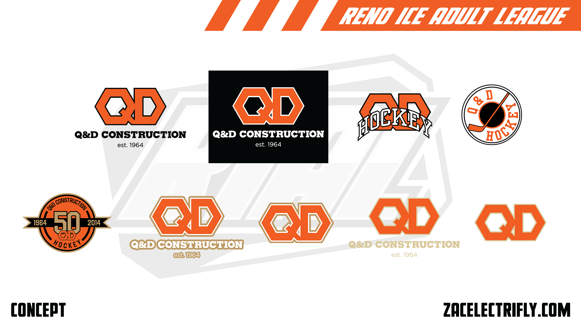
Q&D Construction Throwback Logos
For this concept Q&D Construction has been in the RIAL since the company’s inception in 1964. The first two logos are the teams original logos. They are similar to the current logos. The main difference being that the QD have an outline. The third logo was introduced in the early 70’s and replaced the original logos. For this concept the Q&D Construction wanted to separate their corporate identity from their team identity for all of the different teams they had. That continued into the early 80’s when the fourth logo replaced the third logo. By the late 80’s the team had transitioned back to using the original logos. The original logos would have then been used up until the teams current branding. In the 90’s the third logo made a comeback as an alternate logo.
The five logos on the bottom are from Q&D Construction’s 50th anniversary in 2014. The first logo would have been the teams anniversary logo. It would have been the teams secondary logo during 2014. The second and third logo have a white and gold outline and would have been used for an anniversary jersey. The last two logos replace the white with tan and would have been used with throwback jerseys.
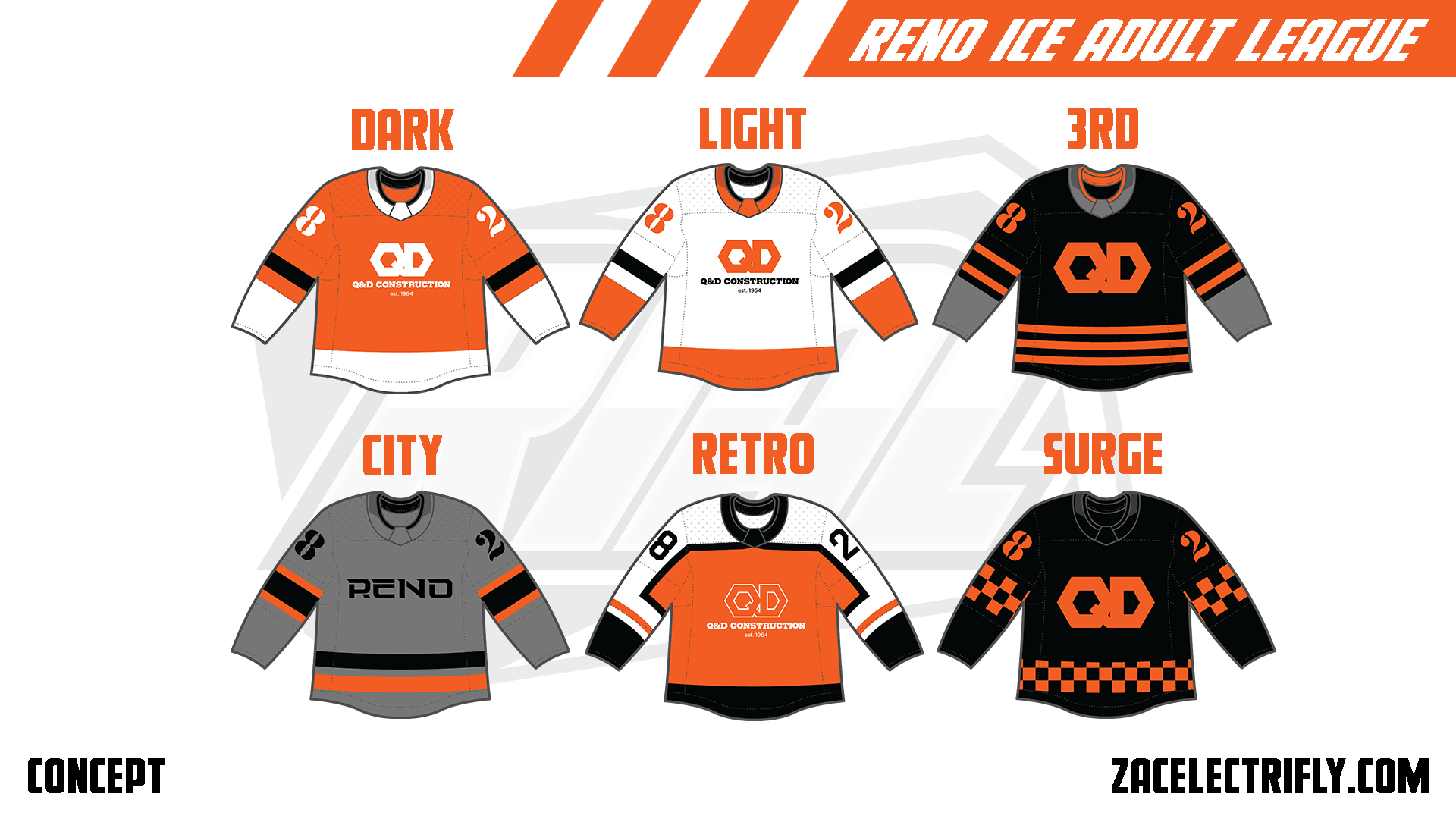
Q&D Construction Jerseys
The Dark jersey is orange, white and black. It has the Q&D Construction primary logo on the front in all white. The Light jersey is white, orange and black. It has the Q&D Construction primary logo on the font. Both the Dark and Light jerseys use the same template. Neither jersey has shoulder logos.
The 3rd jersey is black, orange and grey. It has the QD alternate logo on the front in orange. It does not have any shoulder logos. The pattern is similar but different from the Dark and Light jerseys.
The city jersey is grey, orange and black. It has a Reno wordmark on the front.
The Retro jersey is orange, white and black. It has the second original Q&D Construction logo on the front. For this concept this jersey would have been used from the mid to late 90’s to the mid to late 2000’s.
The Surge jersey is black and orange with an orange checker pattern. On the front of the jersey is the QD alternate logo in orange.


Leave a reply to Reno Ice Adult League Concept Part Twenty One | Reno Division Recap – Zac Electrifly Cancel reply