Next up in the Reno Ice Adult League concept is Reno Sriracha from B-League. Reno Sriracha is named after the hot sauce. For this concept the RIAL team have no affiliation with the company. They like the hot sauce so they named the team after it. Reno Sriracha has the nickname “Remo Sriracha” after a funny or die video. The Reno Aces even did a Remo Sriracha theme night last season. In real life they were Reno Sriracha on the league website in the first season and Remo Sriracha in the second season. I think they were always supossed to be Remo Sriracha but I don’t 100% know. For this concept Reno Sriracha plays in the Reno Division of B-League along with Doughboys, Q&D Construction and Reno Pond Hockey.

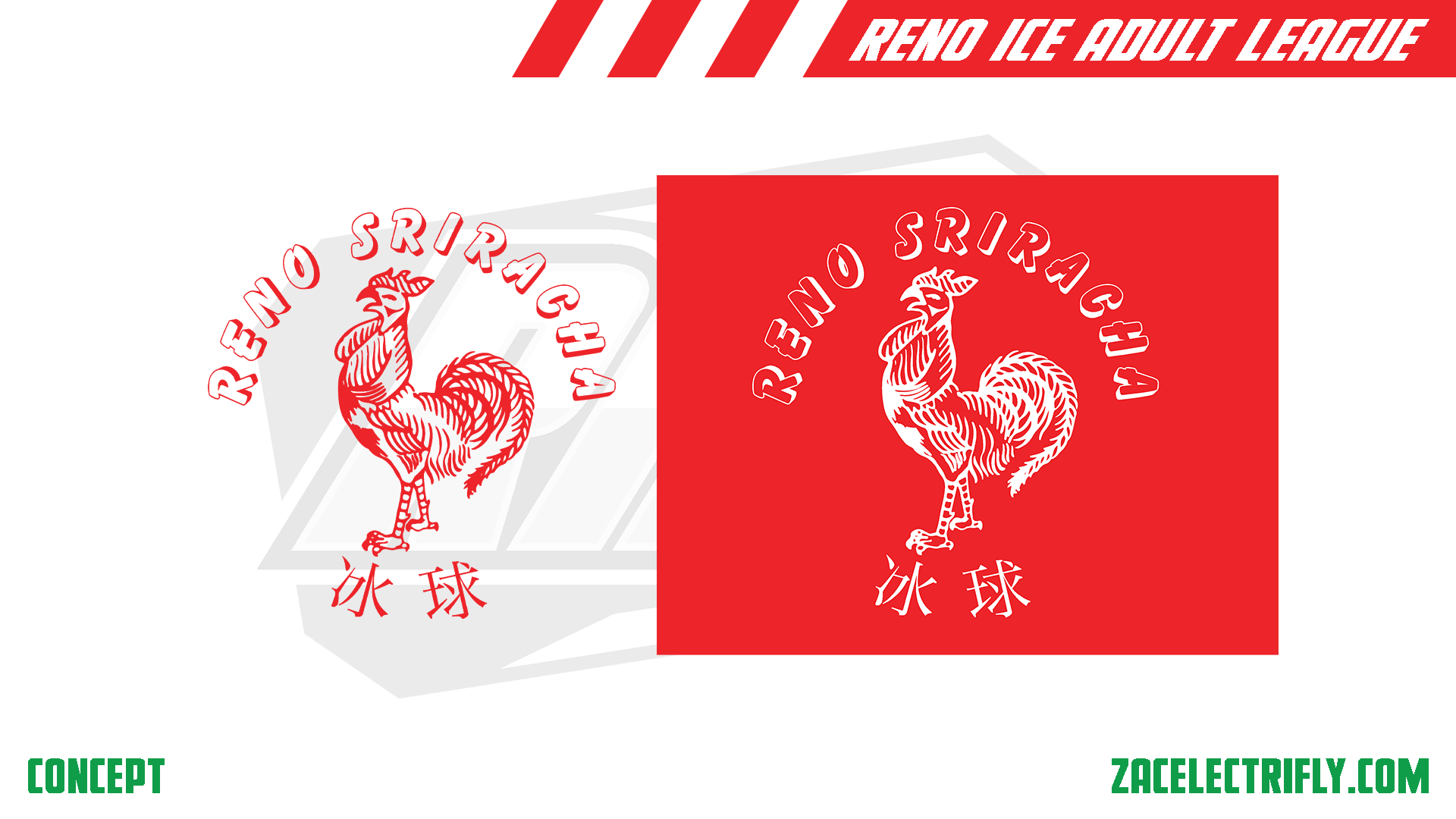
Reno Sriracha Primary Logo
The Reno Sriracha primary logo is designed after the Huy Fong Foods logo. At the top is the team name. in the middle is the rooster. On the bottom it has the Chinese characters for ice hockey. I added the Chinese characters as they are on the bottom of both the Huy Fong Foods logo, Sriracha logo and are on the Sriracha bottle.
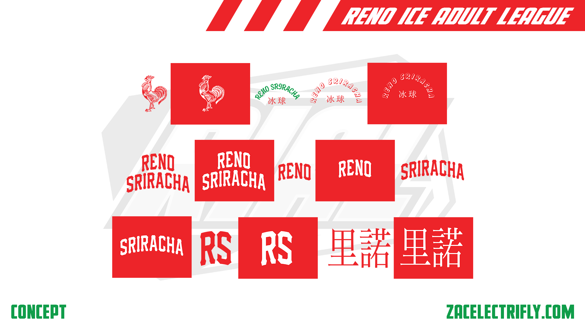
Reno Sriracha Secondary Logos
The Reno Sriracha secondary logos are based on the Sriracha logo. They are similar to the primary logo. The only real difference is that the team name font is different and there is no green in the design. The team name is still arched at the top. The rooster is still in the middle. Ice hockey in Chinese characters is still arched at the bottom.
Reno Sriracha Alternate Logos
The first set of alternate logos is just the rooster from the primary and secondary logos in red and white. The next three logos have the team name arched with the Chinese characters underneath it. The next six logos are just wordmark logos. Then there are two RS logos. The RS standing for Reno Sriracha. The last two alternate logos are the Chinese characters for Reno.
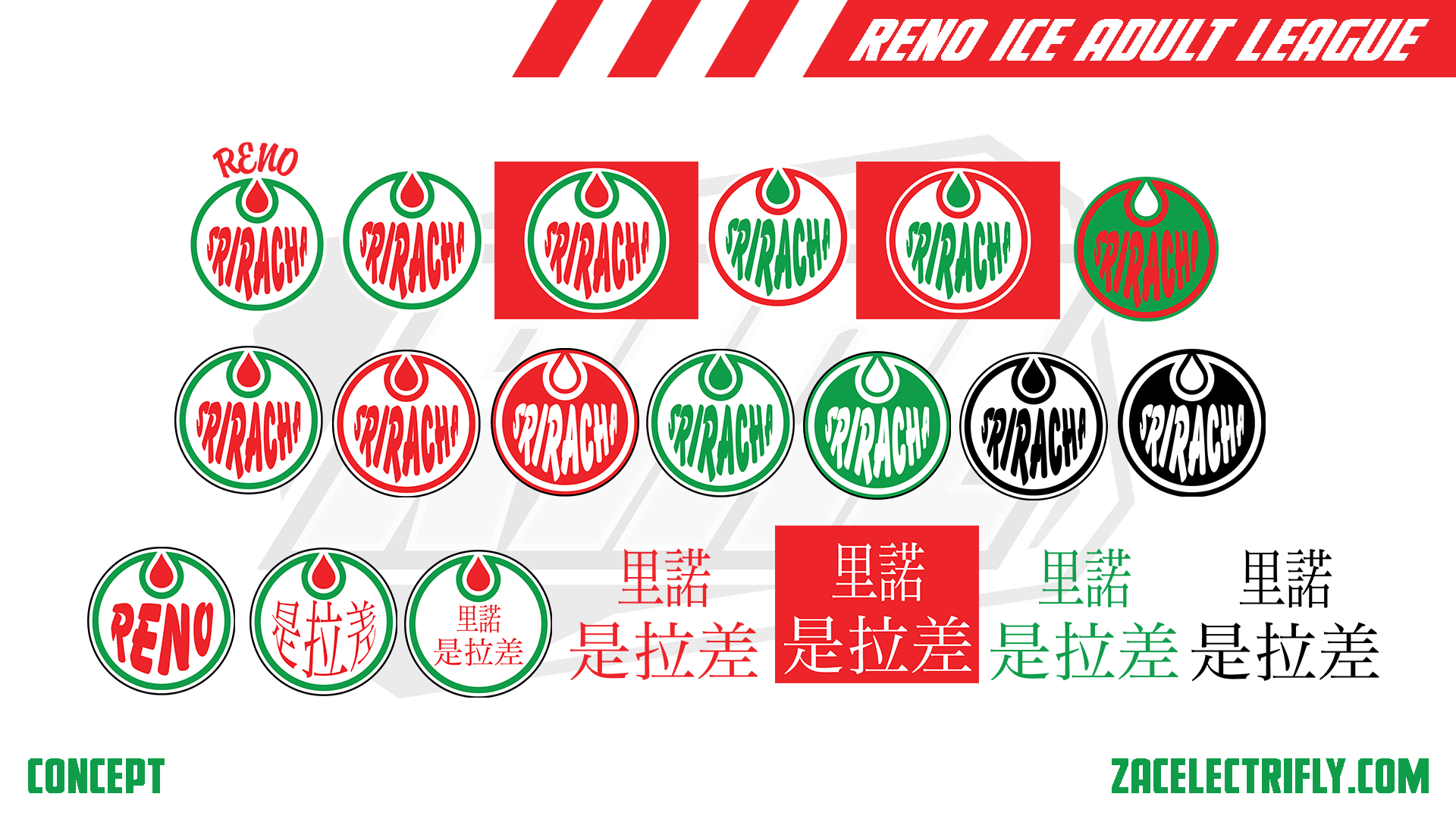
Reno Sriracha Throwback Logos
Huy Fong Foods has been around since 1980. For this concept Reno Sriracha has been around for the same time. The current primary logo, secondary logos and the first two alternate logos were the teams original logos. They changed their logos in the late 80’s early 90’s and they went back to their original logos in the mid to late 2000’s.
The first throwback logo would have been the teams second ever primary logo. Inspired by the Edmonton Oilers of the World Hockey association. The logo is a circle with a drop of hot sauce. Inside of the circle it says Sriracha in warped text. Above the circle it says Reno in arched text. The next two logos would have been secondary logos used at the same time. The next three logos would have been alternate logos that finish off this set of logos.
In the mid to late 90’s Reno Sriracha introduced black into their colors. The first logo in the second row would have been their third primary logo. The logo does not have Reno in it. It adds a black outline to the logo. The next six logos would have been alternate logos. The first logo on the last row remixed the logo by adding Reno to it. The next logo is another remix of the primary logo. It Sriracha in Chinese instead of english. The following logo replaces Sriracha with Reno Sriracha in Chinese. This one also does not warp the text. The last four logos are Reno Sriracha wordmark logos in Chinese.
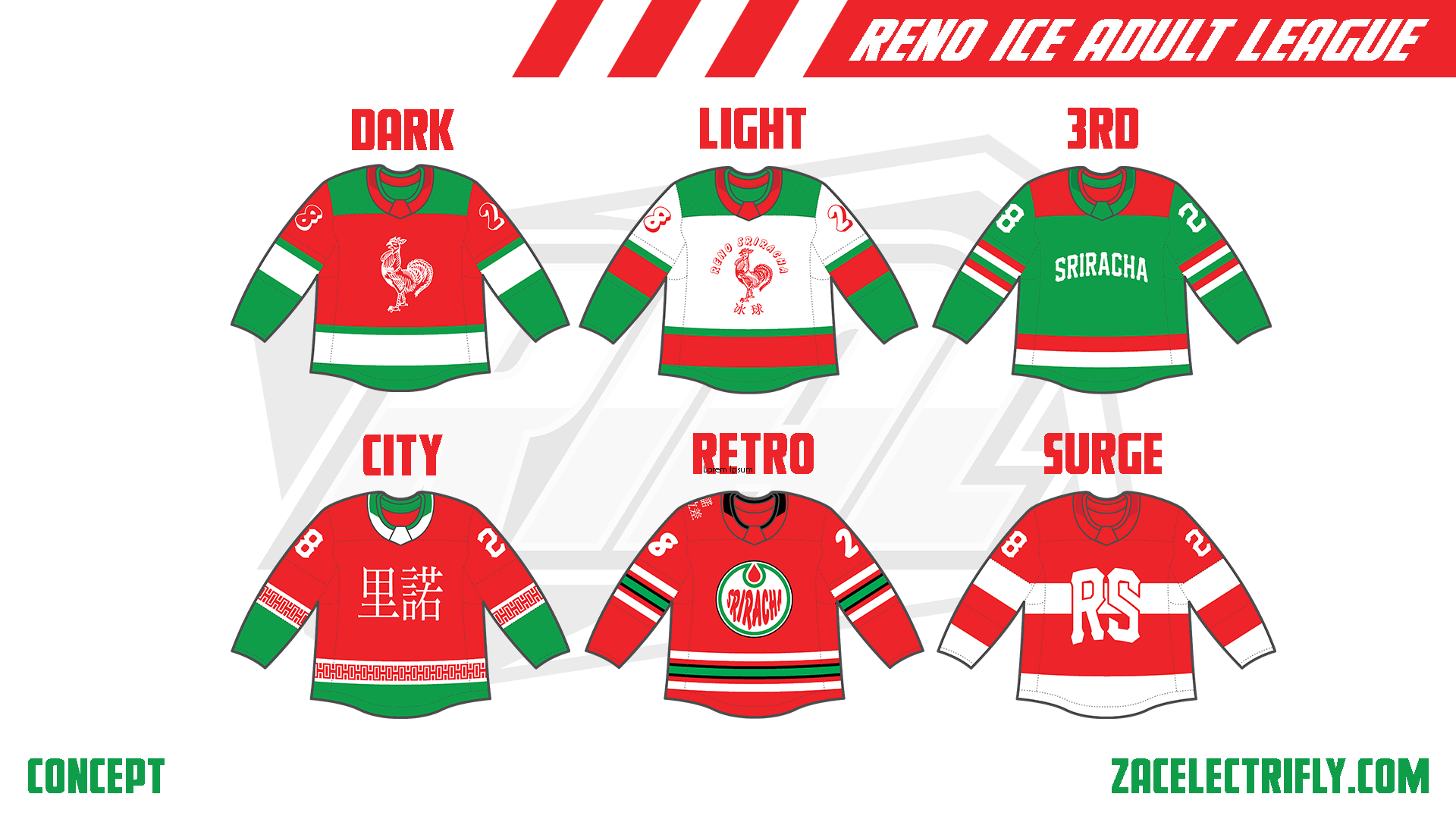
Reno Sriracha Jerseys
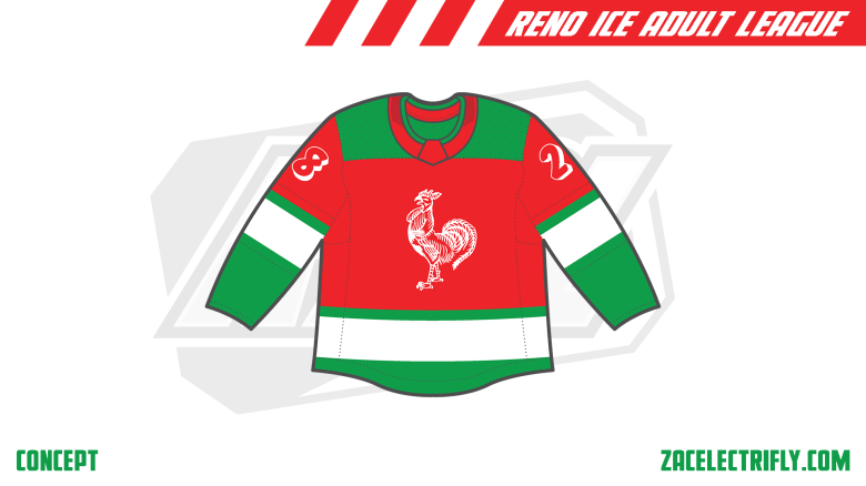
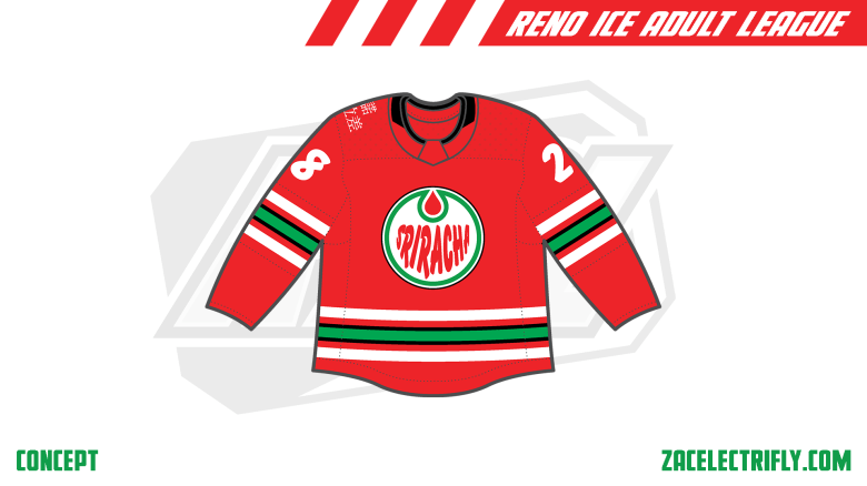
The Dark jersey is red, green and white. The sleeves are green and red with white stripes on the green part of the sleeves. It has green shoulders with green and white on the bottom of the jerseys. It has the alternate rooster logo in white on the front. The Light jersey is almost identical. The difference in the pattern bing that the white and the red switch places. This logo used on the Light jersey is the secondary logo in red.
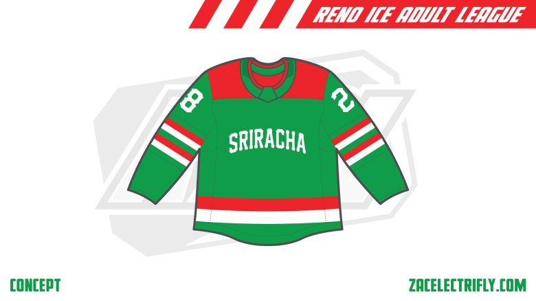
The 3rd jersey is green, red and white. The sleeves have white and red stripes. The shoulders are red. At the bottom of the jersey is a red and white stripe. The logo on the front is the arched Sriracha alternate wordmark in white.
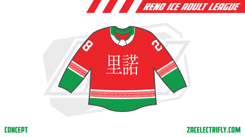
The City jersey is red green and white. The sleeves are green and red with white stripes above the green. inside of the white stripes is an Asian inspired pattern. On the front of the jersey is Reno in Chinese.
The Retro jersey is red, white, green, and black. It has 5 stripes on the sleeves and bottom of the jersey. Theres a green stripe in the middle with two black stripes touching it. There is a space and then two white stripes above and below it. On the font is the primary logo introduced in the mid to late 90’s. On the right shoulder is Reno Sriracha in Chinese in white.
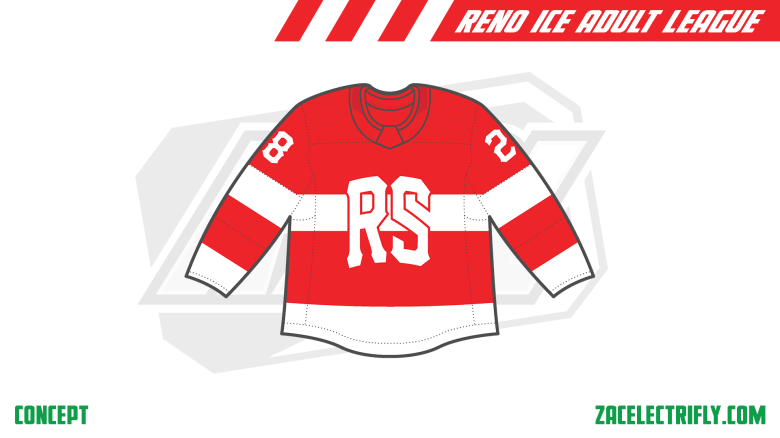
The Surge jersey is red and white. It has one white stripe going through the jersey. The bottom of the sleeves and jersey is white. It has the RS alternate logo on the front.
Reno Sriracha may be the only team in the RIAL concept that does not use their primary logo on any of their jerseys.


Leave a reply to 4 Seasons | Reno Ice Adult League Concept Part Forty Nine – Zac Electrifly Cancel reply