
Up next in the Reno Ice Adult League concept is the Tahoe Dawgs. The Tahoe Dawgs have been around since at least the early 90s. In real life they might be the oldest team playing in the RIAL. They field teams for both lacrosse and ice hockey. They are (or at least have been) a big part of the Reno/Tahoe lacrosse scene. For this concept they field multiple teams in multiple sports throughout Reno/Tahoe.
For this concept Tahoe Dawgs play in the Tahoe Division of B-League along with Cruz Construction, Mid-Ice Crisis, and the Tahoe Storm.
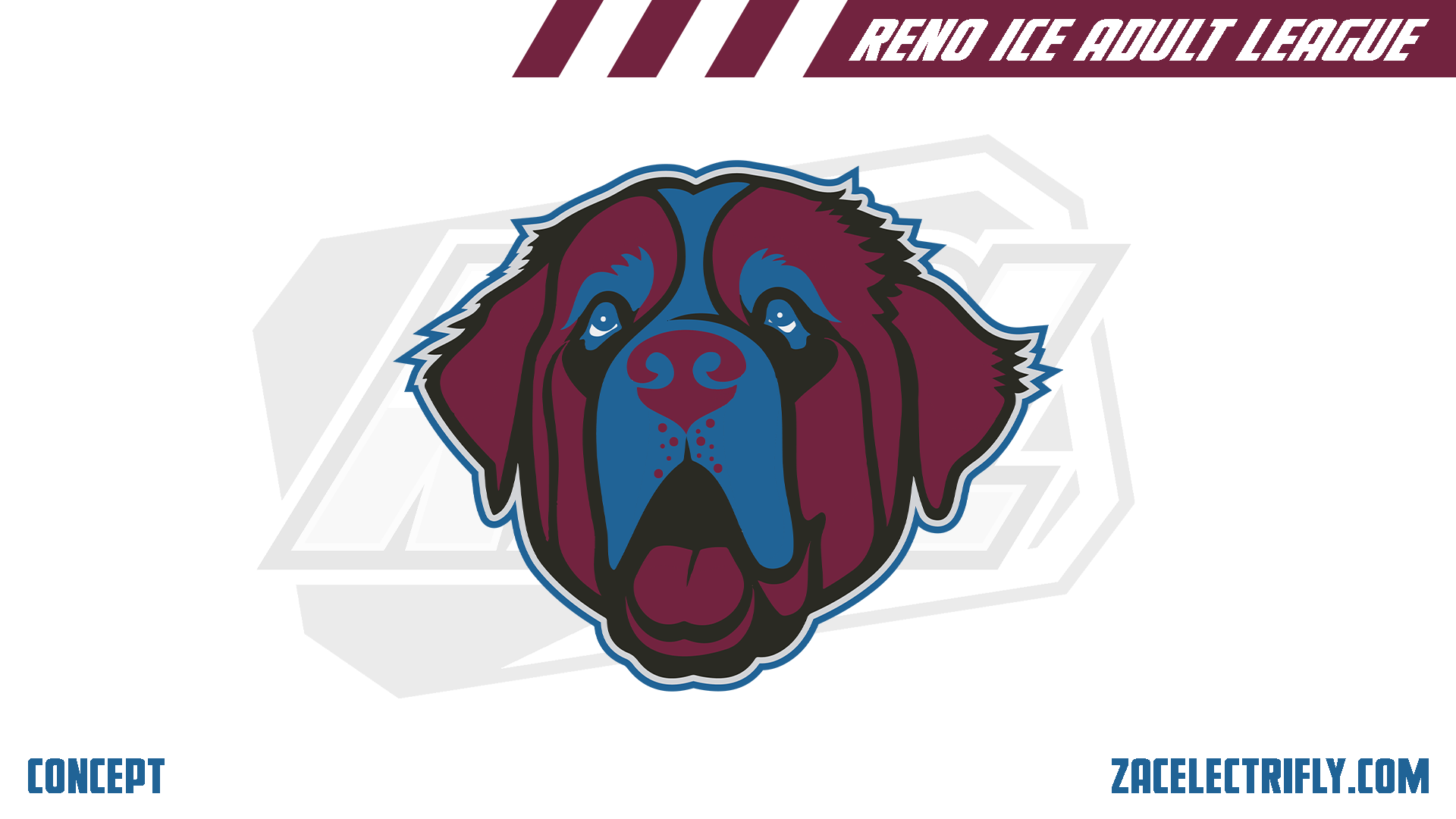
Tahoe Dawgs Primary Logo
The Tahoe Dawgs primary logo is a Saint Barnard head. The branding for this concept is is inspired by the Colorado Avalanche, the Quebec Nordiques, and the Colorado Rockies (NHL). For this concept they went with a 2021 rebrand to coincide with the founding of the RIAL. The Saint Barnard was chosen due to its connection to ski patrol. It is also in their real branding. For this concept this logo would not be the primary logo for all of their sports teams.
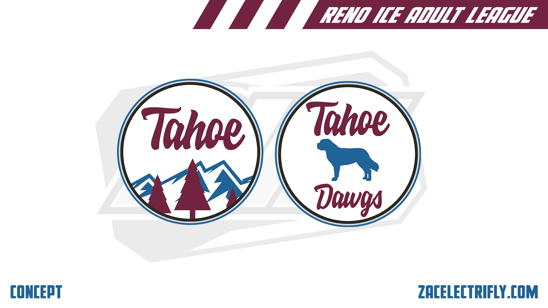
Tahoe Dawgs Secondary Logos
The Tahoe Dawgs secondary logos are circle logos. one has mountains and trees with Tahoe in a script font. The other logo has the team name in the same font with a silhouette of Saint Bernard.
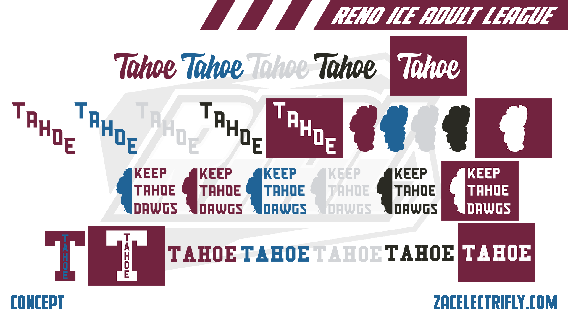
Tahoe Dawgs Alternate Logos
There are a lot of wordmark logos for the Tahoe Dawgs. There is also silhouettes of Lake Tahoe. There is a logo here inspired by Keep Tahoe Blue. There is also a T logo with Tahoe inside of it.
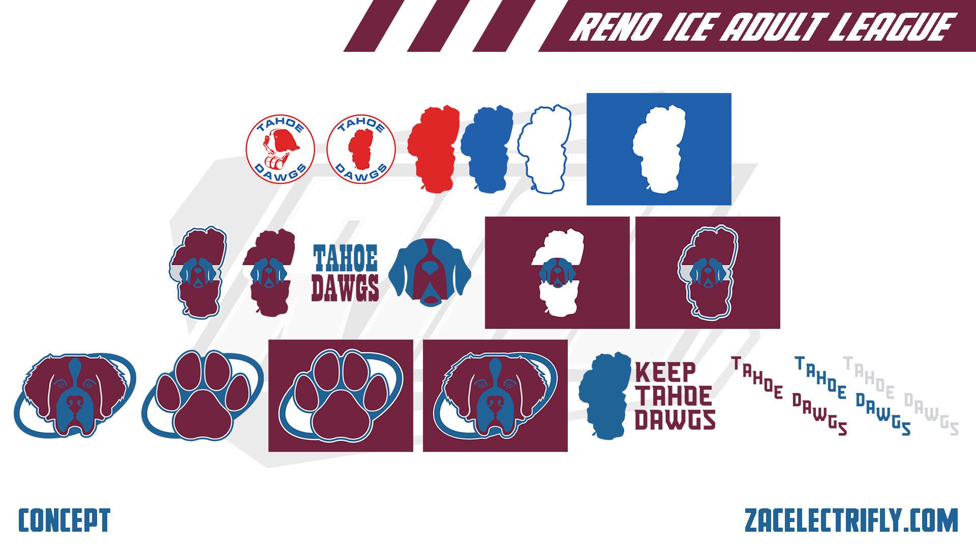
Tahoe Dawgs Throwback Logos
The Tahoe Dawgs started in the early 90s. For this concept the top row of logos would have been their first branding. The first logo would have been their primary logo.
For this concept the Tahoe Dawgs rebranded in the mid to late 90s. The second row of logos would have been that branding. The first logo in the middle row would have been their primary logo during that time.
For this concept the last rebrand for the Tahoe Dawgs before 2021 would have been in the mid to late 2000s. During that time they would have updated their logos once again.
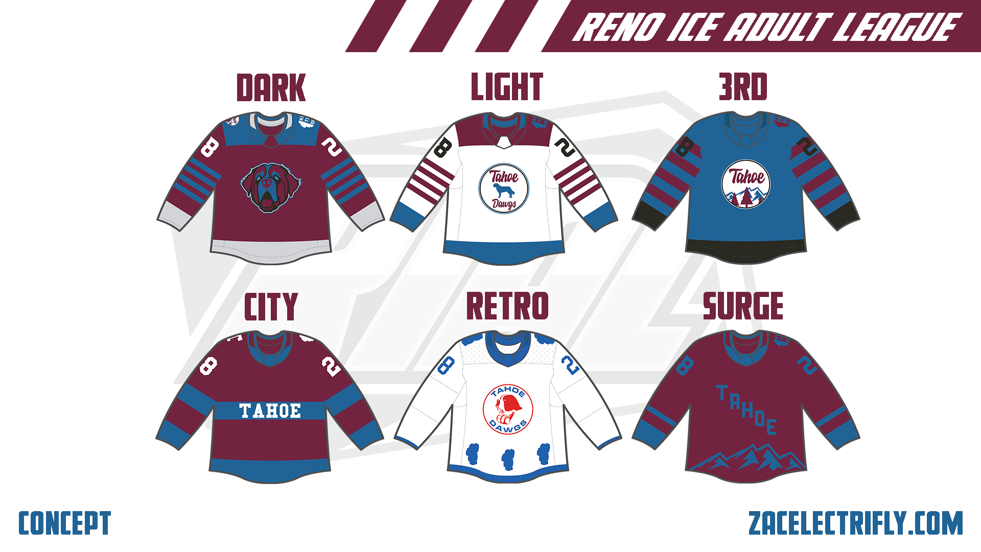
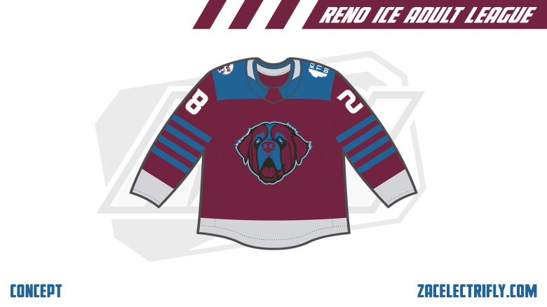
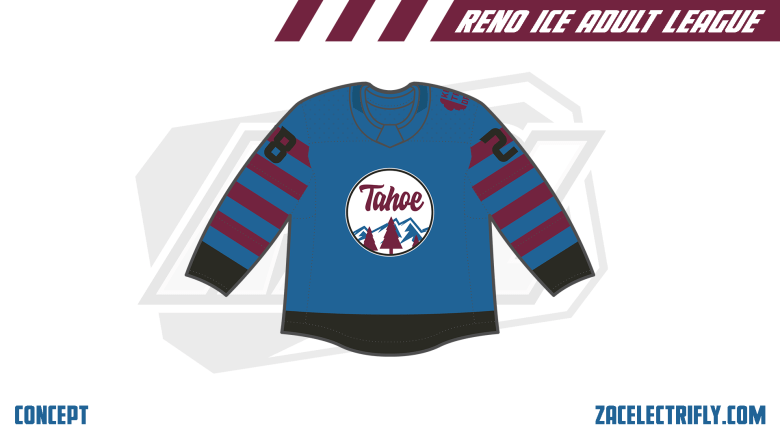
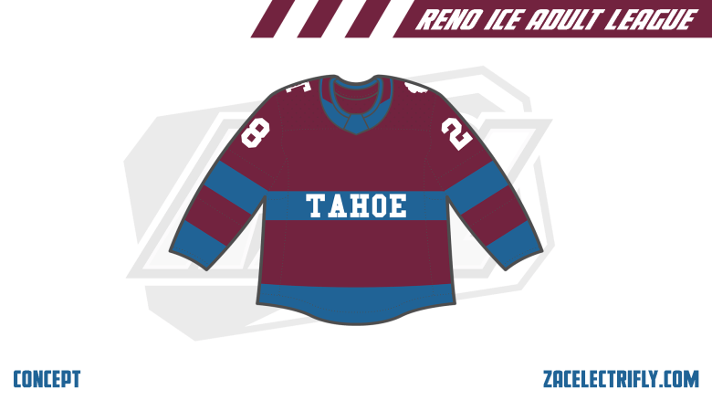
Tahoe Dawgs Jerseys
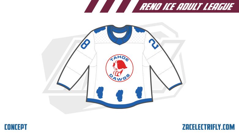
The Dark Tahoe Dawgs jersey is bugondy, blue, silver, and white. The primary logo is on the front. On the shoulders is the secondary mountain logo and the alternate Keep Tahoe Dawgs logo. The Light jersey is white, burgundy, blue, and black. On the front is the secondary silhouette logo. On the shoulder is the Keep Tahoe Dawgs logo.
The 3rd jersey is blue, burgundy, and black. On the front is the secondary mountain logo. On the shoulder is the alternate Keep Tahoe Dawgs logo.
The City jersey is burgundy, blue, and white. Across the front it has one of the Tahoe wordmark logos. On the shoulders is the alternate T logo and alternate Lake Tahoe silhouette logo.
The Retro jersey is white, and blue. It had the original primary logo on the front. On the bottom of the jersey and on the shoulders are silhouettes of Lake Tahoe. The Tahoe Dawgs didn’t have a set home or away jersey when this jerseys would have been used. Both of their original jerseys would have been interchangeable depending on who they played
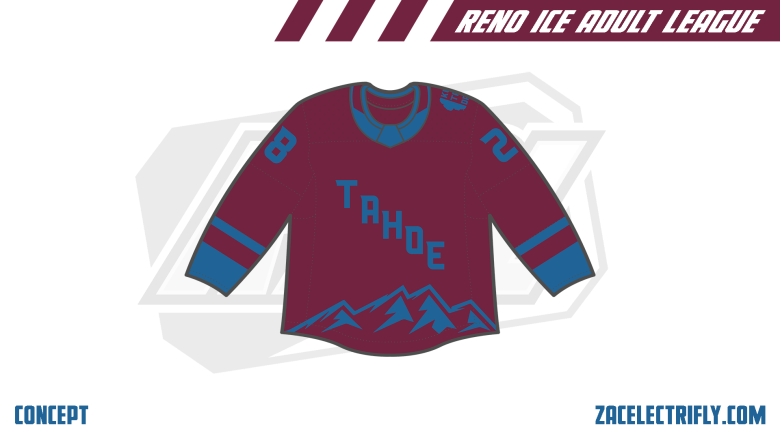
The Surge jersey is burgundy and blue. It has a Tahoe wordmark on the front with mountains on the jersey.
My favorite of these is the City jersey.


Leave a reply to Reno Ice Adult League Concept Part Twenty Six | Tahoe Division Recap – Zac Electrifly Cancel reply