
Up next in the Reno Ice Adult League concept is the Tahoe Storm. For this concept two former Tahoe League teams merged and joined in the RIAL. That team would become the Tahoe Storm. Essentially the Tahoe Storm were created to hep give former Tahoe League players the opportunity to play in the RIAL.
For this concept Tahoe Storm play in the Tahoe Division of B-League along with Cruz Construction, Mid-Ice Crisis, and the Tahoe Dawgs.
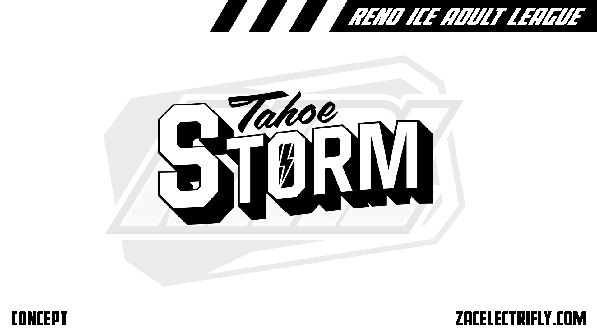
Tahoe Storm Primary Logo
The Tahoe Storm primary logo is a wordmark logo. It’s inspired by greeting cards. One of the influences was Welcome to Tahoe. Other inspiration for this concept comes from the California Golden Seals, Stockton Thunder, Lake Tahoe Blue, Tahoe Icemen and San Jose Sharks. I was trying to connect the Tahoe Storm to some of the Northern California hockey history.
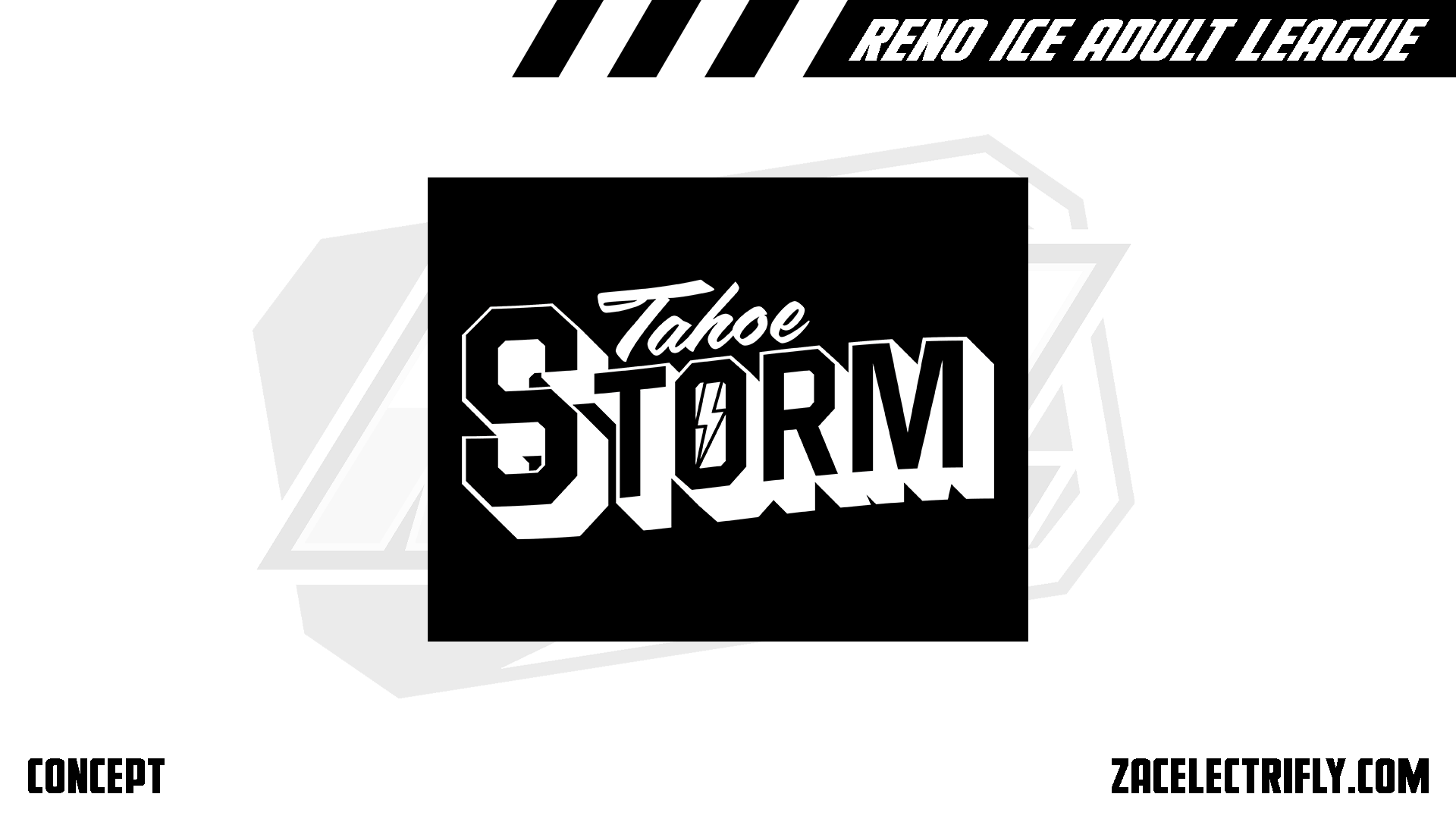
Tahoe Storm Secondary Logo
The Tahoe Storm only have one secondary logo. it is the primary logo with the colors flipped. While the primary logo works with light backgrounds the secondary logo works with darker backgrounds.
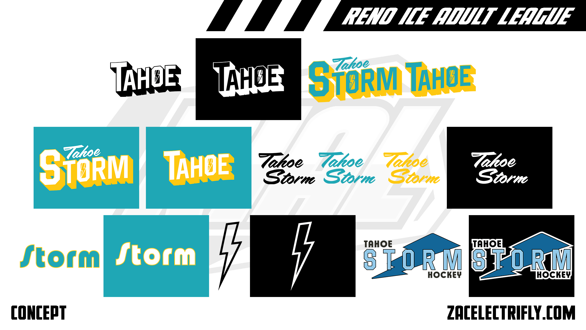
Tahoe Storm Alternate Logos
In addition to the Tahoe Dawgs primary colors of black and white they have alternate colors of teal and gold. The first two alternate logos are designed closely to the primary and secondary logo except they just say Tahoe. The next four logos are the primary, secondary, and first alternate logos in their alternate colors. The next four logos are wordmark logos using the script font from the primary logo. The next two logos are wordmark logos that would act as primary logos for their alternate colors. The next two logos are lightning bolts.
Tahoe Storm does not have any throwback logos as they are a new team. Their throwback colors are blue, baby blue, black and white as used by the Tahoe Icemen. The last two logos are alternate logos that are used as their throwback logos. The logos have a lightning bolt in the background with the team name in front of it.
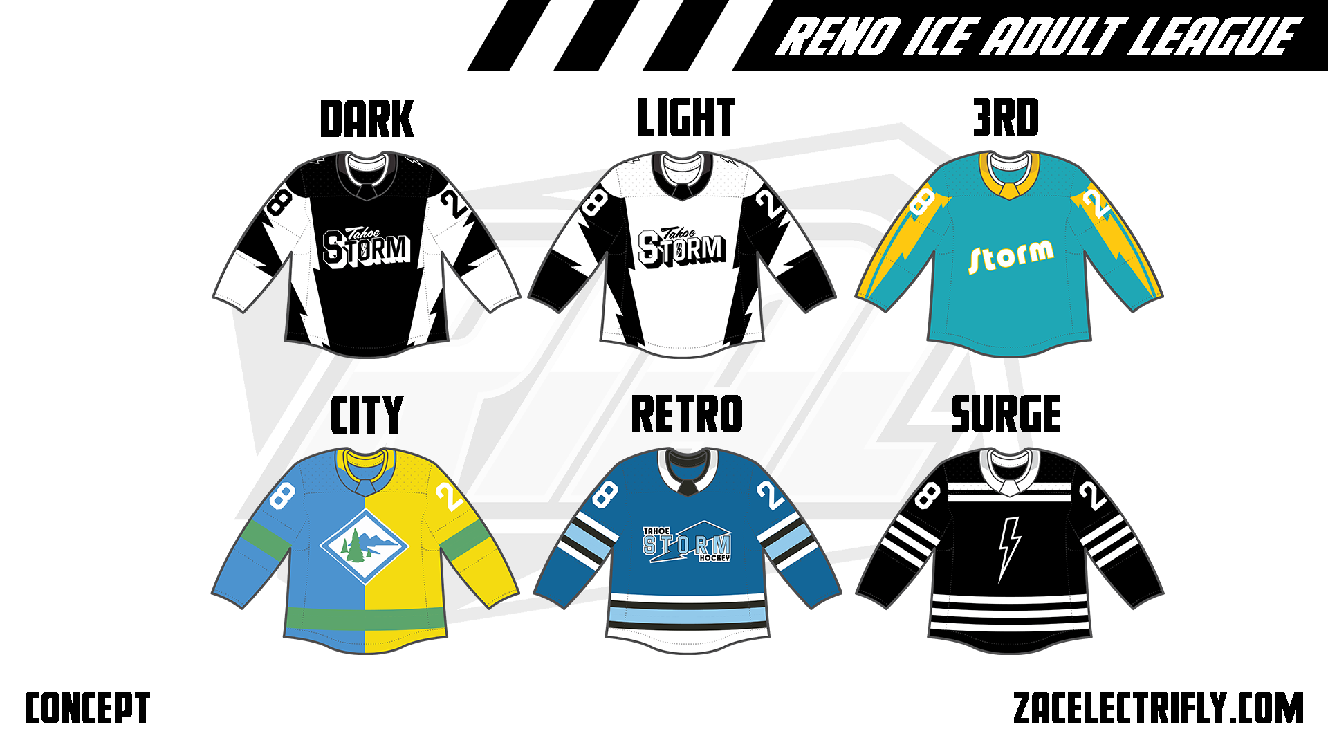
Tahoe Storm Jerseys
The Dark jersey is black and white. It has a lightning dolt design on the jersey. On the front of the Dark jersey is the secondary logo. On the shoulders is the alternate lightning bolt logo. The Light jersey is white and black. It has the same pattern as the Dark jersey. On the front is the primary logo. On the shoulders are the lightning bolt logo.
The 3rd jersey is in Tahoe Storm alternate colors. Lightning bolts are on the sleeves. The alternate color Storm wordmark is on the front of the jersey. There are no shoulder logos.
The City jersey is blue, yellow and green. It is designed after the South Lake Tahoe flag. On the front is the same design seen on the flag.
The Retro jersey is blue, navy blue, black and white. On the front is the alternate throwback logo. It is inspired by the Tahoe Icemen. It is designed like the storm would have worn it during the 90s.
The Surge jersey is black and white. On the front is the alternate lightning bolt logo.
My favorite here is either the Dark jersey or the Retro jersey. Both are good examples of what this team could be doing.


Leave a reply to Reno Ice Adult League Concept Part Forty One | Season One Logos Recap – Zac Electrifly Cancel reply