Next up in my American Hockey League concept series with the Bakersfield Condors. My all time favorite hockey team. They are the primary affiliate of the Edmonton Oilers. They play in the Mechanics Bank Arena. Bakersfield California has a population of 407,615. The Condors have been around since the 1997-98 season. Prior to that they were the Bakersfield Fog and Bakersfield Oilers. The name change came as they moved into their current arena. They almost became the Bakersfield Brontos. The Condors played in the West Coast Hockey League and the East Coast Hockey League before the Edmonton Oilers bought the team and they made the jump to the AHL.
For this concept, the Bakersfield Condors play in the AHL’s West Coast Division in the Western Conference. The other teams in the West Coast Division are the Abbotsford Canucks, Calgary Wranglers, Coachella Valley Firebirds, Henderson Silver Knights, Ontario Reign, San Diego Gulls, and San Jose Barracuda.
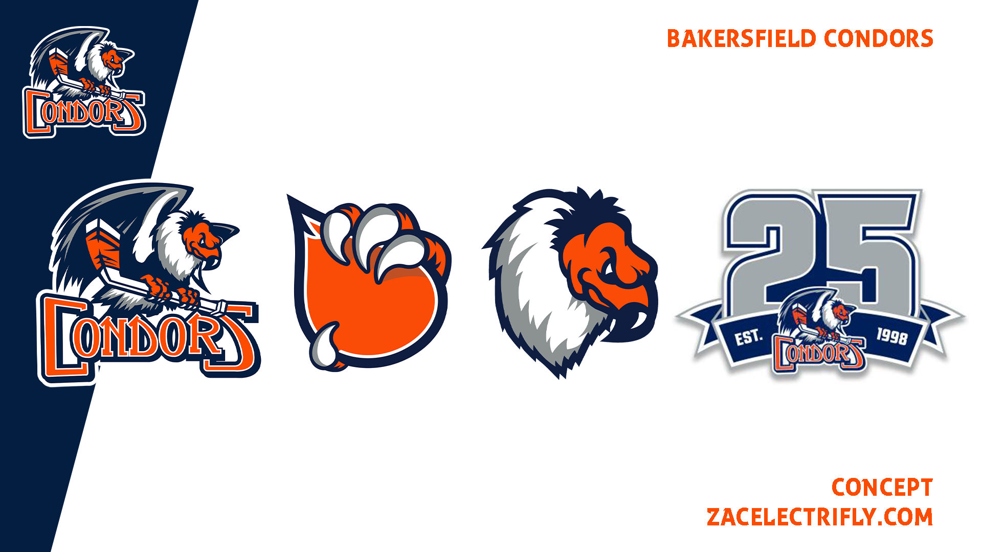

The Bakersfield Condors have three logos. Their primary logo is pretty much what they have always had. A condor with the team name under it. They did change it up a little bit when they entered the AHL. They have an oil drop logo and a condor head logo. For this season they have a 25th-season logo.
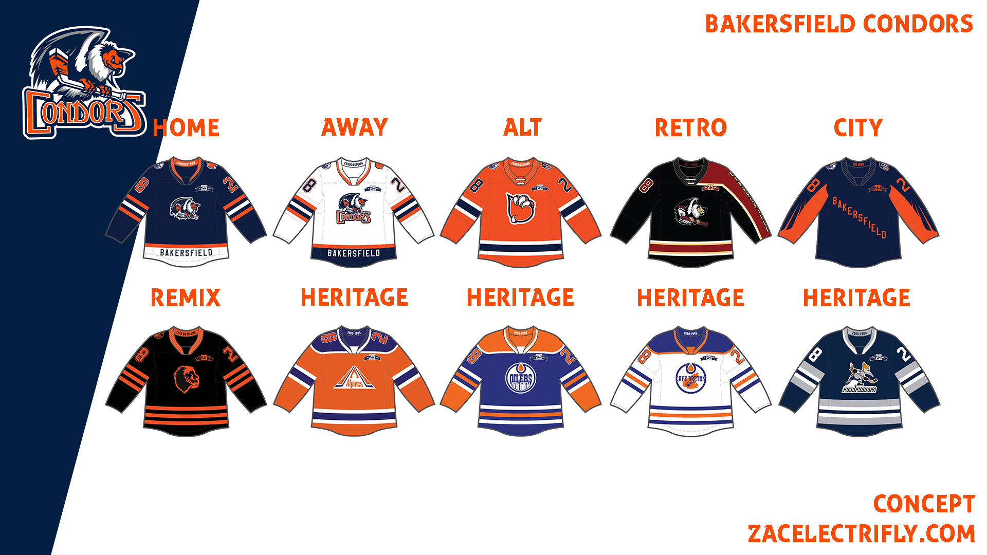

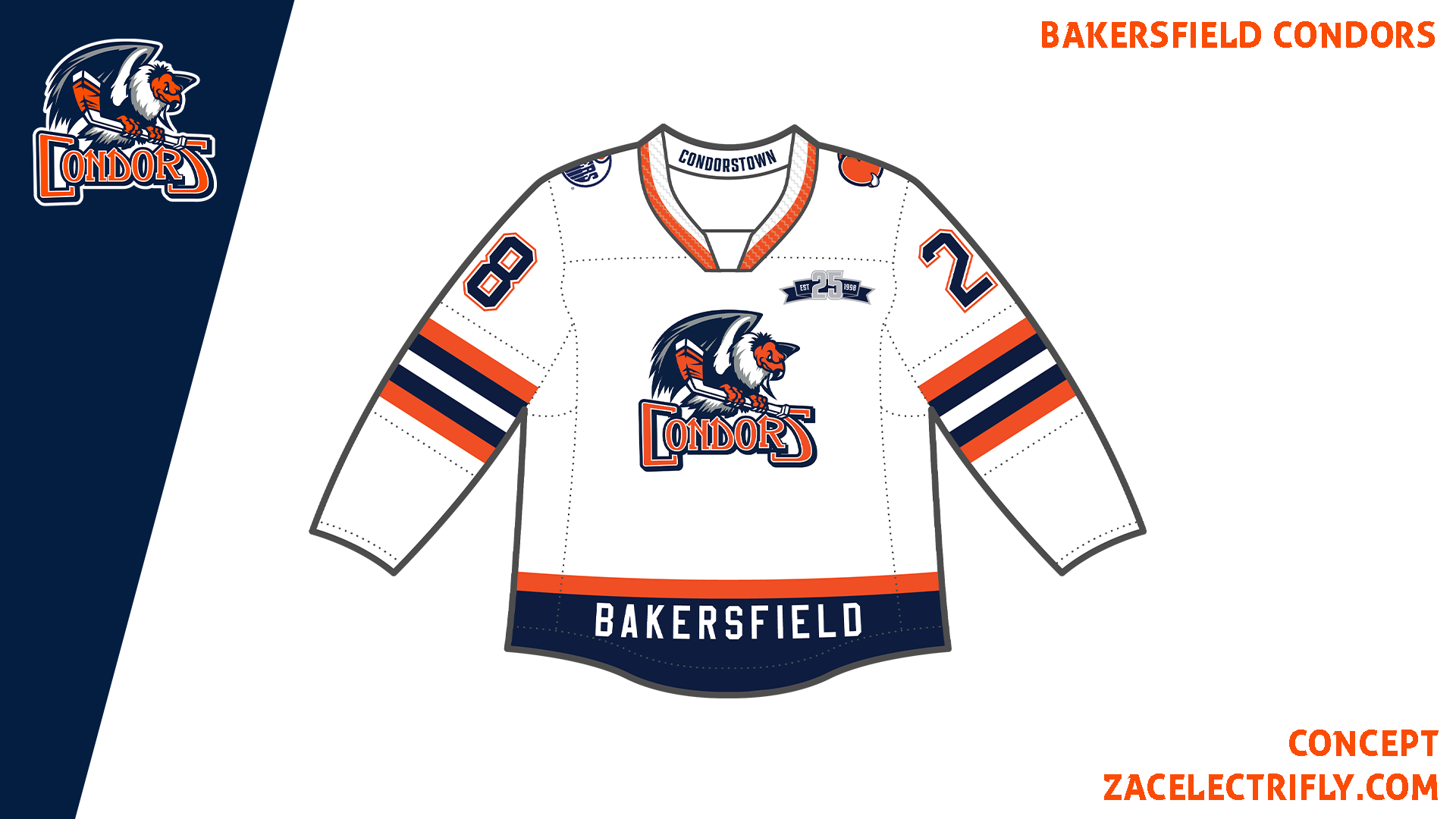
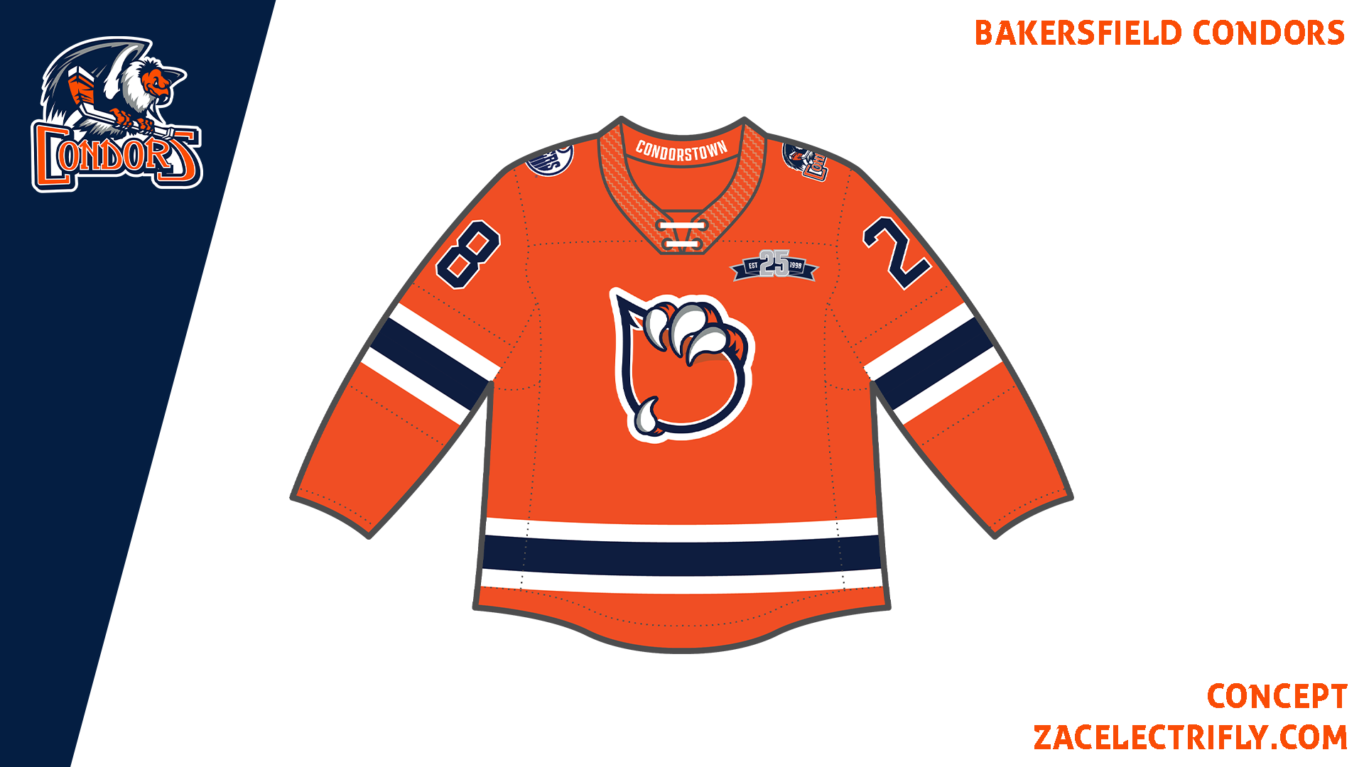
The Home jersey is blue, orange, and white. The Condor logo on the front is the primary logo with the team name removed. Until they entered the AHL they had jerseys with the primary logo without the team name. They do not use this logo but I wanted to do that. The 25th logo is on the front. They are using it on their jerseys this season. I could not find the version they are using on the jerseys so I recreated it. I also put Bakersfield on the front. That is another thing they did up until they joined the AHL. On the shoulders is the Edmonton Oilers logo and the oil drop logo. On the collar it says condorstown which is the team motto/hashtag. The Home, Away, and Alternate jerseys all have condorstown on the collar.
The Away jersey is white, orange, and blue. It has the primary logo on the front. It has all of the other logos as the Home jersey. The home and away jerseys differ in the colors, main logo, and pattern.
The Alternate jersey is orange, white, and blue. The design is based on one of my favorite condors jerseys. It is based on their alt jersey from 2016. It has the oil drop logo on the front. The Edmonton Oilers logo and the Bakersfield Condors primary logo are on the shoulders.
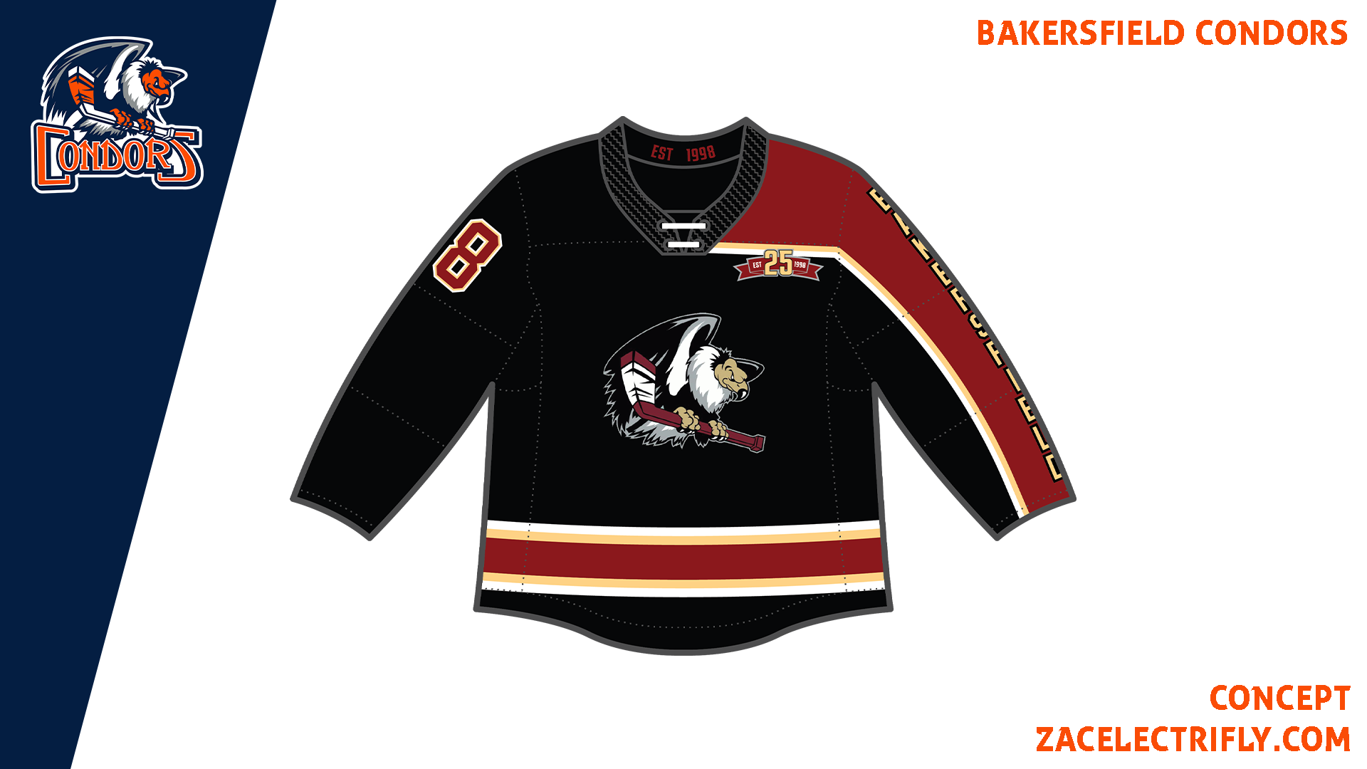
The Retro jersey is inspired by the Bakersfield Condors jersey that was used from 2007 to 2013. The jersey is black, red, and tan. It has their ECHL Condor logo on the front. On the sleeve it says Bakersfield. This is again one of my favorite Condors jerseys. On the collar it says est. 1998 like the 25th-anniversary logo. I also recolored the 25th-anniversary logo for this jersey.
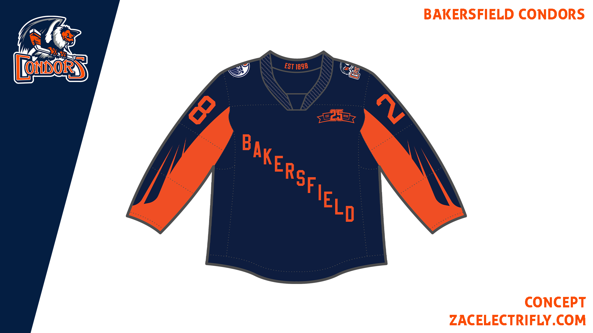
The City jersey is blue and orange. It has wing patterns on the sleeves which are inspired by their jerseys from 2013-2015. On the front is a Bakersfield word mark and a recolored version of the 25th-anniversary logo. On the shoulders is the Edmonton Oilers logo and the primary logo. On the collar is the founding year of Bakersfield CA.
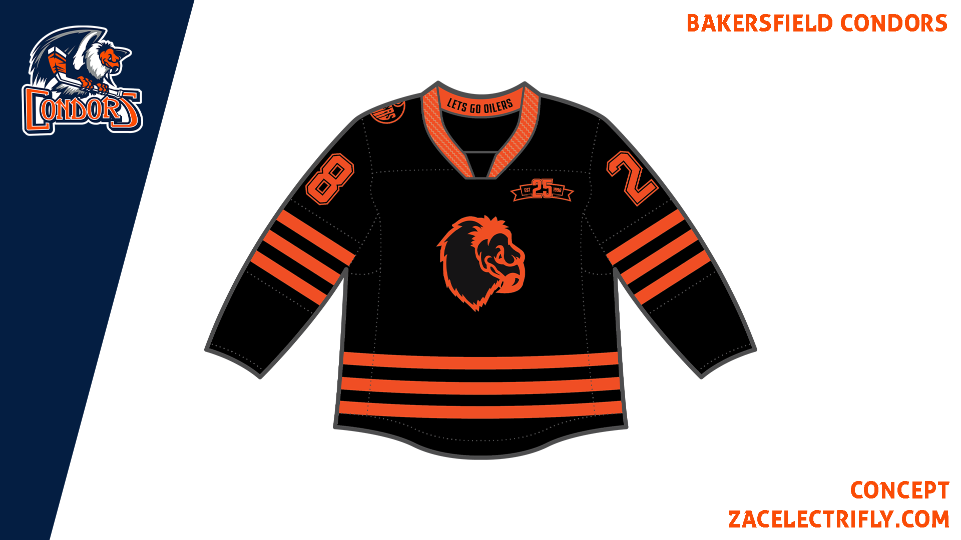
The Affiliate Remix jersey is black and orange. It is based on the Edmonton Oilers white away jersey. On the front is a recolor of the condor head logo and a recolored version of the 25th-anniversary logo. On the right shoulder is the Edmonton Oilers logo from their alternate jersey. On the collar it says lets go oilers which is the Edmonton Oilers hashtag. While it is based on the Oilers jersey it is also inspired by merch released by the Condors.
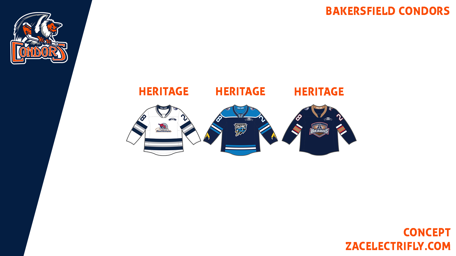
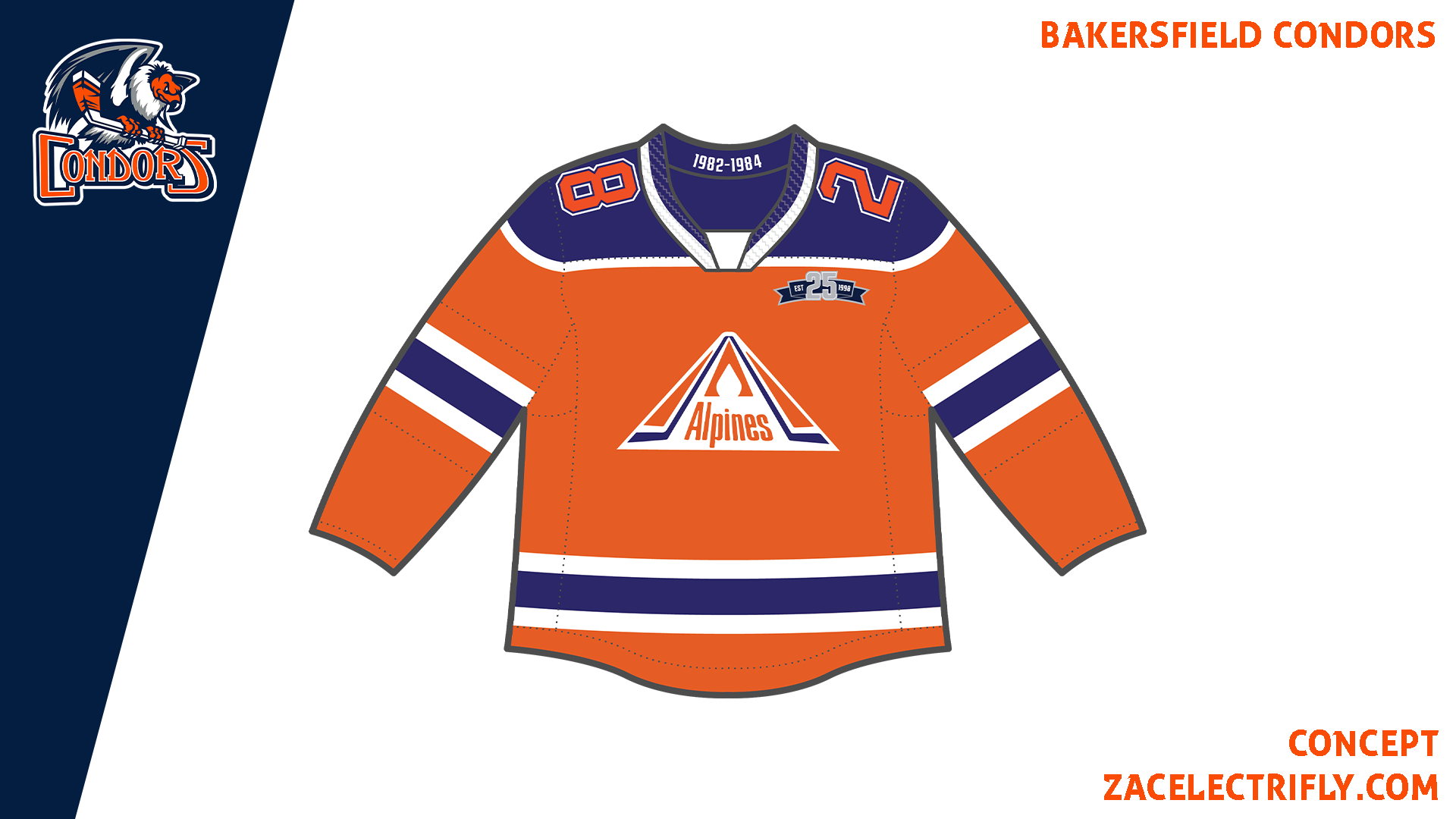
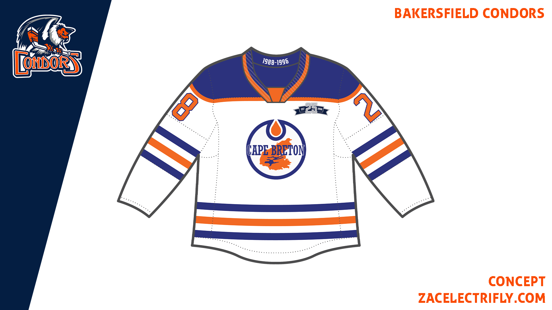
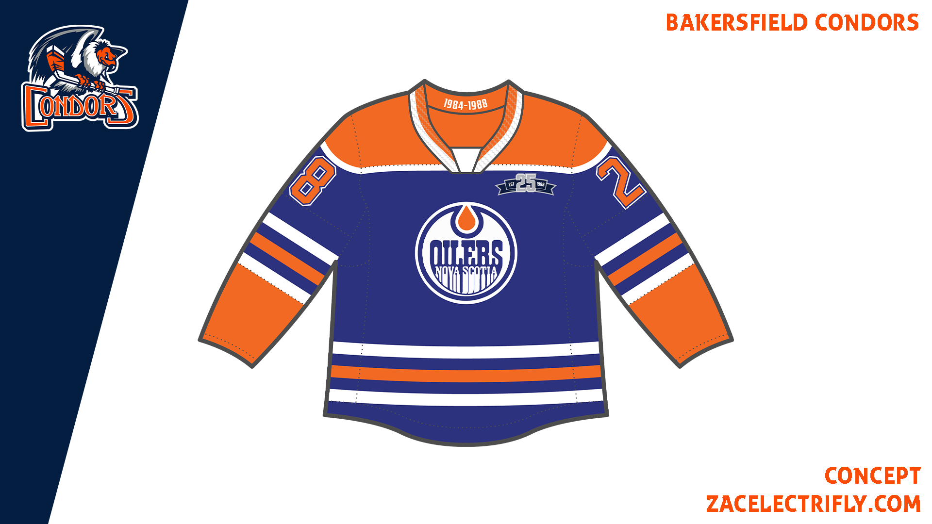
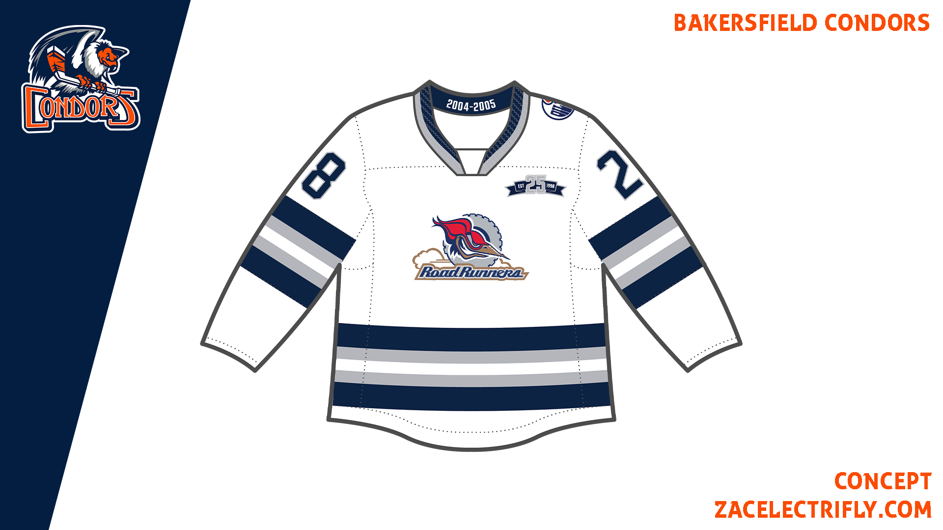
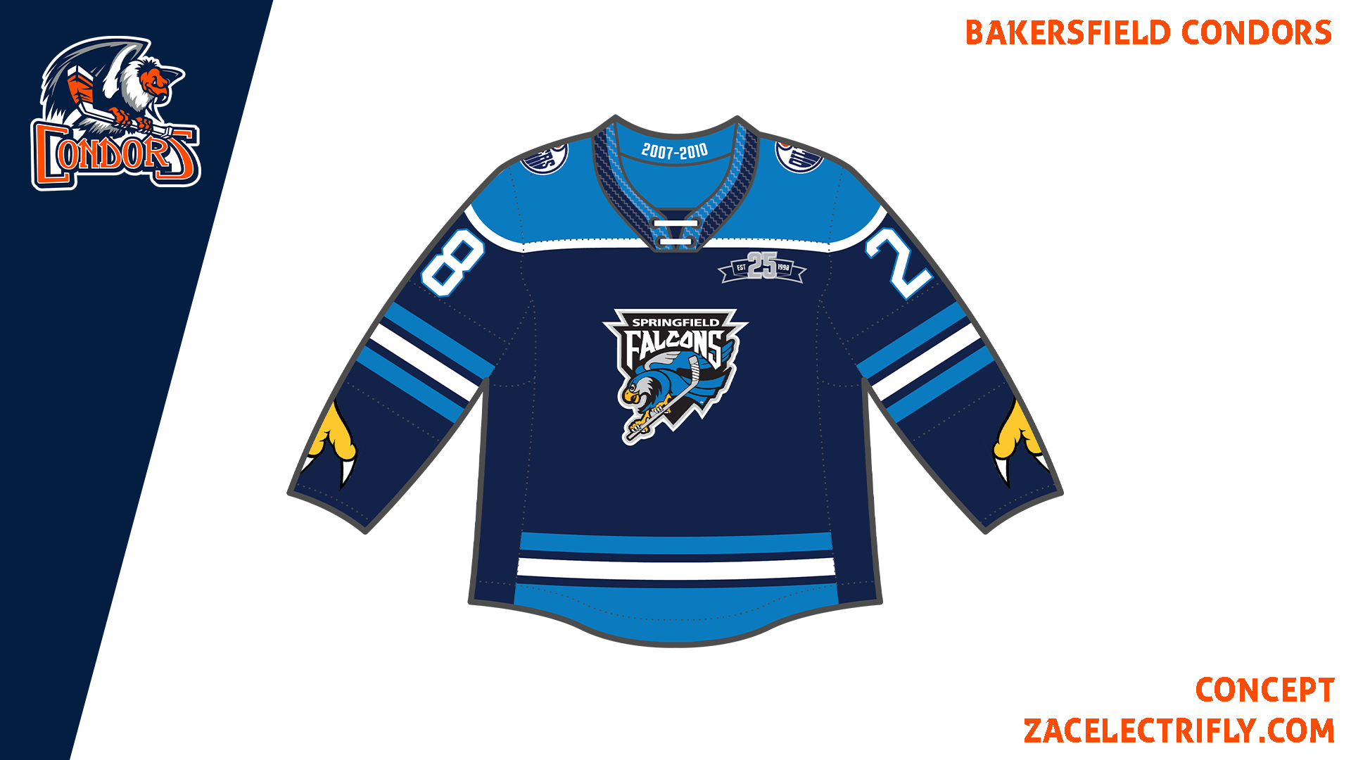
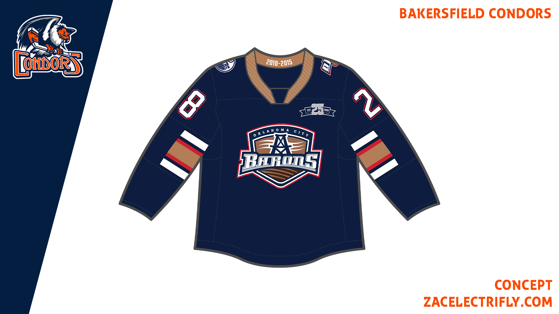
The Bakersfield Condors have thirteen seven Heritage jerseys. The Moncton Alpines (1982-84), the Nova Scotia Oilers (1984-88), the Cape Benton Oilers (1988-96), the Toronto Roadrunners (2003-04), the Edmonton Roadrunners (2004-05), the Springfield Falcons (2007-2010), and the Oklahoma City Barons (2010-2015). The Heritage jerseys are inspired by the Edmonton Oilers former primary affiliates.



Leave a comment