
Next up in my American Hockey League concept series is the Coachella Valley Firebirds. They are the primary affiliate of the Seattle Kraken. They play in the 9,918-capacity Acrisure Arena. There are nine cities in Coachella Valley. The population fluctates between 300,000 and 600,000. The Firebirds are a new team for this season. Their arena didn’t even open until after the season started.
For this concept, the Coachella Valley Firebirds play in the AHL’s West Coast Division in the Western Conference. The other teams in the West Cost Division are the Abbotsford Canucks, the Bakersfield Condors, the Calgary Wranglers, the Henderson Silver Knights, the Ontario Reign, the San Diego Gulls, and the San Jose Barracuda.
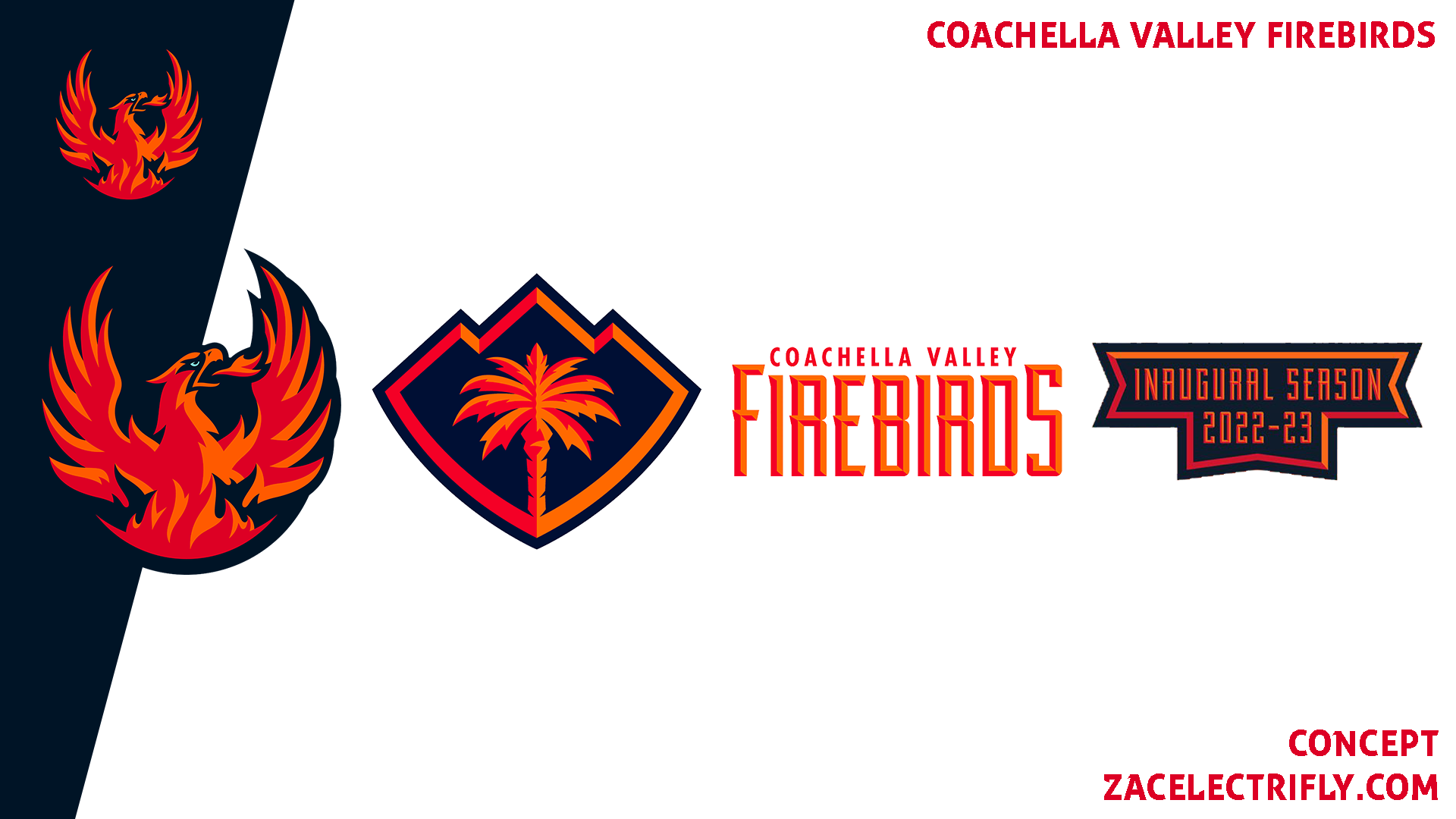

The primary logo for the Coachella Valley Firebirds is a Firebird. Their first alternate logo is a palm tree inside of a crest. Their third logo is a wordmark logo. Their last logo is their inaugural season logo. Their colors are deep sea blue, red alert, orange, and ice blue.


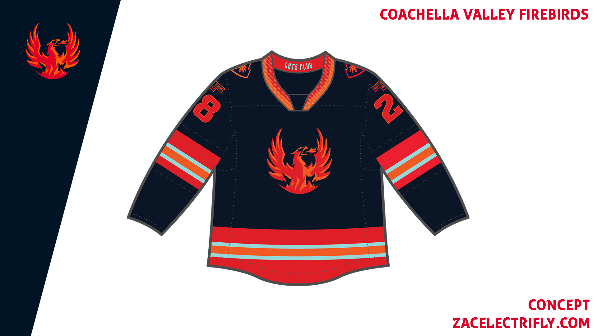
The Home jersey is deep sea blue, red alert, orange, and ice blue. It has the primary logo on the front. It has the palm tree logo on the shoulders. Above the numbers on all of the jerseys is the inaugural logo. On the collar is “Lets Flyy” which is the team’s hashtag.
The Away jersey is white, deep sea blue, red alert, orange, and ice blue. It uses a different template than the Home jersey. It has all of the same logos as the Home jersey.
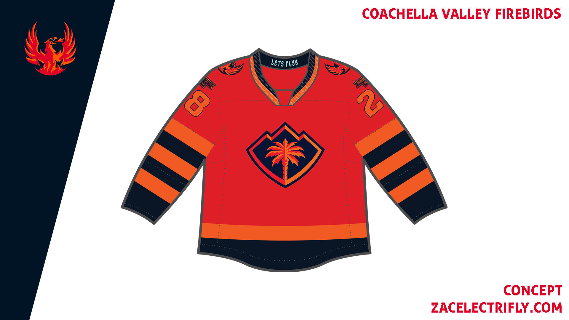
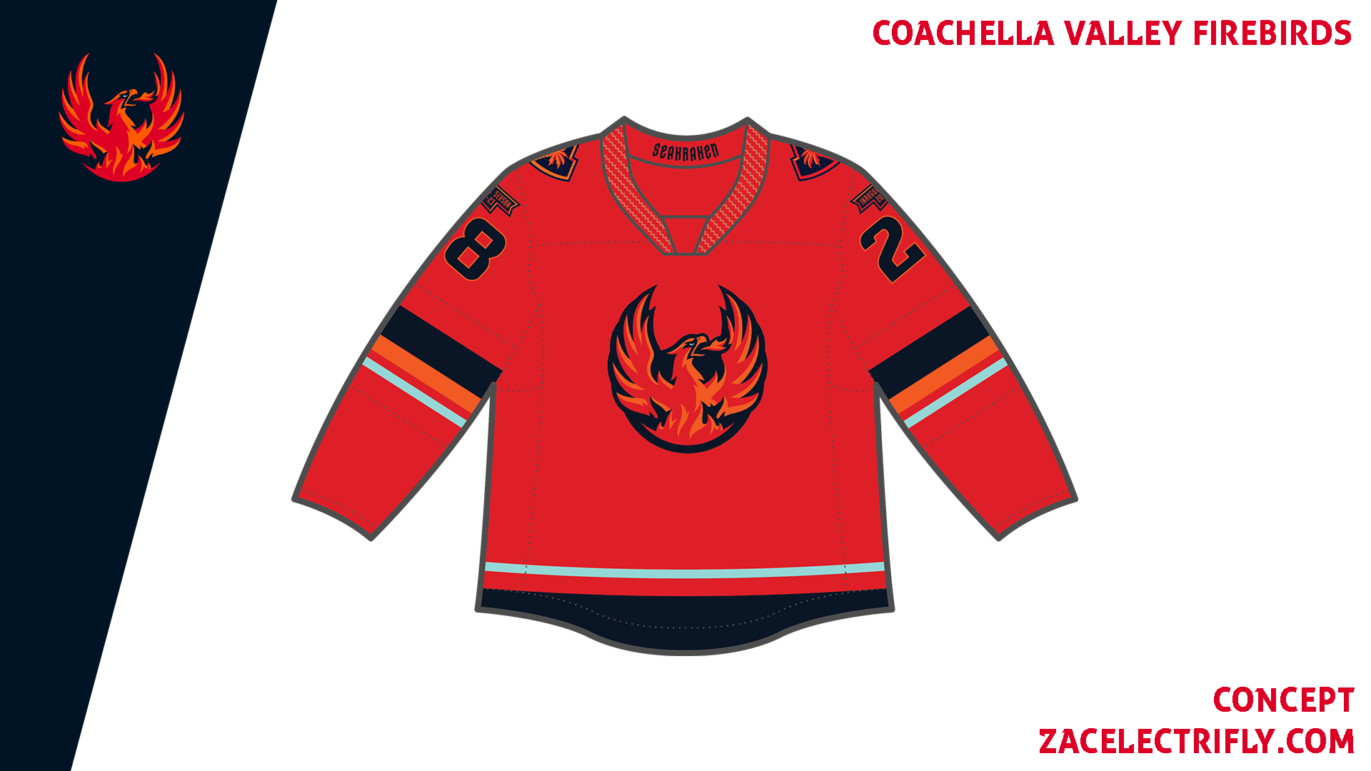
The Alternate jersey is red alert, deep sea blue, and orange. On the front is the palm tree logo. On the shoulders is the primary logo.
The Retro jersey is inspired by the Seattle Totems 1966 white jersey. On the front is a custom wordmark logo I made for the jersey. There are no shoulder logos. The inaugural logo is still above the numbers. I did make the jersey cream instead of just white to emphasize the Retro aspect of the jersey.
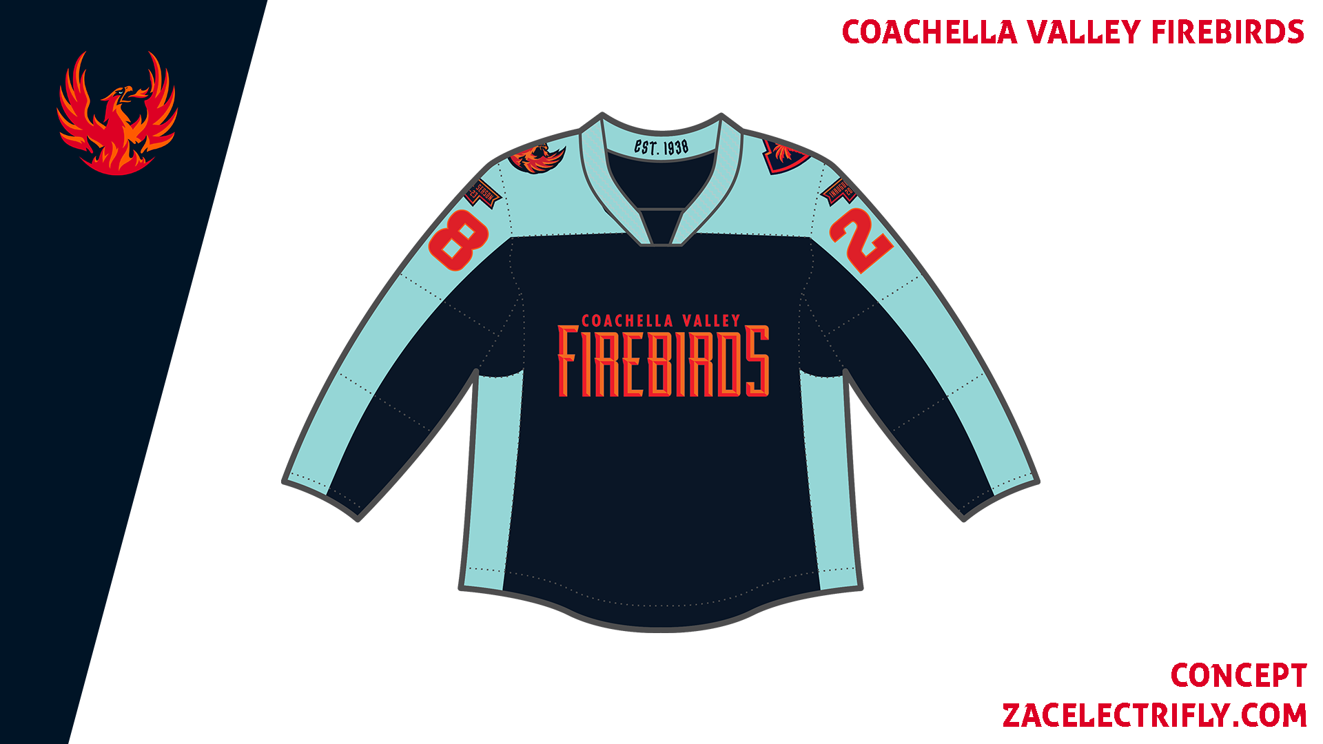
The City jersey is deep sea blue and ice blue. Other colors make appearances in the colors and logos. On the front is the wordmark logo. On the shoulders are the primary logo and the palm tree logo. On the collar is “est. 1938” for when Palm Springs was incorporated. The jersey is inspired by the LA Clippers 2020/21 City Edition jersey. It was harder to come up with a city design for the Firebirds. I think if I had to do it again I would probably have a more Native American inspired design.
The Affiliate Remix jersey is red alert, deep sea blue, orange, and ice blue. The logos are the same as the Home jersey. It is inspired by the Seattle Kraken Home jersey.
The Firebirds do not have any heritage jerseys.


Leave a comment