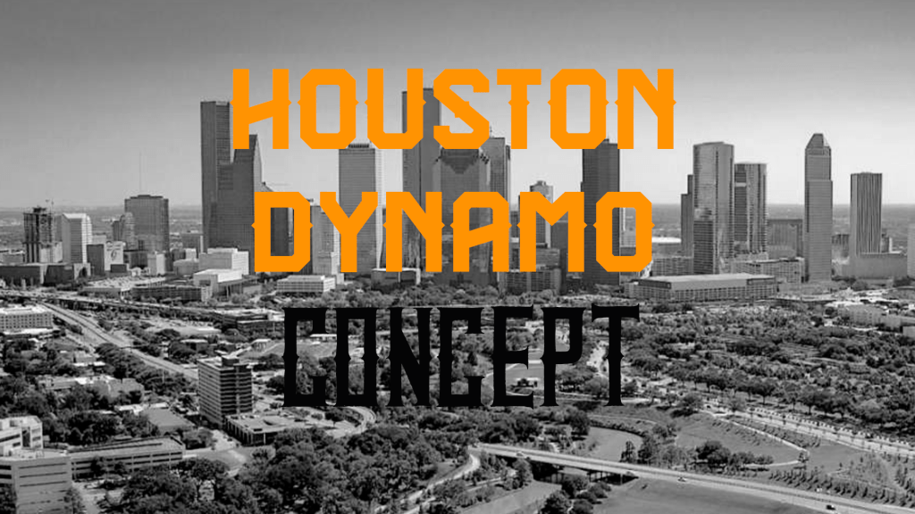
I am going a little bit out of order for this concept. I was originally going to redo part one for part two. For that I was going to implement some of the feedback I got to create a different MLS logo design then the one I did. After that I was going to create concepts in alphabetical order. I decided to put the Houston Dynamo as part two after they announced they would be getting a new crest in 2021.
Current Logo

2021 Logo
Links to other concepts:
Houston Dynamo Rebrand by Houston Design Company (2018)
Houston Dynamo by Matthew Caggiano on Dribble (2015)
I had the main idea in head for what I wanted to do with this logo before I even got started. It is inspired heavily by Dynamo Keiv and HC Dynamo Moscow. When doing research I found that a lot of teams named Dynamo stuck with some kind of stylized d as the primary element of their crest. I like that teams do that. After I finished designing this concept I realized that it was similar to the current Vancouver Whitecaps logo. That wont end up being a problem for this concept series. Having the d could also lead to some issues with Dallas as both teams are in Texas but again that’s not an issue for this concept.
I did decide to take the blue that is in the current logo out of my primary logo concept. the reason for this was that I couldn’t find a good fit for the blue. If any one element in the logo was blue it didn’t look good. The blue only worked when I made the whole logo blue. For the fonts I wanted a script font for the d. I also wanted western or Texas style fonts for the rest of the logo. I did try using the NASA font to further incorporate the city into the logo. I ended not using it.
The Houston flag uses a star. A lot of the Houston logos use stars. I thought that having a star or stars in the design was almost a requirement. Houston has won two MLS cups. Using the stars to represent the teams cup wins was an easy way for me to add stars to the design. 1836 was going to be the Houston’s original name after they relocated from San Jose. 1836 was the year Houston became a city. Houston and Dynamo are supposed to be in a banner that goes both in front and behind the crest. I wanted to add that to further separate this concept from the Dynamo Keiv logo.


Leave a comment