Montreal announced new branding recently. I will be doing a separate concept related to that. New branding is why I went out of order. Again. For this concept Saputo Stadium will continue to be the Montreal Impact’s home ground. They will play select games at the Montreal Olympic Stadium. CF Montreal will play at a different stadium in Montreal.
Current Logo

Links to other concepts:
Montreal Impact Rebrand by OfficialBailey07 on Sportslogos.net
Montreal FC crest concept by BigRed618 on Sportslogos.net
MLS | Montreal Impact Brand Refresh by Go Red Sox on Sportslogos.net
Montreal Impact by Roge Roge on Behance
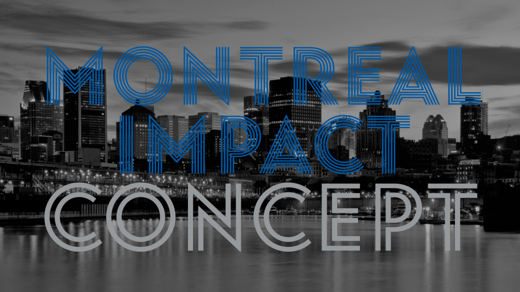
The first idea I had before I even started researching for this concept was an overlapping M and I. A couple weeks later and taking more time than I would have liked I had this. In the end I had two logos that both could have been the final. My focus group said this one was the winner. In the background is a design based off of the Montreal city flag. There was always going to be an M in the design. The font I chose represents three things. An olympic track. The olympic center where the Montreal Impact play, and stripes seen in previous Montreal Impact designs. The team name is in the logo. I changed that font to be more legible. There isn’t anything really special about the shape of the crest. When making the final design I wanted one that had a more traditionally shaped crest. That turned out to be the one people liked. The placement of the M with the team name inside of a rectangle is an homage to the Montreal Maroons. They had a logo with that was an M with a box with their name in it. I added a fleur de lis to the logo as all former Impact logos had one. This particular one is the same one from the Montreal city flag.
I did more of a retro theme with the other logos. I didn’t do that on purpose. that is just the way things happened to turn out. I like it as by doing this the branding and kits will stand out more from the other teams in this concept.
Thanks for checking this out. I would love to hear what your thoughts are on this. Any feedback is appreciated.


Leave a comment