Current Logo

Links to other concepts:
Atlanta MLS concept by Prefix270 on Sportslogos.net
ATLANTA MLS 2017: BRAND CONCEPT by Andrew Wanger on Andrew Wanger Creative
Terminus Atlanta by Mark Crosby on Dribble
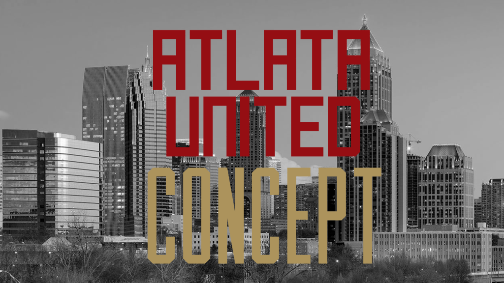
I came up with the crest shape very early on in the process. I don’t have any meaning behind why it is the way it is. I kept stripes inside the crest. I think stripes are a very important part of Atlanta United’s identity. I put 1847 in the design as it is the year Atlanta was founded. I added a star because they did win an MLS cup. The main design of A with United is heavily inspired by the Georgia restaurant chain The Varsity. I think that gives this logo a more personal touch to Georgia and Atlanta. I did take FC out of the logo. I did that because no one calls them Atlanta United FC. Everyone just calls them Atlanta United.
The first three secondary logos are a breakdown of the crest. I think they are all logos that might end up on a kit. I think the shield by itself can work really well on a retro kit. I wanted to make a Georgia logo to express Atlanta United uniting the entire state. The railroad spike logo is just something I wanted to do after I saw Atlanta Termminus concept, Atlanta United’s current logo, and Atlanta United 2’s logo. the wordmark logos are banners from early designs that made their way to the Georgia and railroad spike logos.
Thanks for checking this out. I would love to hear what your thoughts are on this. Any feedback is appreciated.


Leave a comment