Things haven’t been going to plan for this concept series. I haven’t been putting out as much as I was hoping for. Recently I was inspired to do the Columbus Crew. So here it is.
Current Logo

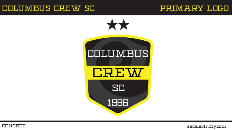
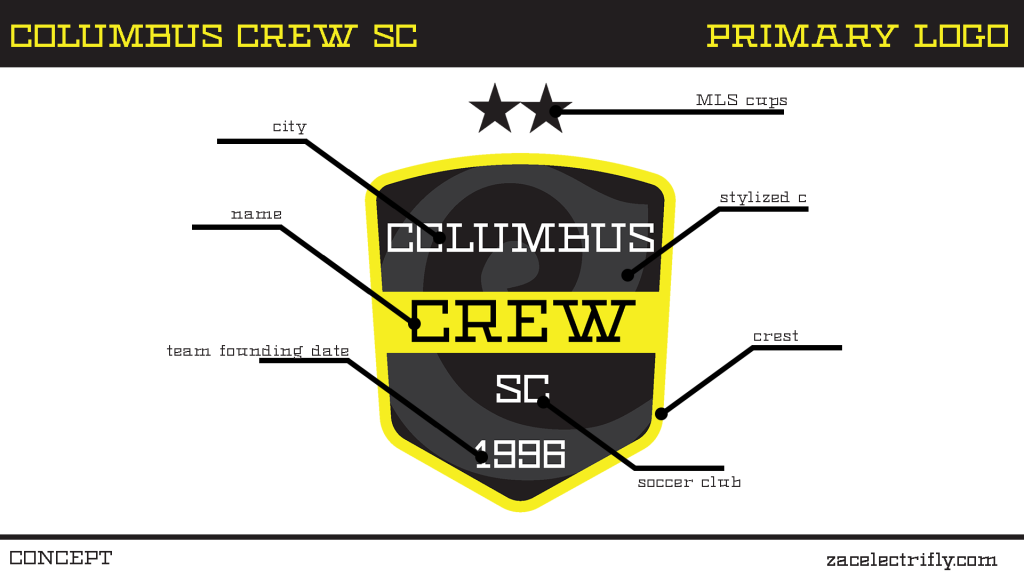
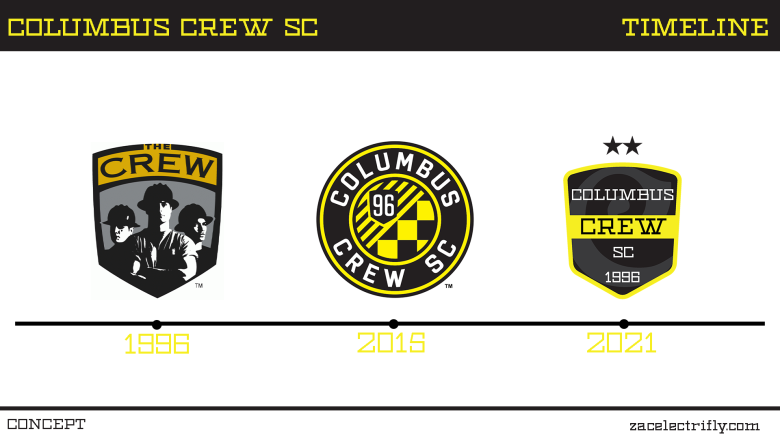
I originally wanted to put the team name inside of the Ohio flag as the primary logo. That didn’t work out. Instead I came up with this more basic logo. The crest shape is inspired by the original and the 2015 Columbus Crew logos. Going through the crest is a solid line. Inside of the crest is a stylized c. “Columbus Crew SC 1996” is placed in the crest. Above the crest is two stars for their MLS cup wins.

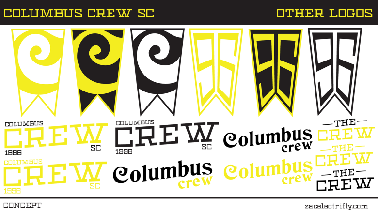
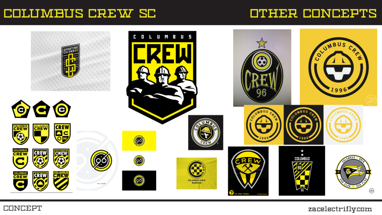
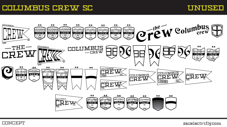
With the other logos I started with a basic crest. I wanted something that I thought would look good on a retro kit. Then I played around with the c’s. Then I wanted to get a logo with 96 in it. I finally settled on the 96 inside of the Ohio flag.
Thanks for checking this out. I would love to hear what your thoughts are on this. Any feedback is appreciated.




Leave a comment