Next up in the Reno Ice Adult League concept are the Whisky Dekes from A-League. This is the last team concept from A-League for now. The Whisky Dekes are inspired by the Milwaukee Bucks.
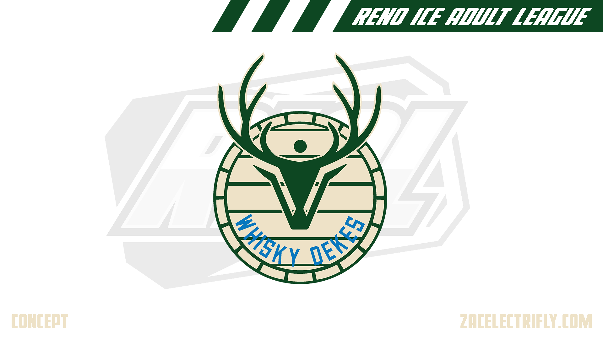
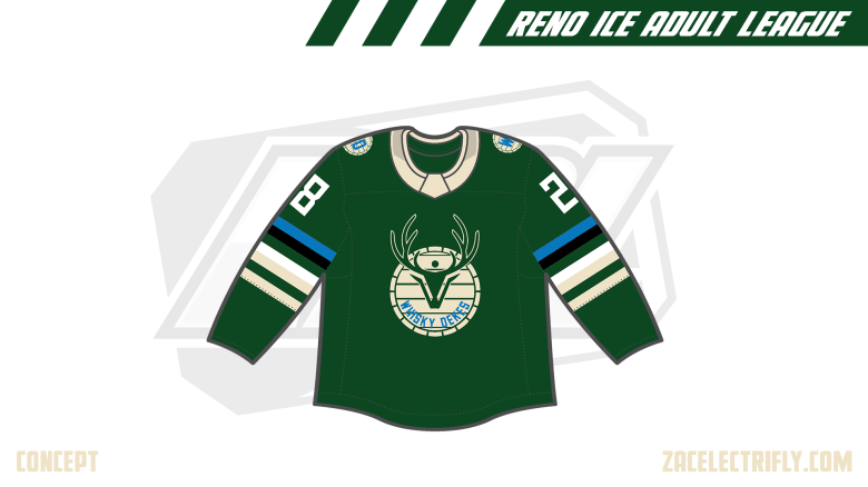
Whisky Dekes Primary Logo
When I started designing this team, I looked for inspiration from whisky logos. Thats how I choose a deer to be the mascot for the team. The primary logo is a whisky barrel with a deer head and the team name. The deer head is somewhat minimalistic. There are hockey sticks hidden in the logo.
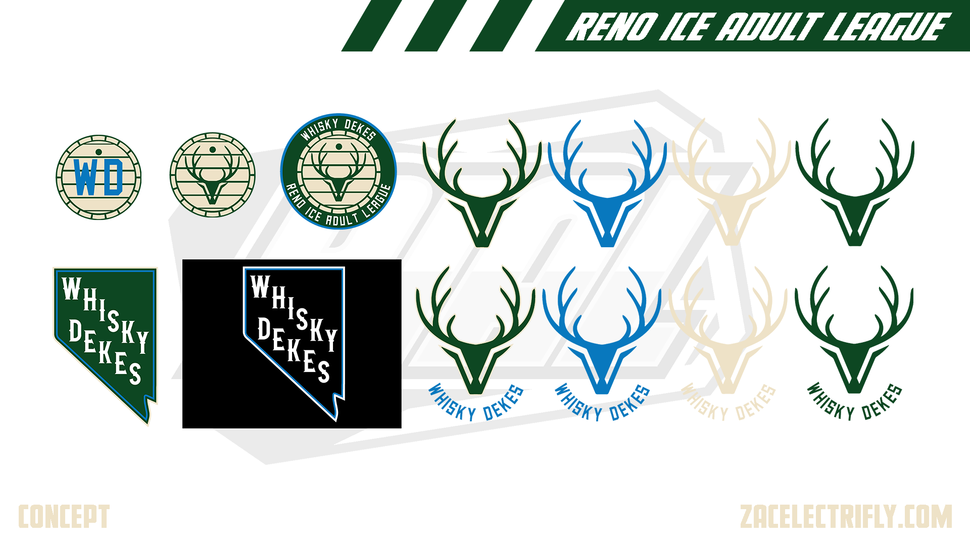
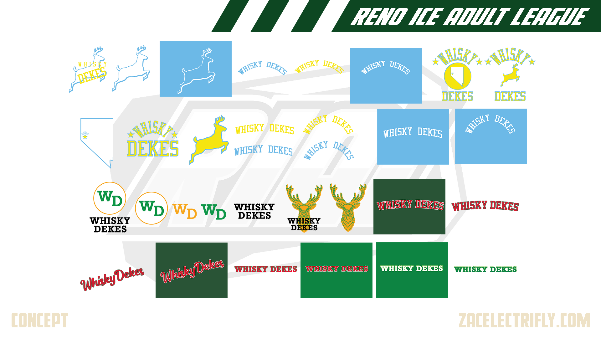
Whisky Dekes Alternate Logos
The Whisky Dekes do not have any secondary logos. To start off the alternate logos, there are three logos that expand on the whisky barrel idea. There are some deer head variants. Then there are two Nevada logo’s with Whisky Dekes inside in a whisky type font. Following that there are a bunch of wordmark logos.
Whiskey Dekes Throwback Logos
For this concept the Whisky Dekes would have been blue and gold similar to the Minneapolis Lakers. The first logo was inspired by the Chicago Stags. The Rest of the blue and gold logos are inspired by the Minneapolis Lakers. The seventh logo would have been the teams second primary logo for this concept.
The next logo set for this concept would have started with the WD circle logo. The logo has a WD inside of a circle with the teams name below it. That and the next four logos would have been one set.
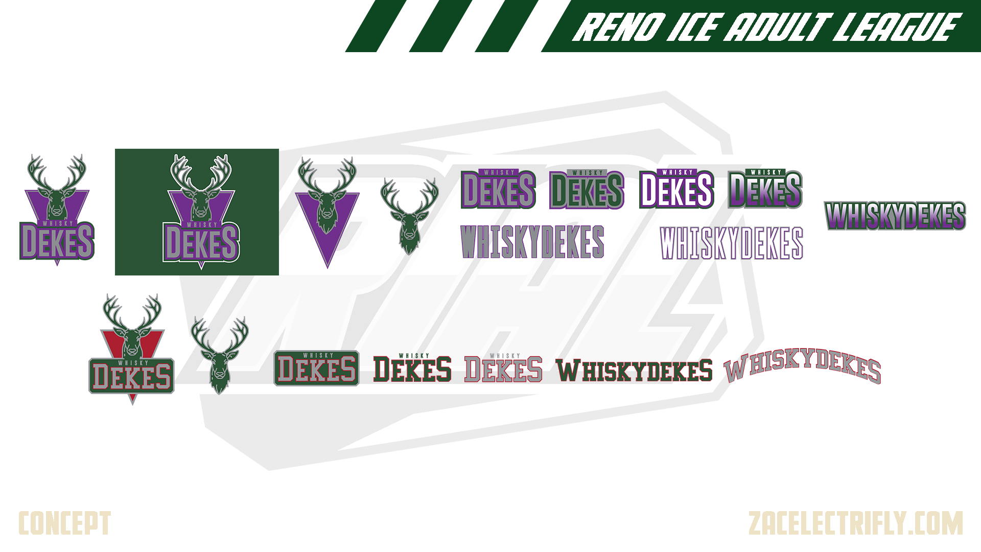
The remaining logos on that page starting with the first deer head logo would have all been in the same set. The deer head logo with the team name would have been the primary logo for this set.
The purple and green logos would have been one set for this concept. The primary logo is the first one on that page. That logo has a deer head with the team name below it all in front of a triangle.
The last set before the current set is the green and red logos. Purple would have been traded out for red. It is the same deer head. The primary logo is also slightly modified.
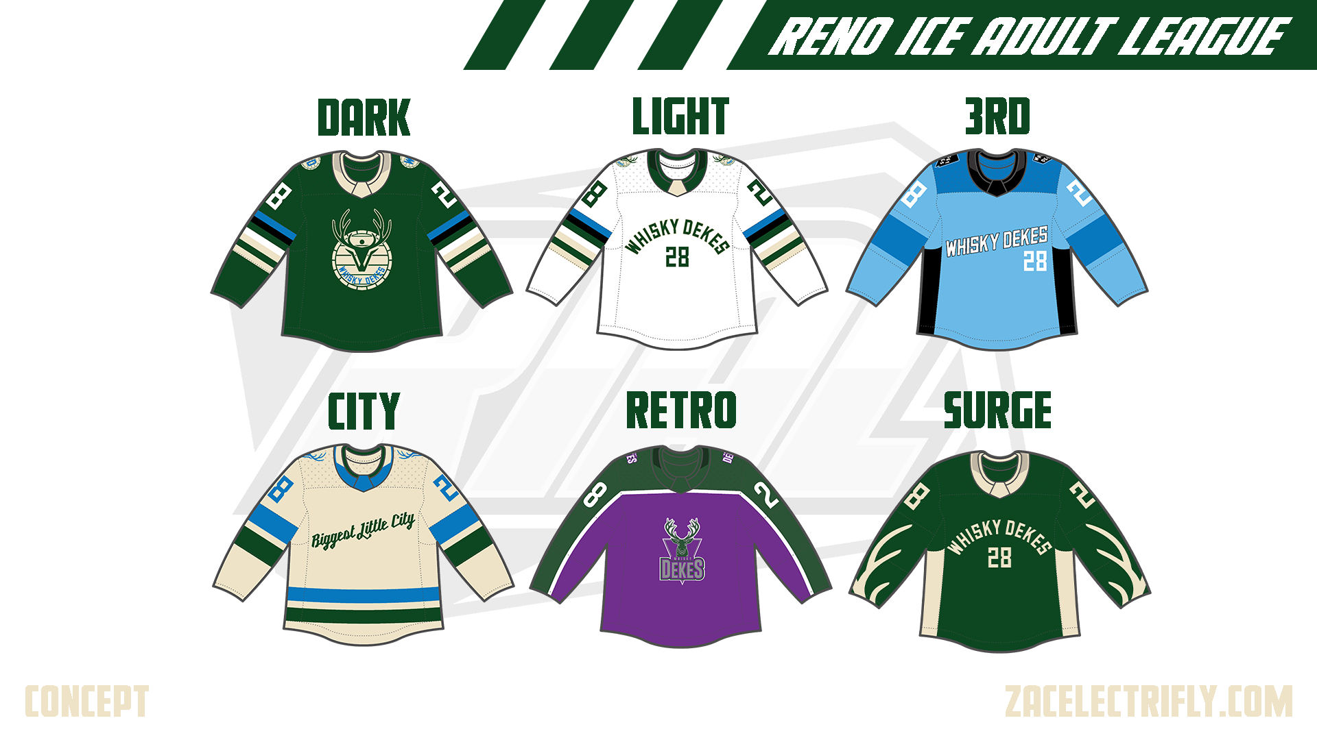
Whiskey Dekes Jerseys
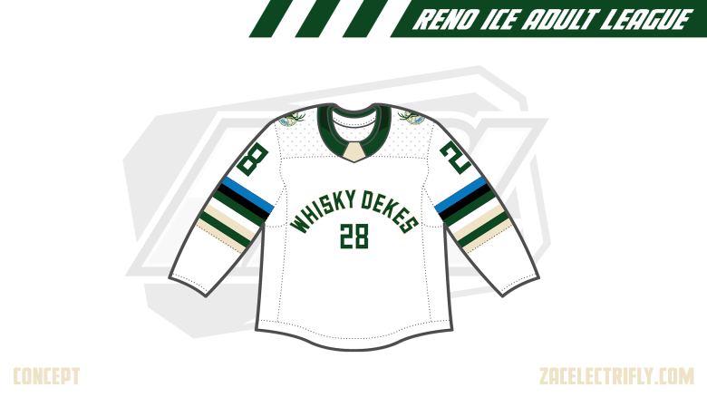
The Dark and Light jerseys use the same template. The Dark jersey is green with the primary logo and the WD whisky barrel logo. The light jersey is white with the primary logo on the shoulders. It has a wordmark logo and numbers on the front.
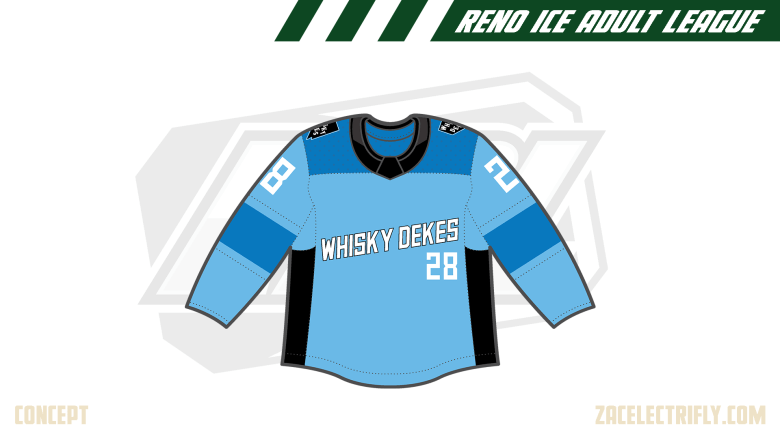
The 3rd jersey is blue. It has a wordmark logo with numbers on the front. It has the black Nevada logo on the shoulders.
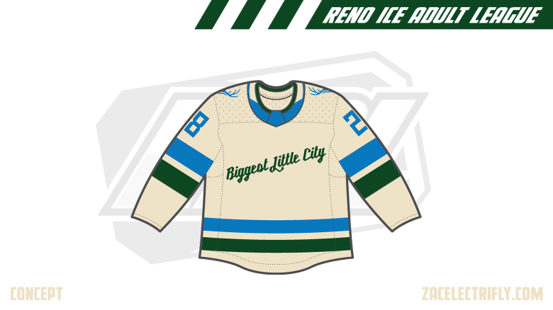
The City jersey is cream. It has the Biggest Little City wordmark logo on the front. On the shoulders are blue deer head logos.
The Retro jersey is purple. It has the teams old purple primary logo on the front. It has old wordmark logos on the shoulders. For this concept this jersey would have been worn during the early to mid 2000’s.
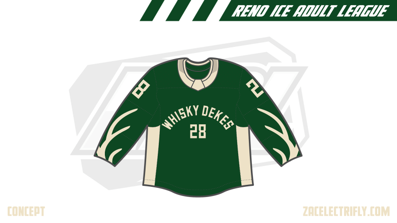
The Surge jersey is green. It has antlers from the primary logo on the sleeves. It does not have any shoulder logos. On the front it has a wordmark logo with numbers.


Leave a reply to BWD Tooth Fairies | Reno Ice Adult League Concept Part Forty Seven – Zac Electrifly Cancel reply